iOS 18 Could Improve the iPhone's Home Screen. It's About Time
Commentary: The iPhone's home screen is in need of a shake-up. And we may get just that with iOS 18.


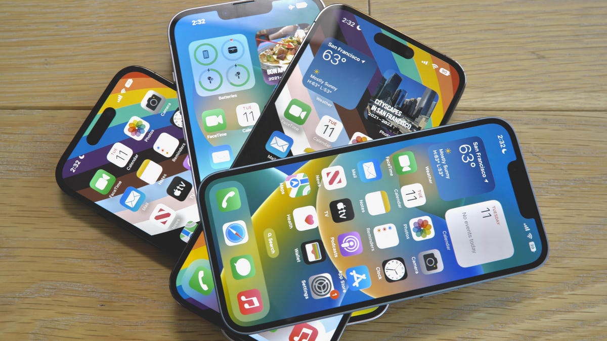
The iPhone 14 series.
If you're an iPhone owner, your home screen probably consists of rows and columns of neatly arranged apps and folders. But what if you had more say in the matter? Apple is reportedly updating the iPhone's home screen in iOS 18 to make it more customizable, according to MacRumors and Bloomberg.
We won't know for sure until Apple announces iOS 18, which will presumably happen on June 10 at its Worldwide Developers Conference. But if those reports turn out to be true, the iPhone's home screen could end up looking a little more like an Android's. MacRumors indicates the update may bring more flexibility when it comes to how icons can be arranged on the home screen. For example, the report suggests you'll be able to leave blank spaces between icons and widgets.
Changing the home screen is delicate business. Apple has to straddle the line between keeping it comfortable and familiar -- we call it the home screen for a reason -- while introducing new features and functionality.
But in the case of the home screen, change can be a good thing.
Read more: The US Lawsuit Against Apple Raises Questions About iPhone and Android's Future
The iPhone's home screen has been largely the same for years. The lock screen got a facelift in iOS 16 that made it possible to customize fonts and added more depth to photos, giving them a 3D-like effect. The home screen deserves its own makeover.
Giving people the freedom to arrange app icons more freely may sound minor. There are likely plenty of iPhone users who are satisfied with their tidily arranged apps. But the option to put spaces between apps and widgets could open new possibilities.
For one, it could put more emphasis on the wallpaper, and perhaps Apple could even design new wallpaper options with this in mind. The option to place apps closer to the bottom of the screen could also be helpful at times when you're using your phone with one hand. Reachability mode already exists for this purpose. But simply positioning an app within reach could feel more natural.
In the near term, a shift like this would probably just make it easier to organize your apps. What interests me the most about a more personalized home screen, though, is the idea behind it. A small change like this could give you the liberty to turn your home screen into whatever you want -- whether that be a checkerboard of apps, a dashboard for your favorite widgets, or something in between.
There's clearly demand for more personalization on the iPhone's home screen. iPhone users have come up with all sorts of workarounds to put some distance between apps. That includes using third-party tools to create the appearance of blank spaces and saving webpages with transparent logos as shortcuts on the home screen.
Android users have had this luxury for a long time. On an Android device, you can drag and drop app icons pretty much anywhere you please on the home screen.
I said earlier that the home screen hasn't changed much in years. While that's true on a fundamental level, it's an oversimplification. Apple has gradually expanded what the iPhone's home screen can do in subtle yet useful ways.
Back in 2020, for example, iOS 14 brought two important changes: home screen widgets and the App Library. The former lets you pin handy information like the time and weather to your home screen, while the latter makes it easier to clean up clutter by organizing apps into specific folders.
Then came the Dynamic Island, which made it easier to keep tabs on activities in apps -- like your Uber's ETA -- from the home screen. Although it's not technically a home screen in the traditional sense, iOS 17's Standby mode could also be seen as an evolution of the iPhone's default screen. Standby mode essentially turns the iPhone into a miniature smart display for showing items like the time, weather, your calendar and more while the device is charging and in landscape mode.
It's features like the Dynamic Island and Standby mode that make me think some big changes are in store for the home screen. While the option to arrange apps more fluidly may not seem relevant to those features on the surface, it perhaps similarly points to a future in which the iPhone's home screen becomes more than just an app grid.