Goodbye peach butt?! Big emoji changes in iOS 10.2
Culture
Apple had redesigned its emoji icons.
And it's killing all the fun.
The weird age of communicating by emoji is slowly dying as Apple's icons are losing their strange spark and becoming more Literal representations of Nouns.
The new emoji designs are revealed in a preview of the next mobile operating system, IOS 10.2 which is out now for software developers to tinker with.
You can see a few of them yourself on sites like emojipedia, when this update becomes available to all, the first thing iPhone owners may notice are the brand new icons, among them are expressions like shrug.
And face Tom.
There are new foods and objects and animals including a guerilla that everyone is calling Harambee because well, this is the internet.
There are also a wide range of new career centered people with male and female version of all these new workers.
Apple didn't make up the categories, these come from the Unicode.
A group that says the standard for communication between devices but it's up to each tech company on how they design the art.
And now, as our phone are becoming flooded with more and more literally full representation of various expressions, We're losing what made emoji so quirky.
It forced folks to be creative in what emoji they picked to express themselves.
But here's where Apple takes boring a step further.
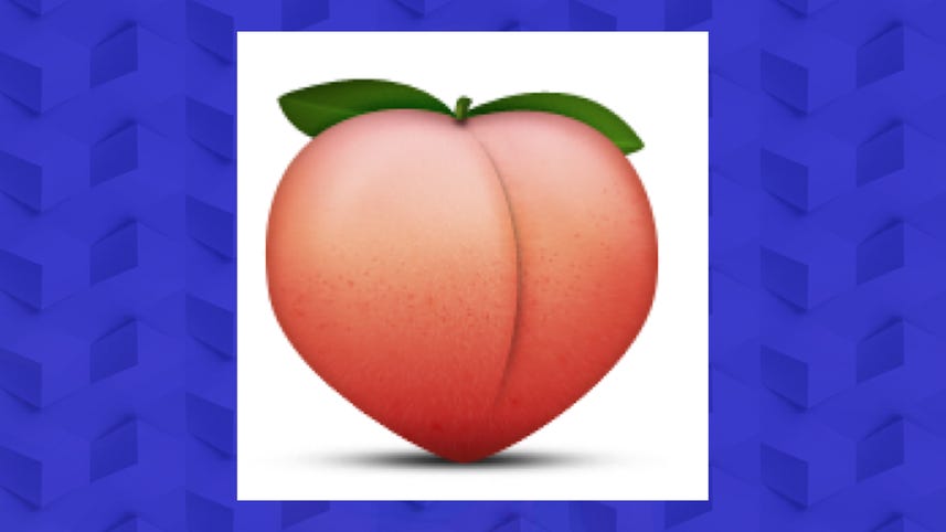
The original emoji have also been redrawn, that iconic apple peach icon was originally drawn in such a voluptuous manner that many used it to reference a round booty.
But Apple's new look resembles a plain old piece of fruit.
Which is very disappointing, as can be confirmed by Twitter user @freckledbutt, clearly an expert on the manner of the derriere.
Hopefully, even with all these changes, we can come together to find a way to keep the emoji creative spark alive.
And find a new ****.
I'm Bridget Carey.
You can keep up with the top tech stories at cnet.com/update.
[MUSIC]