Android, iOS and Windows Phone compared in infographic
Struggling to get your head around the different mobile operating systems out there? This handy infographic could help.


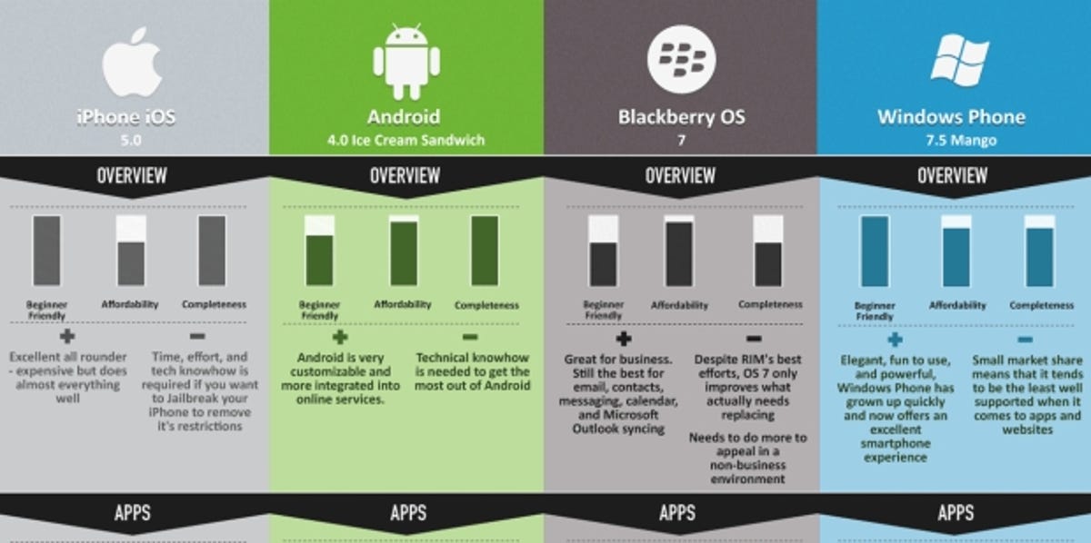
In June we showed you a handy chart that listed the pros and cons of each major mobile OS, including iOS, Android, BlackBerry OS and Windows Phone. Now MyPhoneDeals.co.uk, the company behind the original infographic, has revised its epic image to account for updates to those operating systems.
iOS is now on iOS 5, BlackBerry OS 7 is the newest software on BlackBerry blowers, while Android is poised to get Ice Cream Sandwich and Windows Phone was recently blessed with Mango.
Click the image below to check out the massive graphic in all its glory, which compares each operating system across every category a platform should excel in, from app selection, usability, messaging and gaming, to the hardware these operating systems actually run on -- the phones themselves.
It's handy if you're stumped as to which phone to buy, or if you're a huge fan of one particular platform and want to see how your operating system of choice stacks up against the competition.
The iPhone 4S is the champion device for iOS 5, while the Samsung Galaxy Nexus is about to explode onto the scene, bearing Android's banners. The Nokia Lumia 800 is also making waves in the name of Windows Phone.
If this infographic doesn't help you make up your mind as to which OS is king, check out our comparison video and article of the three phones mentioned above.
In the meantime, let us know in the comments or on our Facebook wall which OS holds your heart.
