The new Android Auto is easier on the eyes and easier to use
The newest version of Android Auto is starting to roll out to users. Take a tour of the redesigned interface.


Meet the new, redesigned Android Auto. This is the first major interface change since the software debuted in 2014.

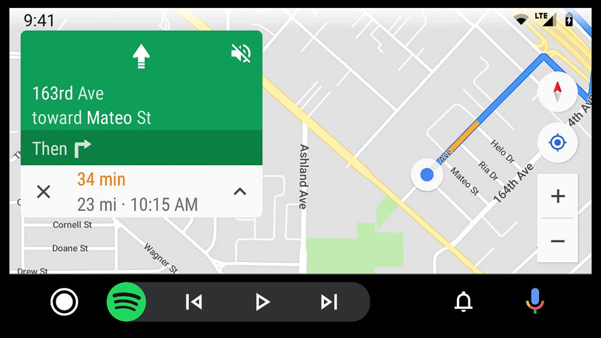
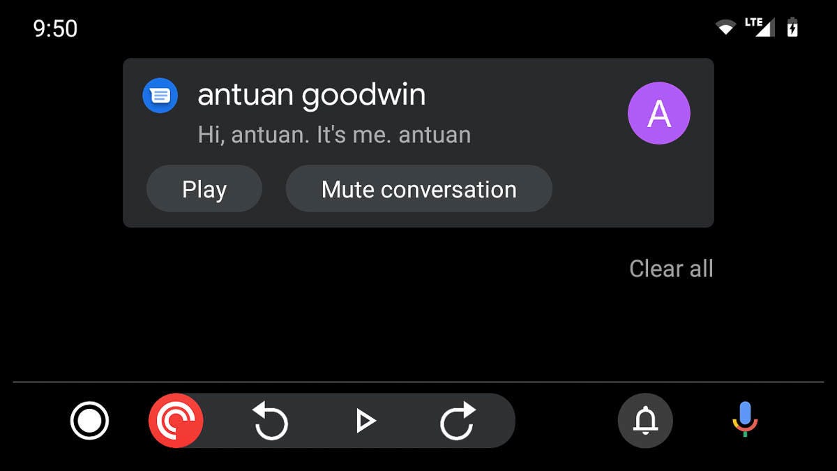
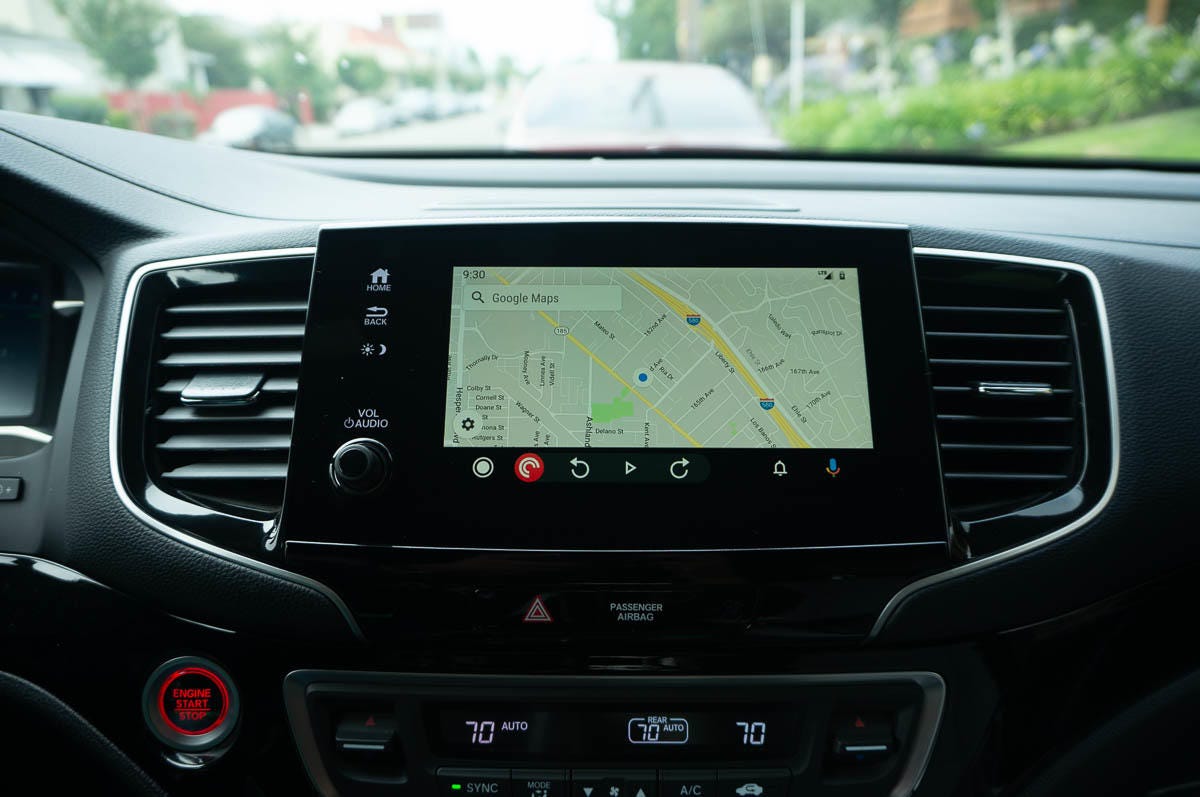
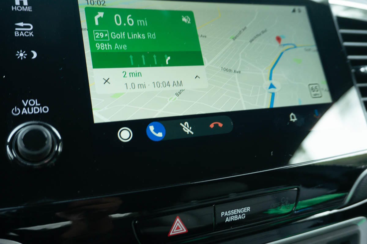
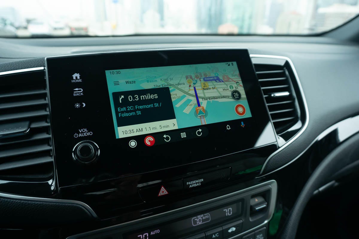
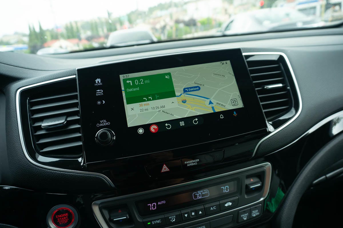
Google Maps looks about the same, but the interface around it -- from the notifications to the menus -- has gotten the dark mode treatment.
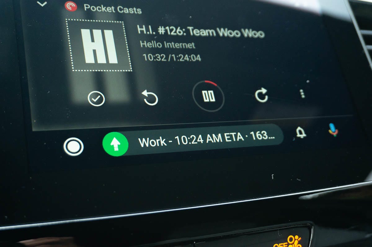
A small change that makes a big difference is the new bottom bar, which now features a dynamic multitasking area.

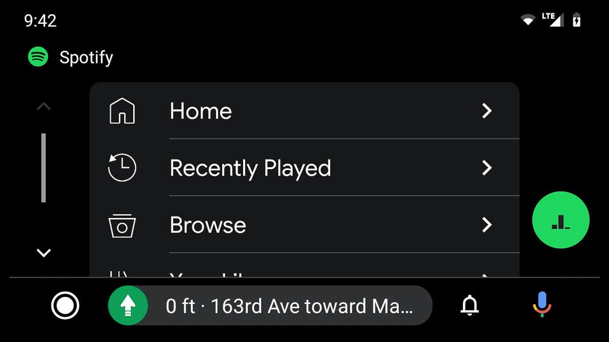
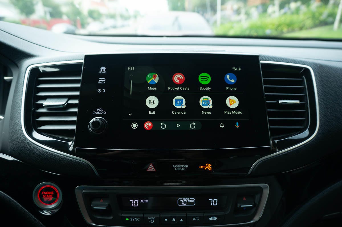
Android Auto now features an app launcher that looks a lot like the app launcher on Google's Pixel phones.
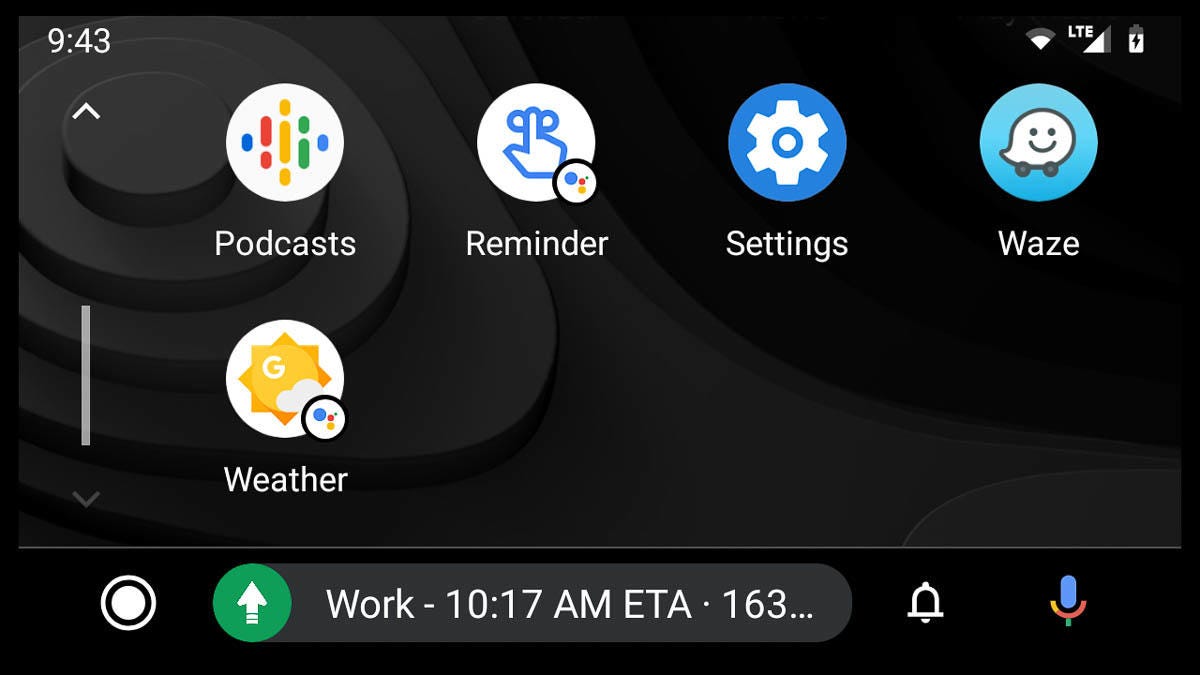
You'll also find new Google Assistant shortcuts nestled among the apps.
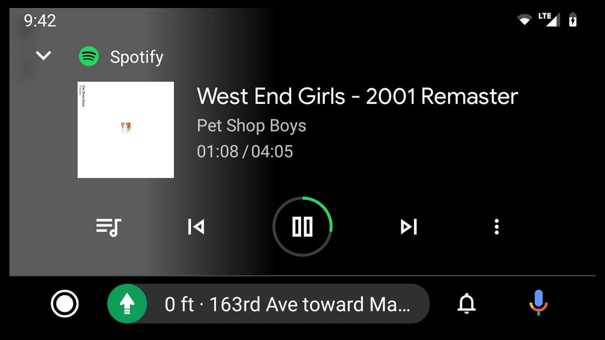
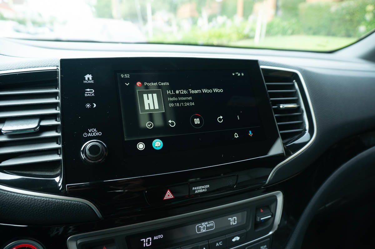
The Now Playing screen now features timestamps and a darker scheme that's easier on the eyes at night.
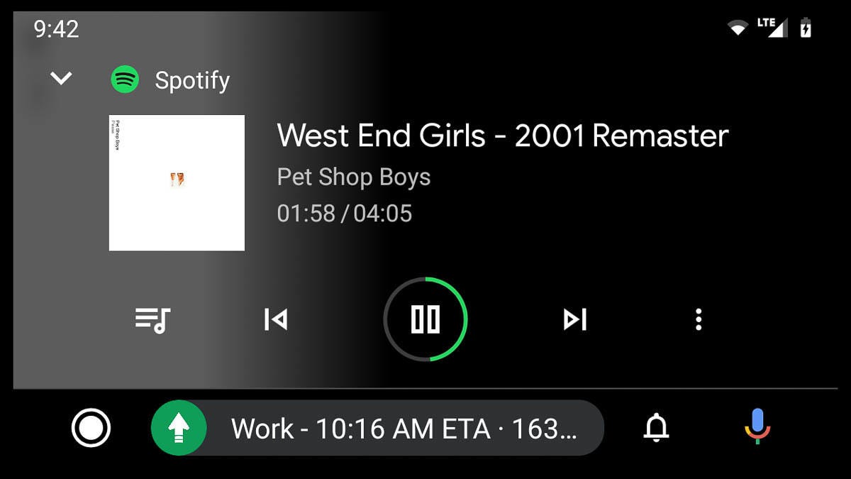
You can now also see complete album art thanks to the thumbnail image next to the titles.
Status icons along the top edge have been pushed deeper into the corners, making room in the main area for content.

And in the bottom right corner are icons for notifications (the bell) and Google Assistant (the microphone).

Keep on clicking or scrolling for more screenshots and in-car photos, and check out our hands-on impressions to learn how the new Android Auto stacks up to the old familiar interface.


More Galleries

My Favorite Shots From the Galaxy S24 Ultra's Camera
20 Photos
Honor's Magic V2 Foldable Is Lighter Than Samsung's Galaxy S24 Ultra
10 Photos
The Samsung Galaxy S24 and S24 Plus Looks Sweet in Aluminum
23 Photos
Samsung's Galaxy S24 Ultra Now Has a Titanium Design
23 Photos
I Took 600+ Photos With the iPhone 15 Pro and Pro Max. Look at My Favorites
34 Photos
