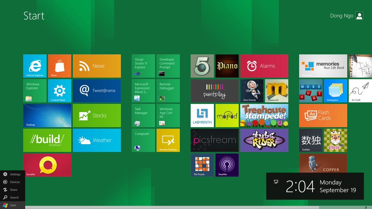
Judging from the Developer Preview version of Windows 8, it seems that Microsoft has finally said goodbye to the traditional Start menu.
Dong Ngo
CNET editor Dong Ngo has been involved with technology since 2000, starting with testing gadgets and writing code for CNET Labs' benchmarks. He now manages CNET San Francisco Labs, reviews 3D printers, networking/storage devices, and also writes about other topics from online security to new gadgets and how technology impacts the life of people around the world.
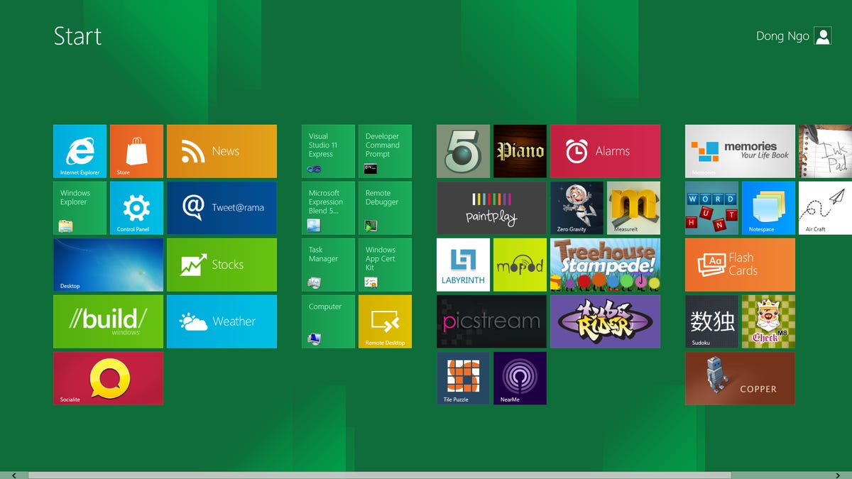
In the Developer Preview version of the upcoming Windows 8, the Start menu is now radically changed and resembles the home screen of Windows Phone 7. This, among other things, indicates Microsoft's intention to create one operating system for both desktop computers and mobile devices. This change in the UI is considered to be as significant as the move from the GUI of Windows 3.x to Windows 95.
2 of 11 Microsoft
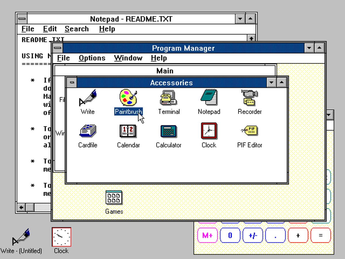
Chronologically, prior to Windows 95, Windows 3.x used Program Manager to manage the OS' settings and applications. With Program Manager, users had to Alt-Tab through cascaded windows to get to what they wanted.
3 of 11 Microsoft
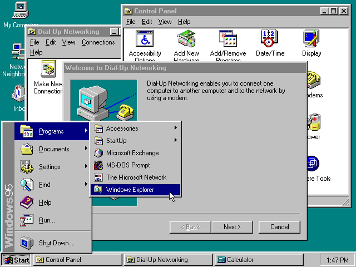
Windows 95 changed all that. Now users could get to almost all of the installed applications and OS settings without having to sort though different Windows by using Start button in the corner. As with the Program Manager, items on the Start menu essentially were shortcuts to installed applications.
4 of 11 Microsoft
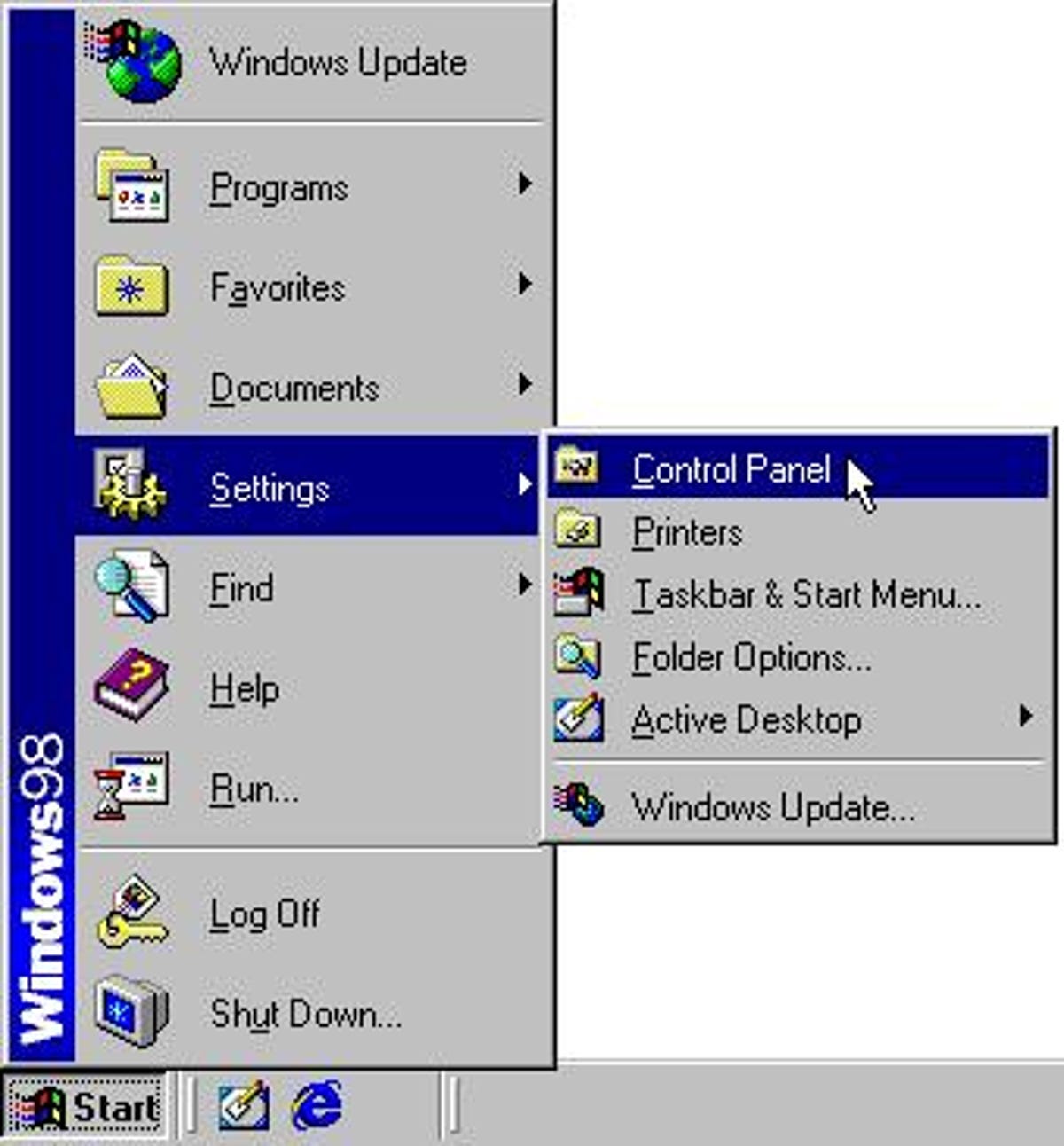
Windows 98 further enhanced the Start menu by allowing for dragging and dropping items within the menu, changing their names or even deleting them. The menu was also larger and more customizable.
5 of 11 Dong Ngo/CNET
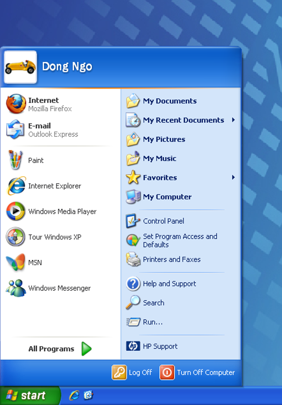
The Start menu remained almost unchanged through out Windows 98, Windows 2000, Windows Me. In Windows XP, it featured a double-pane design with shadow under menus and highlighted newly installed software.
6 of 11 Dong Ngo/CNET
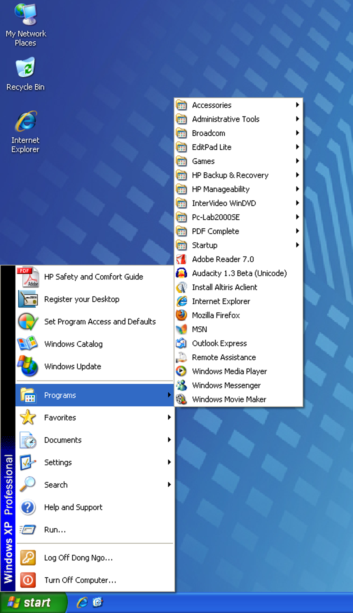
Windows XP also came with an option that allowed users to easily switch between the new double-pane and the traditional single-pane design of the Start menu.
7 of 11 Dong Ngo/CNET
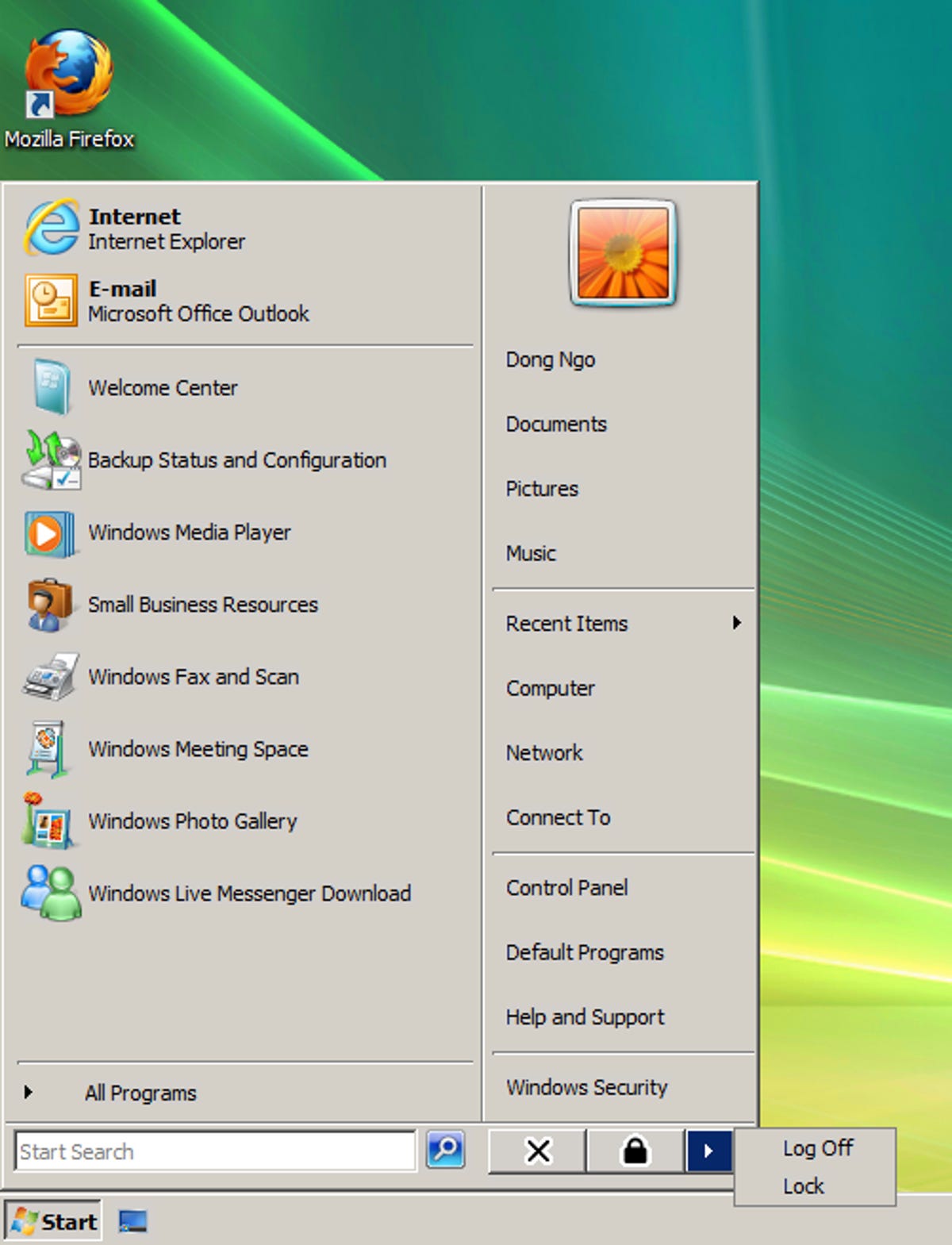
Windows Vista added search to the Start menu. This was a welcome feature that helped quickly find items on the Start menu as well as documents stored on the computer. Windows Vista's release also marked a decade since the Start menu was first introduced.
8 of 11 Dong Ngo/CNET
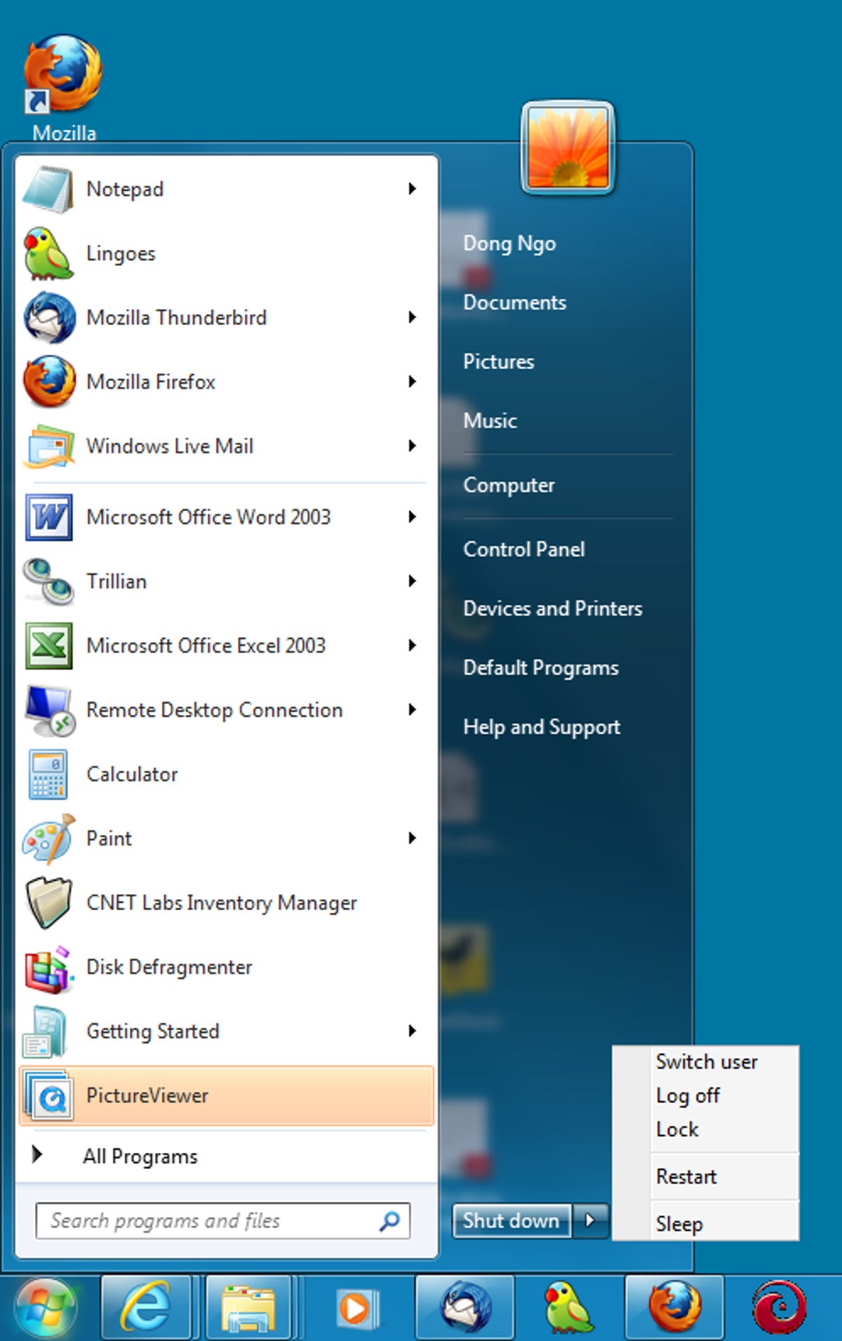
Windows 7's Start menu is almost identical to that of Windows Vista with minor changes.
9 of 11 Dong Ngo/CNET
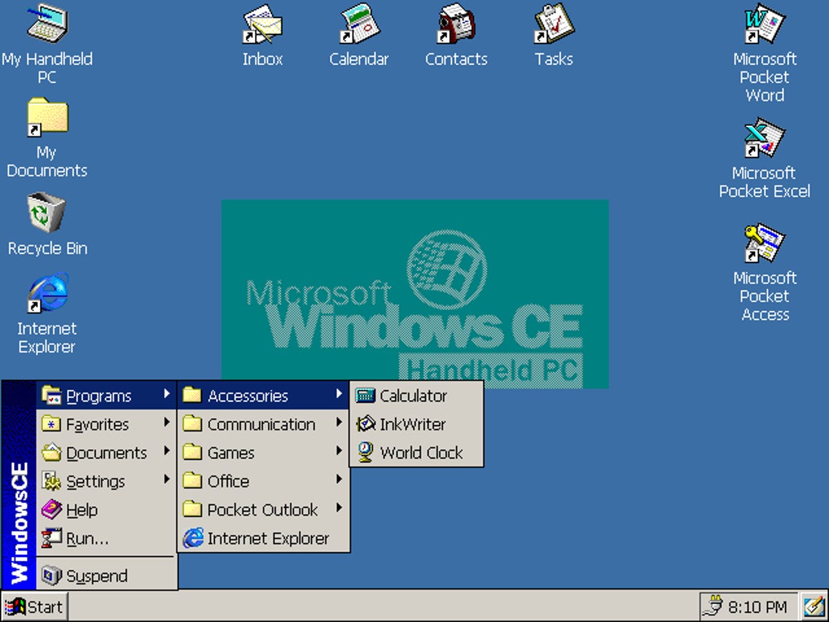
The Start menu is also used in Windows CE, a version of Windows used for mobile devices. Using the UI of desktop computers for mobile devices is the biggest indication of Microsoft's lack of innovation in terms of user interface.
10 of 11 Dong Ngo/CNET
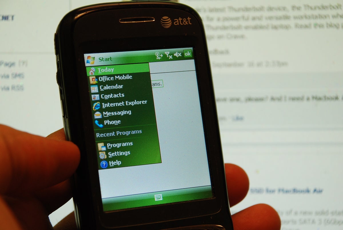
The worst implementation of the Start menu is in Windows Mobile for smartphones, which forces user to use a stylus and works with tiny items.
11 of 11 Dong Ngo/CNET
In Windows 8, the Start menu is now the Metro Start screen. However, if you move the mouse to the corner where the Start button used to be, a little menu also pops up to give quick access to the computer's settings. Since the Metro UI works best with touch-screen computers and tablets, there will likely be an option in the final release of Windows 8 that enables users to switch back to the traditional Start menu.