Susan Kare's early Mac icons gave computers a personality (photos)
Millions of people around the world are familiar with the artwork of Susan Kare, but few would be able to connect that name with Apple's early computer icons. Her new book takes a look back.
James Martin
James Martin is the Managing Editor of Photography at CNET.
His photos capture technology's impact on society - from the widening wealth gap in San Francisco, to the European refugee crisis and Rwanda's efforts to improve health care.
From the technology pioneers of Google and Facebook, photographing Apple's Steve Jobs and Tim Cook, Facebook's Mark Zuckerberg and Google's Sundar Pichai, to the most groundbreaking launches at Apple and NASA, his is a dream job for any documentary photography and journalist with a love for technology.
Exhibited widely, syndicated and reprinted thousands of times over the years, James follows the people and places behind the technology changing our world, bringing their stories and ideas to life.
Millions of people around the world are familiar with the artwork of Susan Kare, but few would be able to connect that name with Apple's early computer icons.
The would-be pioneer of pixel-level art had originally intended to become a studio arts professor. But while working in a museum in the early 1980s, she heard from high school friend Andy Hertzfeld, then lead software architect for the Macintosh operating system. Hertzfeld introduced Kare to bitmap graphics and to the idea of working at Apple, where she wound up being one of the early hires.
She worked in the Macintosh software group, designing user interface graphics and fonts and sporting a business card that read "Macintosh Artist." In addition to her now iconic icons, Kare also designed the first proportionally spaced digital font family.
Kare's icon designs imbued the Mac with emotion and identity, giving it a distinct personality. They also gave the machine its first method of communicating with the user, letting it convey information without words.
Steve Jobs himself didn't specifically direct her art, but Kare said that "Steve definitely looked over options and expressed his preferences. We used to joke that it was never a good idea to show him one of anything, because he could reject it. If there were a few icons, he could still reject something but choose something, too."
Kare's new book, Susan Kare Icons, provides a curated look at 80 of her favorite icons created between 1983 and 2011.
2 of 11 Susan Kare
Alert icon - Susan Kare
Kare's Alert icon from the classic Mac OS. This icon appeared along with a chime tone and a dialog box that carried a notification.
Kare told CNET that she "had always enjoyed mosaics and needlepoint, which are analogous to working in pixels."
3 of 11 Susan Kare
Bomb icon - Susan Kare
When the classic Mac OS crashed, the Bomb icon appeared inside the System Error alert box. Kare says "making a good icon is as much about metaphor as design."
4 of 11 Susan Kare
Happy Mac icon - Susan Kare
The Happy Mac icon was designed by Kare in the early 1980s and literally gave computers a face. The boot-up icon of the classic Mac OS, it greeted users of a healthy and awake Mac and set the tone for a "user friendly" experience. The icon remained unchanged as the Apple boot-up graphic until the introduction of the PowerPC Macs, when it was updated to 8-bit color. Shades of the Happy Mac are still visible in the Mac's current Finder icon.
5 of 11 Susan Kare
Pan Hand icon - Susan Kare
The Pan Hand icon designed by Kare has become a standard in computing, indicating actions like grabbing and moving layers and panning around the screen in programs like Adobe Photoshop and Illustrator.
6 of 11 Susan Kare
Unhappy computer icon - Susan Kare
Not the image a user wanted to see, the Sad Mac icon indicated a severe hardware or software problem that prevented startup from occurring successfully. It was displayed along with a set of hexadecimal codes that indicated the type of problem.
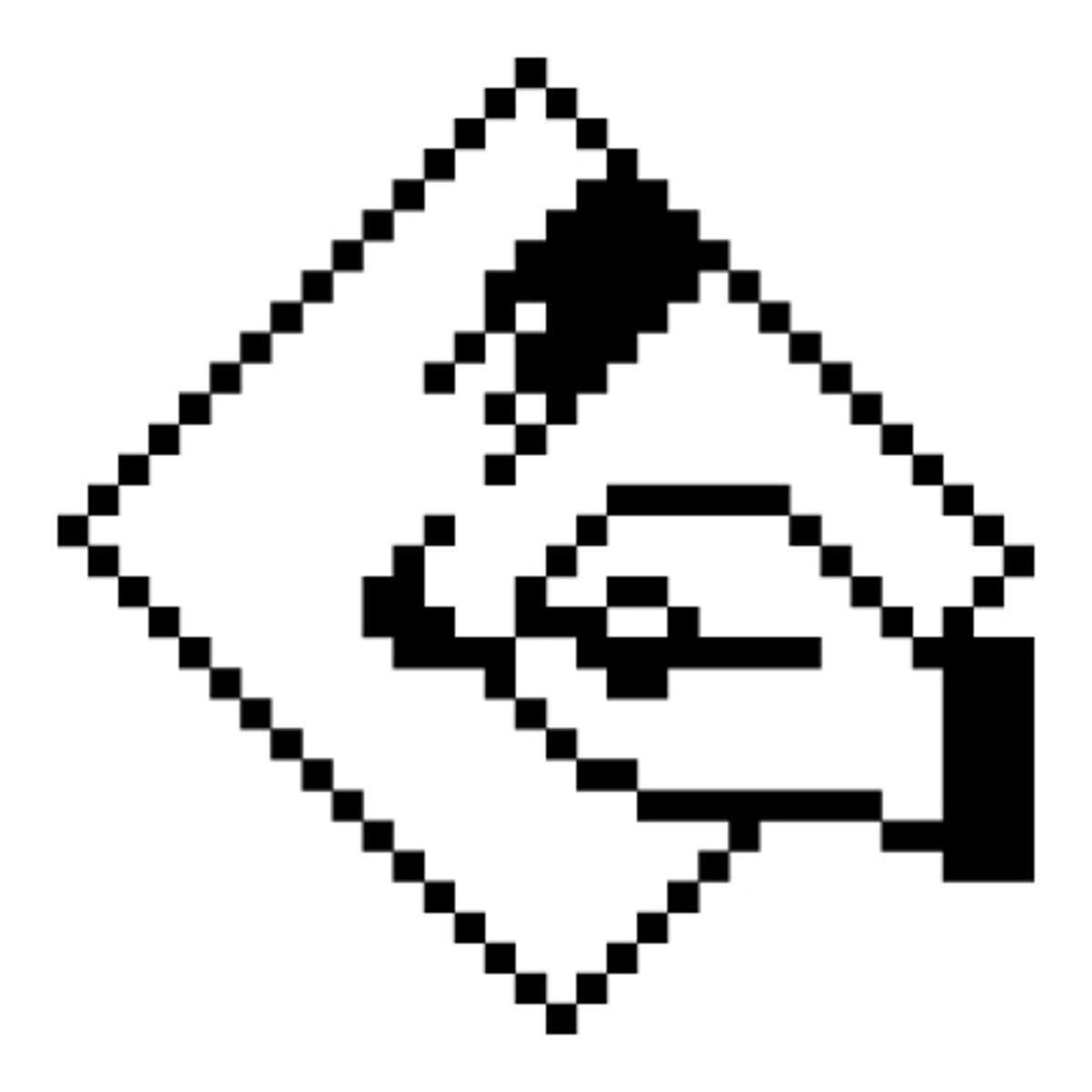
7 of 11 Susan Kare
Command icon - Susan Kare
In developing the Command icon on a tight deadline, Kare paged through a dictionary of international symbols and was eventually influenced by a floral-like design used in Sweden to indicate an interesting feature or attraction in a campground.
8 of 11 Susan Kare
Hare icon - Susan Kare
The Hare icon was a Control Panel illustration that denoted an increase in keystroke repeat speed. It appeared opposite a Tortoise icon for decreasing speed.
9 of 11 Susan Kare
MacPaint icon - Susan Kare
The icon for the MacPaint application, which was a bitmap-based graphics painting program released in 1984. Kare also designed the MacPaint user interface.
As Apple worked toward unlocking the creative potential of home computing in the early '80s, Kare herself saw the power of working in the digital realm.
"The iterative aspect of working on the computer was amazing to me--the power of 'undo,' even before the power of Photoshop," she says. "Icons and fonts were the first images I made on the computer, but I branched out to illustrations for manuals, and elements like the desk ornaments (precursors of the small apps today) and Control Panel. It was also a kind of sheer joy to be able to combine type and images without using pages of letters from art supply stores."
10 of 11 Susan Kare
Watch icon - Susan Kare
When the Watch icon appeared, the OS was saying, "Hold on a second, I'm working on it," as it computed your commands. It's still present in the Mac's current OS.
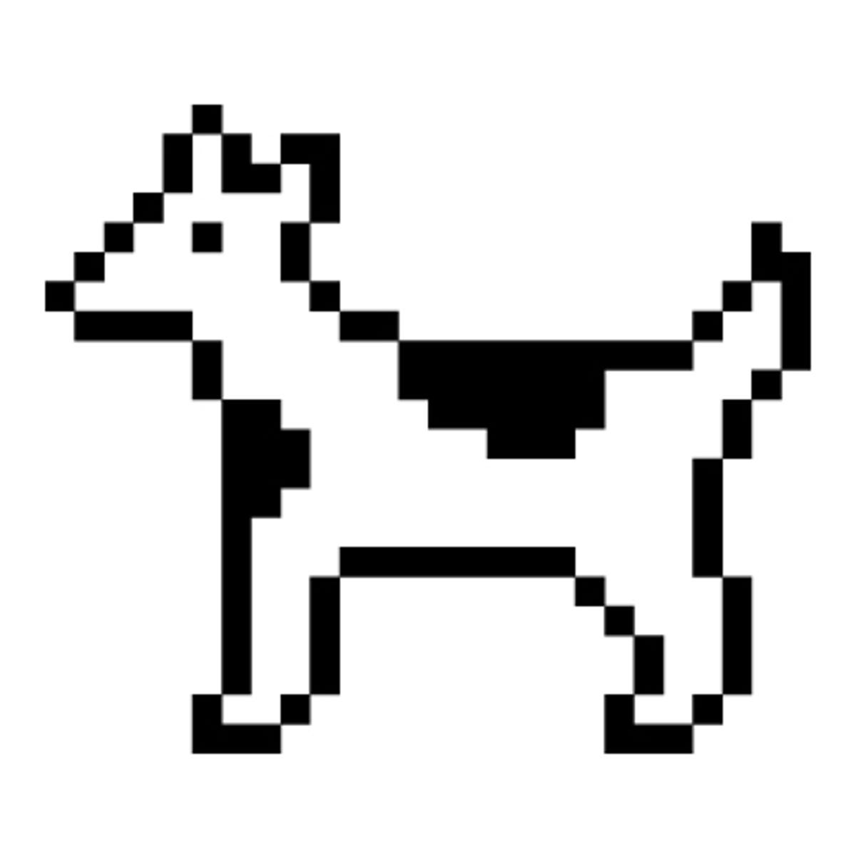
11 of 11 Susan Kare
Dogcow icon - Susan Kare
The Dogcow, also known as Clarus the Dogcow, was created by Kare as part of the Cairo font (it was the glyph for the letter Z). The image was later chosen for the Print Setup dialog box in the classic Mac OS.
Many of Kare's icons can be purchased as art prints in different sizes, signed by Kare, at kareprints.com.


![[Control_panel]_Hare_5x5.jpg](https://www.cnet.com/a/img/resize/8f831661b8aed2c8a7bc7e2614ff5035a6b8cfea/hub/2011/12/01/e809669d-f0ef-11e2-8c7c-d4ae52e62bcc/[Control_panel]_Hare_5x5.jpg?auto=webp&width=1200)