Philips PFL5907 series a good value among LED TVs (pictures)
The Philips PFL5907 is very good value with a number of excellent features and deep blacks with illuminating shadow detail.


Overview
As the prices of LCD televisions continue to erode, it's now possible to pick yourself up a decent television for under a grand. While spending more will get you better quality, televisions like Vizio's M3D470 and Philips' 46PFL5907 demonstrate that you can get a good TV for a Grover Cleveland and still have change for a Blu-ray player and a few movies.
The Philips' strengths are excellent blacks for its price while retaining shadow detail, natural-looking scenes, excellent picture processing, good mix of features, and good price. But its bad points mean that it's not as good a deal as the Vizio M3D470, namely poorly saturated and inaccurate red and blues, and no 3D!
When you throw in improvements like greater picture control, better blacks, and an improved apps suite, the PFL5907 is a welcome evolution of last year's TV, and a decent value. While you're looking at a second-tier brand like Philips you may want to also consider looking at the better value and picture available from the Vizio. Or, you know, get any of the Panasonic plasmas (bar the X5).
Profile
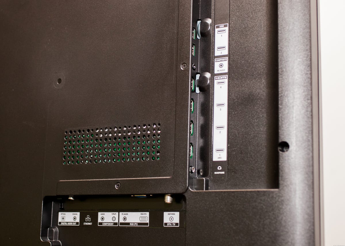
Connectivity
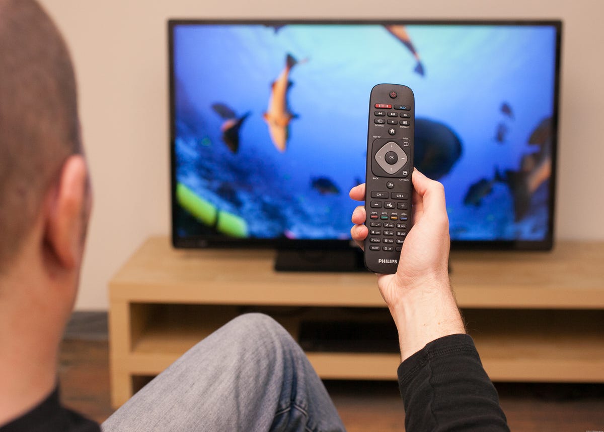
Remote
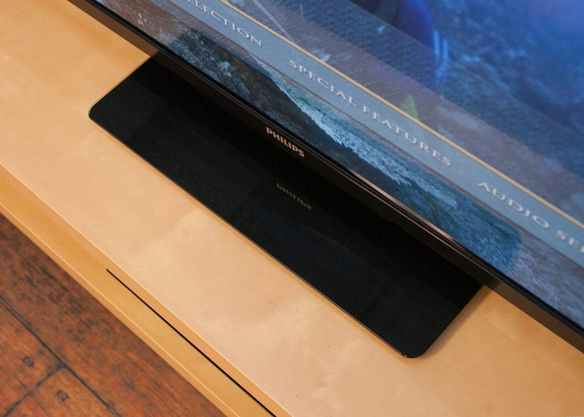
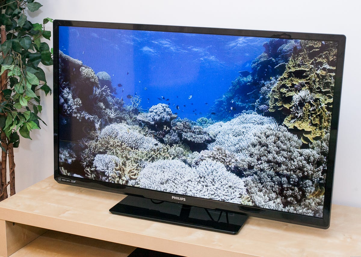
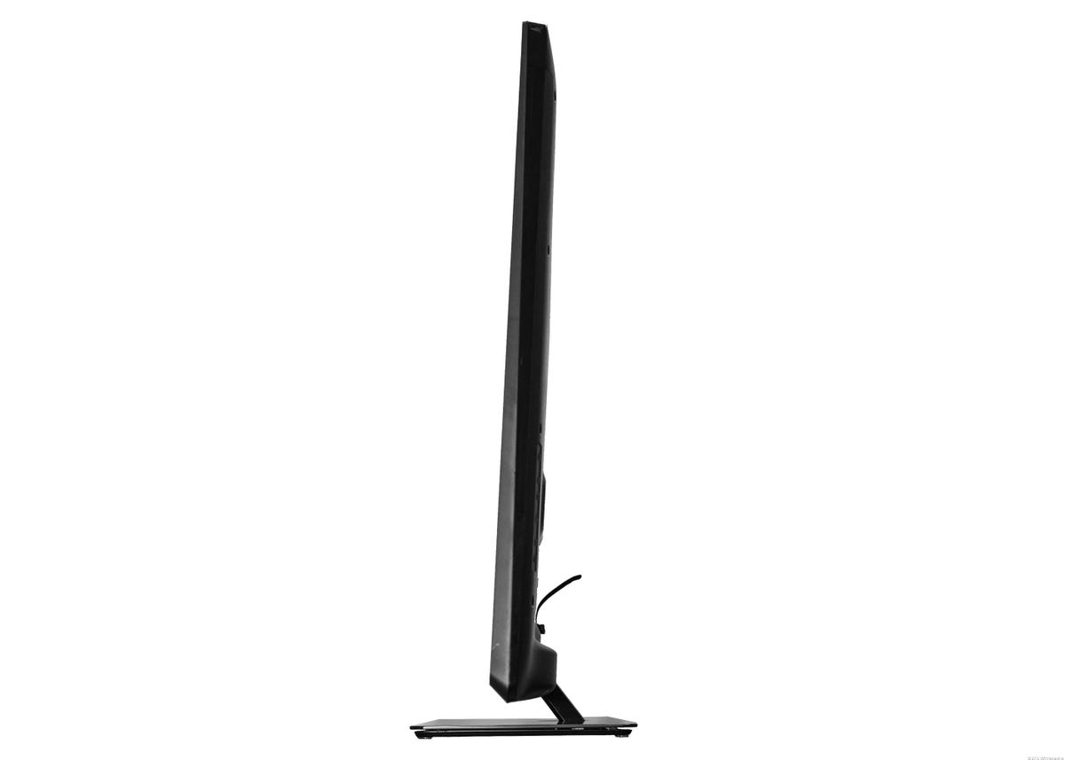
Glass stand
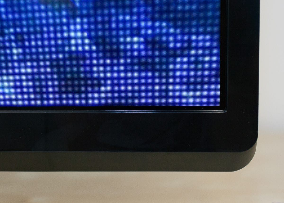
Bezel
Menu
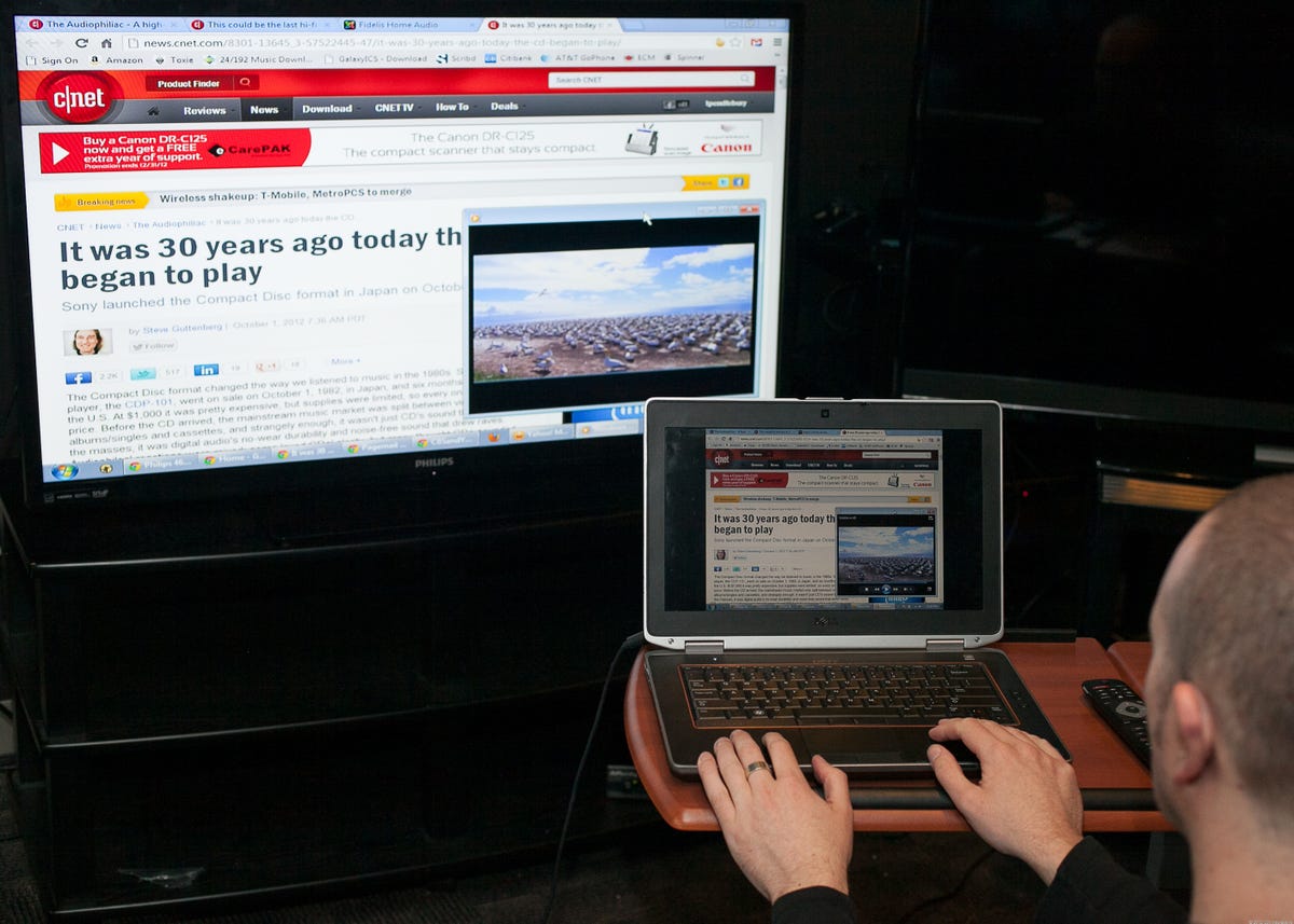
MediaConnect
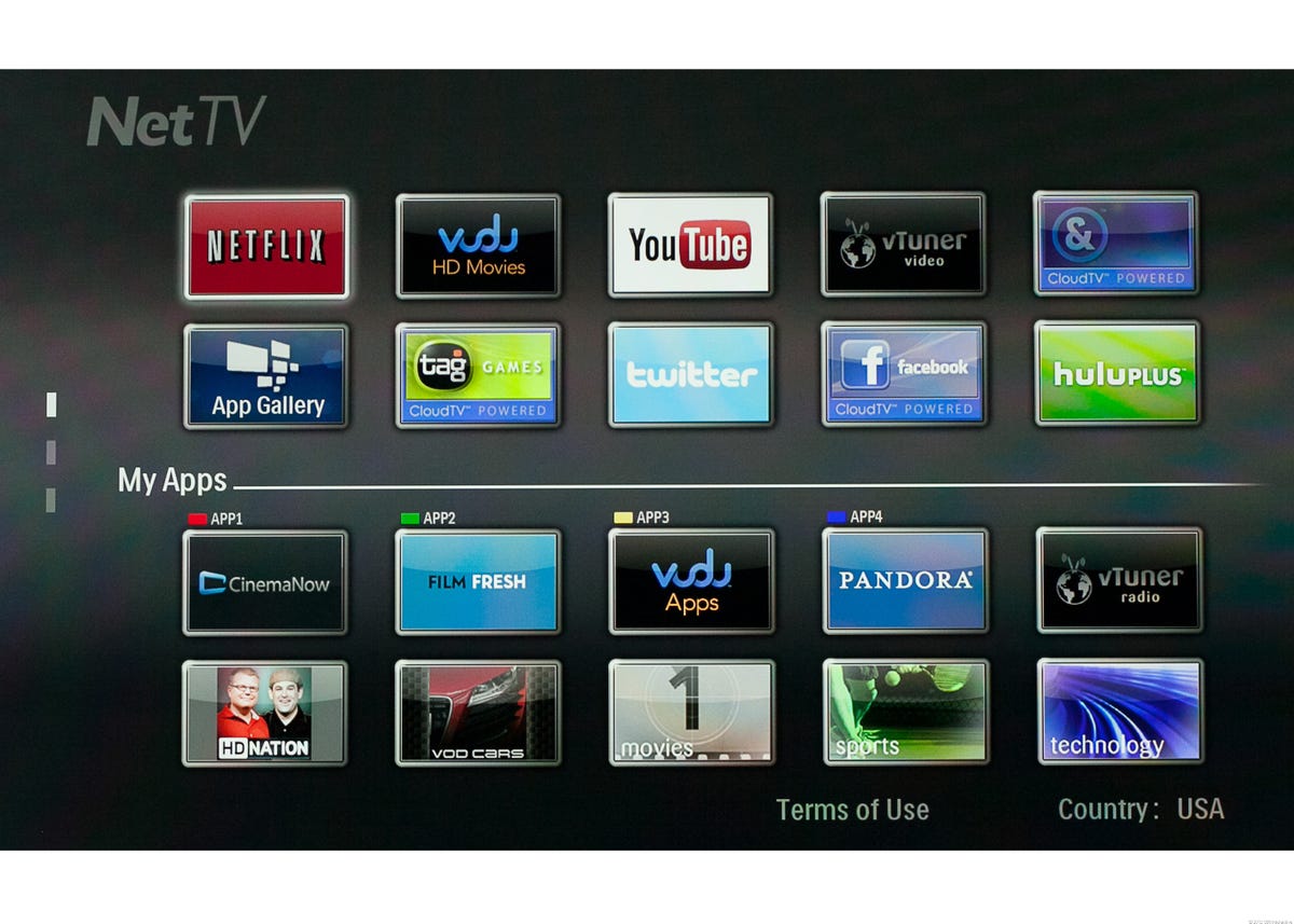
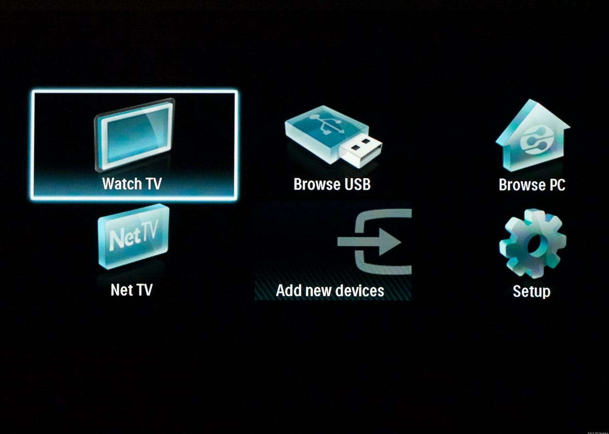
Smart TV
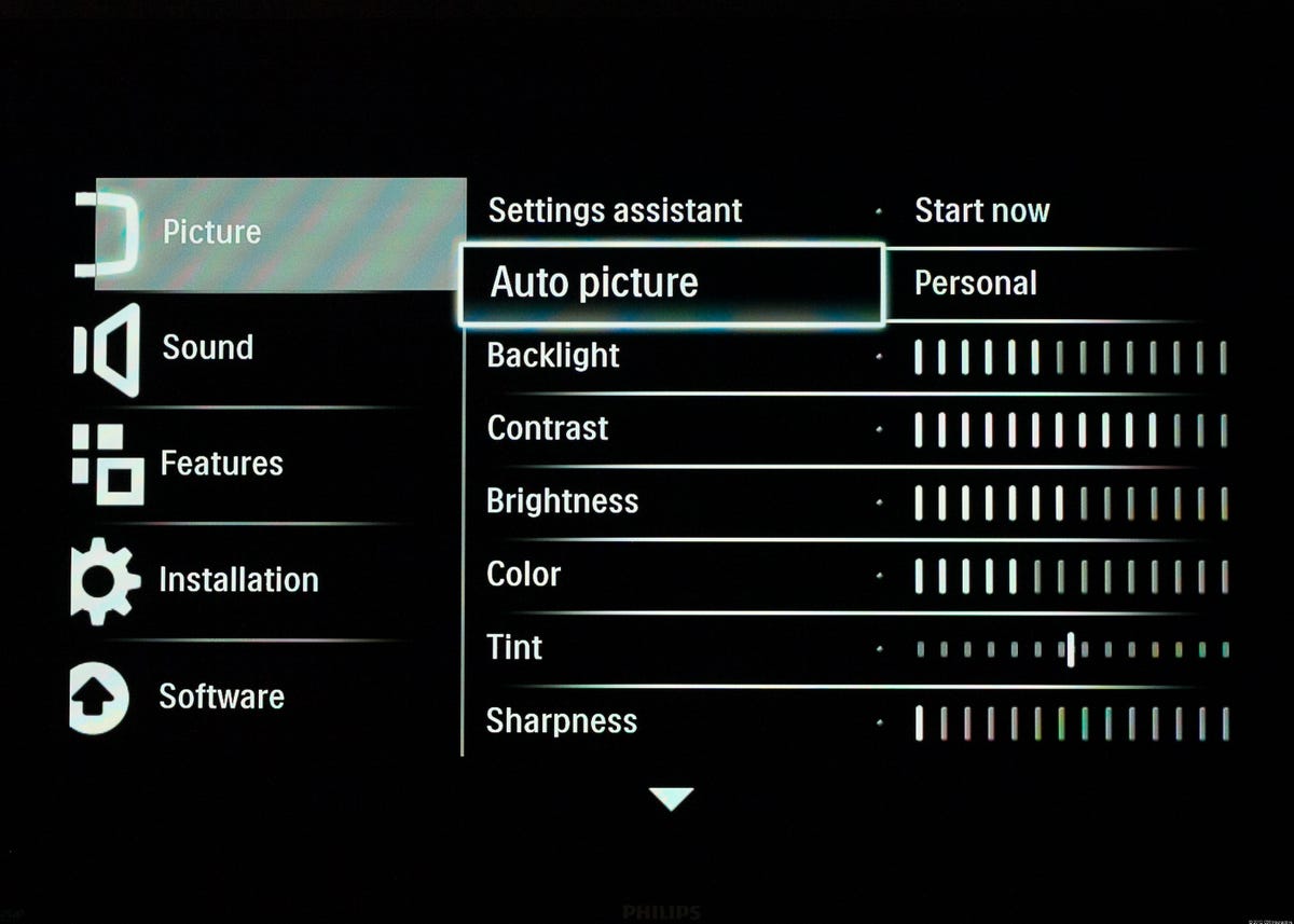
Picture menu

Picture quality
Philips' greatest accomplishment with the PFL5907 is its ability to communicate deeper blacks than TVs twice the price or more and yet still convey intricate shadow details. While TVs like the LG LM7600 are flashier, they can't conjure up as much contrast as this Philips can. The TV's tendency for purple/blue blacks could be overlooked given its low price.
On a related note, uniformity was pretty good with only a little purpleness in the corners, and while I did use the dynamic backlight function, it thankfully lacked the blooming of the price-competitive Vizio while offering almost as much contrast.
Where the Philips fails, however, is in ultimate color fidelity. While the inclusion of a CMS is great, it wasn't very good, and colors lacked the richness of its competitors'. While skin tones looked perfectly natural, pure reds lacked saturation and came out looking orange. Blues were also a little purple. Meanwhile, green was just great!
More Galleries

My Favorite Shots From the Galaxy S24 Ultra's Camera
20 Photos
Honor's Magic V2 Foldable Is Lighter Than Samsung's Galaxy S24 Ultra
10 Photos
The Samsung Galaxy S24 and S24 Plus Looks Sweet in Aluminum
23 Photos
Samsung's Galaxy S24 Ultra Now Has a Titanium Design
23 Photos
I Took 600+ Photos With the iPhone 15 Pro and Pro Max. Look at My Favorites
34 Photos
