Peek inside NASA's fascinating 1975 design standards manual (pictures)
Featuring a now-discontinued logo known as "the worm," this manual offers an insider's look at a captivating piece of the space agency's history.


The worm
From 1975 to 1992, a debate raged at NASA. It wasn't over the best way to get a person to Mars or determining the true nature of dark matter -- it was over a worm versus a meatball.
Those are the two names of very different logos used by the space agency throughout its history.
In 1975, as part of an initiative originally backed by Richard Nixon to update the look of government agencies, two designers named Richard Danne and Bruce Blackburn pitched their idea for a revised logo and type treatment for NASA, and they were awarded the project. Their logo, which became known as "the worm" as seen here, was the standard for NASA until 1992 when then-director Dan Goldin switched back to the space agency's original logo known as "the meatball" in order to bolster morale. It seems not everyone was taken with "the worm."

The reboot
Although the worm and the style manual created by Richard Danne and Bruce Blackburn were tossed in 1992, the aesthetic has always had its supporters. Two of them are Jesse Reed and Hamish Smyth, who've just launched a Kickstarter campaign to create a reproduction of NASA's 1975 Graphics Standards Manual and make it available to the public.
They're doing so by using high-resolution scans of Richard Danne's original copy, such as this page that shows the guidelines for developing various NASA forms and internal communication documents.

Autos
Jesse Reed and Hamish Smyth are no strangers to bringing graphic design manuals back from the dead. In the fall of 2014, the duo ran a successful Kickstarter campaign to bring back the New York City Transit Authority's 1970 Graphics Standards Manual.
"We think this manual and others like it -- regardless of the organization -- are a beautiful example of rational, systematic design," the pair says on their Kickstarter page. "The NASA manual is one of those examples that sets the standard for design excellence -- a document well worth preserving for the future as a learning tool, a gorgeous object, and a moment in design history."
The NASA manual had to lay out design guides for everything from office stationary to the way the agency's cars should look, as seen here.

Planes
NASA might be best known for its spacecraft, but the agency has a fleet of regular aircraft as well. This page from Richard Danne's manual shows how they should be detailed.

Shuttles
Figuring out where to place the NASA logo on space shuttles proved a bit tricky.
"Because the shuttles were covered with heat-resistant tiles, the graphics could be placed only in a few areas that had to be visible in photographs during liftoff," according to a Wired article. "The NASA logo itself had to be smaller than the US flag and the words 'United States of America.'"
“NASA was sort of secondary,” designer Stephen Loges told the magazine. Loges worked on the manual and its updates at Danne & Blackburn from the mid-1970s to the early '80s.

Spacecraft
"When marking NASA spacecraft," says the entry in the manual for this topic, "several principles should be kept in mind: 1) Compliance with scientific and operational requirements, 2) Maximum graphic impact, 3) The use of as many identifiers as possible without creating visual competition or clutter, 4) Consistency within the NASA Unified Visual Communications System."
That last bit refers to the standards developed by Richard Danne and Bruce Blackburn. According to this NASA document (PDF), "This system is the Agencywide [sic] program by which NASA projects a contemporary, business-like, progressive, and forward-looking image through the use of effective design for improved communications."

Seeing red
Even the colors the agency could use in communications were specified in Richard Danne and Bruce Blackburn's manual. Nowadays, colors in the Pantone Match System (PMS) are identified with numbers. At the time the manual was created that wasn't the case, and this particular color was simply known as "NASA Red." According to Wired, it was a more brick-like color to distinguish it from the red in the American flag.
Danne & Blackburn designer Stephen Loges says the modern version of NASA Red is called Pantone 179.
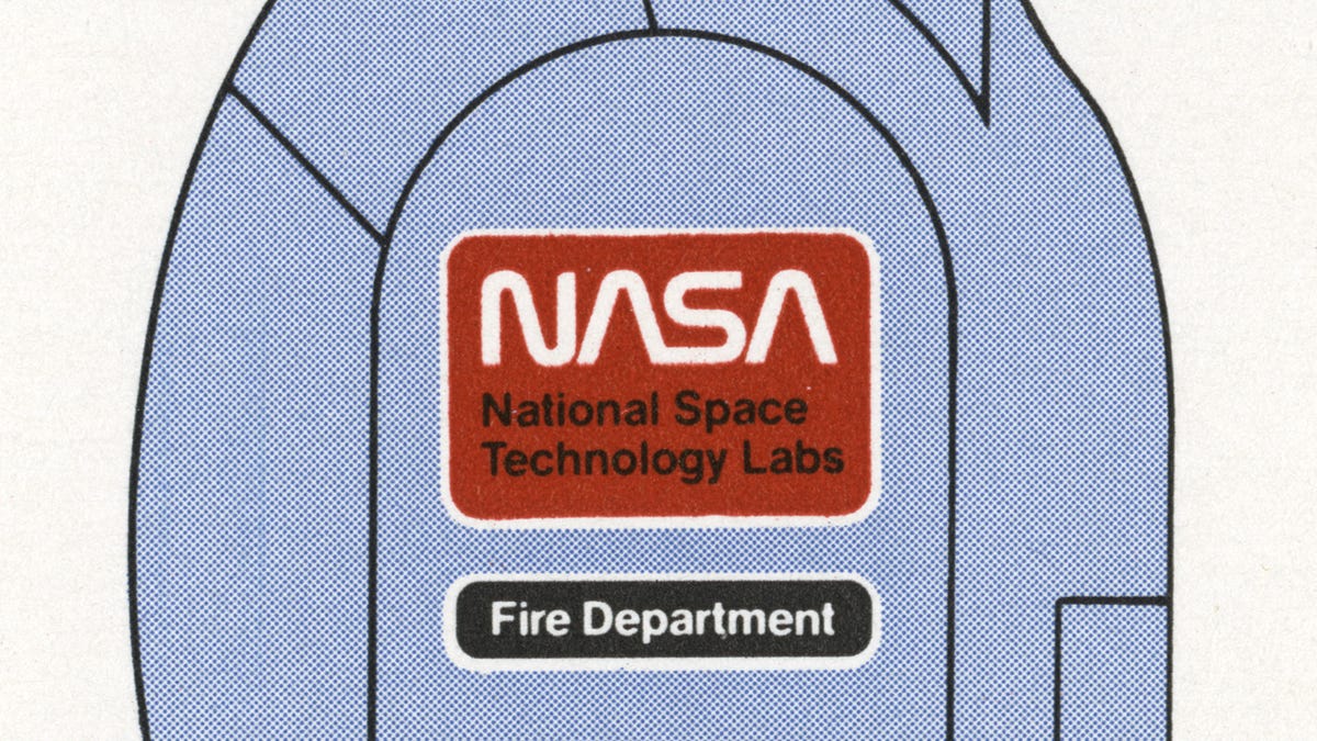
Patch perfect
Every aspect of NASA's operations were considered in the design manual, including patches for uniforms as seen here.
"The system provides a professional and cohesive NASA identity by imparting continuity of graphics design in all layout, reproduction art, stationery, forms, publications, signs, films, video productions, vehicles, aircraft, and spacecraft markings and other items," the NASA document says about the graphics standards program. "It creates a unified image which is representative and symbolic of NASA’s progressive attitudes and programs."

An American original
The original NASA Graphics Standards Manual was issued in a ring binder and featured section dividers and flip-out pages called gatefolds. The reissued version of the document will feature the section dividers and gatefolds but will be a more durable hardcover book. It will weigh about 5 pounds (about 2.27 kilograms) and .9 pounds on the moon, according to the makers, and will feature 200 pages, including 93 high-resolution scans of Richard Danne's personal copy of the manual.
It will also include a forward from Danne himself, who's provided never-seen-before materials from his archives.
The Kickstarter project proves emphatically that there is widespread interest in our program," Danne told CNET's Crave blog. "Forty years later, there is endless curiosity."
The book is available for $79 (about £50, AU$115) through the Kickstarter campaign only. Once the campaign ends on October 5, it will no longer be possible to order a copy. The campaign has already well exceeded its fundraising goal of $158,000.
More Galleries

My Favorite Shots From the Galaxy S24 Ultra's Camera
20 Photos
Honor's Magic V2 Foldable Is Lighter Than Samsung's Galaxy S24 Ultra
10 Photos
The Samsung Galaxy S24 and S24 Plus Looks Sweet in Aluminum
23 Photos
Samsung's Galaxy S24 Ultra Now Has a Titanium Design
23 Photos
I Took 600+ Photos With the iPhone 15 Pro and Pro Max. Look at My Favorites
34 Photos
