MeeGo? But I just got here! Intel's mobile operating system may have been jilted by Nokia just last week, but it's dried its tears enough to appear on an impressive demo tablet at Mobile World Congress in Barcelona.
We took a swipe through the latest version of MeeGo, which is still in an early pre-alpha state. Our first impression is of a simple, straightforward and immediately understandable user interface that's well suited to a mobile device focused on surfing the Web, social networking and watching videos.
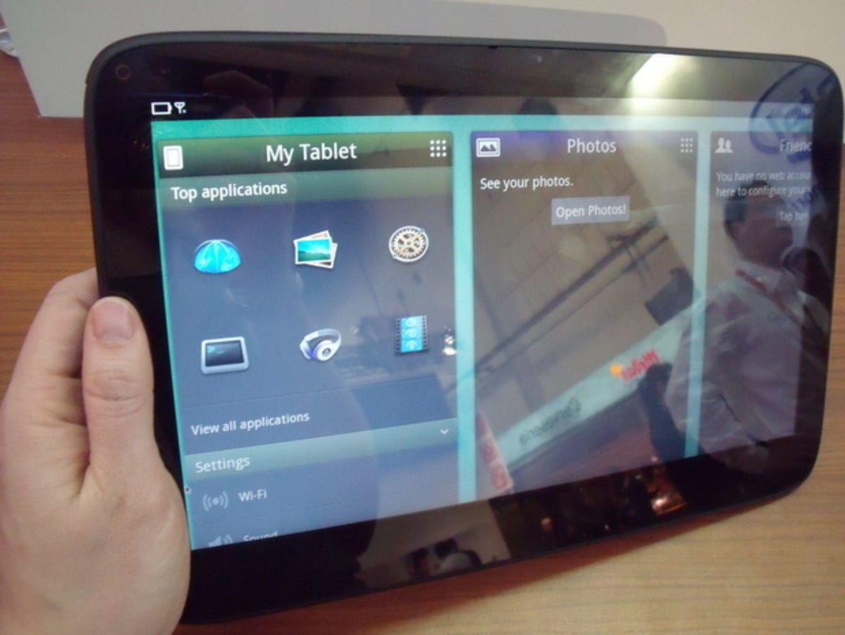
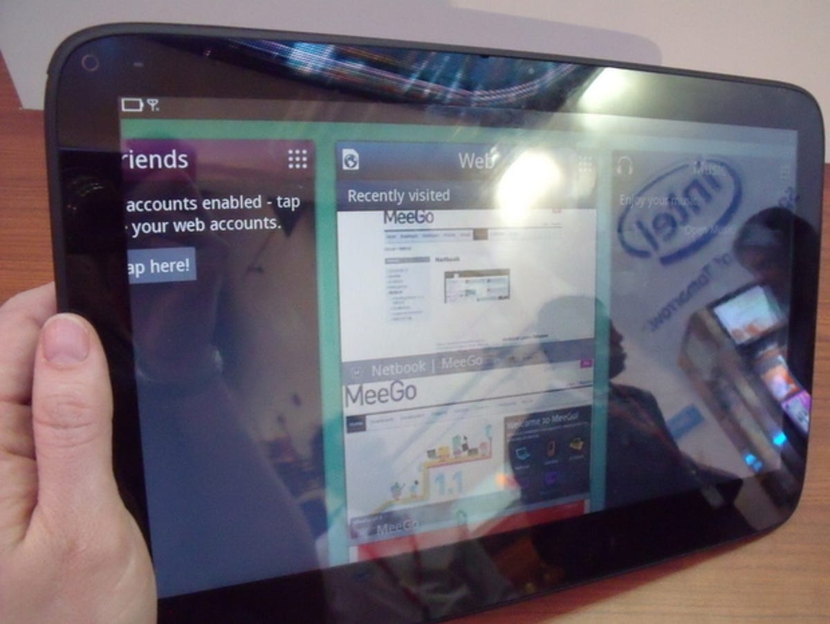
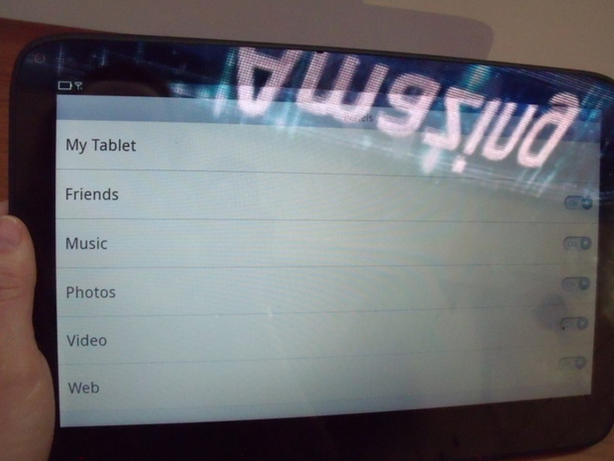
The bedrock of this implementation of MeeGo is a series of panels that sit side by side on the screen. It reminds us of the 'deck of cards' webOS UI that's on the HP TouchPad tablet and the Palm Pre, although the panels don't stack on top of each other like in the deck of cards.
The panels can show a medley of information, from your latest tweets to what's playing in the music player. You can hold and slide the panels to put them in the order you prefer, or hide them altogether.
This approach seems like a middle ground between the unchangeable grid of icons we see on the iPad, and the chaos of widgets and shortcuts that's possible on Android 3.0 Honeycomb tablets such as the Motorola Xoom.
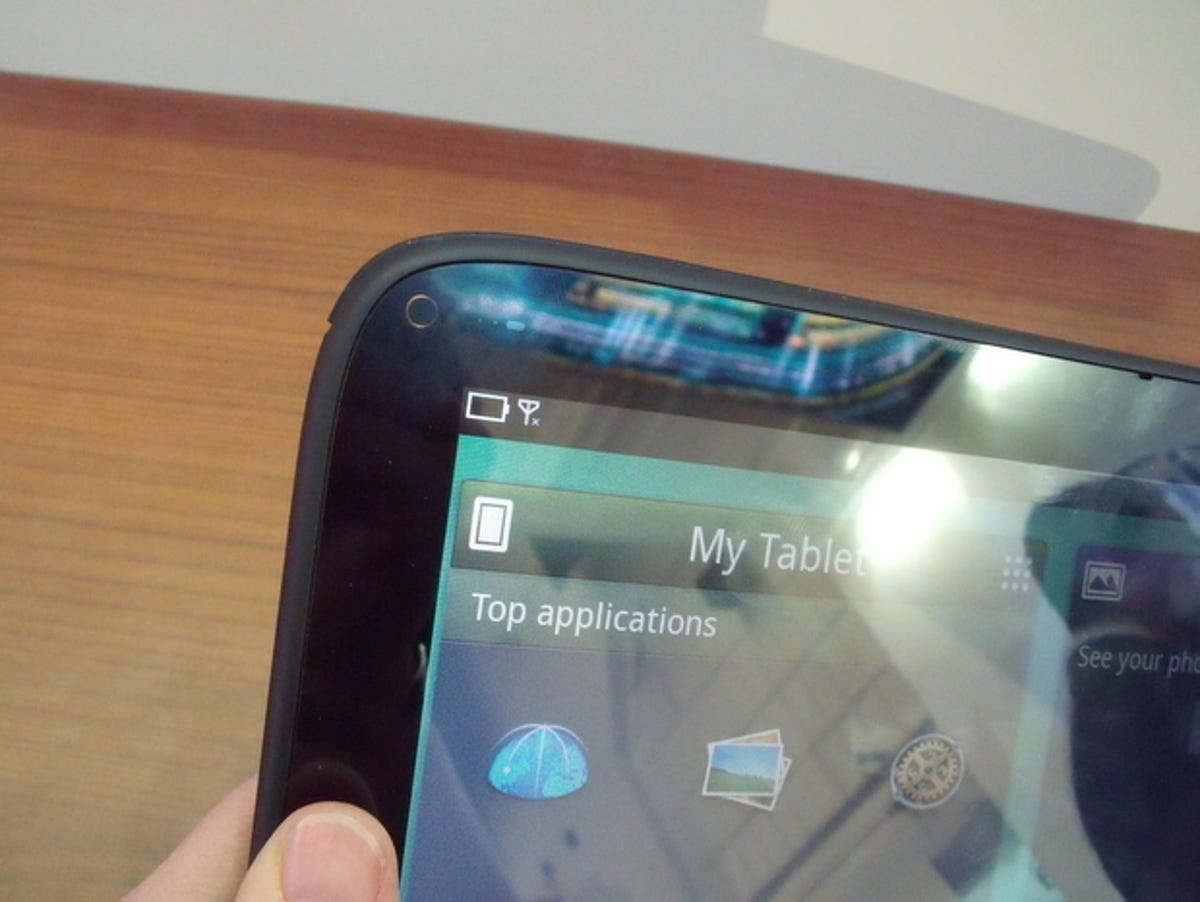
One aspect of the demo tablet that wasn't so simple was the virtually invisible home button in the upper left-hand corner. But this black button on a black background may never make it to a real tablet, so never fear.
One of the panels displays a list of your favourite apps, or you can tap to open a long menu of apps to choose from. This area of the OS felt unfinished, and didn't take good advantage of the screen space, but this is a very early version of the software.
Ditto, at first glance, to the settings menu. It's easy to get to, but the options are spread out widely. We did enjoy the way some settings slid out into bigger panels when we touched them, however. The Twitter settings option, for example, slides open like a drawer so you can type your username and password.
Compared to earlier versions of MeeGo we've seen, we were happy the latest user interface was so intuitive and easy to pick up. But without Nokia driving MeeGo development with much enthusiasm, we don't know where we'll ever see it.

More Galleries

My Favorite Shots From the Galaxy S24 Ultra's Camera
20 Photos
Honor's Magic V2 Foldable Is Lighter Than Samsung's Galaxy S24 Ultra
10 Photos
The Samsung Galaxy S24 and S24 Plus Looks Sweet in Aluminum
23 Photos
Samsung's Galaxy S24 Ultra Now Has a Titanium Design
23 Photos
I Took 600+ Photos With the iPhone 15 Pro and Pro Max. Look at My Favorites
34 Photos
