Data Cuisine makes information taste good (pictures)
The Data Cuisine project uses custom recipes to express data sets, often resulting in colorful culinary statements of information.


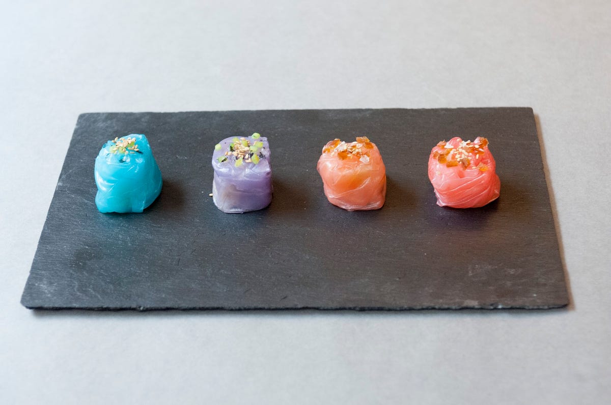
In & Out
Data Cuisine is the art of representing information with food. This dish, titled "In & Out" is based on data collected from the chef's Facebook contacts. The informal survey data looks at how often couples have sex compared to singles. These rice paper dumplings are filled with either meat reductions (for men) or fish reductions (for women). Lighter colors are singles. The amount of sesame and salt on the top of each dumpling represents the frequency of sexual encounters.
Read more: Bite my pie chart: Data Cuisine expresses facts with food
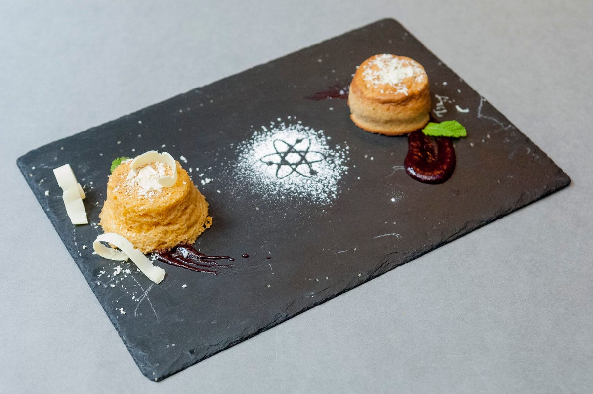
Requiem for Science
This dish, titled "Requiem for Science," was created for the Barcelona Data Cuisine workshop. Created by Antonija Kuzmanic, it's a representation of how science funding in Spain has been cut by 34 percent over the last few years.
The two different almond cakes were made with two different methods: one was cooked use techniques from molecular gastronomy, including foaming the dough with a siphon and microwaving it. The other was baked with traditional methods and 34 percent less sugar than the "scientific" cake. Data visualizer Moritz Stefaner describes it as "a witty, multi-layered representation of a simple, but striking statistic."
Read more: Bite my pie chart: Data Cuisine expresses facts with food
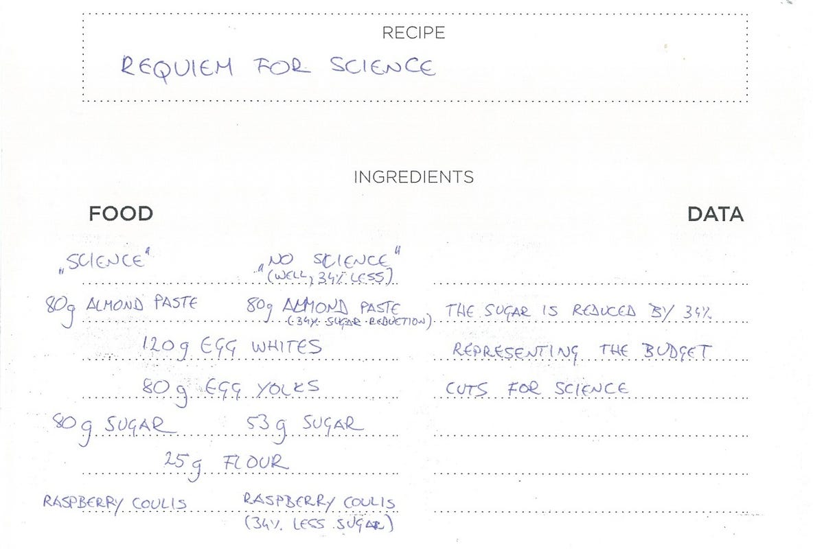
Requiem for Science recipe
This is the ingredients part of the recipe used to create the Data Cuisine dish "Requiem for Science." It shows the difference in sugar, which relates to the cuts in science funding in Spain over the years.
Read more: Bite my pie chart: Data Cuisine expresses facts with food
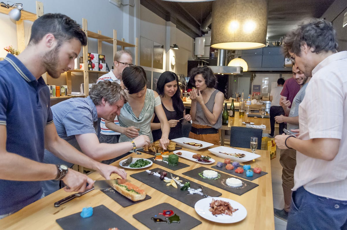
Barcelona workshop
This photo shows participants at the Barcelona Data Cuisine workshop. Chefs whipped up custom creations designed to visualize data through food. The creators of Data Cuisine hope to schedule more workshops and perhaps expand into full dinners for small groups.
Read more: Bite my pie chart: Data Cuisine expresses facts with food
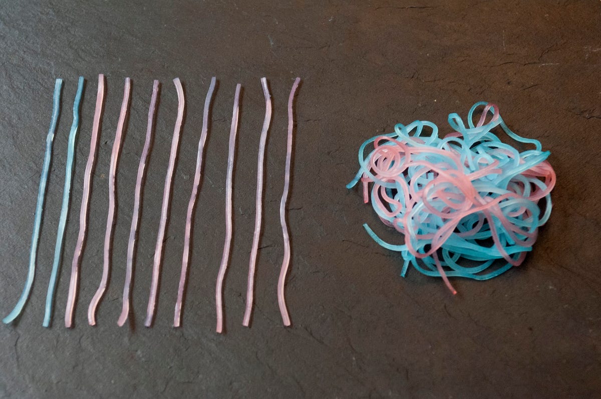
First Date Noodles
These colorful noodles actually hold quite a bit of information. It was created for a Data Cuisine workshop and represents the sex life of young people in Barcelona.
According to the Data Cuisine description, "This one shows, who will have sex on the first date. 86 per cent of men, and 59 per cent of women, as it turned out in a spontaneous and informal survey among the cooks’ Facebook friends. The messy 'noodle ball' represents that part of the data set, and the color indicates the people’s gender. The abstinent men and women are represented by the straight noodles not touching each other."
Read more: Bite my pie chart: Data Cuisine expresses facts with food
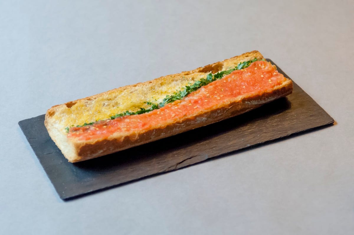
Unemployed Pan con Tomate
Area charts never looked so good as this one created for a Data Cuisines workshop. It's a take on the traditional dish of bread with tomatoes. It displays rising youth unemployment over time in Spain. As the line representing unemployment rises, so does the amount of garlic, making that portion of the bread unpalatable.
Read more: Bite my pie chart: Data Cuisine expresses facts with food
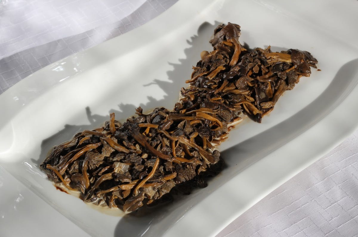
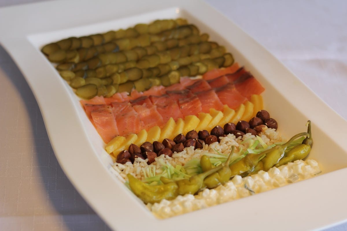
Criminal herring in fur coat
Dmitrii Rogozhin created this unusual dish for a Data Cuisine workshop in Helsinki. It's a chopped Russian salad that represents Finland's crime rates in 2011. Each layer represents a different type of crime.
Read more: Bite my pie chart: Data Cuisine expresses facts with food
Suppi célavi
This unusual mushroom soup actually holds a dark secret. It represents the suicide rates in Finland, showing the difference in rates between the sunnier south side of Finland and the darker north side. It was created for a Data Cuisine workshop dedicated to showing information through custom food recipes.
Read more: Bite my pie chart: Data Cuisine expresses facts with food
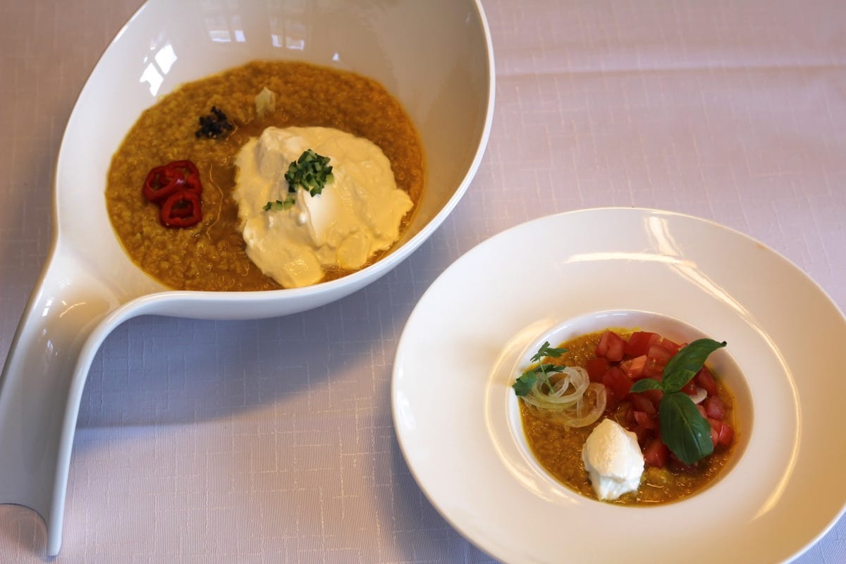
Age & Language in Lentils
These two food charts represent the median age, population size, and languages spoken in the US and Italy. The white yogurt represents English-speaking people, tomatoes with basil are Italian speakers, and lentils are the overall population.
Read more: Bite my pie chart: Data Cuisine expresses facts with food

Kippis!
"Kippis!" translates to "Cheers!" in English. This arrangement of meats, breads, and fruit is in the shape of Finland. Three glasses are assigned to each region. The levels of those glasses correspond to the amount of wine, beer, and spirit consumed in each area.
Read more: Bite my pie chart: Data Cuisine expresses facts with food
Taste of migration
Eleonora Ivanova attended a Data Cuisine workshop and built this dish to represent immigrants in Finland. Salmon, for example, represents people of Swedish origin while rice represents people of Chinese origin. The amount of food designated to each one is in proportion to the number of people of that nationality in the overall population in Finland.
Read more: Bite my pie chart: Data Cuisine expresses facts with food
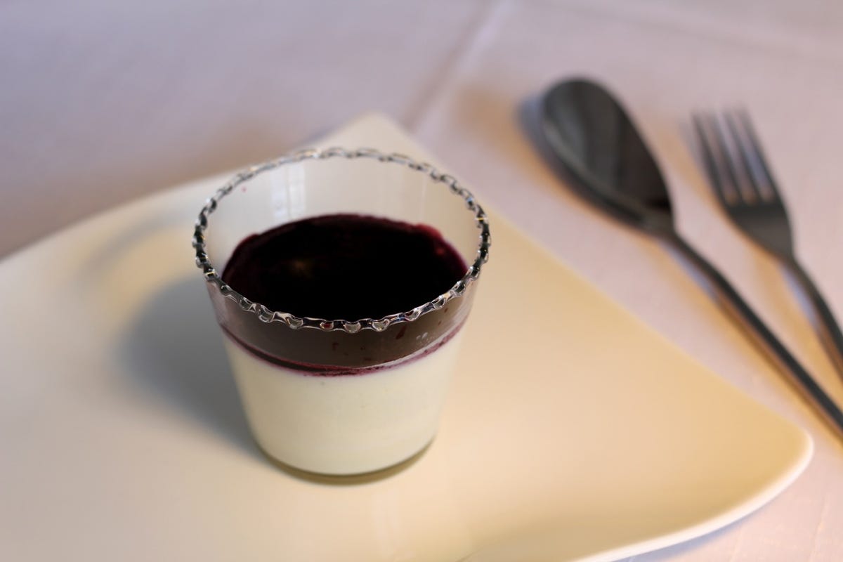
Lakmoussetikka
This delicious dessert is designed to represent the number of wild berries picked in Finnish forests versus the number left behind. The thin layer of blueberry topping shows how many are picked compared to the vast quantity (the white mousse) that are not. The creators, Nathalie Aubret & Melinda Sipos, question why consumers buy blueberries at the supermarket when they could just go get them in the wild. The dessert was created for a Helsinki workshop on Data Cuisine, the art and science of representing data with food.
Read more: Bite my pie chart: Data Cuisine expresses facts with food
More Galleries

My Favorite Shots From the Galaxy S24 Ultra's Camera
20 Photos
Honor's Magic V2 Foldable Is Lighter Than Samsung's Galaxy S24 Ultra
10 Photos
The Samsung Galaxy S24 and S24 Plus Looks Sweet in Aluminum
23 Photos
Samsung's Galaxy S24 Ultra Now Has a Titanium Design
23 Photos
I Took 600+ Photos With the iPhone 15 Pro and Pro Max. Look at My Favorites
34 Photos
