Best and worst smartphone interfaces
A smartphone's user interface can make or break the experience. Here's our take on 10 of the most noteworthy--good and bad.


Best and worst smartphone interfaces
I think we all can agree: however easy or hard it is to get around a phone's software features is just as crucial as its hardware frame. Over the past year, we've covered six mobile operating systems: Android, iOS, Windows Phone 7, BlackBerry OS 6, Symbian 3, and the forthcoming Web OS 2.0. Judging the designs of these interfaces is subjective, so you may not agree with all our points if your phone runs on one of these platforms, but we CNET mobile editors align our views on the following 10 smartphone "skins."
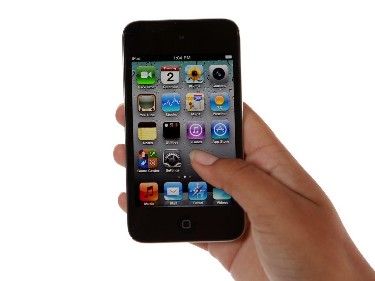
iOS 4
Like: It's almost difficult to recall the days before Apple's iPhone shattered the norm of the shrunken desktop UI (adopted by many a smartphone OS) with its elegantly simple design. Since then, the iPhone 4 has beautifully carried on the tradition of finger-friendly icons on a series of swipable screens with some useful enhancements like a pop-under multitasking bar and folders for grouping similar apps. Rearranging icons can still be cumbersome, but the universal search bar does help find programs (and people) in a sea of apps.

Stock Android
Like: Google's unadorned Android looks--without any additions from manufacturers--are still some of our favorite flavors. We called the T-Mobile G1 interface "clean, fun, and easy to use." That also applies to the updated Android UI on the Nexus S (left) and Nexus One (right). These share a Google search bar, intuitive icon controls, and the ability to customize multiple home screens with widgets, shortcuts, and application icons. Live wallpaper keeps things visually interesting. The more recent Nexus S slightly darkens the Nexus One's color scheme and tweaks the virtual keyboard font.
HTC Sense
HTC Sense isn't exclusive to Android phones (it's known as known as the TouchFLO, for example, on the HTC Touch Pro2), but it's our favorite manufacturer add-on interface for Android. Shown here on the HTC Evo, Sense has several high-gloss wallpapers, slick widgets, and curved, highly polished navigation bar. It also has it unique Leap screen, a pinch feature that pulls back to show thumbnails of all your home screens. Plus, we love watching animated rain and fog fill the display when you return to the Home screen on inclement days.
MotoBlur, Droid edition
WebOS
The forthcoming Palm Pre 2 is the first Palm phone to release under HP's new ownership; it will also premier WebOS 2.0. The update looks promising, with enhanced multitasking and a more powerful universal search "widget" that can also be used to quickly compose texts and update social networking status. But will it be as compelling and eye-catching in its 2011 refresh as it was in its 2009 debut? We won't know until it's in our hands.
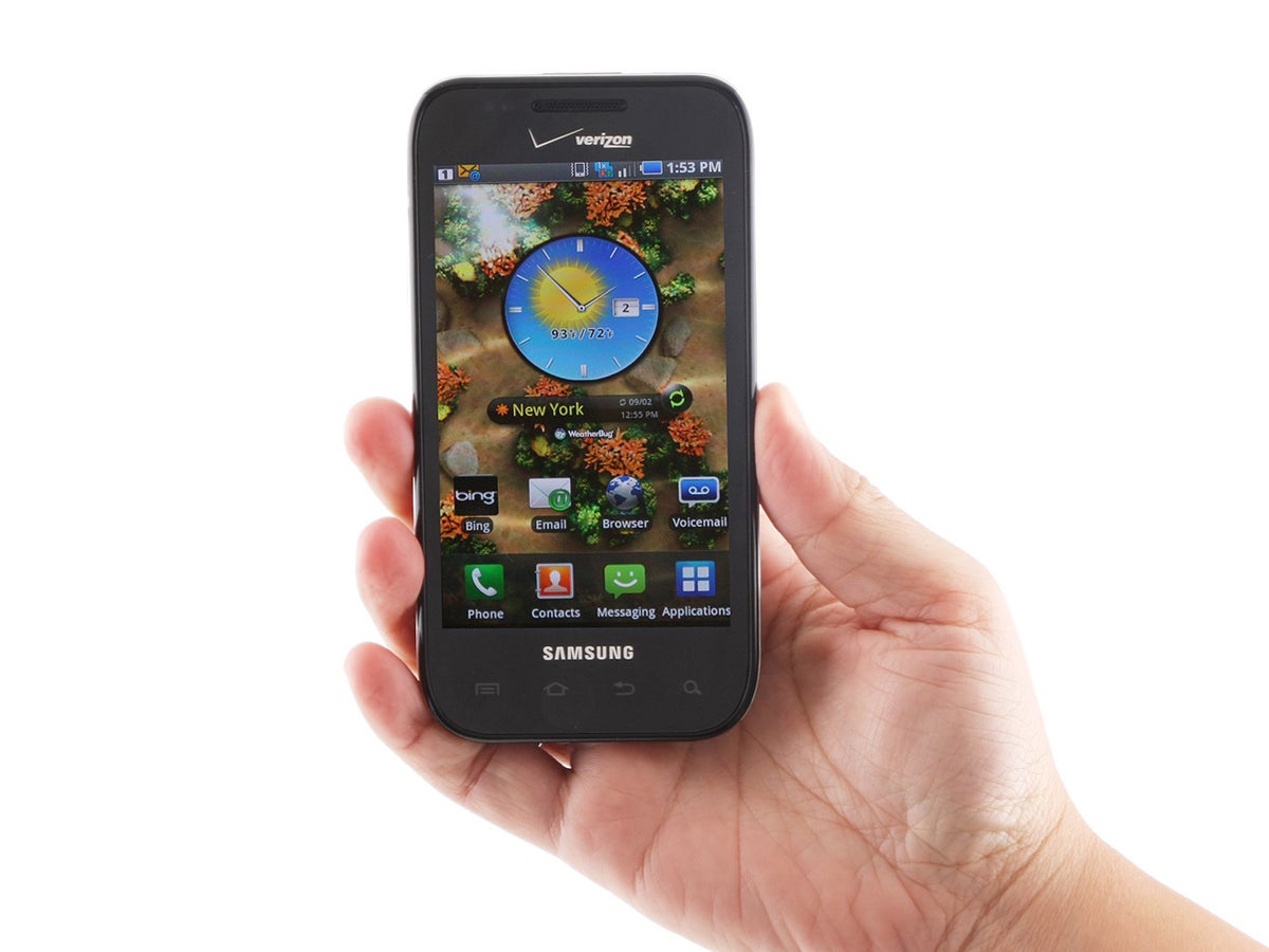
TouchWiz 3.0
Don't like:Samsung's TouchWiz interface used to elicit groans; we weren't fans of the 2.0 interface with its impossible-to-ignore widgets tray that's still found in smarthpones of yesteryear like the Windows Mobile-run Samsung Omnia II.
However, Samsung has smoothed and finessed the TouchWiz 3.0, at least in terms of Android. On the Samsung Fascinate, for instance, TouchWiz 3.0 ditches the intrusive, pop-out widget tray and adds new social networking widgets. It also uses a grid layout that makes it easy to view applications across multiple, swipable pages. The stock Android phone, on the other hand, requires you to scroll up and down to see apps--albeit using a neat "box" metaphor.) While TouchWiz is much improved, we still prefer the snappier, more polished HTC Sense.
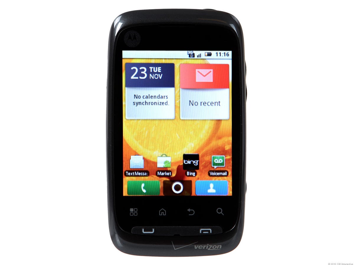
MotoBlur
Don't like: Motorola's Motoblur has improved since the early days of the Android-running Motorola Cliq (MotoBlur review), where it overwhelmed with its influx of social networking information.
Motorola has toned MotoBlur down by allowing filters for the social "Happenings" widget, something we can appreciate in phones like the Motorola Citrus. Still, we don't love having to sign up for a MotoBlur account, and the interface seems blocky and amateurish compared to smooth operators like HTC's Sense.
Blackberry OS 6
True, there is a new navigation bar that lets you swipe sideways to reveal favorite and frequently used apps to name two, plus a new task manager as well, but we couldn't call either one inspired. Don't get us wrong, OS 6 is welcome. We just think RIM could have done a better job shaking things up visually.
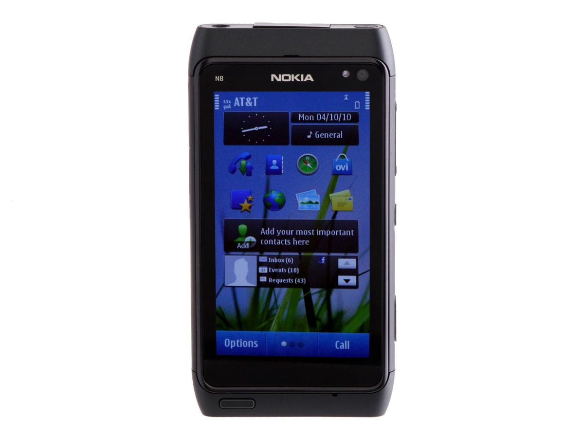
Symbian 3
Don't like: We can't help but sympathize with Nokia, whose share of the mobile market is on the edge of decline for the first time in years as Android and iOS continue making inroads. Symbian 3 takes the Symbian OS in the right direction, we'll give it that, but compared to its lither competitors, the OS (shown here on the Nokia N8) is still clunky and unintuitive.
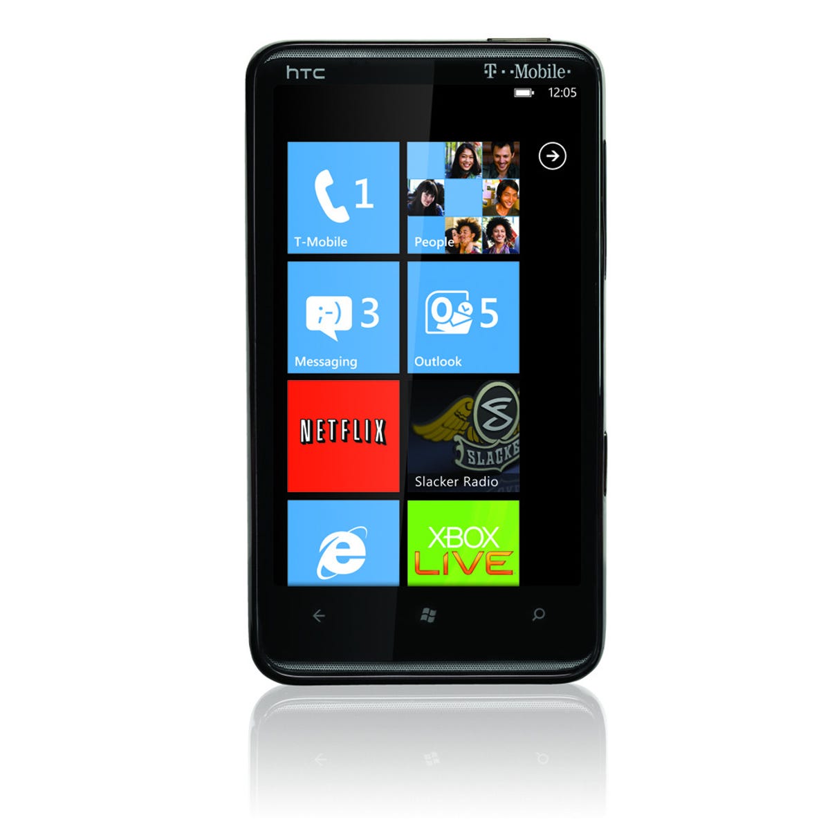
Windows Phone 7
A very stripped-down Start screen now consists of colorful "live tiles," large icons that represent everything from apps and features to people; some dynamically update with information like missed calls and incoming texts. A second page lists all apps and tiny icons. When you open an app, the "panoramic" interface is also unique and different; it's flexible for developers, but often overlays foreground functions on a background image that spans all the app's swipable screens. There are problems, however, like limited support for landscape mode, especially on that Start screen.
We commend Microsoft for taking a chance on a bold, brash Zune-like design, but not all of us editors connect with the visuals, which almost feel like a throwback with their 2D simplicity. Still, being able to nimbly navigate a powerful phone like the HTC HD7 speaks well of the Windows Phone 7 layout.
More Galleries

My Favorite Shots From the Galaxy S24 Ultra's Camera
20 Photos
Honor's Magic V2 Foldable Is Lighter Than Samsung's Galaxy S24 Ultra
10 Photos
The Samsung Galaxy S24 and S24 Plus Looks Sweet in Aluminum
23 Photos
Samsung's Galaxy S24 Ultra Now Has a Titanium Design
23 Photos
I Took 600+ Photos With the iPhone 15 Pro and Pro Max. Look at My Favorites
34 Photos
