Best and worst of Yahoo's logo makeover (pictures)
Yahoo releases 30 different versions of its logo leading up the reveal of a new design -- they couldn't all be winners.


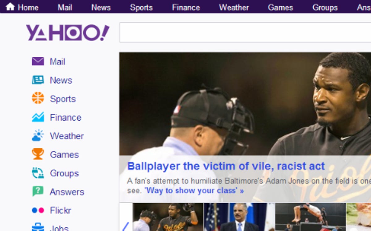
Yahoo hypes a new logo
For the last month, Yahoo has been trying out a logo a day en route to picking a new one to last it a while. The Web giant started off its logo fashion show on August 8 with the compact sans-serif version above. It's somewhat toned down for announcing "30 days of change," but it reflects the flat design aesthetic Internet companies are favoring these days.
While the fonts changed over the 30-day unveiling, each temporary logo held onto the company's signature purple color and exclamation mark. In the end, though, Yahoo's turnaround will depend more on the success of new features -- not a new logo.
Click through to check out some of the good (and bad) that led up to Yahoo's new logo.
Movie magic
Yahoo's logo for August 10 seemed to be modeled after the "Back to the Future" title.
Gamer's delight
Yahoo tried out this logo on August 12. After staring at the shape-like letters for a while, I found myself searching to match this logo to something I'd seen before -- I just wasn't sure what.
Eventually I decided the logo reminded me of a PlayStation controller. There in the Yahoo logo was a trident, square, and circle. The only thing missing was a cross (unless you squint your eyes when you look at the "y"). What do you see in this logo?
Clean lines
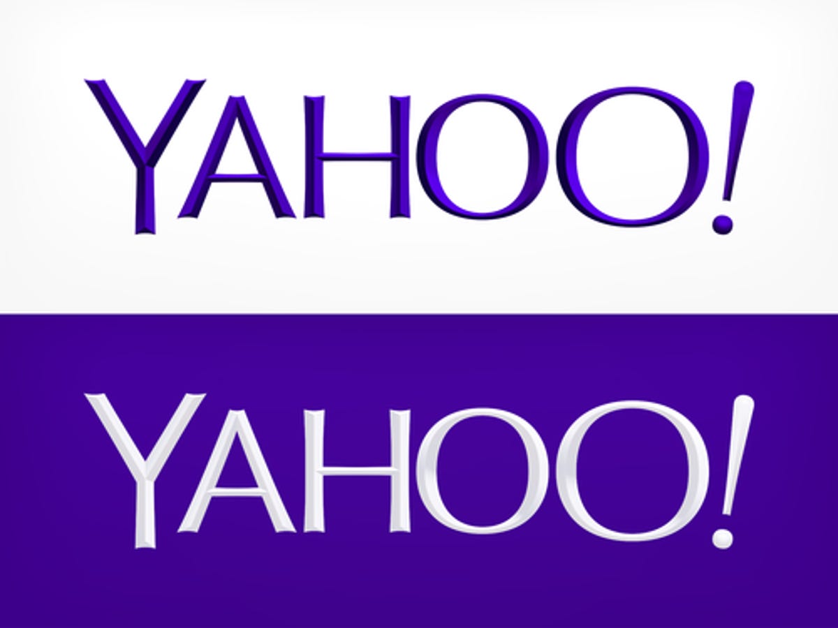
Wait, isn't this Yahoo's old logo? Well, not quite.
Yahoo tried out this sans-serif, streamlined version of its logo on August 16. It's very similar to Yahoo's traditional logo but with a much cleaner look.
Despite the subtle change, I think this logo struck just the note Yahoo was trying to achieve. The company holds onto its "fun, vibrant, and welcoming" personality, but also tells the world it's a modern company ready to take on its competitors. The company could have quietly come out with this subtle change, but after a 30-day logo rollout, Yahoo would surely have gotten panned for unveiling something so similar to its traditional logo.
Donuts for babies?
Does anyone else think this looks very similar to the lettering used in the Dunkin' Donuts logo?
Beyond reminding me of donuts, the logo for August 18 looks young. I'd expect to see this font on toys or children's brands. I'm not sure tykes playing on their parent's tablets are the crowd Yahoo should be going after. Then again, maybe giving up on this generation and going after the next one isn't such a terrible idea.
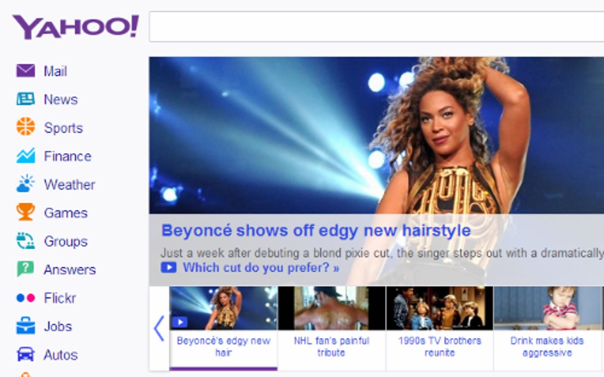
Soft and stylish
Curly logos
To the (exclamation) point
At least the logo Yahoo tried out on August 24 was clear. The large exclamation point was a nice touch, but beyond that, the logo was generally uninspiring.
The logo appeared to be written in the standard "Georgia" Web font (or something similar). It was one of several that made folks wonder if the company was just running through a package of free fonts, rather then trying to wow the Web with its transitional logos.
Doesn't work
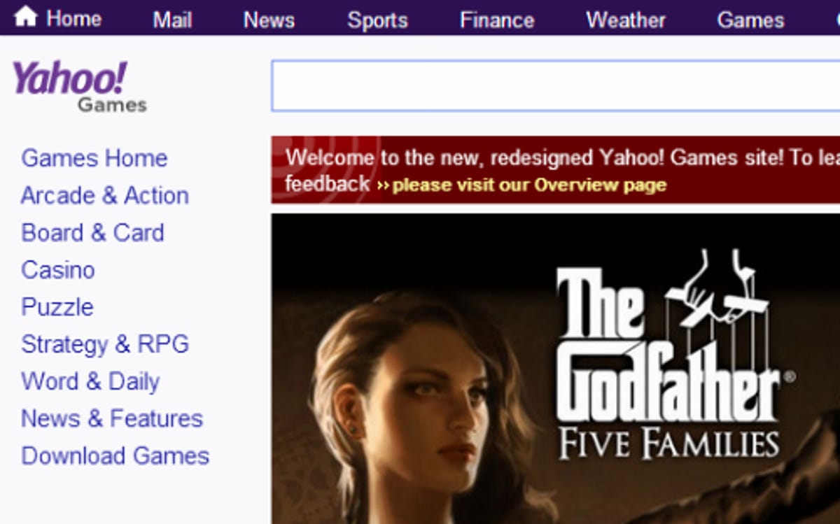
Company of the future
Yahoo went with this minimal logo on August 28. To me, the logo gave off a very strong tech vibe, and it also happened to be my favorite of the bunch. It reminds me of something that might be used to hype the latest sci-fi thriller.
But despite my affections for this logo, it didn't necessarily work for all of Yahoo's Web properties. The logo looked out of place on pages like Yahoo News and Yahoo Sports.
Final countdown
And the winner is
Worth waiting for? Or maybe the better question is, is the world a better place for the arrival of dancing punctuation?
More Galleries

My Favorite Shots From the Galaxy S24 Ultra's Camera
20 Photos
Honor's Magic V2 Foldable Is Lighter Than Samsung's Galaxy S24 Ultra
10 Photos
The Samsung Galaxy S24 and S24 Plus Looks Sweet in Aluminum
23 Photos
Samsung's Galaxy S24 Ultra Now Has a Titanium Design
23 Photos
I Took 600+ Photos With the iPhone 15 Pro and Pro Max. Look at My Favorites
34 Photos
