Twitter becomes one with the bird
The company rebrands by taking away its text logo, opting for a simple bird silhouette as its sole icon.


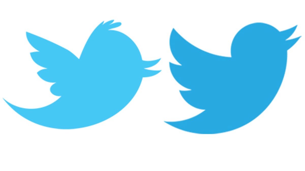
Twitter has decided to simplify its branding, choosing to only associate itself with the silhouette of its little blue bird. A new, happier-looking blue bird, to boot.
The company announced on its blog today that it's dropping the text, bubbled typefaces and lower case "t" icon from its branding. (See defunct Twitter logos below.)
"Twitter is the bird, the bird is Twitter," the blog post said.
The bird is created from three sets of overlapping circles (see video below), which Twitter likens to "how your networks, interests and ideas connect and intersect with peers and friends." Compared to the old silhouette, the new bird appears to have lost some weight, gotten a haircut and greatly improved its mood.
See also Twitter's new branding page, which features instructions on what you should and shouldn't do with its new logo if you use it.