Hulu rolls out new design, with focus on content discovery
Streaming video site replaces traditional grid with larger images and new features focusing on personalization.


Streaming video site Hulu launched a redesigned Web site this evening that replaces its traditional grid with larger images and focuses more on personalization.
The changes, which it hopes will improve content discovery, include a browse button and a "Staff Picks" list that highlights titles users may have missed. Users will also find recommendations based on their viewing history.
The chief goal of the redesign is to do a better job of surfacing Hulu's hidden gems, Rob Wong, Hulu's VP of product, said in a company blog post.
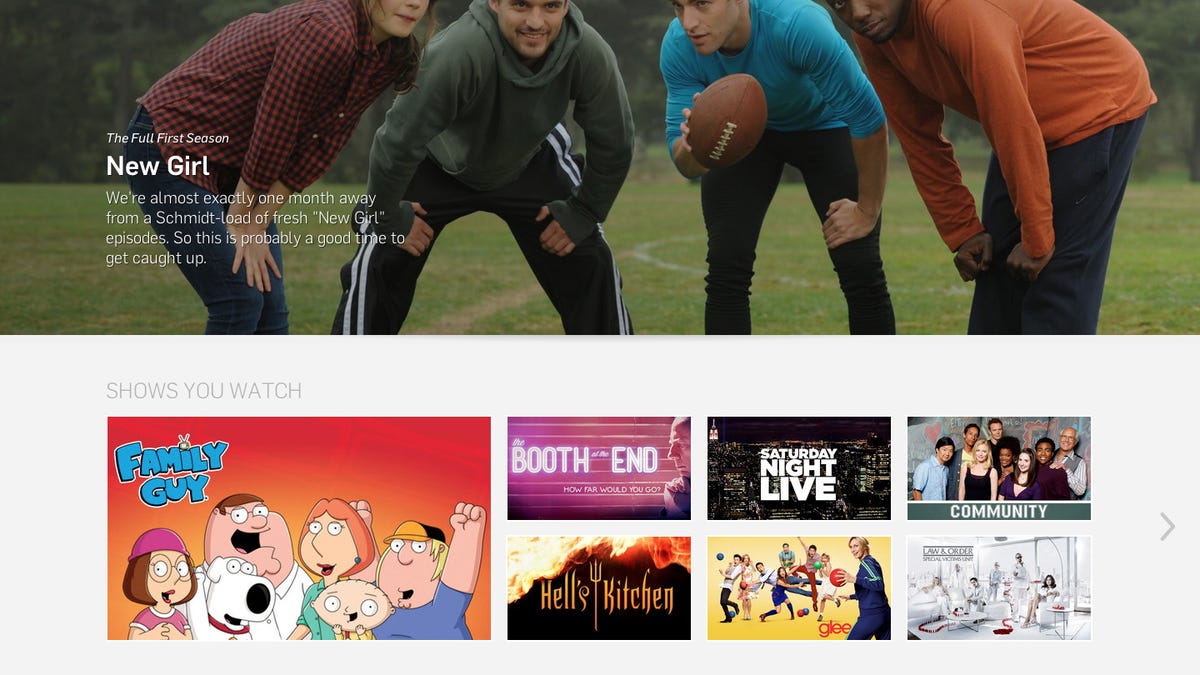
"We've started by using larger, more vivid artwork to feature last night's TV episodes and new additions to Hulu," he wrote. "We've also implemented a new tray-style format to make it easy for you to browse and discover content. And for logged-in users, we highlight the 'Shows You Watch' to make it super easy to jump directly to the shows you are already enjoying on Hulu."
Another key feature is the updated search bar at the top of the page, which is designed to get users to content faster.
Most customers can expect to see the changes over the course of the next few days, but those who are eager to see the new layout can get a peek at new.hulu.com or check out the video below.