Google gives Chrome OS a less alienating interface
The browser-based OS previously could show pages only in full-screen mode, but now Google adopts a more familiar resizable, movable windows and a task bar. Still, are full-screen views the future?


- Shankland covered the tech industry for more than 25 years and was a science writer for five years before that. He has deep expertise in microprocessors, digital photography, computer hardware and software, internet standards, web technology, and more.

In the computing world right now, there are two general ways to show windows on a screen: with the window taking up the entire screen, as on smartphones and tablets; or with resizable, overlapping windows, as on personal computer OSes.
Until yesterday, Google's browser-based operating system, Chrome OS, fell into the former camp. Users had no choice but to see browser pages and run browser apps at the full size of the screen. That changed with a new window manager that debuted with Chrome OS 19.0.1048.17, released in a developer build.
With the Chromebook notebooks that are the sole way of getting Chrome OS today, being limited to full-screen pages isn't a big deal: the laptop screen isn't that big, so it's useful to see as much as you can, and the tabs across the top provide an obvious way to switch among browser windows.
But evidently Google wanted the Chrome OS to be more like Microsoft Windows and Apple's Mac OS X. That's smart, given how many people are familiar with those operating systems and how weird Chrome OS can feel when you first try it. For a look at some of the features, check the slideshow showing the new Chrome OS look.
And happily for people like me who want our maximum-sized windows, it's largely optional.
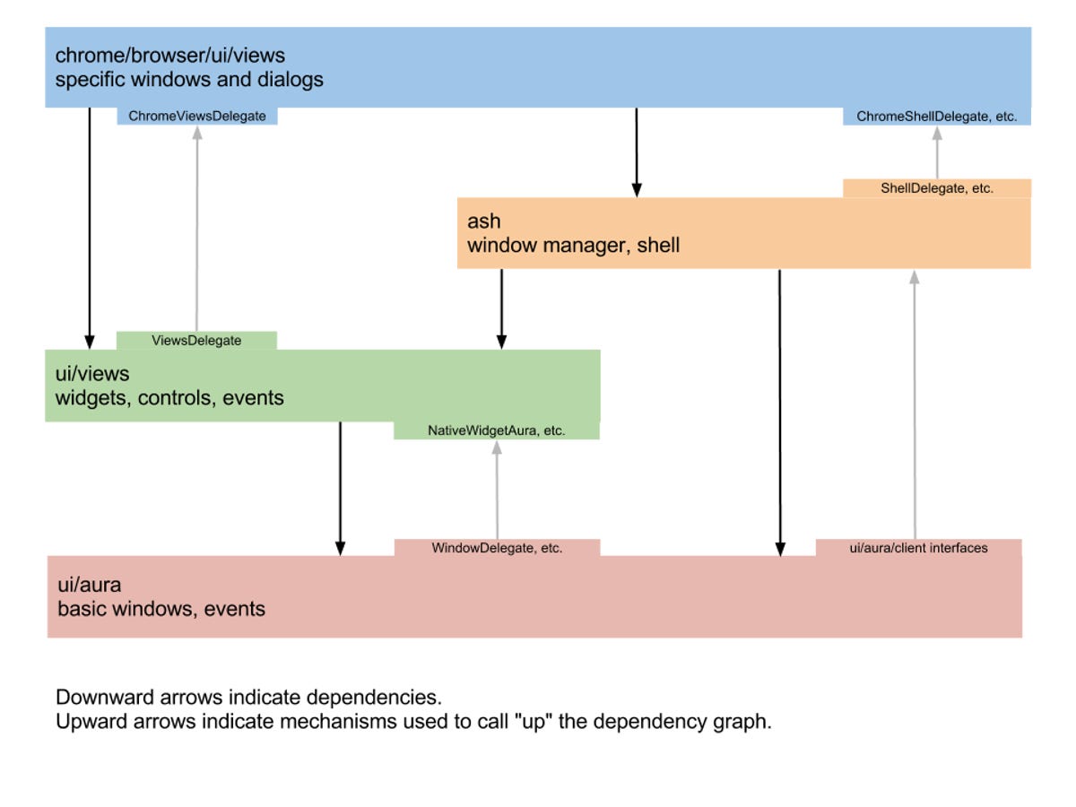
The new interface comes through two Chrome OS projects, Aura and Ash, according to Chrome interface leader Ben Goodger. Aura provides the hardware-accelerated graphics engine, and Ash runs on top of of that, controlling the windows themselves.
The new look
The update adds several features:
• The ability to show smaller browser windows, each with its own set of tabs, in front of a desktop screen background. These smaller windows can be overlapped like traditional windows, and the tab strip at the top is translucent to show a bit of windows underneath. As the work continues, you can expect translucent apps and blurred translucency, too.
• A list of shortcuts a la OS X's dock or Windows' task bar that shows across the bottom of the screen when smaller windows are showing. The task bar also absorbs the status items such as the clock and battery state icon that had been in the upper right corner. This task bar disappears when the browser window is maximized but reappears if you slide your mouse pointer down to the bottom of the screen.
• Browser tabs can be torn off of the tab strip and their windows dragged to new positions on the screen or merged with the tab strip of another window. Each window gets a rectangle in the upper right that toggles between maximized and smaller-screen, and windows can be resized by dragging any edge, a la Windows for decades and Mac OS X since Lion.
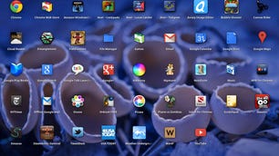
• Clicking on an icon in the task bar shows a grid of icons for the apps and bookmarks you have installed, rather like OS X's Launchpad or the apps button on Android. These are the same items that would otherwise appear in Chrome OS's new-tab page, which now shows frequently used pages when you click the new-tab button or type Ctrl-T.
Maximized windows are good
Overall, the user interface is probably more familiar to average users, but I'm not a fan of the new window modes for the most part. I'm already a maximum-screen kind of guy for the most part, unless I'm using a really big monitor.
There are areas in which I see the new UI as useful, though.
First, for bigger screens, where windows don't need to be run maximized, it could be very handy. And don't forget that Google wants to bring Chrome OS beyond just its initial Chromebook incarnation, and that Chrome OS can support external monitors.
Second, it can be nice for intentionally small windows. For example, the Chrome OS "view background pages" command now invokes a small separate window on its own rather than a small window against a big empty browser tab that takes up the whole screen.
Third, the new app icon grid is handy. The new-tab page didn't hold enough icons, so this does better.
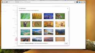
Last, Chrome OS now can show off background images on your desktop. This might be nice for some people, but for me it's just as useless as on any other OS. It's like having a beautiful tablecloth for a table that's always completely covered with other stuff. Maybe your computing habits are different, but when I want to look at photos -- which is often -- I look at them full screen in some dedicated software, not at whatever parts of them aren't behind icons, gadgets, and windows.
Traditional UIs are changing
What I find most interesting about the new Chrome OS interface is that Google has chosen to go with a conventional interface at a time when those conventions are changing.
The iPad is one case in point, where full-screen apps are the only apps, and people don't seem to have a big problem with it.
The bigger uncertainty is Windows 8's Metro interface, for which apps are full screen only unless you're pulling in one of those thin-strip second apps along the side.
So arguably, the rising star of full-screen apps means that Google is anchoring itself into the past with Chrome OS. Although I'm a full-screen fan, it's probably smartest for Google to adapt to prevailing customs in this case. Chrome OS already is different enough that it's best to preserve any familiarity that can be preserved.