Twitter redesign: Close but no cigar
Too bad Steve Jobs never got his hands on a microblogging site whose design has long been serviceable but crappy.


After reading through Walter Isaacson's new biography of Steve Jobs, any technology lover is left with myriad regrets. Here's another: Too bad Jobs never got a chance to design Twitter.
Twitter has been a smash success almost from the moment it hit the transom in 2006. Moving beyond the circle of early adopters into the mainstream, it fast became an indispensable tool of communication, and in North Africa, a handmaiden for revolution. But that doesn't mean it was elegantly laid out or easy to understand. Anything but.
Maybe one of the founders was born under a lucky star, but in an era where intuitive software is supposedly the goal, the irony is that Twitter has succeeded in spite of a design that was the norm when the PC era first got going: Serviceable but crappy.
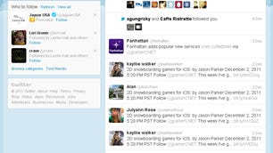
Hashtags and @ signs aren't clear enough for me? Not especially. I can only imagine the fit that Jobs would have had if he were in charge of the original design review. Tens of millions of people may use Twitter's navigation metaphor each day, but I'm wiling to bet that most of them find the interface to be a kludge.
In his book, Isaacson describes the creative tension that flourished at Apple, where Jobs' liberal arts sensibilities continually clashed with the dictates of computer engineering. He demanded design clarity and he got what he demanded.
But he was the exception to the rule. Many moons ago, I got into an argument with an ex-Lotus engineer about Lotus notes. Although I liked Notes, I thought there were design flaws that sometimes got in the way.
"It's not our fault," he maintained. "It's your fault."
I shrugged. OK, I said, maybe I'm a dummy but keep turning out overly complicated stuff at your own peril. A couple of years later, IBM swooped in and saved Lotus from what would otherwise have been its rendezvous with bankruptcy. You can't chalk up the company's subsequent history to the poor design of Notes--which in fact was Lotus' best product at the time--but that defensiveness, where users got blamed not being sufficiently swift, was a widespread mindset within the computer industry.
At Apple, Jobs enjoyed a superstar presence that allowed him to enforce the right aesthetic over coders who sought to explain why things had to be another (wrong) way. Twitter seems headed in the right direction, but even with today's surprise redesign, the company knows it has more work ahead. More photos, as Sean Parker notes, will help. Twitter chairman Jack Dorsey's characterization of "less places to click, less things to learn," is the right approach--especially if Twitter wants to expand beyond the approximately 100 million people who now use the service. (Gee, ain't it amazing how having the likes of Google and Facebook competing for attention tends to concentrate minds.)


Give Twitter credit: The tweaks are an improvement, but this can't 't be the final look. Twitter's still not great. It's more useful than it was, but still not 100% intuitive. So when will it be good enough to leave the design alone? The purists say the pure design is a never-ending search.
Maybe so, but let's think about it another way: When your family's proverbial Uncle Harold starts tweeting up a storm without breaking his false teeth, that will be the day Twitter can pop the champagne. Until then, they have more work ahead.
This post first appeared on CBSNews.com under the headline "Twitter redesign: Close but still not great."