Switch quickly between Word's smart quotes and straight quotes
Improve the readability of your documents by using smart quotes, and their Web-ability with straight quotes.


When I described how to replace Microsoft Word's smart quotes with straight quotes to keep the HTML versions of documents from breaking, several people objected, claiming that straight quotes make the docs more difficult to read. I agree completely, which is why I decided to tell you about the quickest way I know to convert from one quote style to the other. In just a few seconds you can optimize a document for the Web, or for readability in print or onscreen.
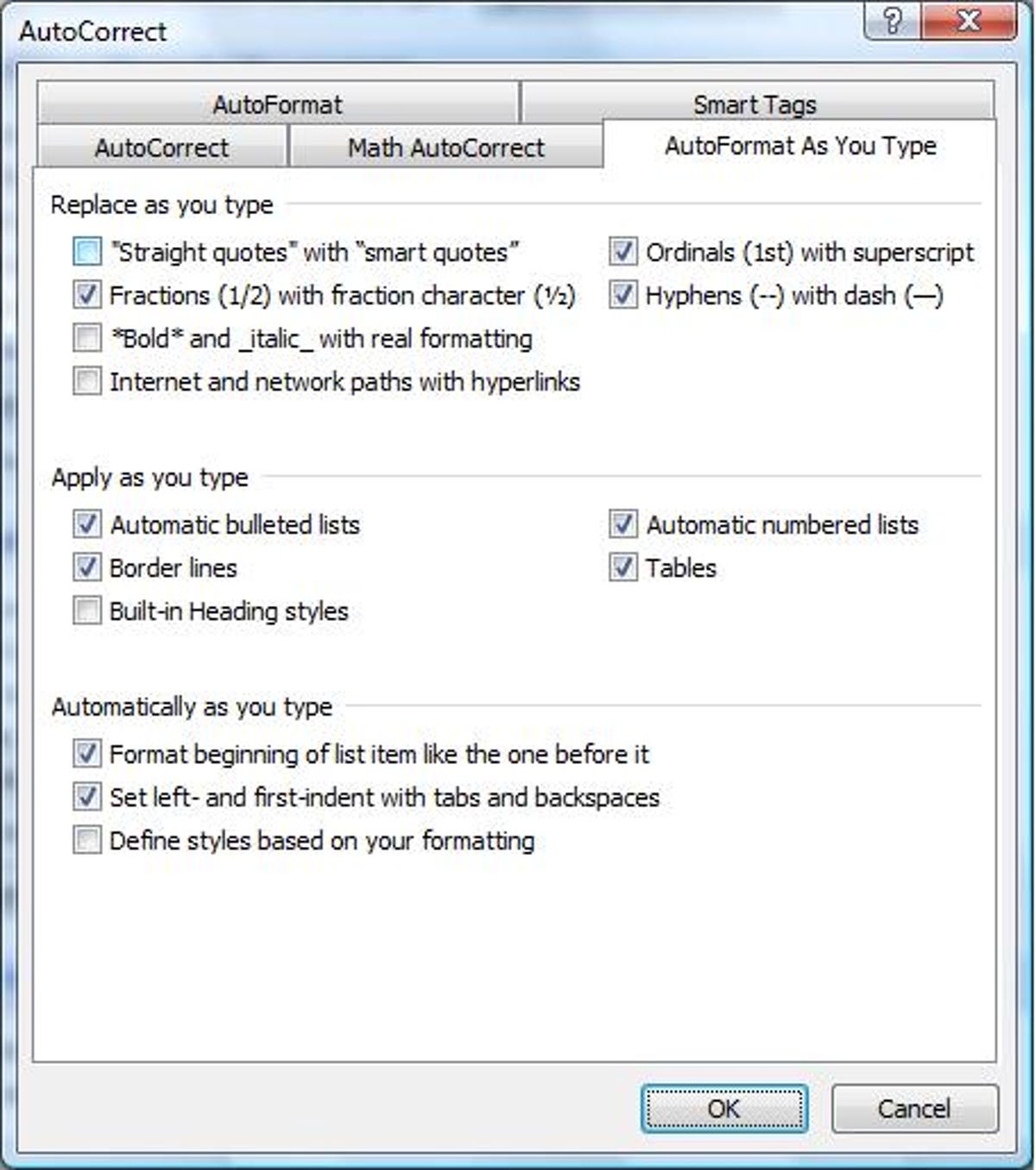
Suppose you want to put a Word document that's full of smart quotes--both the double quotation-mark style, and single apostrophes--onto a Web page. You know the HTML will break the smart quotes, rendering them a nonsensical series of characters. To get the file ready for the Web in Word 2003, click Tools*AutoCorrect Options*AutoFormat As You Type; in Word 2007, choose the Office button in the top-left corner, click Word Options at the bottom of the window, select Proofing in the left pane, and click AutoCorrect Options*AutoFormat As You Type. In both versions, uncheck "Straight quotes" with "smart quotes," and click OK (twice in Word 2007).
Next, click Edit*Replace in Word 2003, or the Home tab and then the Replace button to the far right in Word 2007 to open the Find and Replace dialog box. Type " (the double-quote mark) in the "Find what" field, and the same character in the "Replace with" field below it. Click Replace All*OK (or press Alt-a and then Enter). Now type ' (the apostrophe) in the "Find what" field, and the same character in the "Replace with" field, and click Replace All*OK again (or press Alt-a and then Enter again). Your document's quotes are now as straight as a school marm's posture.
Now suppose you want to switch back to smart quotes to make the text easier to read. Simply follow the same steps again, checking rather than unchecking the "Straight quotes" with "smart quotes" option in the AutoFormat As You Type dialog.
A question of readability
When I took a class in Web design back in the late '90s, we were taught that sans serif fonts (such as Arial, Calibri, Tahoma, and others without the little finishing strokes at the ends of each character) were easier to read on computer screens than serif fonts, such as Times New Roman, Garamond, and Century. Researcher Alex Poole conducted a literature review of serif vs. sans serif readability, finding that such characteristics as the "x-height" (the height of the lower-case "x"), letter spacing, and stroke width had a greater effect on a font's readability than whether or not it uses serifs. Poole concludes that aesthetics have more to do with the selection of serif or sans serif fonts than legibility. (I was also intrigued by the researcher's explanation of how "legibility" is distinguished from "readability.")
Tomorrow: My 10 favorite Web-search shortcuts.