Google+'s stream gets Pinterest-like makeover at I/O
A new redesign for Google+'s news stream makes it look a bit like Pinterest with a responsive design.


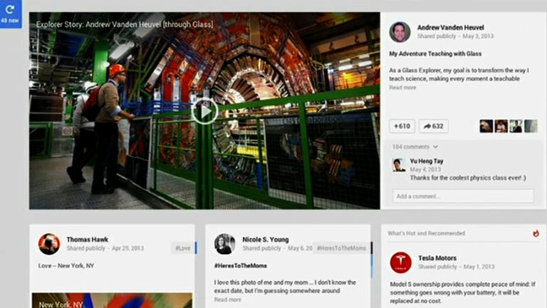
The Google+ news stream is getting a new face.
The new display is very similar in style whether viewed from a mobile device or large-screen computer. The only real difference is that it switches from one to three columns depending on the device used.
The change to Google's nearly 2-year-old social network was unveiled during the company's keynote at Google I/O, an annual developers conference in San Francisco.
At first blush when viewed on a large screen, the new design bears some resemblance to the social networking site Pinterest. However, Google is giving certain types of media, like large photos and videos, even more exposure by making them stretch the full width of the screen.
Behind the scenes, the new Google+ interface now has an automated system that adds relevant hashtags to posts based on content.
The system can add up to three hashtags, something Google hopes will help people discover other related content. Users can remove or change hashtags after the fact.
Google+'s last big redesign came in April, with a move that put all the navigation on the left side of the screen and added more customization features. Google says the latest version will roll out to users later today.

