FriendFeed's redesign makes entire site real-time
A new design puts the focus on search and viewing content in real time across the entire FriendFeed site. Find out what's new and better.


FriendFeed is releasing a newly redesigned version of its service today (its second major one since launching), and the emphasis is all about viewing both freshly posted items and user discussions as they happen. The service has had a real-time view since October of last year, but this update goes deeper than that, adding it to nearly every facet of the site.
The new look can be accessed at beta.friendfeed.com.
If you've got real-time turned on, any item you're viewing with will refresh with new content as other users interact with it. This includes both likes and comments, which turns it into more of a live chat room than a forum (see also: Tangler). This can be turned off too, which reverts the site to refreshing only when you do so in your browser.
Besides the design change, the service's site-wide search has been given a much-needed overhaul. It's now easier to get at content that flows by at--what is now, a quicker pace. Instead of having to first start a search, then wait until it's done to begin filtering the results, it will pull up suggestions of what kind of content you want to get at as you're typing. For instance, in a search for "teletubbies" it now asks whether you want to be searching for content from just your friends or everyone before it does the query.

The redesign has also brought in a new way to sort through the content you find in searches or items you've interacted with, which have been designated as "filters." If you had wanted to save that search for teletubbies for later use, or simply create a feed that monitors the entirety of FriendFeed for when the word comes up, you can save that search as a filter. These go in your filter list, where FriendFeed also classifies things like the "Best of Day" and a feed of any post you've liked or commented on.
Another big shift is that the UI has been pulled back and compacted. Things like rooms or people you've subscribed to are now bunched together into one unit, where previously they were separated. You can also hop straight to a specific friend just by typing the first few letters of their name in the search box, which will provide suggestions as you type.
What may be slightly controversial is that the company has, again, moved all the navigation back over to the right side--a place where it was during the beta stage of the last redesign. Users made enough of a stink to get it moved back. FriendFeed co-founder Bret Taylor told me that one of the things that they learned from the last time around, and what's different this time, is that the UI now scales to fit your screen, where previously there would be a giant white space between the navigation and new content. The new one simply centers itself, no matter how big of a screen you're working on.
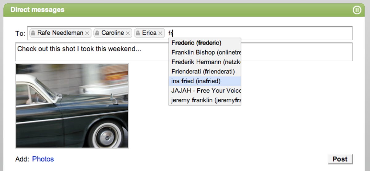
One small but nice new feature is the option to send one or more users a direct message. You can create the same kind of post you would when posting to a main feed, or a room, but you're able to limit who can see and comment on it. Taylor says this was in part to let people send things to one another privately without having to create or monitor a private room, as whenever you get a direct message it shows up in your filters with an unread message count, just like you'd get in a Web e-mail client. You can even use this to send things to people from outside of FriendFeed (via a cc to Twitter), and any replies get sent back to your FriendFeed in box.
So will users like this new look? I'm on the fence about it. I liked all the buttons and dials, which FriendFeed still has, but they're now tucked away, and trying to find them is going to take some learning. I'm also not a big fan of the real-time stream, which prior to having it site-wide I used rarely and found to be a bit of a distraction when something I was giving a quick look disappeared farther down the page. Users who are following a lot of friends are going to have some trouble keeping up with it, which is why I'm glad there's still the option to pause it and easily create and save filters.
One thing that's really, really a massive improvement though is the search, which makes cruising through content on the site an absolute breeze. FriendFeed can change colors and button placement all it wants, but if the search tool continues to let people dig through it all in just a few seconds, it becomes less than just a social network, and more of a really fun and engaging social search engine.