Volvo's next-gen infotainment simplifies design, builds on Google ties
Overcomplication leads to more distraction, which kind of nullifies the whole thing.


Every time a new infotainment system comes out, it feels like the majority of what's new can be boiled down to, "We put more crap in it!" Some systems are downright distracting to operate, no matter the speed. Volvo's clearly aware of this, because while the next iteration of its in-car telematics will continue to be feature-rich, the idea of safety plays a big role, too.
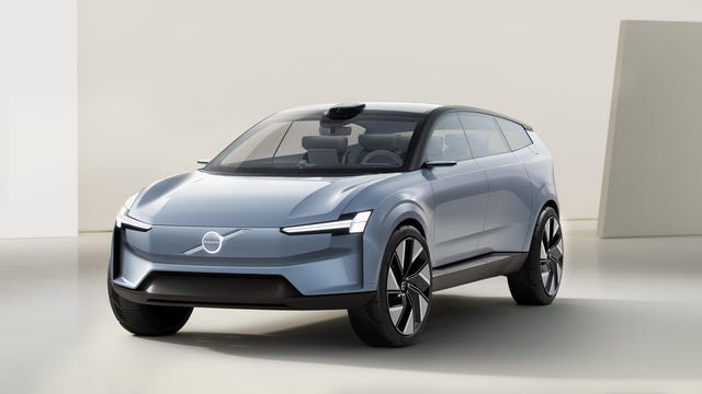
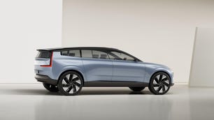
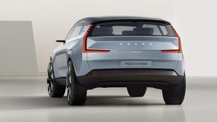
Volvo on Wednesday announced a new infotainment system that will accompany its next generation of battery-electric vehicles. It will still run on the Android Automotive OS that underpins the current system, but that framework will be part of a larger ecosystem that the automaker calls VolvoCars OS, an umbrella of sorts that incorporates the various operating systems that are needed to run… well, just about everything in the vehicle.
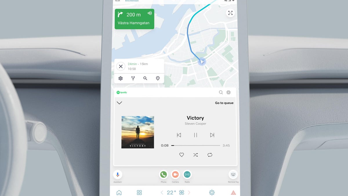
Two screens comprise the primary part of the system. There's a large portrait touchscreen in the middle of the dashboard, similar to current Volvo vehicles, but what's on that screen has changed dramatically. The upper two-thirds of the screen is now dedicated to the "anchor" app, which is usually a map, with widgets to access other parts of the system just below that. Like the current Volvo situation, system information (e.g. seat warmer status, climate control settings) hang out at the bottom. The visuals are brighter and more obvious at a glance, which should go a long way in mitigating distraction.
There's also a digital gauge cluster. However, since there's no need for physical gauges anymore, the cluster display has been compressed a bit, similar to how it is in the Ford Mustang Mach-E. The gauge screen only displays the most pertinent information, such as range, road speed and any navigation information. A head-up display is optional, and like current HUDs, it simply moves information that much closer to the road.


Who needs a giant gauge cluster, anyway? It's not like physical gauges are necessary anymore.
Don't forget your phone, though! No, seriously, I mean it, because it's going to function as a key. Volvo wants the device in your pocket to act almost as an extension of the vehicle itself. A new app will become a one-stop Volvo shop, letting you start your car, pre-condition the cabin, pay for charging when away from home and connect to certain smart-home devices.
A reliance on over-the-air software updates means the system that comes with your car may get even more features over time, as well. Volvo is on a big hiring spree as it moves a whole bunch of software development in-house, which means new or improved features should take less time to arrive.
Volvo didn't offer too many specifics with regard to timing, but its next generation of electric vehicles begins with the XC90 's successor in 2022, so it may not be very long before some of these changes can land in your driveway.