General Motors reveals new logo as automaker eyes its electric future
This is only the fifth time GM decided its iconic logo was due for a change.
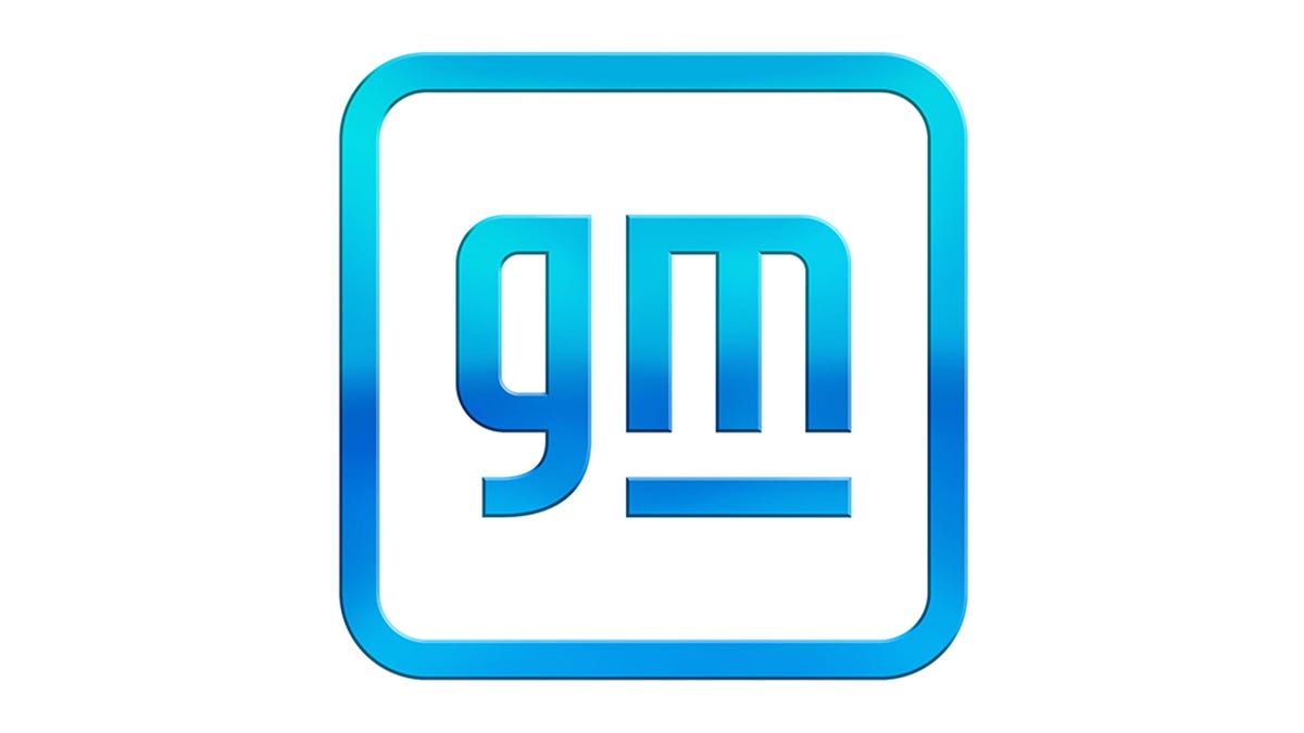
Can you see the plug?
Everyone, meet the new General Motors logo. America's largest automaker decided it was time for a fresh look as it eyes a radically different future for its business -- a business that revolves around electric cars and zero emissions.
The new logo was revealed on Friday. It's a radical departure from the slate blue and uppercase design of the outgoing look. This new logo features a lowercase "gm," a white background, a blue outline for the font and a rounded box design. The automaker said the goal was to invoke thoughts of a cleaner future with a bright blue gradient, while conjuring feelings of inclusiveness with the move to lowercase letters. I can get the first part, but the lowercase feels dramatically less professional, at least in my view.
The final major change is a line that sits beneath the "m" to create an electric plug out of the white space in the letter m -- reminiscent of the arrow in the FedEx logo, and a signal that directly points to the automaker's in-house Ultium battery and motor technology.
"This was a project our team took so personally, not just for ourselves but for the 164,000 employees this logo represents," Sharon Gauci, GM executive director of global industrial design, said of the new logo. "At every step we wanted to be intentional and deliberate because this logo signifies creative and innovative thinking across the global General Motors family."
The new logo will roll out across the automaker this year and serve in any place we'd typically see the outgoing logo. It will tie into a new marketing campaign entitled "Everybody In." The campaign will lay the groundwork for the automaker as it seeks to put drivers into EVs and begin a slow march away from the internal-combustion engine.


Solar Installer Guides
Other Energy Saving Guides
Our Experts