Interface tweaks are a step in the right direction
Released with Mac OS X Yosemite, iTunes 12 gets some small interface changes that make your music, movies, and other content easier to navigate.


iTunes 12 launched right alongside Yosemite today, and though there aren't any major changes, the minor tweaks make it much easier to use.
iTunes has long been lambasted for being too confusing, but that's largely because it gradually became the hub for all your media and iOS devices. In the beginning iTunes was only for music, and later Apple added movies, TV shows, podcasts, iTunes U, audiobooks, and more. And don't forget it began as the only way to sync your iOS devices -- though that's less true today with wireless syncing. In other words, iTunes had a ton of content to display and Apple has seemed to struggle with how to design the interface so it makes sense to people.
iTunes 12 for Mac does a lot to remedy that, with a better navigation system and simplified controls. It may not be completely out of the woods yet, but it's definitely a step in the right direction.


Simplified design
Like most of the core Apple apps in Yosemite, iTunes gets a design overhaul with flattened buttons and a slim toolbar at the top, but it's the interface changes that are the most welcome. The drop-down menu that lets you select between things like music, movies and TV shows in iTunes 11 is gone. In its place you get a couple of icons in the upper left for the most common selections such as music, movies, and TV shows, and a drop-down menu just to the right of that for more selections, such as podcasts and apps.
Across the top, in the middle of the interface there are menu headings relevant to the type of content you choose. So, if you select Music, your menu headings are My Music, Playlists, Match, Radio and the iTunes Store; if you select Movies you get My Movies, Unwatched, Playlists and also the iTunes Store. In iTunes 12, you only need to select the content type, then go through the contextual buttons across the top to navigate.
It's a smarter setup because you can access all the stuff you already own in one place, and having the iTunes Store handy across each category makes it easy to add new media to your collection
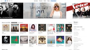
iTunes Store
The layout of the iTunes store is the same as previous versions, but the way you navigate it is much easier. Now, once you're in the iTunes Store, you can use those same icons in the upper left to switch to each different storefront. You'll still get all the featured content across the top, and you can browse for more new releases below.
Final thoughts
While iTunes 12 is not a large change over previous versions, the small tweaks make it much easier to get around. The navigation tools are smarter than before, and should make it easier to find the stuff you want to watch and listen to, plus the store makes it easier to find the stuff you want to buy.
It's important to note that this First Take is for the Mac version, and we'll be looking at the Windows update at a later time.