 Why You Can Trust CNET
 Digg.com review: New clean look, but lacking in features
The Digg.com Web site had a mass exodus of users back in 2010 when the site let major news agencies dominate the front page with sponsored listings. Can a cleaner design and a new attitude bring the site back to its former glory? Read our early review of Digg version 1.


Digg, which first launched in 2004, has been rebuilt from the ground up by a team of 10 engineers from Betaworks, a company that spent years learning the news game with News.me. But can they bring Digg back to its former glory?

Digg.com
The Good
The Bad
The Bottom Line
Sporting a new minimalist look and big plans for the future, Digg.com has relaunched in the hope of becoming your favorite social news and link aggregator. The Web site was a big hit with users during its heyday, and with the new look and matching iPhone app, Digg could win users back -- if the company makes the right development decisions.
For some history, once Digg went to what it called Version 4 back in 2010, users fled the site in droves because the company replaced user-generated content with sponsored content from major news sites. Since then, Reddit (a similar news aggregator) has taken over as the top user-generated news site and many ex-Digg users have taken up residence there.
It's important to note that the launch of Digg 1 doesn't include everything the team from Betaworks envisions, so I am reviewing an early version of the product (and it will show). To log in to Digg, you'll need to sign in through your Facebook account, an unsavory, but temporary measure to stave off spammers. There is currently no comment system in version 1 (a huge part of link aggregator sites like Digg and Reddit), but the developer blog promises it's a feature that is coming soon. While the Digg site is a work in progress, check back here as it evolves over the coming months for updates to the review on the new features as they become available.
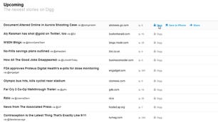
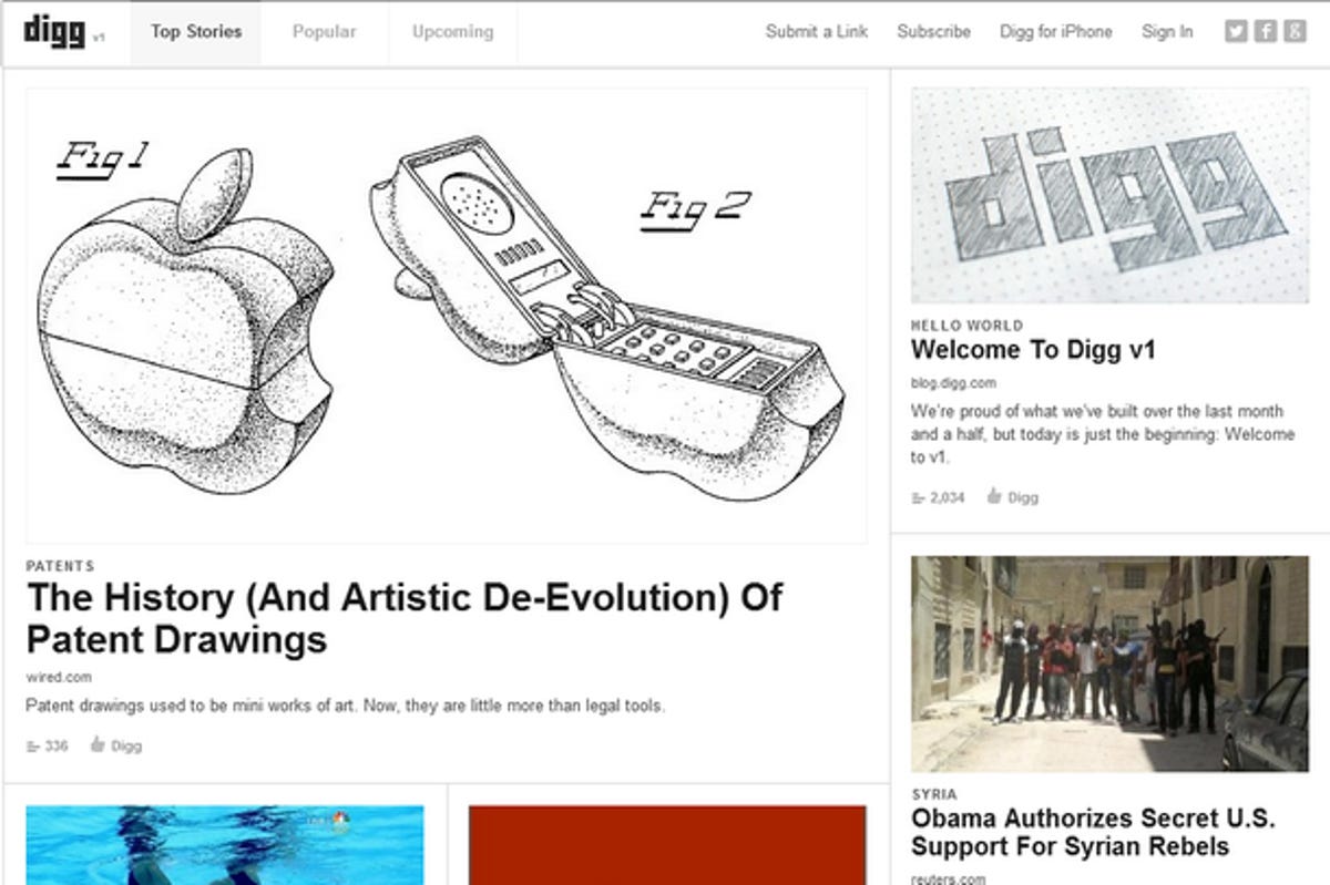
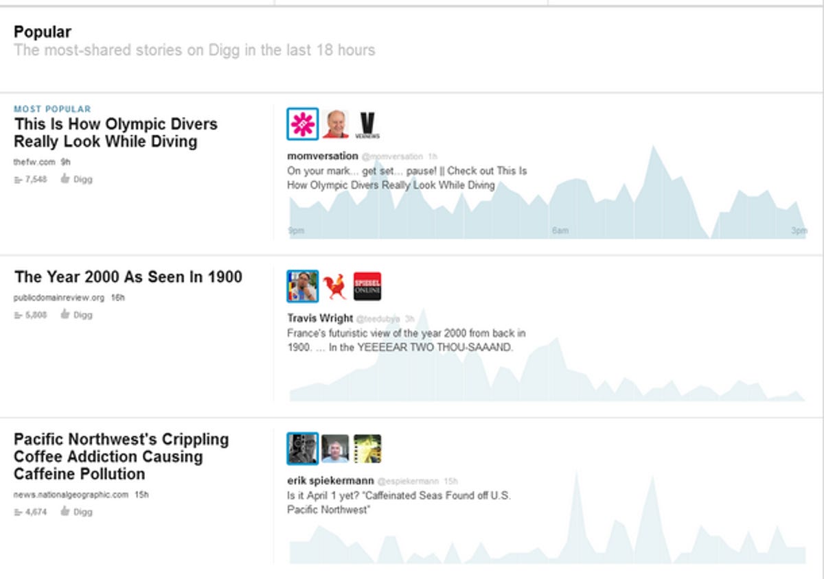
The new Digg.com layout is divided up into three sections and looks a bit like a magazine at the top with large images for Top Stories items and smaller photo graphics with teaser blurbs and related tweets below. As you scroll down the page, you come to the Popular section, where a combined score of shared tweets, Facebook likes, and Diggs push stories to the top. To the right of each popular story, a graph shows the peaks and valleys of votes over time. At the bottom there are the Upcoming stories -- the news items that have been submitted to Digg and have gained a small following. There are also tabs across the top to jump to each of these three sections, a button to Submit a Link to the site, a Subscribe button that doesn't seem to lead anywhere, and a link to the Digg App for iPhone (reviewed below).
The site feels much cleaner and better organized than previous versions, but I wonder why the News.me team didn't at least keep some of the original site's color scheme for user familiarity. The Facebook log-in as a temporary way to sign up may decrease spam for the short term, but not allowing people to log in with their original Digg log-in (and subsequently, providing no access to their digg history), could turn off a lot of users. There are also currently no options for selecting categories to only read what interests you, nor can you set up RSS feeds in the current version.
Overall, the site feels clean, and seems to be off to a good start, but lacks the Digg look and feel people have come to recognize. With the absence of key features like a spam-proof log-in system and (most importantly) comments, it will be a shakey start for the new Digg.