 Why You Can Trust CNET
 Adobe Ink and Slide review: Adobe stylus and app bundle doesn't quite justify its lofty price
This combination of a stylus, a "digital ruler" and two Creative Cloud-connected drawing apps is on the expensive side, but a commendable first effort at hardware by Adobe.


Editors' note, February 24, 2015: The apps, Line and Sketch, have subsequently been renamed Illustrator Draw and Photoshop Sketch. Adobe also dropped the price to $125 via Adonit.net (roughly £81 and AU$160), reflected below.
Adobe Ink and Slide
The Good
The Bad
The Bottom Line
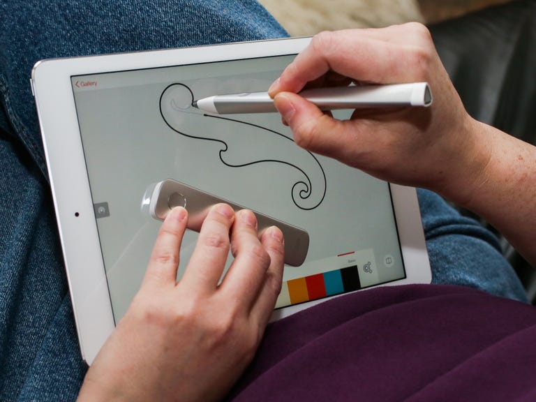
Morphing from the more interestingly named Project Mighty and Napoleon, the Adobe Ink and Slide is the company's first attempt at hardware: a stylus and ruler that work with your iPad , plus a pair of apps that take advantage of their features.
Adobe refers to its Ink pressure-sensitive stylus as a "cloud pen", though in its initial incarnation at least the cloud connection seems rather underwhelming. Ink works in conjuction with Slide, which Adobe describes as a "digital ruler," and strikes me as oddly superfluous. It's almost as if the concept for Slide launched the whole development process, but after discovering it was unnecessary they felt compelled to make it a real product anyway.
It's currently available in the US and UK, among some other regions, but still not Australia. And for now, it's all iOS-only, in part because the overlap between Apple and Adobe fans is fairly large.
More on Adobe Creative Cloud 2014
- Adobe Creative Cloud 2014: It's all about apps and APIs
- Cloud computing gives Adobe mobile apps a power boost
- Adobe Photoshop Mix earns mixed marks
- Adobe squeezes Lightroom into the iPhone
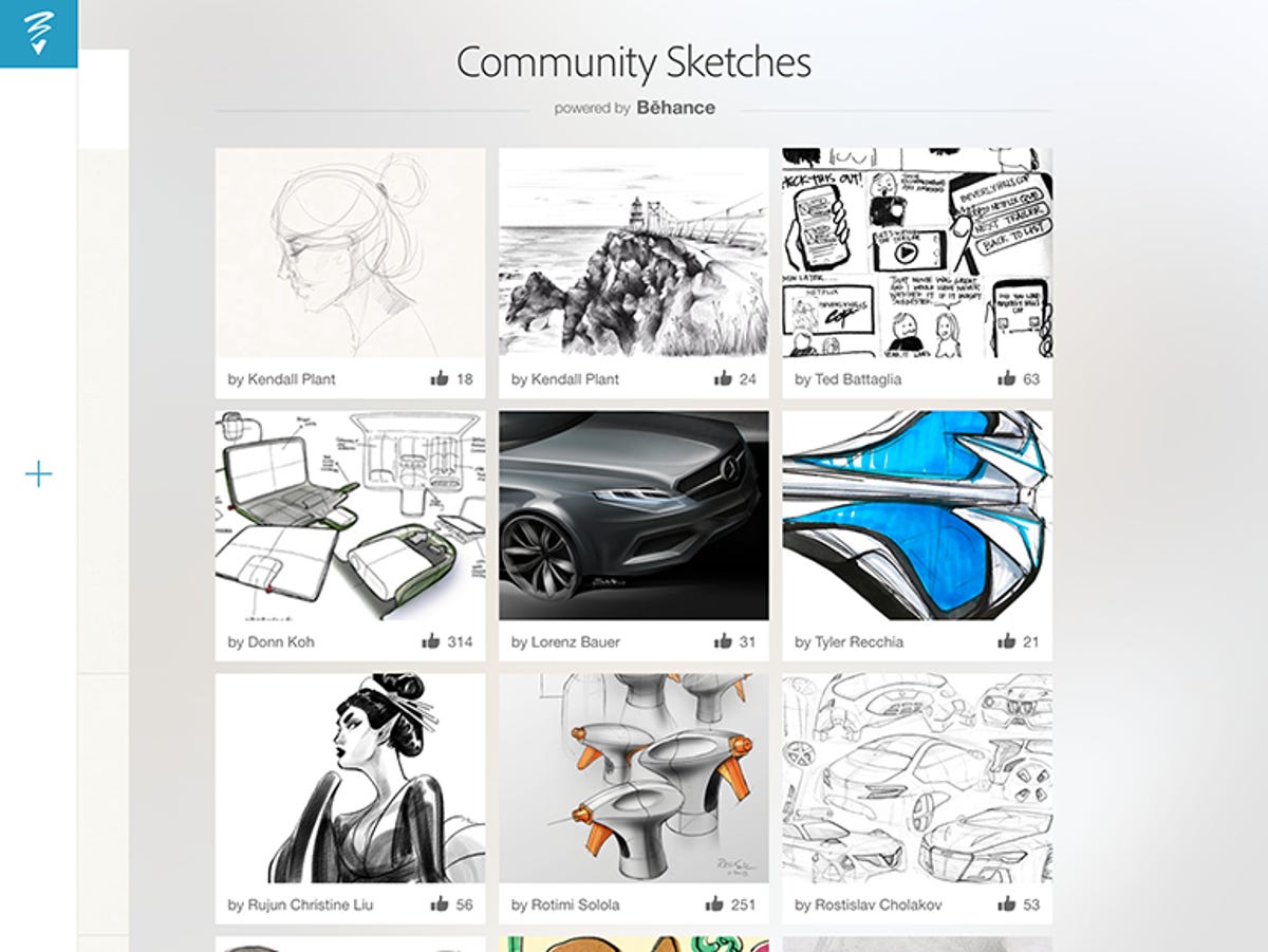
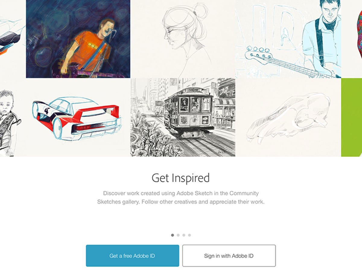
The other half of the Ink and Slide package consists of two apps, Adobe Line and Adobe Sketch, both of which will be available for download -- with a Creative Cloud subscription, free or paid -- and those you'll be able to get outside the US. They're both drawing apps, though Line might be considered more of a technical sketch tool (albeit without numeric precision), whereas Sketch is a creative freehand tool intended for sharing sketches on the online portfolio site Behance.

Note that the hardware is really beside the point for Adobe -- the company doesn't want to be in the hardware business as much as it wants to inspire developers to hook into its software, and by extension, Creative Cloud. For better or worse, it's in the business of selling subscriptions. Ink and Slide are ultimately just proof-of-concepts to attract third-party hardware developers to create tools, along with the launch of Adobe's Creative SDK.
The hardware
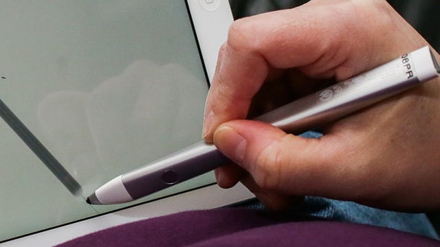
Ink is an elegantly designed, pressure-sensitive stylus manufactured in conjunction with Adonit. (Ink and Slide sales go through its site.) Made of lightweight hydroformed aluminum with a triangular twisted barrel and a single button, flush with the surface, the stylus fit comfortably in my hand. Like the rest, it connects via Bluetooth 4, which limits it to iPads subsequent to the iPad 2 .
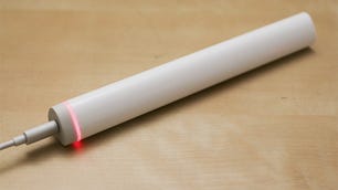
On its end sits an LED that you can program to a custom color to identify your Ink out of the potential crowd of other Inks in your vicinity. Other setup options include palm rejection and a choice from six options to tell the apps which way hold the pen. (The latter is to perform parallax correction to more accurately represent where the tip is onscreen.)
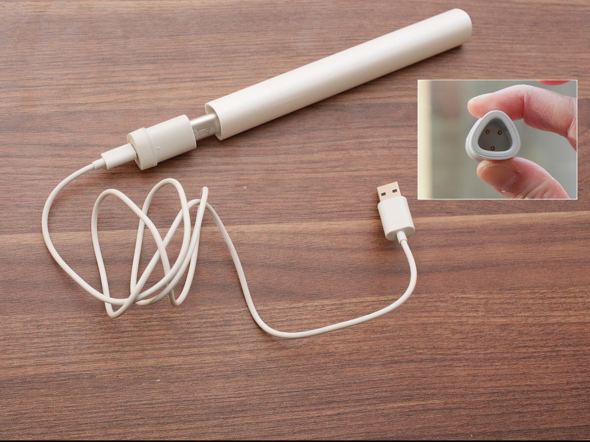
Ink's charger/carrying case is also quite cleverly designed, and when detached from the USB cable intended to be thrown into a bag or pocket. Adobe rates Ink as taking 1 hour to charge and runs for 8 hours of continuous use.
Most iOS styli use either a disc (like the Jot Touch 4) or large round rubberized nub (like the Wacom Intuos Creative Stylus) to combine multiple sensors in order to simulate pressure sensitivity on iOS. Ink's tip has a relatively fine 2mm point that's just a little bigger than a typical Wacom desktop stylus. It makes a big difference in feel -- less friction, more natural -- and feels very much like using a Wacom Intuos stylus.
While only Sketch and Line support pressure sensitivity (for the moment?), Ink will work with any app, with some caveats -- for instance, if you put it down it may go to sleep. But it otherwise worked well in several other apps, such as ArtRage iPad and Autodesk SketchBook MobileX. In fact, TopHatch Concepts actually recognized the stylus as an Adonit Jot.
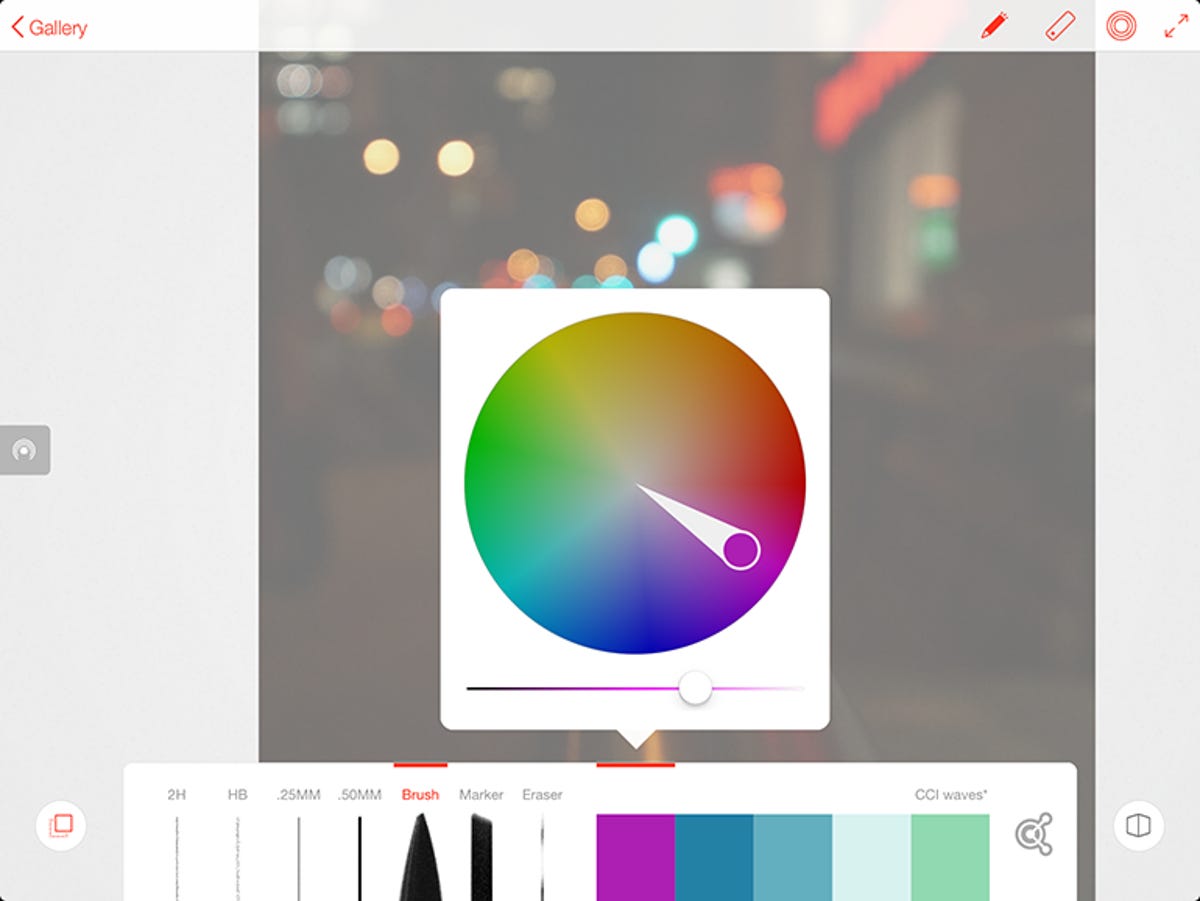
You access a Pen Tip Menu in both apps by pressing the button on the barrel. It brings up your current color/access to Adobe's Kuler; a clipboard (you can copy sketches and drawings to Creative Cloud and paste them between apps); options for the currently selected tool; and sharing options for copying the image to CC, sending to Photoshop or Illustrator, the typical iOS sharing options, and Get Feedback (which really means share on Behance).
The pen tip has a tiny bit of memory to store a link to your account, but you still have to log in -- it doesn't store your credentials, which would be really useful, if insecure. It does store your palm preferences settings, and I successfully accessed one account's clipboard while logged in under another account.
The LED on the back cycles through colors as it's connecting to the cloud. It is kind of cool to use Send to Photoshop or Illustrator and have it magically launch those apps and open the file, though it's sending as a PNG rather than vectors, at least for now.
During testing, the menu was a little wonky -- sometimes it would come up and sometimes it wouldn't, and I had to shut down and reopen the app -- and it couldn't always access the Cloud Clipboard, though that may be an issue with my pre-mass-production evaluation version.
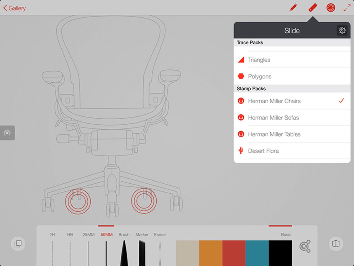
Slide is another story; it's essentially a dumb device, in that all it does is simulate two-finger contact with the tablet. In fact, the Touch Slide feature in both the supplied apps mimics its entire function, which is to summon and control a series of templates, from drawing aids like straight lines and basic geometic shapes (Trace Packs) to placing more complex forms (Stamp Packs) that the app automatically strokes on commit. Slide's button cycles through the various options in a selected Pack; tapping the concentric circles on Touch Slide does the same.
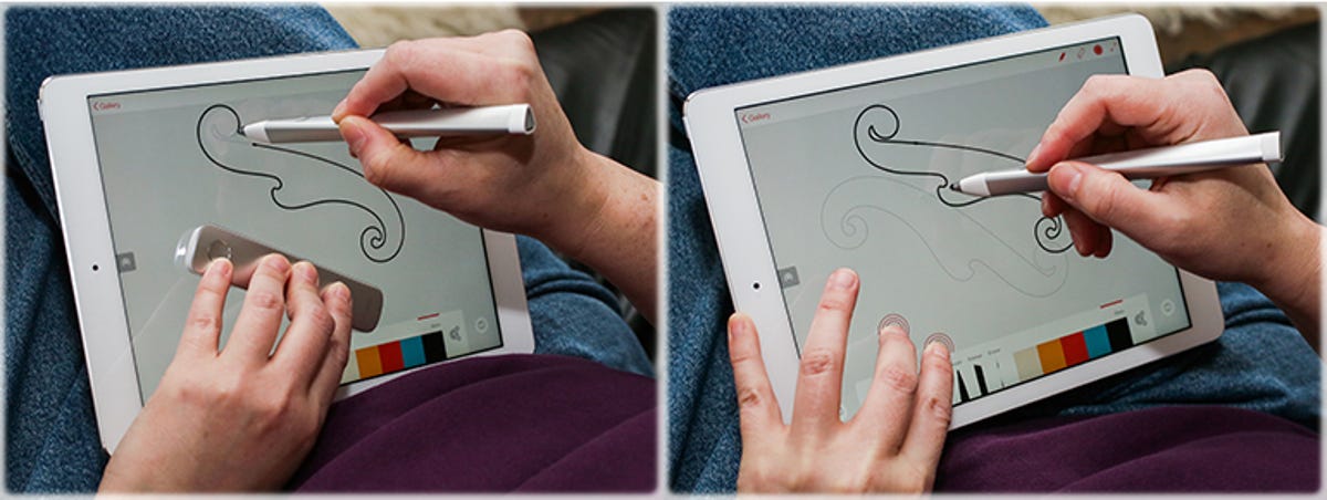
It is true that Slide is a little easier to maneuver than the two-finger shuffle, but it also takes up valuable visual real estate on the drawing surface.
The apps
The apps are exactly what I've come to expect from Adobe's first-generation subscription-driving mobile products: they're somewhat behind the competition for anything that's not cloud-related. There's just enough to be useful, pique your interest, and allow you to create some very nice work, but because they're intended to fold into a product portfolio and an entire service they tend to be more feature-light than competitors.
For instance, neither one of them supports text. With the competitor app Concepts, by comparison, you can buy text support for $2. There's also only one drawing layer, whereas SketchBookX offers multiple layers. Both those apps also offer upgrade paths to more powerful versions.
Given the accusations of desktop-application-bloat historically hurled at Adobe, I can understand the desire to err on the side of lightweight mobile apps. It just feels like the company's product porfolio is becoming increasingly difficult to parse. I'm hoping that when iOS 8 ships and allows for more interconnectedness among apps, the sense of fragmentation may decrease.
Adobe Line
Line is the "precision drawing" app; I put it in quotation marks because it's really just less of a freehand tool than Sketch. The precision aspect comes from the Trace and Stamp packs and the perspective grid. I'd probably call it a technical sketching app.
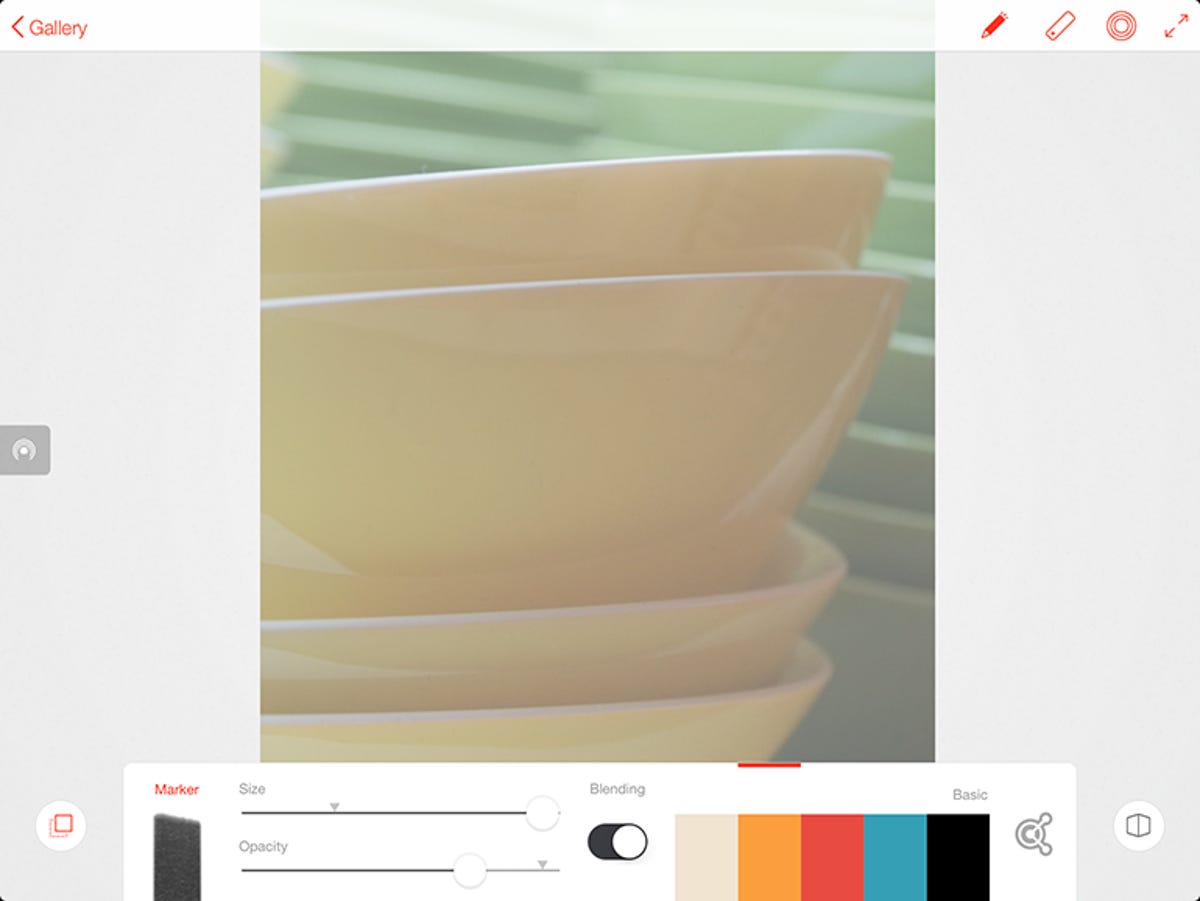
Line organizes your work into a gallery of drawings, which you can name, duplicate and share the same as with the Pen Tip menu. (Sketch is a little different.) In the drawing view, a toolbar along the bottom supplies six drawing tools -- two pencils, two fine-point markers (0.25mm and 0.5mm), a brush and a fat-tip marker -- plus an eraser.
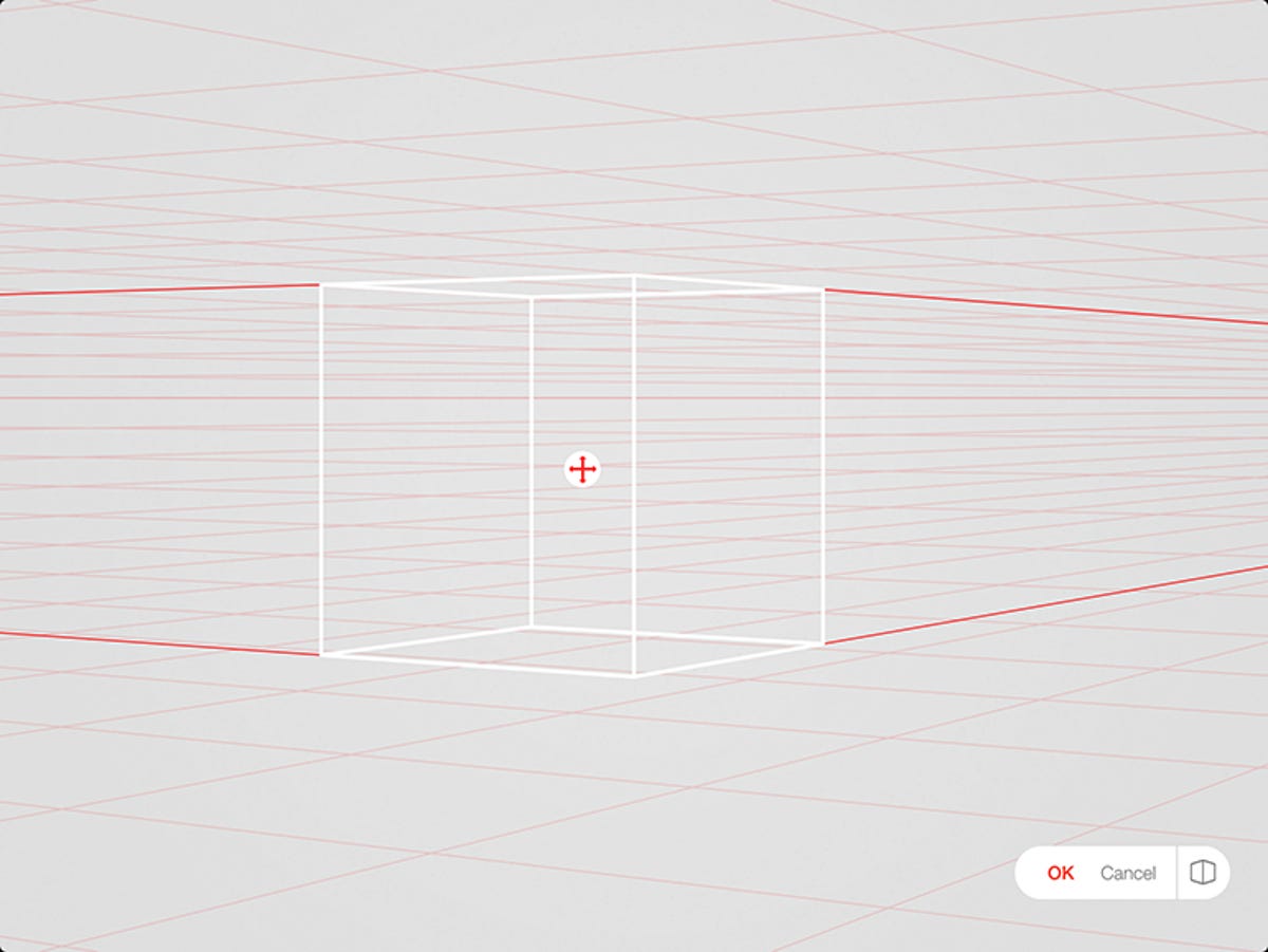
There are six color swatches that you can either pull from Kuler or via color picker, and an icon that pulls up a perspective grid. At the top sits the Touch Slide toggle, the Slide and Trace Packs menu and the pen connection menu. You can also expand into a toolbar-free full-screen mode.
Long-pressing the brushes bring up options for size, opacity and blending; blend off overlays the next brush stroke, but with it on, it seems to perform more of a luminance/hue overlay than a color mix. You can pull in a photo for tracing from either the Camera Roll or your CC files.
I do love the Trace packs -- I have pretty pathetic drawing skills, and the ability to create accurate polygons is really useful. (I'm a polygon doodler.)Tapping on the right Touch Slide control cycles through various polygon shapes. Snap guides pop up for intersection, right angles, parallel lines and so on as you move Touch Slide around the drawing.
In contrast, though, Concepts has a grid and the ability to stroke custom curves; more notable, the Pro version offers Spline editing.
The strokes certainly look and feel pretty natural to draw, both with and without the stylus. Only the brush seems to be pressure sensitive, responding in both density and size, and you have to press quite hard to get the tablet to sense the stroke.
Adobe Sketch
Sketch seems less of a standalone creation tool than an adjunct to Behance. Here, the app organizes your work into Projects, each of which is composed of five sketches by default, though you can add more. That allows you to create variations of a sketch that you can upload as a group to solicit feedback. You can reorganize the sketches within the group, and interact with feedback directly from within the app.
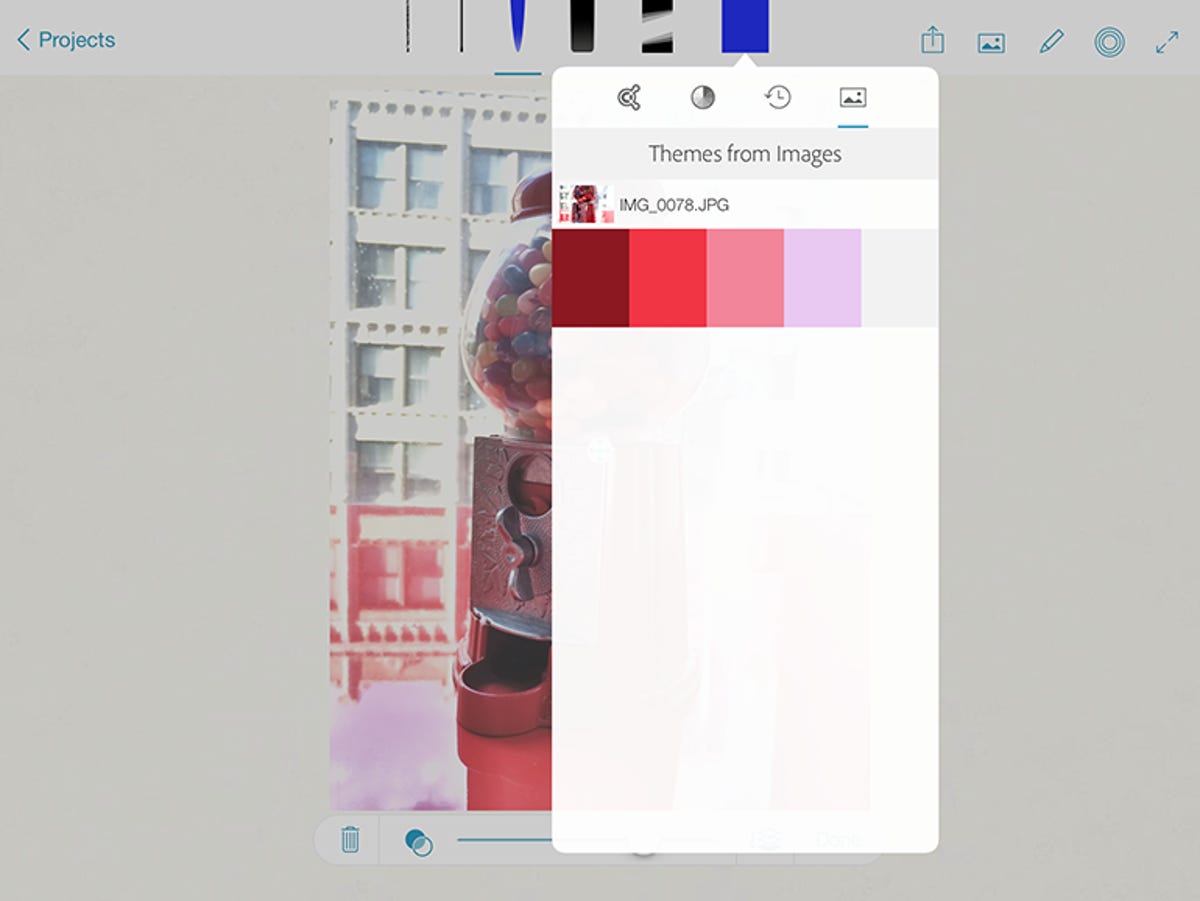
The drawing screen is similar to that of Line, except a more abbreviated toolbar sits along the top. It only has five drawing tools -- a pencil, a fine-point marker (which looks like the 0.25mm), a brush and a fat-tip marker -- plus an eraser. It only shows you the currently selected color, but pressing it brings up access to Kuler colors, a color picker, colors pulled from an underlying image, and a handy color history.
Next to that sits the Share menu, and an icon to load an image -- in Sketch you can pull in from the tablet camera as well as the Camera Roll and your CC files. Unlike Line, the Slide Touch Slide only supports basic shapes -- line, circle, square and triangle -- and photos can be used for collage, not just tracing. You can also expand into a toolbar-free full-screen mode.
The brush and fat marker behave differently in Sketch than in Line. There's more color mixing, the app seems more sensitive to light pressure, and the marker shows increased density when a stroke overlays itself. While Line and Sketch are differentiated by function and color, the interfaces are also slightly different for no apparent reason and in ways that can be annoying if you use them both. For instance, the toolbar runs along the top in Sketch and the bottom in Line.
I also find it bewildering that Line lets you adjust size, opacity and blending settings for brushes and markers, but Sketch doesn't. It would be really useful to be able to, say, at least set a minimum brush size or maximum opacity. I understand that we don't want a single bloated app, but some of the differences seem arbitrary.
There are a couple of potential annoyances with both apps. First, for best operation you have to turn off multifinger gestures in the iOS settings. That's not Adobe's fault -- there's no way, at least in iOS 7, to turn it off selectively within an app. It also decided to run a backup when I launched the app without offering any way to cancel or reschedule.
More problematic, you can't use the apps unless you're logged in to Creative Cloud. Yes, they work offline, but only if you logged into CC before you went offline. Given that CC logs you out after a given period of time, this has the potential to be incredibly annoying for infrequent users. And as I mentioned earlier, I couldn't reliably access the Cloud Clipboard.
Is it worth it?
Here's the thing with the Ink and Slide bundle: essentially, you're just paying $125 for a nice stylus. In contrast, the Jot Touch costs about $100 (£80, about AU$145) and the Wacom Creative Stylus 2 only $80 (£65, AU$100). Granted, Ink is a really nice stylus, but all of the Creative Cloud-related features are replicated in the apps. It really needs to come with, say, a free year of the Photography subscription or have a discounted price for current CC subscribers -- something to make it feel less expensive.
Unless you're a current CC subscriber, the apps are handy but not a terrifically compelling option. The unique and interesting features -- syncing with Photoshop or Illustrator or sharing on Behance -- only make sense if you've got the paid CC subscription, since it requires the CC versions of the applications. A small group of users will probably find that syncing to be the feature they've been waiting for in order to justify subscribing. As simply standalone apps, however, there are comparable or better choices available already.