 Why You Can Trust CNET
 Palm Pre 2 review: Palm Pre 2
The Palm Pre 2 is another fun, feature-packed Pre, but it's hard to get excited about incremental improvements, and you'll be mostly excluded from your friends' app frenzy.
The Palm Pre 2 is a refresh of the Palm Pre that brings us webOS 2.0 -- but that's about as exciting as it gets. Like the Palm Pre Plus, the best we can say about the Pre 2 is that this is a slightly better version of a very good phone. The problem is, does anyone care anymore?
Palm Pre 2
The Good
The Bad
The Bottom Line
Prices for the Pre 2 haven't been released yet, but we'll update this review as soon as they're available. We expect it to be one of the pricier smart phones.
WebOS like a boss
Check out our reviews of the Palm Pre and Palm Pre Plus, because the Palm Pre 2 sticks very close to its tried-and-true recipe. We'll focus on the differences in this review, although none of them are world-shatteringly huge.
The new version of webOS is 2.0, and Palm promises it's faster than ever. The software now takes advantage of the hardware graphic processor to be even more whizzy, and the Pre 2 also doubles the processor speed to 1GHz. It shows when opening apps, which pop up promptly, although there was the occasional pause when we woke up an app that was paused.
Palm's 'deck of cards' feature is still present and correct, which means that if you have several apps open, each is displayed as a large thumbnail on the home screen. You can easily swipe between cards to move between open apps, or swipe a card up towards the top of the screen to close the app.
You can now group cards together so that you don't have to swipe quite so much, and have a pile of cards related to a particular task. The groups also get created automagically. For example, when we opened a link from the Spaz Twitter app (apologies for that name -- we don't condone it, but the app is free and works), it opened in a browser window. Press the touch-sensitive home button to minimise the app to the deck of cards view, and the browser window is shown stacked on top of the Twitter window. You can still interact with them both, and you can manually split up the cards or stack them in a different way.
That said, we think the deck of cards could be more useful on a day-to-day basis if the cards worked more like widgets. It's great to have the option to multitask -- to pause a game while you respond to a text message, for example. But the cards don't work well as widgets that let you keep up to date with Facebook, for instance, without opening the full app. In our straw poll of regular Pre users, people tend to open apps one at a time, as they need them, rather than hold heaps of open apps in their deck of cards.
The Pre 2's menu has also been tweaked so that you can group icons into screens, and add and remove screens, to organise your apps.
The changes are welcome, but we don't think they'll blow your mind with their newness if you've used a Pre before. If not, we think the user interface is fun to use and efficient. Getting around using the swipes and gestures only takes a few minutes to learn, and once you get your head around it, it's easy to use the Pre 2.
Ask and you shall receive
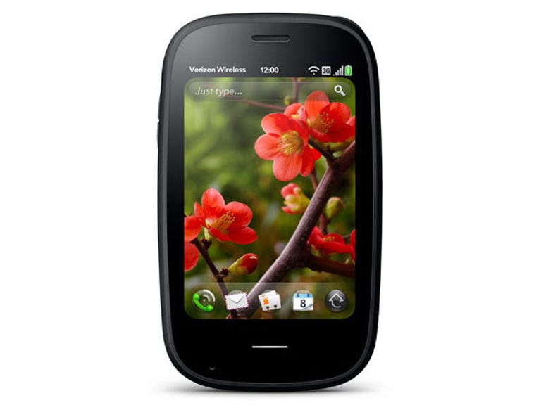
Another improvement we're more excited about is the search feature. Previously known as 'universal search', it's been renamed 'just type', and we can see why. From the home screen, start typing and the option pops up to search the Web, your contacts and other phone data, create a text or email, and plenty more. It's a very handy way to move quickly around the phone's features or find what you want, if you can get into the right headspace. To write an email, for example, you have to think of typing first, rather than finding and launching the email app.
Developers can also write their own search plug-ins. This means you can launch the Facebook website, for example, and search for something from the 'just type' app, along with the built-in search engines like Google. Whether the overstretched dev teams of various sites can be bothered to get around to this, along with writing Chrome extensions, Firefox plug-ins, iPad sites and everything else they're expected to do these days, remains to be seen.
App anxiety
Getting developers on board has been a long struggle for Palm, and its app store has suffered as a result. In our tests, the big players were present -- there's a revamped Facebook app, for example. But there are still plenty of holes -- no official Twitter app, for example. We also missed having lots of great free apps to choose from, since the best selection was in paid apps.
Gettings apps on the Pre 2 definitely made us feel like fourth-class citizens, somewhere behind the bulging sleeves of the iPhone App Store, the wild wonderland of the Android Market, and even the paltry offerings of the BlackBerry App World. There are apps, and some of them are very good, but they are far fewer.
Palm has a few plans to sort out its dearth of apps. First, there's a 'PDK' available that it says makes moving apps onto the Palm easier -- apparently Angry Birds was ported in 48 hours. Secondly, Palm promises its recent marriage with HP will release a bag of money to throw at developers. We have our fingers firmly crossed that the App Catalogue will soon see an influx of goodies, but in the meantime, be aware that if you fancy the Pre 2, you may have to shell out a few pounds for the best apps, and you may not always get what you want.
More juice is loose
One of the Pre's biggest drawbacks was its paltry battery life, and that seems to have improved with the Pre 2. When we tested the phone with a number of cards open and Twitter, email and Facebook all polling for regular updates, we still got a day and a half of use out of the handset.
Plus, the inductive back panel required to take advantage of the wireless Touchstone charger is included on the Pre 2, although you'll stuill have to pay extra for the Touchstone itself.
There's not much else to tell you in terms of hardware, except that the curved plastic screen has been replaced by a flat glass one. We liked the pebble-like roundness of previous Pres, but the new look is also fine. The slider mechanism has been rejigged to be less floppy, although it still doesn't feel like the snappiest hinge we've used. The camera has also been bumped up to 5 megapixels, with an LED flash.
Flash, bang, whallop
The Pre 2's Wi-Fi support and great Web browser makes for accurate, fast surfing. The phone had no trouble rendering sites correctly and quickly, and if you can't find the apps you want, you won't have any trouble getting your shizzle done in the browser instead.
Flash support is new to the Pre 2, and in our tests it worked fine. It doesn't feel as well thought out as Flash on Android, though. For example, we sometimes struggled to activate the controls on a Flash video and then move back to interacting with the page outside the video. There didn't seem to be an elegant way to switch to full-screen, either, which is an easy move in Android.
We were also sorry to see that (at the time of reviewing) the BBC iPlayer website doesn't support the Pre 2, so even though you can watch the Flash videos, you can't get at them. There's no iPlayer app, either, so you'll miss out on that benefit of your TV licence.
Despite being only 3.1 inches, the screen is sharp and easy to read, and we didn't feel cramped even after getting used to the huge real estate of the HTC Desire HD. That makes the Pre 2 a good choice for anyone who's avoiding the recent crop of giant phones and looking for something more pocket-friendly.
The slide-out Qwerty keyboard is also as good as ever, which makes the Pre 2 excellent for emailing.
Conclusion
The Pre 2 is more of the same from Palm, but that's not necessarily a bad thing. Like previous Pres, this phone is fast and fun to use, with a finger-friendly and beautiful user interface that's had plenty of little improvements. The problem is that while Palm is polishing the Pre, other manufacturers are firing out amazing Android phones like a gattling gun of goodness, and the iPhone App Store continues to bestride the world of tiny programs like a clickable collosus.
We love the Palm Pre 2's smooth, elegant package of smart phone fun, but if you go down this road, you go almost alone. If you can handle that, you won't be disappointed with the Pre 2, but get ready for some lonely nights down the pub while everyone else is swapping app chat.
Edited by Emma Bayly