Twitter redesigned its website to make it easier for you to navigate
Get ready for a new look on desktop.


- 2022 Eddie award for consumer analysis
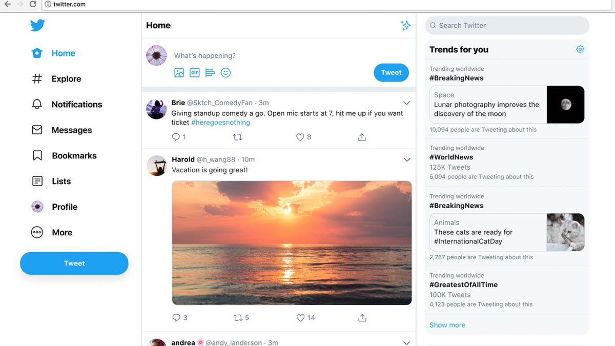
Twitter's redesigned website.
The Twitter website you once knew will soon be a thing of the past. The tech company said Monday that it redesigned its website to make the social network easier for users to navigate.
The new desktop look starts rolling out globally today. Twitter tested different layouts for the site this year and settled on this one after receiving thousands of responses from users.
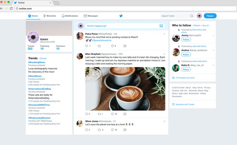
This is how Twitter's website looked before the redesign.
The updated website includes more white space and less grey. Your tweets are still displayed in the middle of the page. On the old website, tabs for Home, Moments, Notifications and Direct Messages were at the top. Now shortcuts are on the left side and include tabs for bookmarks, lists, and your profile. The site's Explore tab, which features curated tweets and hashtags, will include more live video and personalized local content for users, according to the company.
Trending hashtags are now on the right side instead of the left. Twitter also tweaked direct messages so users can see conversation threads from other users and send messages from the same page instead of having to switch to another screen.
The company said it's giving users themes and color options for the website along with two choices for dark mode. One version, called "Dim," has a blue-gray background. The other option, called "Lights Out," turns the background to black.
Twitter, which has 330 million monthly active users, has struggled to attract more people to use the site. Conversations on Twitter can be tough to follow especially when a flood of people are commenting at once. The company has also faced criticism that it isn't doing enough to combat bullying and harassment but is trying to be more proactive about flagging those tweets.
Now the company will have to wait and see if their redesign entices users to stay logged into the site.