Nokia unveils new typeface, Pure
World's largest phone maker unveils a new, more rounded font dubbed Nokia Pure for mobile and digital environments that's designed to deliver "pin sharp" legibility.
Nokia Sans, one of the most familiar typefaces worldwide and a brand recognition money can't buy, is about to become irrelevant. The world's largest phone maker has unveiled a new font dubbed Nokia Pure for mobile and digital environments.
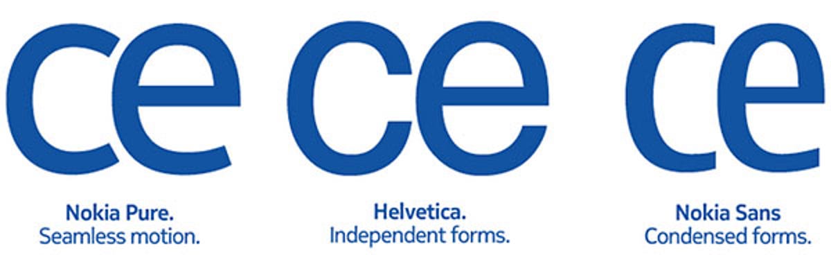
"Logically enough, the starting point for our brand new typeface, Nokia Pure, was also on-screen legibility at small sizes--although now we're talking about the pin-sharp color screens of contemporary smartphones," Nokia said in a blog post on its Brand Book site. "At the same time, we also needed a recognizable corporate typeface, versatile enough to work well in all manner of different environments--from other screen-based formats, to a whole host of printed materials."
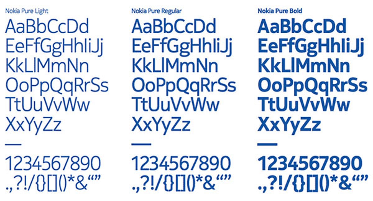
Based on the concept of a seamless and fluid motion, the Nokia Pure typeface comprises rounded letters without serifs that "flow into each other" to create an impression of forward movement. The font was developed by Nokia together with London-based typographic designer Bruno Maag, who is the founder and managing director of Dalton Maag. A short film called Pure Reversal," which features a woodblock version of the typeface, has also been produced by graphics design studio Build.
The new font will come in three weights: light, regular, and bold. These are designed to deliver "pin sharp" legibility on screens. The new branding--which is also supposed to create a sense of harmony between the different divisions of the Finnish outfit--will appear on billboards and devices this year, according to Nokia Conversations.
(Source: Crave Asia)