Microsoft squares off with new logo
Out with the old, in with the new -- logo, that is. As Redmond gets ready to unleash Windows 8 and a wave of other new products, it does a little design housekeeping.


- 30 years experience at tech and consumer publications, print and online. Five years in the US Army as a translator (German and Polish).
Microsoft has a brand-new logo to go with all the brand-spankin' new products it's got coming this fall.
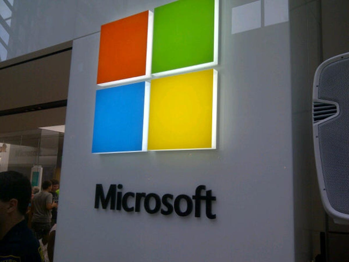
The new design uses the long-standing Windows logo as its starting point, but gone are the wavy edges of that older look. The graphic element of the new logo is one squared-away image: the colors remain the same, and in the same order, but now they're enclosed in a square box. Equilateral sides, 90-degree angles, ta-da!
Overall, the updated logo is both the colorful graphic at the left and the newly refonted "Microsoft" to the right.
The change isn't coming at any old time for Microsoft. The company has a serious spate of major product releases coming up this fall, including Windows 8, Windows Phone 8, and the Surface tablet -- "one of the most significant waves of product launches in Microsoft's history," the company says today in a blog post:
It's been 25 years since we've updated the Microsoft logo and now is the perfect time for a change. This is an incredibly exciting year for Microsoft as we prepare to release new versions of nearly all of our products. From Windows 8 to Windows Phone 8 to Xbox services to the next version of Office, you will see a common look and feel across these products providing a familiar and seamless experience on PCs, phones, tablets and TVs. This wave of new releases is not only a reimagining of our most popular products, but also represents a new era for Microsoft, so our logo should evolve to visually accentuate this new beginning.
It's surely not a coincidence that the new Microsoft logo has the same sort of tiled look (formerly known as the Metro style) that characterizes Windows Phone and Windows 8.

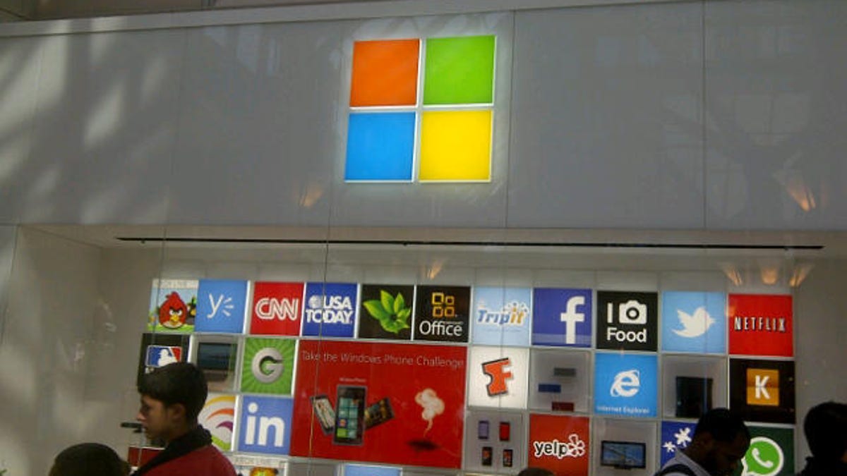
The new logo is already appearing at three Microsoft retail stores: in Seattle's University Village; in Bellevue, Wash.; and in the Boston store, where CNET's Jim Kerstetter got some snapshots of it this morning. It'll appear in other stores over the next few months, and in the company's television ads globally. It'll also, of course, grace Microsoft.com.
The old logo may linger in some places for a while. "Fully implementing a change like this takes time," the company says.
For you font fanatics out there, the lettering in the "Microsoft" portion of the new logo (see the video below) is known as Segoe.
Update 9:13 a.m. PT: A reader helpfully points out that the new-font "Microsoft" made an early showing a few weeks back on the company's latest keyboards and mice.