LCDs, used for controlling stereos and navigation, are relatively recent additions to car dashboards, and their interfaces often lack much in the way of design. We take a look at current interfaces from all major car makers to see who is doing it right, and which ones need work. In our roundup, we start with the worst and work our way through to the nicest-looking and most useful interfaces.
Wayne Cunningham
Wayne Cunningham reviews cars and writes about automotive technology for CNET's Roadshow. Prior to the automotive beat, he covered spyware, Web building technologies, and computer hardware. He began covering technology and the Web in 1994 as an editor of The Net magazine.
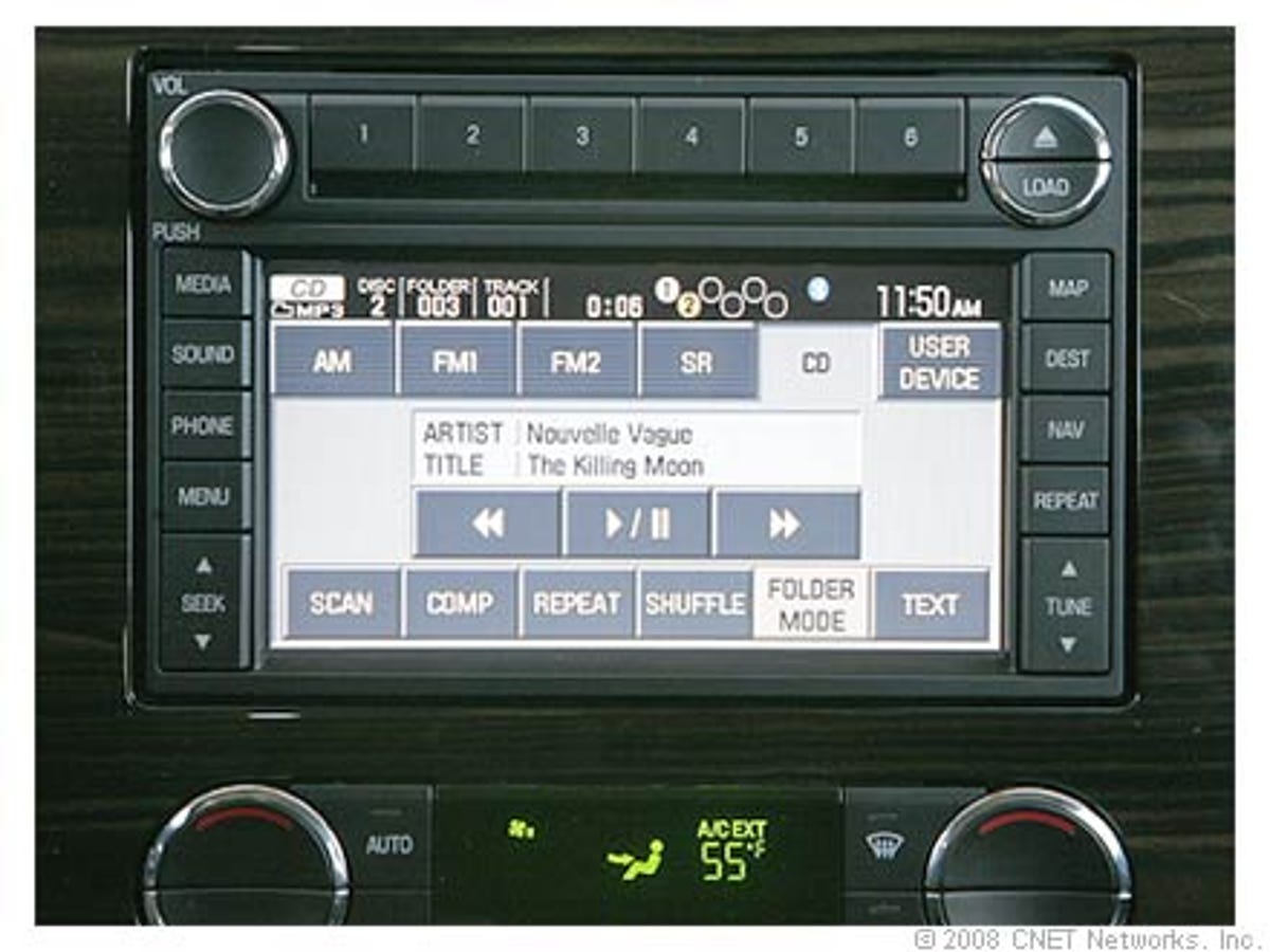
Ford uses this same interface across Lincoln, Mercury, and Ford-branded cars. While the touch screen is functional and the buttons are easy to hit, the whole thing is ugly. The buttons don't need to be that big and we don't like the color scheme. It is also odd to see the same interface in a Ford and a Lincoln. Fortunately, the upcoming Lincoln MKS gets a different and aesthetically designed interface.
2 of 17 CNET Networks
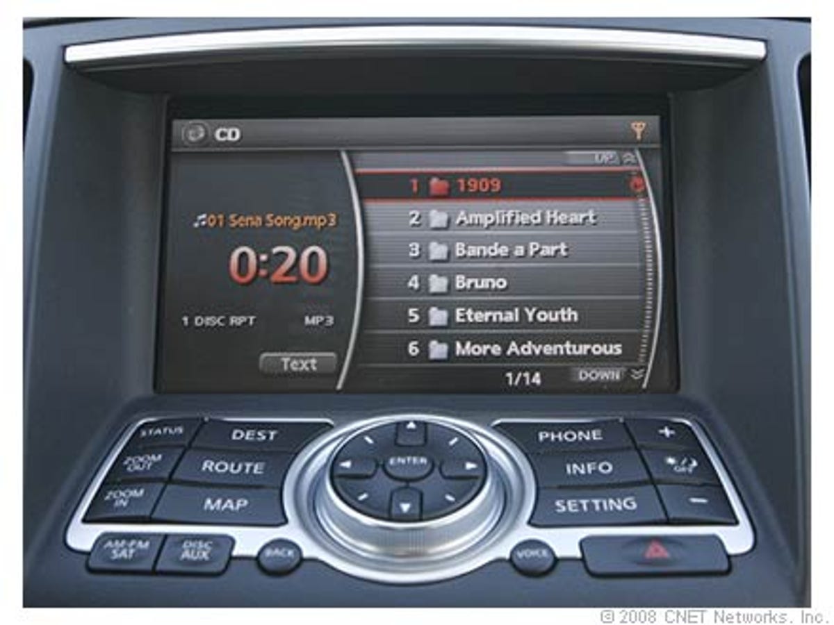
Infiniti uses a very distinct design that we like with nice, solid fonts. It is not entirely intuitive, though, and you have to press the Text button to see song names.
3 of 17 CNET Networks
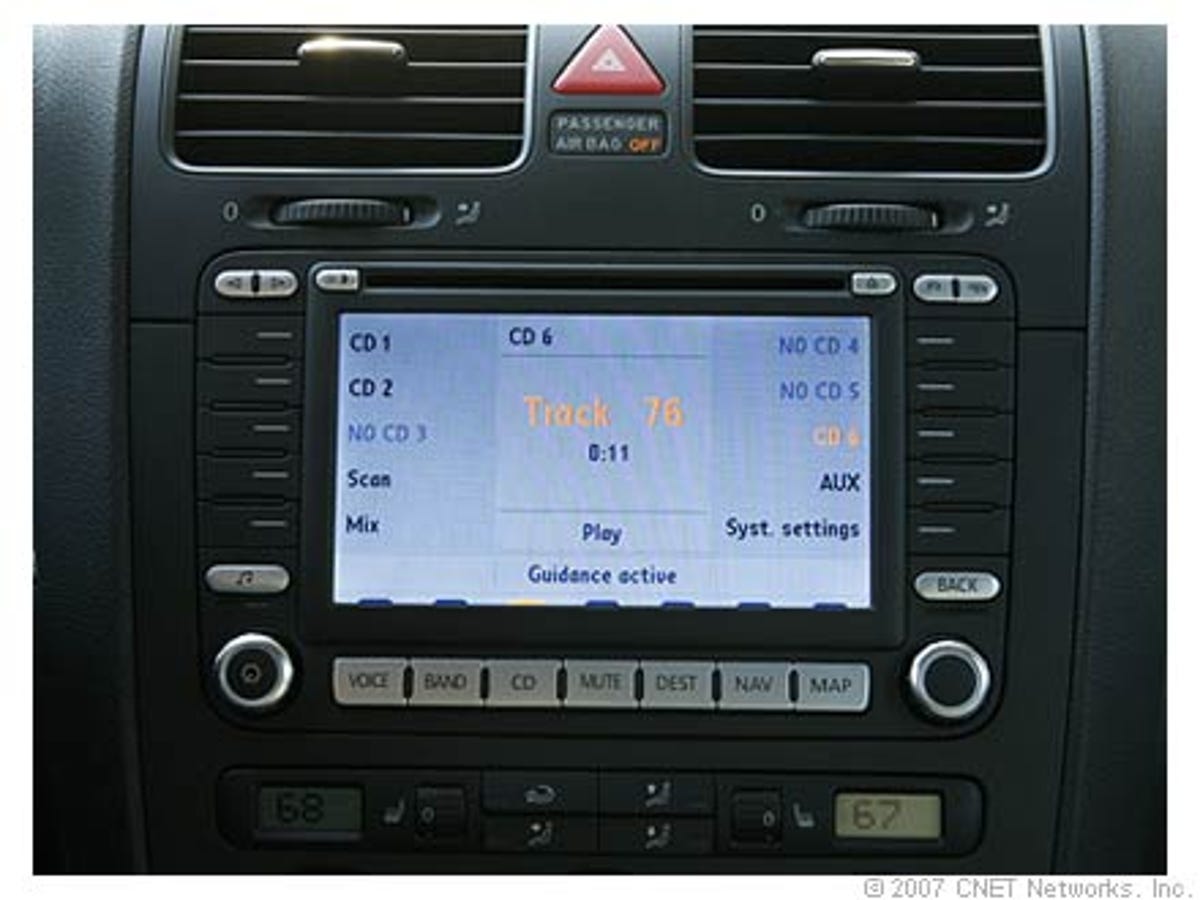
Volkswagen's interface, seen here on the R32, uses a similar color scheme and button structure as the low-end one from Mercedes-Benz. With this one it is almost more difficult to see which labels correspond to which buttons.
4 of 17 CNET Networks
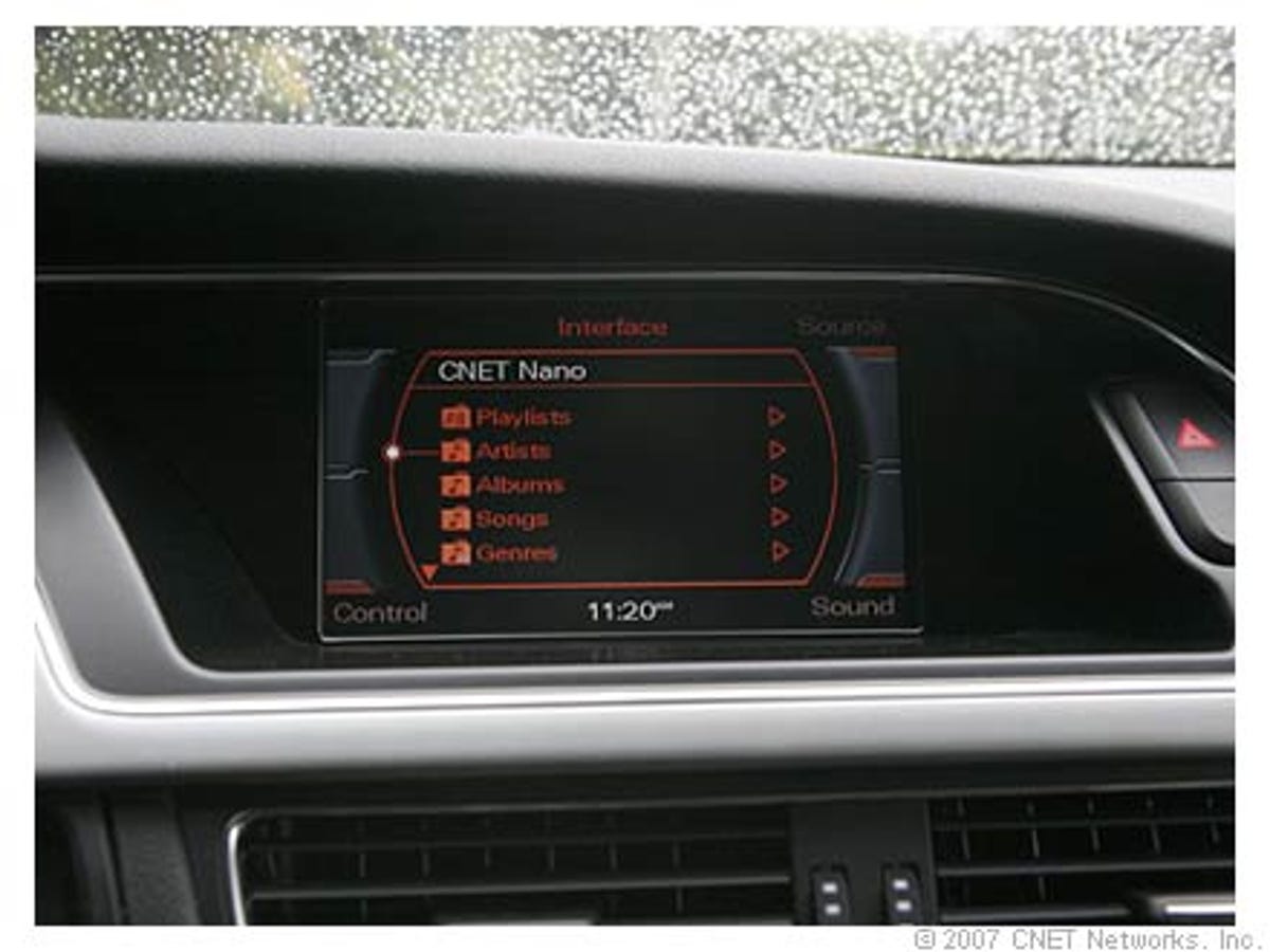
Audi's interface is very different, and color codes the various functions. For example, the text is amber if you are looking at music, and green if you are choosing a contact from your phone.
5 of 17 CNET Networks
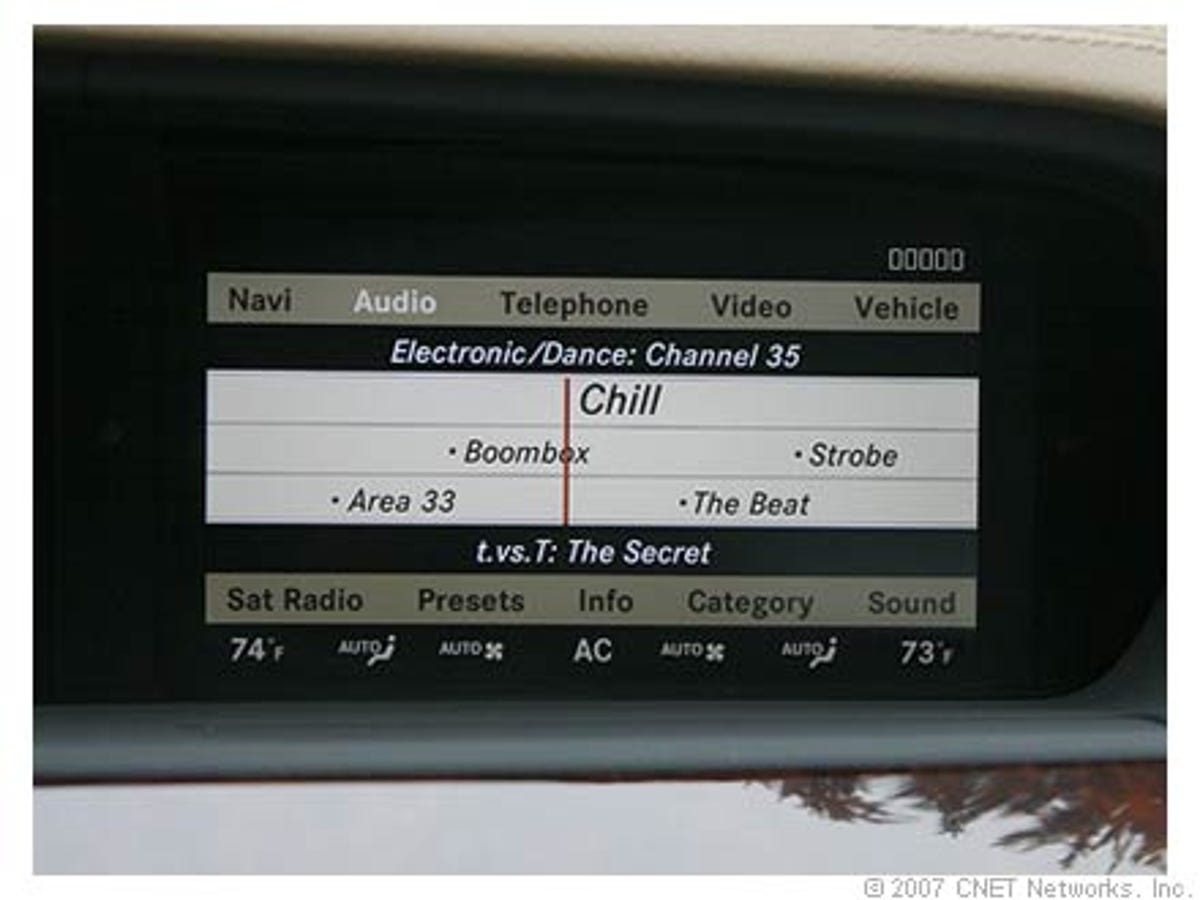
Mercedes-Benz offers this much nicer interface, with its refined color scheme and high-resolution LCD, in its more expensive cars, and, strangely enough, in its low-end sedan, the C-Class.
6 of 17 CNET Networks
Mercedes-Benz uses this interface in most of its low end cars, meaning those that cost less than $100,000. We don't care for the color scheme and the button structure isn't very intuitive. Mercedes-Benz doesn't use a touch screen. Instead, on-screen labels let you know what the buttons on the bezel do.
7 of 17 CNET Networks
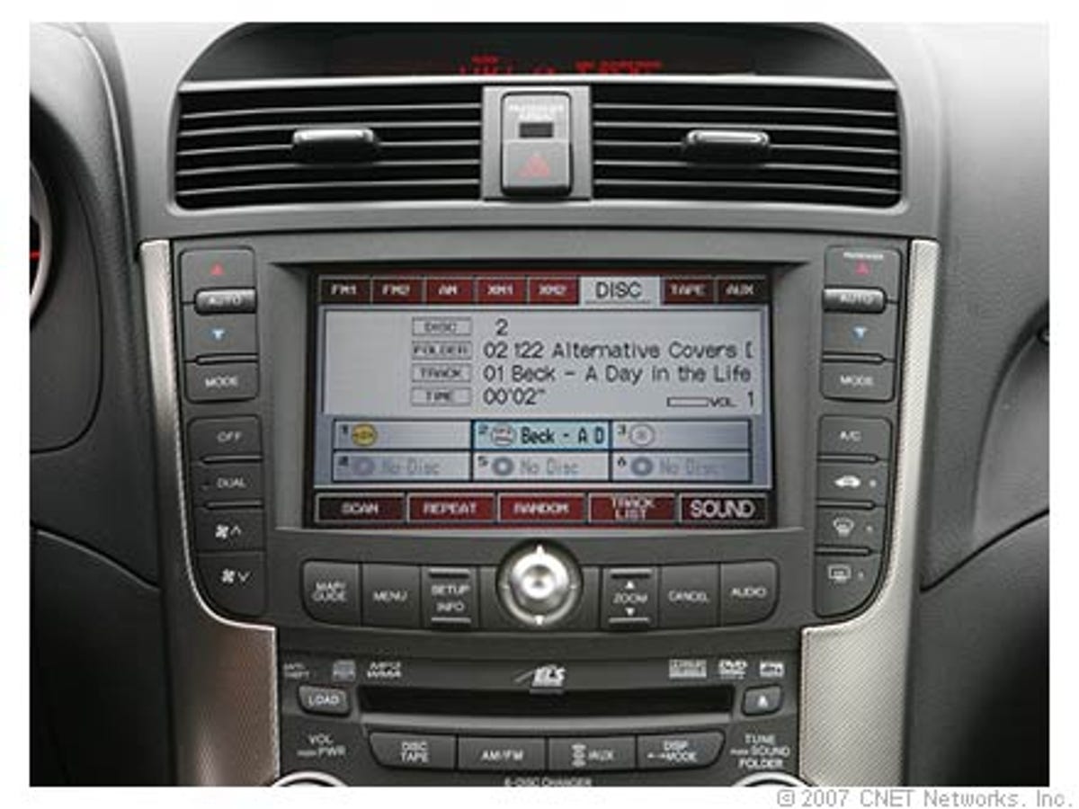
We like the touch screen on Acura's interface, along with the buttons on the upper and lower part of the screen. But the text in the middle is very bare.
8 of 17 CNET Networks
Honda's latest interface uses a similar structure as in Acura cars, but the look is different. We like that Honda pays attention to brand differentiation at this level. The styling is good with this interface, although the text comes off as a little bare.
9 of 17 CNET Networks
The CTS interface uses a similar structure to GM's standard interface, but for the new CTS, the company gave it a different look, something we hope happens throughout the automaker's brands.
10 of 17 CNET Networks
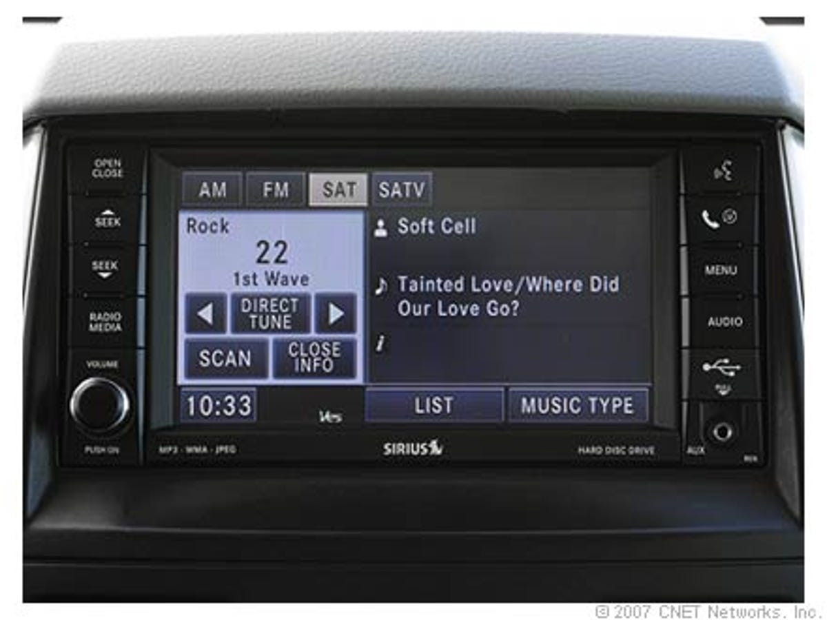
The interface for the MyGig system, found in several Chrysler cars isn't too bad. The touch screen is easy to use and we like the split screen. However, the styling is spare, and you get the same interface in a Chrysler, Dodge, or Jeep.
11 of 17 CNET Networks
Toyota's new interface design, which we saw in the new Highlander, uses nicely styled buttons. Unfortunately, its fonts are a little thin.
12 of 17 CNET Networks
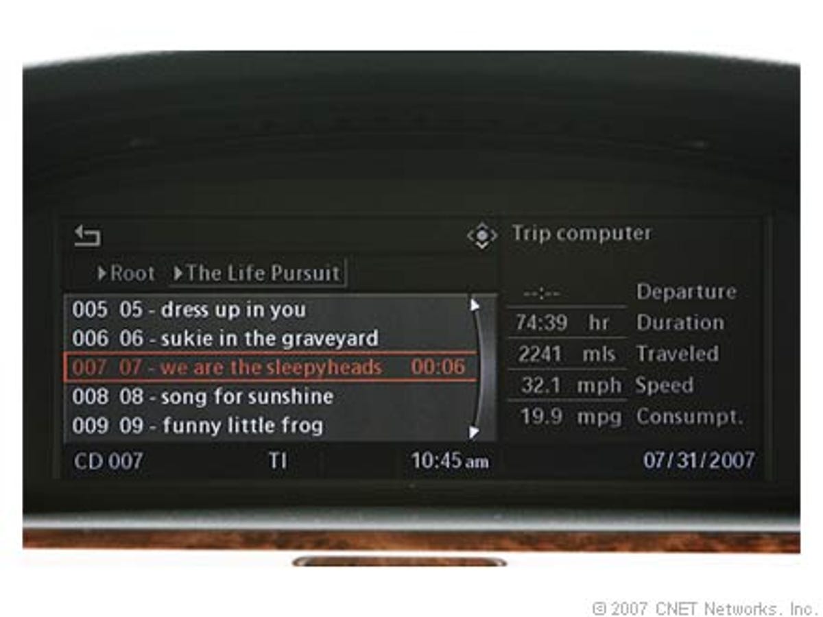
BMW offers a split screen in its interface, in this instance showing music in the main area and trip information in the smaller screen. The look is somewhat spare, but it is straightforward, with nice, readable fonts.
13 of 17 CNET Networks
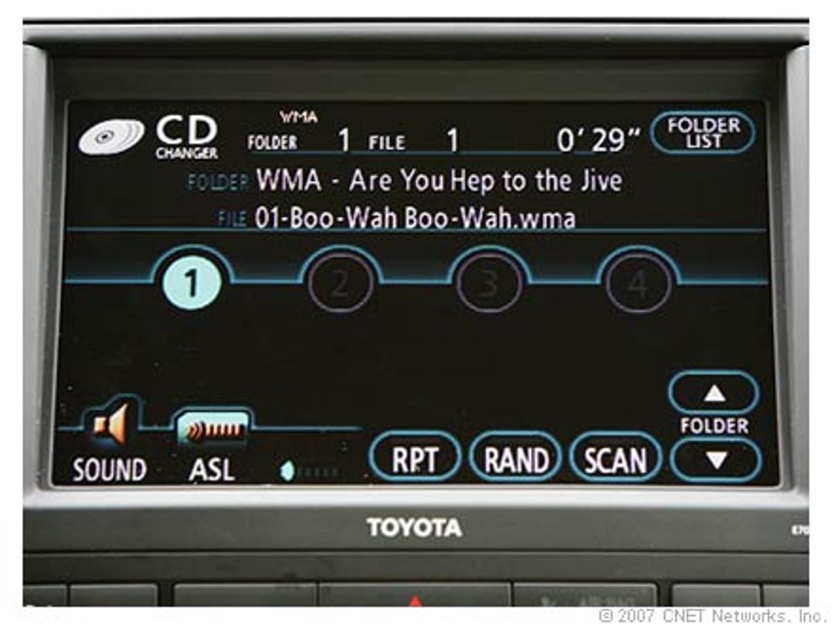
Subaru uses a touch screen, which works well enough. But the styling on this interface is horrible. The font for folder and file name looks like something an engineer hastily put in place.
14 of 17 CNET Networks
Lexus was a pioneer in offering an aesthetically pleasing interface, and the touch screen is very functional.
15 of 17 CNET Networks
GM's interface is nicely done, with a good, deep color and a convenient tabbed design for easy access to different functions. But we think GM could have better brand differentiation, as we've seen this same interface on everything from a Cadillac Escalade to a Suzuki XL7 (built for Suzuki by GM).
16 of 17 CNET Networks
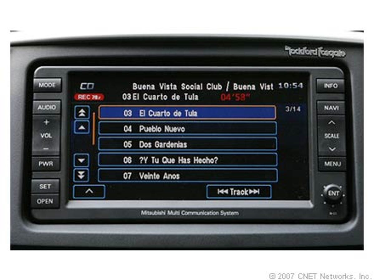
Mitsubishi uses nicely curved buttons in its interface, and the color scheme works. However, the fonts lack style.
17 of 17 CNET Networks
Jaguar launched this new, flash-based interface with its XK. We like the curved buttons, but the colors seem haphazard and the fonts are a little thin.