Design Review: Motorola Droid
The Droid smartphone is a departure from competing models, but it's not an altogether successful effort. Here's why.
Heavy Duty
The feel of the Droid is anti-elitist. If the the iPhone is designer hip, the Sidekick inner-city hip, and the Blackberry corporate hip, the Droid is everyman hip. That's where many of the strongest American brands, from Ford to Google, have positioned themselves.
The Droid strikes me as a hefty American product designed by Midwesterners for American users. Its weight means it's fine if you're wearing jeans, but it's too heavy to tuck in a fat-cat's suit jacket. It has an industrial-grade feel, with the aesthetics of a consumer product. In Europe or Asia, the Droid would probably be regarded as the Hummer of touch-screen phones. The Droid plays to Motorola's roots as a manufacturer of heavy-duty radios for police and the military.
Got a comment? Leave it in the Design Review blog post.
Text: Gregor Berkowitz/MOTO Development
Slow touch
We do not think the lagginess is a computing problem. The Droid is built around the same Texas Instruments OMAP 3430 processor used in the Palm Pre. It's an advanced processor, more powerful than the one in the newest iPhones. In other areas, you can feel the Droid's raw power. Launching apps, for example, happens very fast.
The lagginess is instead an example of how much work is required to make hardware that works smoothly with the Android operating system. Specifically, this is an input interpretation issue. After receiving a touch signal on the screen, the device in effect waits to understand what the user wants to do next. On the Droid, a touch almost always means "select." Then there's a delay to verify that you indeed intended to "select," as opposed to, say, "scroll," which is the default touch assumption on the iPhone.
Text: Gregor Berkowitz/MOTO Development
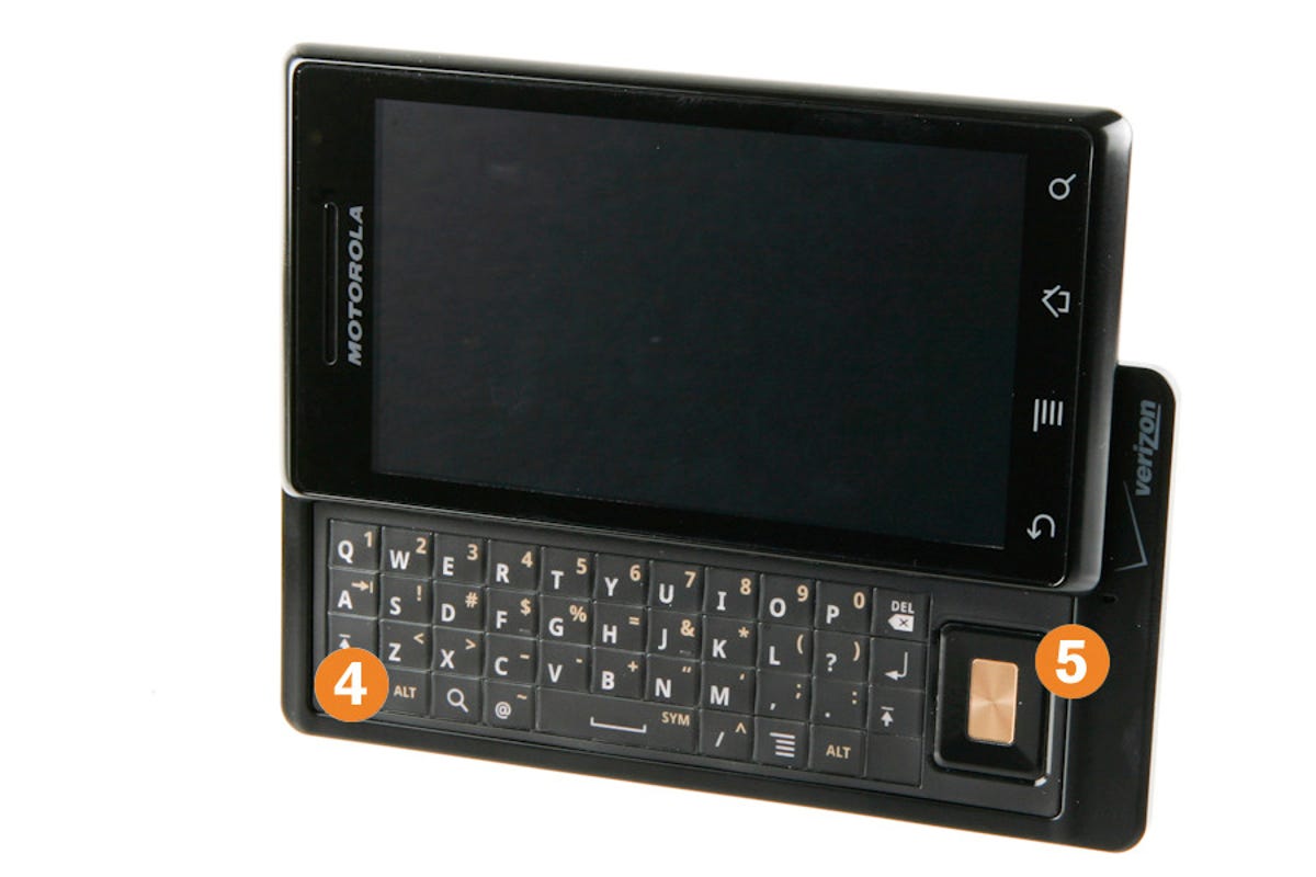
Lost in the flats
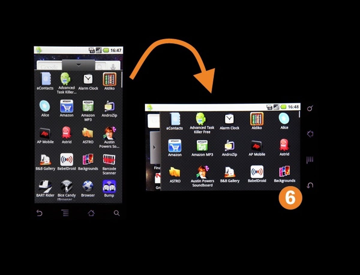
To reveal the Droid's keyboard (4), you slide the touchscreen up. The slide feels a little too stiff, with a firm click when the screen moves fully up or down. Still, stiff and robust is much better than light and flimsy. It's satisfying and solid, just what you'd expect from Motorola.
At first glance the keyboard is great. Personally, I prefer a physical keyboard. The iPhone's touchscreen keyboard means I keep my written engagements to one or two sentences, because it's just too much work to type more -- the iPhone was clearly designed to be a consumer-oriented browsing device. The Droid is meant to be more of a full-featured device, so it gets a full keyboard.
Unfortunately, the Droid's keyboard is flat, with no physical texture. This keeps the product thin, but you can't touch-type with a flat keyboard, which largely defeats the purpose of having one at all. From a development perspective, this kind of trade-off is very challenging. These kind of decision gets made very early in the product-development process, and once set it becomes very hard to change without slipping beyond the product's target release date.
Otherwise, the keyboard's navigation pad (5) is interesting, and with practice it's nice to navigate without moving your hand to the touchscreen. But Android doesn't have a cursor in its onscreen menu mode, so Motorola had to hack BlackBerry-like functionality in with the navigation pad. While this is a solid hardware decision, Android lacks the user-interface cues which make the touchpad (or the Nexus One's scroll-ball) intuitive. Motorola is working hard to improve usability, but there are constraints when the hardware manufacturer does not make the software stack. Since Android is open-source, Motorola could have, theoretically, added a mouse cursor to Android. But that major change would almost certainly have delayed the product's release.
Text: Gregor Berkowitz/MOTO Development
An awkward hardware handshake
Tuning the hardware to work with the software is the key to delivering the kind of clean experience that is so much a part of a device like the iPhone (which is intentionally pared back to limit complexity) or the BlackBerry (which is tuned to simplify the task of reading and responding to enterprise e-mail), or the Nexus One (which offers an excellent touch-screen interface, without a physical keyboard). The areas where Motorola decided to focus -- things like the physical hardware and the overall feel of the device itself -- show Motorola's strong roots as a device maker. Motorola packed the Droid with lots of features, which is great, except that it makes the task of tuning the details much more challenging and time-consuming.
Text: Gregor Berkowitz/MOTO Development
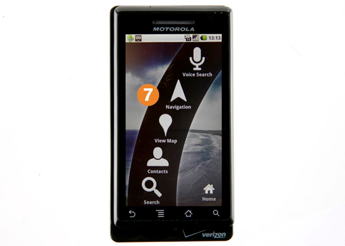
When less is more
The Droid's Car Mode feature is a more interesting idea. Car Mode is a simplified interface (7) with enlarged icons that's designed to help motorists keep their eyes on the road while driving their cars. In general, we love touch-screen devices because they are so engrossing -- they engage all of the user's visual and physical focus. But that same quality creates real problems when the user is supposed to be doing something else, like driving. It's simply impossible to touch dial or navigate menus without looking at the screen, but that's not good when you're operating a vehicle. Car Mode provides an interface that is simpler to use, and it also makes easier to get your fingers in the right place quickly and efficiently.
Car Mode is definitely easier to use, but it also points to a larger problem that we'll hear plenty more about in the years ahead -- the dangers of using touch interfaces in dynamic, multitasked environments.
Text: Gregor Berkowitz/MOTO Development
Back to Branding
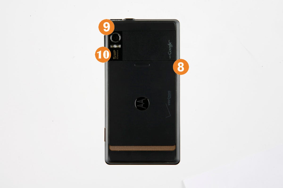
The camera (9) has 5 megapixels with autofocus. Looking just at the camera hardware, the components Motorola picked are nice. The autofocus module and imager are quite good, but the image tuning (which happens in software) isn't quite there yet. Despite the good hardware, the pictures taken on the Droid look as if they were taken with an old cameraphone, with a lot of grainy noise and poor coloration. Meanwhile, the Droid has a flash (10), but it doesn't do very much. It's basically a "party flash" -- a fun effect, but you can't generate enough power with an LED to make much of a difference in a real low-light environment. Chalk all this up as another instance of the Droid offering an impressive list of features, but clearly revealing itself as a first-generation product.
Text: Gregor Berkowitz/MOTO Development
A rush to market
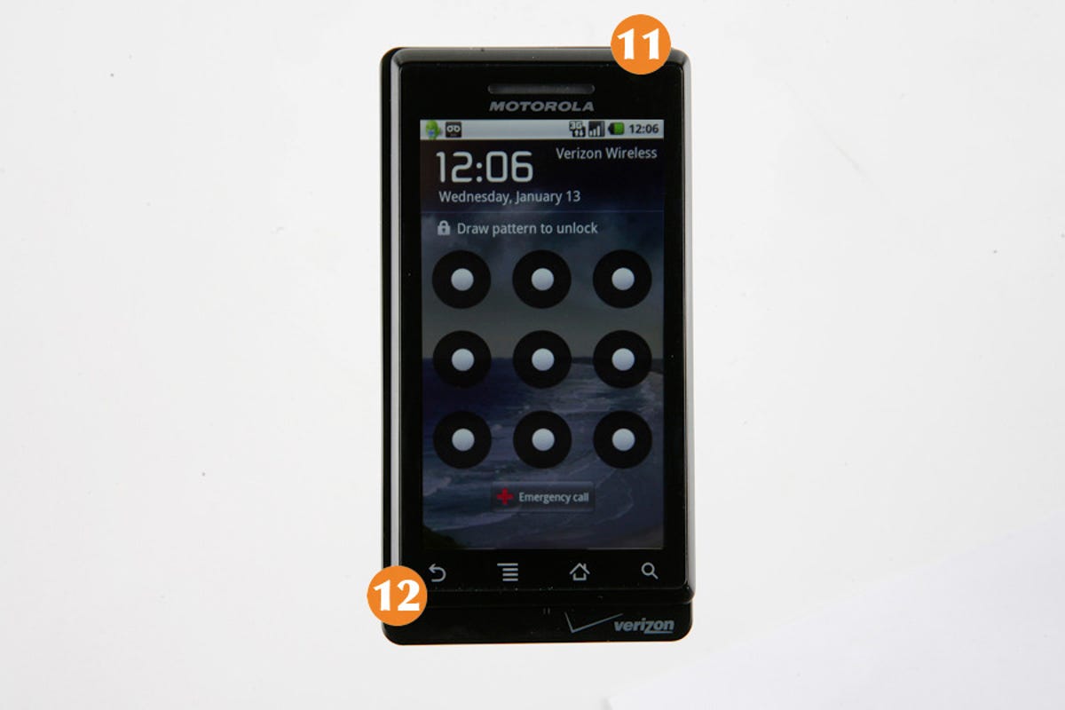
Little things added up. For example, to wake the Droid from sleep, you have to either hit the button on the top (11), or open the keyboard. Neither action is particularly obvious. So why is it designed that way? The buttons on the front of the Droid (12) are actually part of the touch screen, and the screen shuts off when idle to save power. That means those buttons are inoperative until the phone is re-awakened. There's a technical logic to this, but it's hardly as intuitive as, say, hitting one button smack in the front of the screen, as on the iPhone. Striking the right balance between power optimization and user experience is a struggle that requires time and iteration to get right.
There's also a glitch in the design of the battery cover: It slides off rather easily, and you tend to open it naturally with your fingers as you seek leverage to open the screen.
These issues are indicative of a first-generation product. Now that the product has shipped successfully, Motorola has time to refine and iterate. There's a lot to like about the Droid's design, but I suspect there will be much, much more to like about the Droid 2.0.
Got a comment? Leave it in the Design Review blog post.
Text: Gregor Berkowitz/MOTO Development

About the author
More Galleries

My Favorite Shots From the Galaxy S24 Ultra's Camera
20 Photos
Honor's Magic V2 Foldable Is Lighter Than Samsung's Galaxy S24 Ultra
10 Photos
The Samsung Galaxy S24 and S24 Plus Looks Sweet in Aluminum
23 Photos
Samsung's Galaxy S24 Ultra Now Has a Titanium Design
23 Photos
I Took 600+ Photos With the iPhone 15 Pro and Pro Max. Look at My Favorites
34 Photos
