Flickr goes wider, gets faster with redesign
In a move to appeal to users with wide-screen displays, Flickr makes photos 30 percent larger, while using less of Yahoo's computing resources to serve them up.


Flickr is unveiling a dramatic face lift on Wednesday that takes the Yahoo-owned photo-sharing site into the wide-screen era. Both photo pages and the site's home page have been stretched out to accommodate users with wider screens, as well as to put more of an emphasis on what users have uploaded.
Photos now get 640 pixels of width, instead of the previous 500, which makes for a 30 percent increase in size. While seemingly a small boost when compared to the originals of photos (which can stretch to close to 10 times that size), that extra space ends up filling out the page in a more pleasing manner when viewed on a wide-screen display. The size change also ends up benefiting videos--many of which can now be presented in their native resolution.

The change is not just for looks though. Matthew Rothenberg, Flickr's head of product, this week told CNET that the overhaul has resulted in a page that's much smaller and faster to load--freeing up the site's servers for other tasks. "We did some tricky magic to make the photo smaller, despite being physically larger," Rothenberg said. That "magic" ends up making pages load 50 percent faster than before, on average.
As a result, users can now click through photos with near instantaneous results, an activity that has been made easier with the inclusion of the same left and right keyboard shortcuts competitors like Facebook and Google have offered for years. "We've actually had keyboard shortcuts for a while now, but they've been hidden," Rothenberg said. "Now almost everything is prominent."
Other design changes include on-screen back-and-forth buttons to cycle through photos, and a simplification of the many links that sit above a photo, which have now been organized into two drop-down menus. There's also a new mode called "light box" that presents a much larger version of the photo on a black background--something Rothenberg said should fulfill the desires of many who have wanted to look at photos on something other than Flickr's unchangeable white background. Light box also pulls double duty as a slideshow viewer, which can automatically advance through both photos and videos, just like Flickr's Adobe Flash-based slideshow tool--but without the Flash.
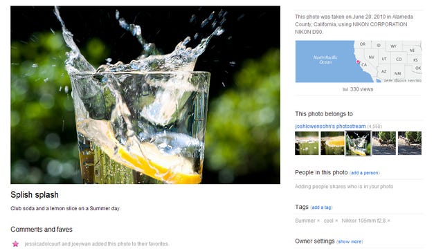
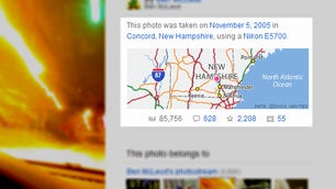
Besides the cycling controls and the larger size of the photos, geotags--or the physical location of where a photo has been taken, are now something that's far more prominent; as is a reminder to add a photo to Flickr's world map if it does not already have a geotag. Rothenberg explained that the main reason for moving this piece of information higher up onto the photo pages was to give people a greater sense of story about the photo, as it now fits together with information on who took it, how popular it's been, and how many comments or favorite bookmarks it's picked up.
The new look of these photo pages is available as part of a month-long opt-in program for all Flickr members. After this beta concludes, the company will be pushing out the design to all users, with no way of going back. For a more in-depth look at the new features, be sure to check out the slideshow below.