10 hot Web redesigns of 2008
Redesigns happen all the time, but 2008 featured nearly a dozen major redesigns of massively trafficked Web sites. We round down 10 of them.


It may be a little too early to do a roundup of the best redesigns of 2008 like we did last year, but with Thursday's one-two punch of new looks for social sites Twitter and FriendFeed, it's a good chance to take a look back at some of this year's redesigns and talk about what was changed or fixed.
I've picked 10 of my favorites below, listed in no particular order. See also the honorable mentions section at the bottom of the post, which includes content sites or other places that didn't quite make the cut.
1. Twitter

Twitter's redesign was a twofold change: one part to simplify the interface, and another to reduce the resources needed to host the site. Now when users hop between various functions it doesn't reload the entire page, meaning a faster experience and less data to serve.
The most interesting part of the redesign is actually something we don't know about. The tabbed interface on the right was apparently set in place to make room for additional features as they become available. It could be the new things from Twitter itself, or the foundation for special developer-created applications users will be able to use without leaving the service.
2. Facebook

The "new" Facebook was one of the most drastic changes of any site this year. Like Twitter, tabs took center stage, as did the chat which shares screen real estate with what's essentially the "start" button on Windows. This new menu let users launch networked applications from any page they're on. The change also embraced widescreen displays, making use of the extra room to let users build out the experience horizontally instead of having to scroll up and down.
You can read more about it, and the user backlash, here.
Continue reading the rest of this article after the jump.
3. FriendFeed

FriendFeed's big change moved the navigation from the very top of the screen to the side, and allowed the posted content to make full use of widescreen displays. More importantly, it made room for additional features without squeezing things together, much like Twitter's. One of the most interesting aspects of the new look was that the company let any user who wanted to test it with the use of a special URL, then pushed out the look to everyone in less than a month.
4. Yahoo.com

Yahoo's big, bold new look is the only one on this list that's not actually out yet. The Web giant will be letting users add customized bits and pieces of content, much like users are currently allowed to do on the company's My Yahoo service (whose look was also tweaked this year). The big difference is that this custom content will sit alongside Yahoo's constantly updating stream of news, photos, and links from around the Web.
Screenshots of the new look were posted by Yahoo on Wednesday and the company has already begun testing it on a select percentage of users to work out some of the kinks. Look for it in the coming months.
5. MySpace
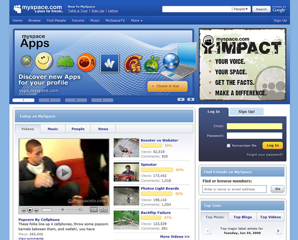
MySpace's redesign took place in mid-June. It was a play to get some of the service's features and user-generated content into the limelight, and away from the sea of links that existed before. More importantly, it added things like better search, a profile editor that removed the need for hard coding, as well as a high-resolution media player for its video service.
6. Digg / Digg mobile

Digg's big change this year was the inclusion of a recommendation engine which completely re-tooled the way users parsed through newly submitted stories. On one hand, it improved your chances of finding content you'd be interested in based on past digging, however, it came at the expense of the cloud view, which simply grouped together all the story headlines in one mass.
The same release brought with it a re-do of Digg mobile. Previously the site was only optimized for iPhones, but the new version let users on any handset view and vote on the site's top stories.
7. MobileMe (formerly .Mac)

With the announcement of MobileMe at WWDC '08 in early June, and subsequent release in mid-July, Apple effectively killed off .Mac in place of a handful of updated Web apps. One of the biggest changes was in its Web mail service which joins an online calendar, file and contact manager which are all accessed within a single interface.
Despite its slicker look, the core functionality of the service suffered substantial problems in the first month or two, including the Web mail which was unavailable for some users.
8. LinkedIn

LinkedIn's February redesign came hot on the heels of a two-month long beta test for registered users of the site. Aimed mostly at integrating applications designed by developers, the site made room for growth with a left-hand side toolbar and tabs--much like Facebook's design before its facelift.
9. Delicious

Yahoo's Delicious unveiled its new lookto all users in late July. Users had been testing it in private beta since late 2007 (our look here). The big change was not only in the name, which ditched the hard to remember de.licio.us, but also what was going on behind the scenes to make it more responsive and scalable. The site also got a complete overhaul of its search engine, making it easier to dig through old stories, tags, and users.
10. Last.fm

Music social network Last.fm underwent a complete redesign in mid-July. With the new look came the capability to get recommendations simply based on dropping in a few band names instead of having the site analyze the user's music library and ratings. Like MobileMe, the service also suffered some stumbles with unreliability.
Honorable mentions for other sites: CNET, Engadget, Wall Street Journal online, TechCrunch, CenterNetworks, Mashable, Bebo, Revision3, and coComment. If you think we left one off drop us a line.
(Disclosure: Last.fm is owned by CNET News parent company CBS Interactive.)