Dropbox's Gentry Underwood on great design's disappearing act (Q&A)
Dropbox's design chief arrived at the online storage company with his stylish and popular email service, Mailbox. Now, as Dropbox evolves, he's helping it design a way into every facet of our digital lives.


"Often I think really great design disappears. You don't think about it," he says. "It's that 'of course' kind of feeling that I think is in so many of the great products that we've come to know and love over time."
When he's not running a vintage automobile enthusiast website with his friends, Underwood is shuffling between meetings at the online storage startup Dropbox. There he is responsible for coordinating the visual language and product design for a company that has tripled in size and nearly quadrupled its funding war chest in the last few years.
Underwood joined Dropbox as head of design in March of last year after the company paid a reported $100 million to scoop up him and his team of 12 alongside the simple, iPhone-only email app they had developed and launched a month prior. Mailbox amassed more than 1.5 million people in a waiting list post-launch, partly on neat design like swiping and snoozing features for organizing messages, but also by enabling users to think about their inbox as something that can, and should, approach zero all the time.
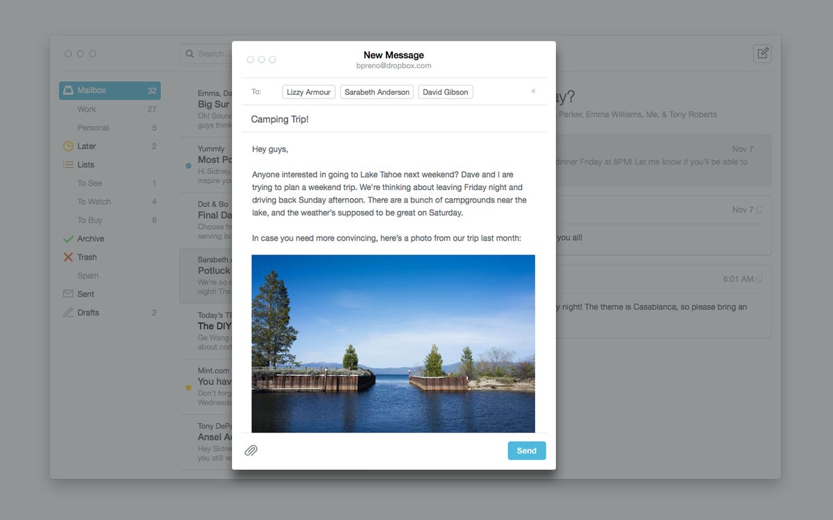
Since then, Underwood has helped that app, Mailbox, move from its iPhone beginnings onto the iPad, then onto Android devices, and now, onto the desktop as well. He's also helped Dropbox tackle the mountain of photos users dump into their cloud lockers, not by designing a solution to live within Dropbox, but by approaching it sideways with a dedicated app called Carousel. Carousel automatically uploads and organizes every photo you take with your smartphone and anything dropped in your Dropbox folder.
More importantly, Underwood has worked with Dropbox CEO Drew Houston and co-founder and CTO Arash Ferdowsi on realizing their dream of a company that's more than just file hosting -- especially as that service has become a cramped space where storage pricing continues to fall to zero. The goal is what Underwood calls a constellation of solutions -- with Mailbox and Carousel as the base -- that solve everyday Web users' painful problems, and in the process attempt to drive more and more users back to Dropbox as the hub for your digital belongings.
"Drew, before we even began talking, set a vision of evolving from the magic folder into this ecosystem -- into a set of products or experiences that were dedicated to solving these core use cases," Underwood says. "We joined under the flag of that vision, under the idea that Dropbox itself was going to be evolving into a service provider that had much more product surface area than it had historically."
Underwood, a former IDEO designer who co-founded Orchestra in 2011 with former Apple employee Scott Cannon, is now tasked with helping Dropbox out-design its competitors, which include everyone from Apple and Google to Microsoft and Box. CNET sat down with Underwood prior to the Mailbox for desktop's public beta launch on Tuesday to discuss the evolution of Dropbox and the cardinal rules of good app design.
This interview has been lightly edited for clarity.
Q: It seems as if Dropbox has become more design-focused since acquiring Mailbox, and that the app now informs the ways in which Dropbox tackles problems. How do you see the evolution of the company since last March?
Underwood: I might challenge the narrative a little bit. Design has always been a big part of Dropbox. What's changed is the surface area of what needs to be designed.
Arash [Ferdowsi] and Drew [Houston] have a penchant for intuitive simple solutions. Often I think really great design disappears. You don't think about it or pay attention to it because it's so effective that your experience of it is that it just works -- it's just right.
It's that 'of course' kind of feeling in so many of the great products that we've come to know and love over time. The fact that the next Kleenex comes out right after the one before, or the shape of your phone and the way that it's one giant piece of glass that's incredibly adaptive to whatever function you're using it for.
And you saw that in Dropbox?
Underwood: The way Dropbox works originally as -- what we refer to here -- a magic folder is a really great example of a passion for design that is really focused around simplicity and intuitive experience. One of the key differentiators that made Dropbox successful was this intuitive experience of it as just another folder on your computer, yet another folder that had these magical properties.
That transformation...it takes a lot of design to get to that place where it just seems like an obvious solution. Simple design is surprisingly complicated to pull off and it actually takes a lot of design work.
Was that something that evolved more quickly after Mailbox got acquired?
Underwood: Drew, before we even began talking, set a vision of evolving from the magic folder into an ecosystem -- a set of products or experiences that were dedicated to solving these core use cases.
We joined under the flag of that vision and the idea that Dropbox itself was going to be evolving into a service provider that had much more product surface area than it had historically. That that meant that there was a lot of mobile-friendly product design work that needed to be done. It certainly wasn't my idea that Dropbox needed to evolve that way. It was more like, "Hey this is where Dropbox is going. Can you help us get there?"
Having said that, now we're in a world where files and folders are a one of subset of ways that we store information. Increasingly we're using devices that are not file and folder centric. The core promise of Dropbox of being a home for people's and companies' most precious information has to evolve into this world where information lives in more formats than just files and folders. That's where Dropbox is today with this constellation of solutions.
Part of that now is Carousel. When I first opened it and began using the app, it immediately felt like Mailbox. How was that design process and was it intended to feel like a Mailbox successor?
Underwood: We have a pretty remarkable collection of designers here now. There are almost 30 designers at Dropbox and it's an incredible set of talent. If there is anything consistent between Mailbox and Carousel, it is that love for simplicity and intuitive design that just works -- the love for getting to that place of naive obviousness, of pushing on something until you get to that "ah-ha" or "of course" place.
I think there is still work to be done to integrate the visual languages of the different apps. We haven't been very draconian about keeping these things with highly consistent visual languages. We may integrate those over time. But the primary goal has been to create focused experiences that are best of class in terms of their ability to meet the needs they're setting out to meet, and to do in a way that is deferential and non-flashy. It's a similar belief system [between Mailbox and Carousel] that gets applied.
Why did you approach Dropbox's photo problem with an app-centric solution like Carousel?
Underwood: Files aren't really helping the use case of capturing memories. What you want to do is be able to quickly access, relive, share memories from other times in your life. That doesn't need a file or folder metaphor to work. In fact, I think files mostly get in the way. The file name for a photograph is largely useless. It's kind of kludgy in the same way that MS DOS was sort of primitive compared to a graphic interface.
Carousel is a great example of saying, "Okay, people are trying to keep their memories in Dropbox, keep them safe, access them from multiple devices, share them quickly and easily with other trusted loved ones. How do we create a dedicated experience for that use case that can be a part of this Dropbox world, but is really focused on that one thing?"
In the mobile era, the apps that win are the ones that are less like a Swiss Army knife and more like a hunting knife.
Unlike Mailbox, Carousel has a direct effect on the storage limits of your Dropbox account -- photos take up space. How did you maneuver that when trying to design something that was easy and fun to use, but still acknowledge the friction between being a free and paid user?
Underwood: It's a big issue. The value proposition of Carousel only comes through when you have a lot of stuff in there and if you have a lot of stuff in there it means you need space, and presumably you have to pay for that, or somebody's got to pay for it.
There is a lot of work still that needs to be done in terms of the pricing and also right now, there's no desktop app. So you have to go back to a folder on your computer to really get to those photos or you can go to the Web. It's still early in that world.
With these singular, focused apps, especially Mailbox, you're often deciding what gets left out and what kinds of user behavior will be easy or difficult to maintain. How do you make those decisions for the user?
Underwood: As we're creating these greater experiences, we're also thinking about ways to encourage people into them. Mailbox is a good example. It's both a tool and a gateway drug to greater experiences.
Email is this universal transport for all kinds of information. We should be able to get smarter and smarter all the time about helping you achieve what you're trying to achieve more effectively through more dedicated experiences that are more tailor-fit for what you're trying to do.
That's the user research portion of a design process. Watching people work with mail and recognizing the biggest pain point for mail. "The core goal we're trying to accomplish is help people remove this feeling of having an elephant on their back. A lot of people feel the elephant, and are wasting a lot of time organizing and not using it."
Eventually you will incorporate things, like labels into Mailbox?
Underwood: What you really want is something more deferential than that. A really good example of this is natural scrolling on OS X. The system came out and was a like, "Hey you're going to pushing things up and down on your phone and you're going to push them up and down on your iPad and when you go back to your laptop, it's going to be in reverse. Trust us, if that's consistent everywhere, in the long run, that will be easier for you."
They [Apple] try to get you to do that, but if you say no, which a lot of people do, they let you do that too. They let you defer. Mailbox needs to evolve to that place. There are enough real reasons for the support of labels that eventually we need to support labels. It's just a question of prioritization in terms of product development.
There's this idea that the mobile Web should have superseded the need for an app that you download on your phone and on your desktop, that it should just work there in the browser. Where do you see that conversation now in 2014?
Underwood: It comes down whether you're trying to optimize for the quality of user experience or whether you're trying to optimize for ease of distribution: getting it out to people such that they can use it without doing that installation moment.
I think they're use cases for both. We've all had the experience of searching for something on the Internet, getting to a Web page for the results, and the Web page says, "Hey you should download our app." That's the last thing you want to do.
That's the one extreme where an app is terrible. The other is for things you're doing every day.
What is the data telling you and where are there inefficiencies in the way we do things on mobile and on the Web where these kinds of solutions need to be found?
Underwood: To me the most interesting, most ripe areas for innovation center around working together as teams, collaborating in a world where some people are on their computer and some are on their phone.
That seems like fertile ground, both from a product design perspective and from an impact the world perspective. I am very attracted to the idea of building tools that are so useful around that space that teams say, "How did we do this before? Do you remember how crazy that was?" And the efficiency gains are so big that the people using those tools have an instant advantage over their competitors.
That's the kind of thing worth putting your time and energy into.