The secret to designing a great smartphone font
In the second portion of our <a href="http://www.cnet.com/8301-17918_1-57411523-85/the-man-behind-your-phones-fonts/?part=rss&subj=news&tag=title">two-part series,</a> we explore the history and theory behind mobile phone fonts with the help of typeface designer Steve Matteson.


What makes a great font for a smartphone? Aside from legibility, is it its simplicity, its brand recognition, or the way it influences people's feelings toward the product? From neutral and casual, to just plain wrong, we sit down with Steve Matteson, typeface designer extraordinaire, to get the lowdown on the typefaces featured in Windows Phone, Android, and iOS devices.
Segoe (UI) for Windows Phone: The beauty in neutrality
Before Matteson, current creative director at Monotype Imaging, designed the typefaces featured on Android and Windows Phone devices, he created the aggressive lettering for Microsoft's Xbox (which was aimed at hardcore gamers), and its successor, the more approachable and sleek Xbox 360.
Remembering the work that Matteson did for its consoles, Microsoft approached him once again in 2003 to solve a problem.
It was looking for an overall typeface for its brand, but the design Microsoft was currently considering was too geometric and mechanical.
"They were using five different typeface families in all of their collateral," said Matteson. "The art director thought that it was crazy, and saw the need for a single solitary family that would tie everything together."
Matteson looked to the design of Mundo, which was created by a colleague, Carl Crossgrove. Although fond of Mundo's style, Matteson modified it to lessen its calligraphic, pen-drawn elements.
"Mundo had the stress and angles of a calligraphic pen," he said. "Its skeleton, or the trace inside of the letter forms, was how I wanted Segoe to be structured."
The new design was named after the street Segoe co-designer Tom Rickner lived on, in Madison, Wis.
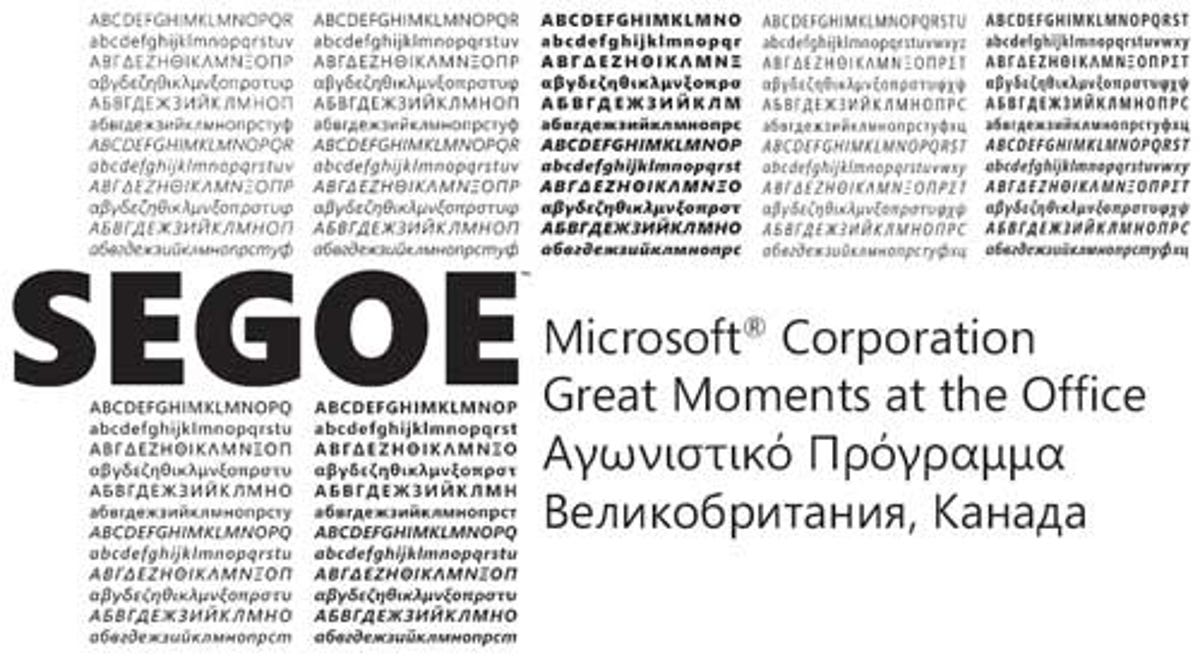
Since its creation, Segoe has extended beyond its initial look to cater to the needs of different devices. Segoe UI, for example, appears on Windows 7 and Windows Phone.
According to Microsoft: Segoe UI is "meant to give the same visual effect onscreen and in print. It does not have any strong character or distracting quirkiness."
There's also a version of Segoe modified for the television screen, which is used for MSNTV.
"TV has unique challenges," said Matteson, citing low resolution, bigger pixels, and background motion graphics as some of the reasons why it's more difficult to design for it.
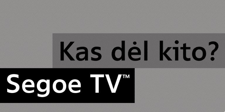
"We needed a very sturdy letter form that has plenty of space between the letters, and a very large lowercase height, but we had to keep the spirit of the Segoe design."
While designing typefaces is a collaborative effort with the client, the designer has no say as to the typeface's end use. Fortunately, he was blown away by Microsoft's results.
"When they showed us what they were doing, I thought it was really cool," he said. "I wish I knew who was the brain child behind Metro, because it's a breath of fresh air."
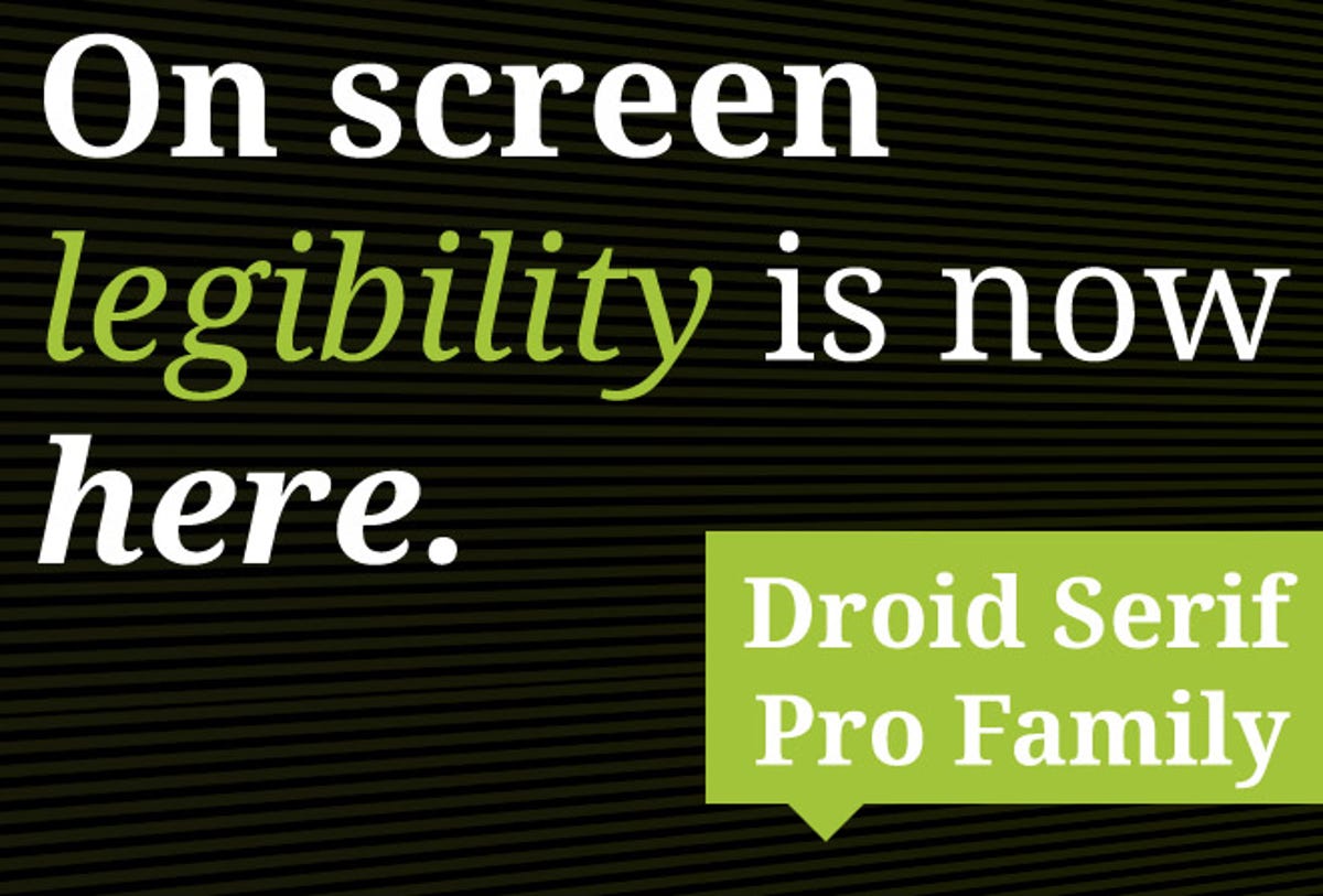
The Droid family for Android: Just the right amount of playfulness
When Google quietly bought Android in 2005, the tech industry was buzzing over the possibility that the search giant had plans to dive into the mobile phone business. At the time, Matteson was working for a typeface company he helped start called Ascender. His team was eager about the new merger, and pitched five designs to the User Experience department at Android. The group told Matteson that they wanted to retain the playfulness behind the Google brand voice.
Google is seen as "fun and cuddly," said Matteson, but because no one wanted the Android look to turn off prospective manufacturers at the time, they couldn't design a font that was too "bouncy."
One of the characteristics of a playful typeface is asymmetry. This can range from slight to a look that's completely inharmonious, like Matteson's first font, Andy. In the font Google decided on, Droid, the asymmetry is only evident when observed carefully. The idea was for users to feel that Droid was more informal, they just didn't have to know why.
Droid Sans comes in a serif version, which is a style of typeface that includes small lines or details in the letters' ending strokes. In the early days of desktop technology, serif fonts did not render well onscreen due to their small detailing.
These days, however, with such high pixel density on computers and mobile displays, serif typefaces appear much clearer. And Google knew its devices would be able to handle it.
"They weren't afraid at all," said Matteson. "They needed a serif design in case a Web site's HTML called for a serif typeface. Times New Roman is really delicate and brutal, but there are some designs that are heavy and coarse-looking."
So they settled on a serif style that met somewhere in the middle between delicate and heavy--a typeface that would read well on a glass screen, while harking back to the lettering of newspapers. All the while, Matteson and his team retained the proportions and characteristics of Droid sans in its serif counterpart so the two could harmonize as a font family.
Aside from English, Matteson also helped design Droid for other languages and alphabets, including Greek, Cyrillic, Thai, and Hebrew. Letters in the Vietnamese alphabet, for instance, have to be readjusted because the use of multiple accents takes up a lot of vertical space.
After Android Gingerbread, Google stopped using Droid and replaced it with an internally designed font called Roboto, created by Christian Robertson. The company cited its desire for a font that looked even more human or "emotional," but Matteson believes that its look, along with its name, doesn't serve this purpose.
"It's great that they went ahead and made a new design," he said. "But for the reason behind why they say they did it, the typeface doesn't really reflect that, in my opinion. It's different, but it's not human."
Helvetica for iOS: A classic, but is it right?
There is no denying the presence of Helvetica. It's been around since the late 1950s when it was created by a pair of Swiss designers and has gained an almost exponential surge of popularity recently. On its fiftieth anniversary in 2007, a documentary was released about it and the MOMA in New York had an exhibit celebrating "50 years of Helvetica."
It's the New York Subway system's font of choice; you see it when you fill out your federal income tax forms; and most pertinently, it's the font used in iPhone's iOS.
According to Matteson, fonts will have a wealth of lovers and haters alike. Because it is so popular, Helvetica's group of advocates and critics are especially passionate. Matteson has no problem with the typeface itself. It was meant to be clear, neutral, and above all else, big -- perfect for signs viewed at far distances.
As a typeface for a small handheld device like the iPhone, however, Matteson doesn't think it works.
"There's a right typeface for the right time, and Helvetica was just not the right call," he said.
Matteson cites Helvetica as a typeface belonging to the Grotesque genre (a style known for its industrial utility, sturdiness, and symmetry), meaning that letters and numbers close in on themselves too much. This makes reading difficult at small sizes or in short glances. The lowercase c is a sliver away from being an a, and the numeral 3 is nearly identical to the 8.
Even Microsoft chimed in about it. Praising the varying widths of Segoe's capitals, the company points out that its narrower E and S are more legible on a mobile device when "compared with Helvetica, where the widths are more alike, fairly wide."
Aside from Segoe, Matteson once saw a jailbroken iPhone feature Droid sans and said it looked wonderful. But even he knows Apple doesn't have to run his fonts, or the fonts of its competitors, to improve user experience.
"The Mac operating system uses a typeface called Lucida, which is beautiful for UI," he said. "For dialog boxes and quick readings, it's outstanding, and it would have been a fantastic choice for the iPhone."
Lucida was designed to be so readable that a version of it was made to withstand faxes, so that when a document was refaxed numerous times, you could still make out the letters.
Although in need of a face-lift to match the chicness of the iPhone, Matteson tapped the typeface, Chicago, as a fine alternative as well. Created by famed designer Susan Kare, it was featured on the original Macintosh and the first few generations of the iPod. It is a wholly identified as an Apple font, and was named in honor of one of Steve Jobs' favorite cities.
Even though it's easy to see how inherently beautiful and simple Helvetica is, for Matteson, it doesn't fit.
"For a company with such a vision for design and a sensitivity toward user design," he said, "Helvetica was just the wrong choice."
Editors' note: This is the second piece of a two-part series on font design, desktop publishing, and Steve Matteson, a designer whose work is featured in several user interfaces. Read the first part here.Note that although the words "font" and "typeface" had distinct definitions before the era of digital publishing, they are used synonymously in this piece to mean the visual style or representation of written characters.