The man behind your phone's fonts
In the first part of our <a href="http://www.cnet.com/8301-17918_1-57412345-85/the-secret-to-designing-a-great-smartphone-font/">two-part series</a> about mobile phone fonts, we sit down with Steve Matteson, the typeface designer for Droid, Windows Phone, and countless other UIs.


Editor's note: This is the first piece of a two-part series on font design, desktop publishing, and Steve Matteson, a designer whose work is featured in several user interfaces.
Additionally, although the words "font" and "typeface" had distinct definitions before the era of digital publishing, they are used synonymously in this piece to mean the visual style or representation of written characters.
No one outside the font world will recognize Steve Matteson. No one on the street will ever stop him and ask for an autograph, despite the fact that his designs are seen by millions of people around the world.
If you ever used Windows Vista, read off a Barnes & Noble Nook, or played a game on an Xbox, Matteson's work has already reached your eyes. Open a Word document in your computer and pull down the font menu. He is there -- nestled in Andale Mono, Cambria, and Curlz.
But it is his contributions to two mobile phone platforms that are perhaps most well-known. Matteson designed the Droid font, featured in every Android phone before Ice Cream Sandwich. He also designed Segoe, the typeface seen in Windows 7 and on Windows Phone devices.
"I'm in your pocket," he joked while sitting in our office.
Matteson, 46, lives with his wife and two daughters in Louisville, Colo., where he goes mountain biking and walks his two Labrador retrievers. His staunch, athletic build matches his crew-cut hair, but he's soft-spoken. He says he's a historian at heart, and his long, factually dense phrases attest to that. Matteson easily spills out important years in typeface history, font names and the names of their creators, his colleagues and what they've designed, and even the names of his colleagues' mentors.

He apologized (unnecessarily) for his long-windedness, and attributed it to his passion for fonts.
"Once I get going, I can't stop," he said.
From ancient techniques to the digital era
Matteson became interested in typefaces while attending college at the Rochester Institute of Technology in 1984, where he specialized in printing and handled hot-metal typesetting.
In that same year, Steve Jobs introduced the world to the Macintosh. That machine gave users something that no computer before that time had offered: a choice of different fonts.
"I went to school for printing, and learned a lot about letterpress printing and became enamored with the history of type," Matteson said. "The rich history of the spread of the written word, and the different technologies used to create books -- that was really my end."
Upon graduating, a company that made laser printers hired Matteson. He worked in the department that wrote computer code for typefaces so that they would appear correctly when printed on paper.
In 1990, he joined the team at Monotype Imaging, owner of the Helvetica font, to code and rebuild Times New Roman, Arial, and Courier for the digital age. Around that time, Apple created TrueType, a file format that was licensed for free to Microsoft, which it then included with its Windows 3.1x operating system.
Suddenly, desktop publishing was available to everyone, and home-printed kitschy neighborhood newsletters and birthday invitations abounded.
"That was the year that secretaries became typesetters," he said. "The Mac kind of got it kick-started, but Windows made a much larger worldwide impact."
An artistic inclination
After two more years of coding, or what Matteson calls the "technical stuff," he began sketching out typefaces of his own design.
"My work with the technology of type, and my background with calligraphy and printing, really helped me understand how type was designed...my heart was on the artistic side."
The Andy script was the first font he designed, in 1993. It was based on the handwriting of a left-handed childhood friend. After digitizing the individual letters from a letter his friend wrote, Matteson typed a letter back to his friend set in Andy. The font is playful and childish, and can still be seen on Pampers boxes.
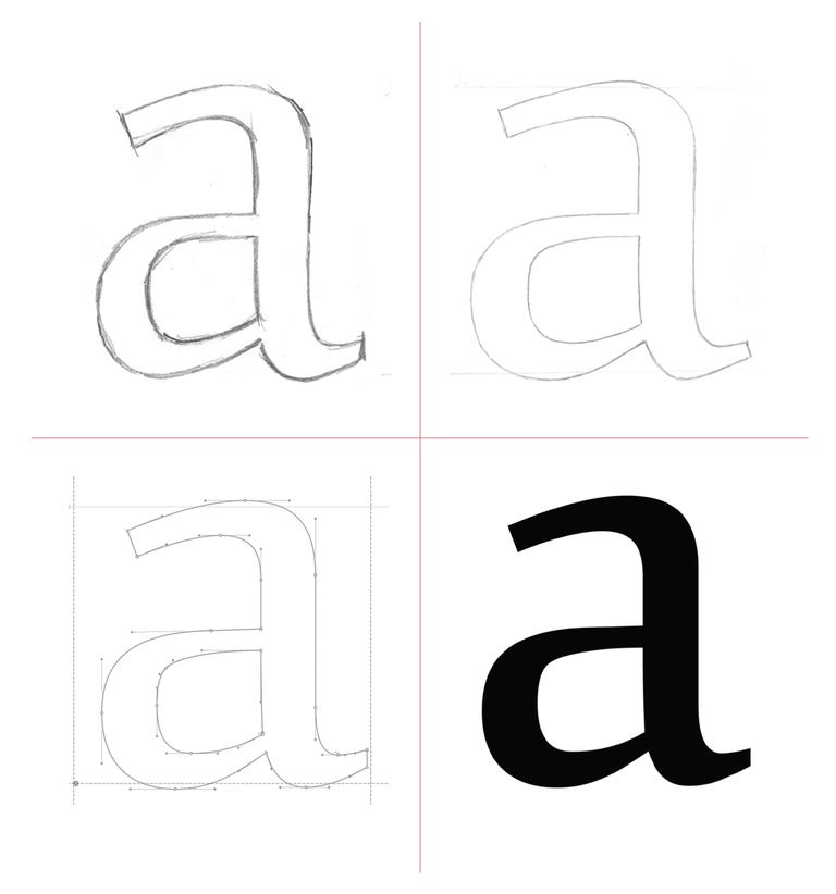
When Matteson begins designing a new typeface, he starts with the lower case g. He likes the way it curves and its proportions. Sometimes, though, he begins with the vowels. They're in every word, and so the look of the rest of the letters heavily depends on the a, e, i, o, and u.
A type designer has many things to consider. Some are obvious concerns that can be easily understood by an outsider -- things such as the thickness of the letters (known as weight), the spacing between them, and the angle at which they stand. Other esoteric details, like the nuances of beaks, bowls, and brackets, are best handled by people like Matteson.
A new approach for Microsoft
At both Ascender, a typeface foundry he helped start, and Monotype Imaging, where he now works as a creative type director, Matteson landed several popular tech companies as clients. His designs for Microsoft and Google have made his and his team's work nearly ubiquitous here in the States.
He designed the fonts for both generations of Xbox interfaces. The first version had an aggressive style of lettering and was commissioned to attract hard-core gamers. To appeal to a wider demographic, Microsoft wanted a redesign for the Xbox 360, and requested a softer, more approachable look.
In addition to that, Matteson designed the Segoe family font mentioned above, which would eventually find its way into Windows 7 and the Windows Phone OS.
Getting an in with Google
In 2005, Google acquired Android, and rumors quickly spread that the tech giant was expanding its reach into the mobile space. Matteson, who at the time worked for Ascender, competed for the account, and pitched five different designs to Android's User Experience department.
Originally, his team threw around the idea of having the Google brand voice, with its instantly recognizable colored lettering, be integrated in the OS. However, they decided against it.

"Because multiple hardware companies were going to use this typeface in multiple different products, we needed to keep it more neutral, not as fun and bouncy," Matteson said.
"We didn't want any [phone manufacturer] to say, 'Oh, I can't use this,' or have anyone balk at the idea of Android."
The choice landed with what would later be known as the Droid family font, which comes in a serif, a sans serif, and a monospace version.
Although the typeface isn't featured in the newest version of Android, Ice Cream Sandwich (instead, the interface uses the in-house designed font, Roboto), Matteson is nonetheless proud of this accomplishment.
Wired's Webmonkey site reported that "the early consensus is that designers are gaga over Droid." Gizmodo called it "clean and Google-y," a comment that Matteson takes as a pat on the back for the work he and his team did.
Fontophiles and flamers
Although he said it's easy to lose people when he discusses the particulars of his job, Matteson has noticed that the public's understanding of what a typeface designer does has grown noticeably because of the spread of personal technology.
"When I started my career, I really had to explain carefully what it was that I did," he said. "Today, people are very aware of what fonts are."
And when more knowledge becomes readily available to the masses, one phenomenon inevitably manifests: haters. Fonts like the playful Comic Sans and Papyrus (which you probably saw on the menu of the last Thai restaurant you ate at) have recently been vilified on the Internet. It's the sort of criticism Matteson can certainly understand.

"One reason people hate Papyrus so much was because it was used in the film 'Avatar,'" he said.
"They spent millions of dollars on this movie, but they couldn't spend some extra money to commission a font to represent this completely different culture from another planet?"
Matteson is quick to point out that most people's frustration with these fonts does not reflect anything inherently "ugly" within the designs themselves, but rather the inappropriate, unimaginative, or overuse of the typefaces.
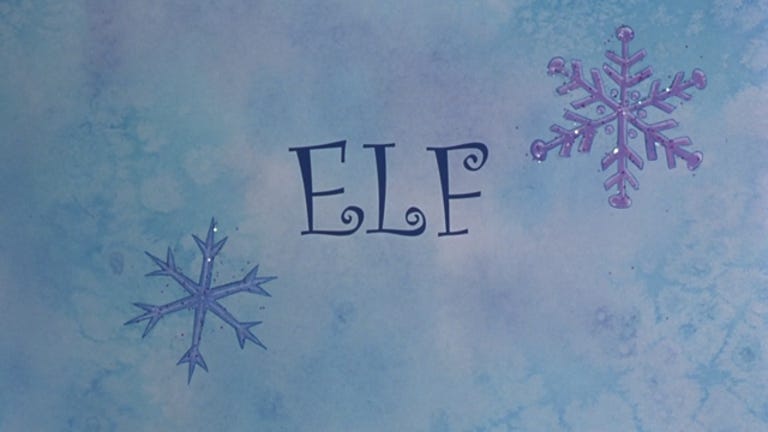
Although not in the same scale of intensity, his own font, the ultrafeminine swirly typeface known as Curlz, is a victim of such hate. The typeface isn't his proudest moment, and even his own daughter isn't a fan. He stands by it when used responsibly, such as in the title sequence of the movie "Elf." But when whole sentences are set in Curlz, he understands how visually unappealing that looks.
That's the risk you take when you design the look of words that people live and interact with everyday. They become bigger than their creator.
"These typefaces develop a life of their own," Matteson said.
They will gain their trove of lovers and haters. Even when people say they have no opinion, that's a success in itself since bad design is noticed most easily. And while it's unlikely a fan or critic will call him out on the street by merely recognizing his face, Matteson knows that whatever screens you'll be staring at during the day, chances are he's tucked in there somewhere.