Notifications: The Good, The Bad, and The Pretty
My impressions of the Pre's notifications.
Quick post today to comment on the Pre's system of notifications. Generally speaking, I love it. It's clear, accurate, and subtle without being coy--if that makes any sense.
The Good
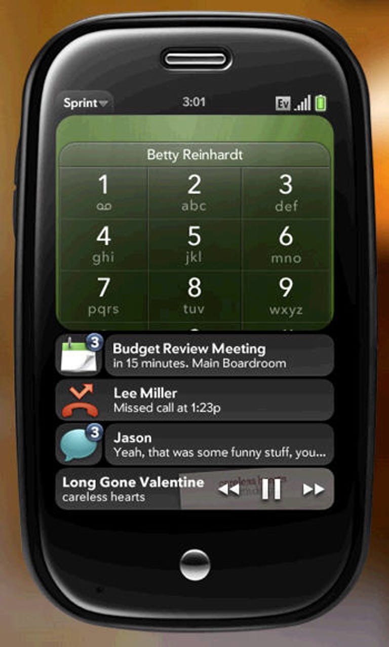
Each "layer" of notifications has a small "bubble" (not sure what Palm calls them) to the left and a larger, wider one to the right. Tapping on the larger bubble, takes you right into that message. Tapping on the smaller bubble (which is also overlaid with a small # representing the number of that kind of message you have), will take you to a list view of all messages you have of that type.
The Bad
Not a lot bad about notifications on the Pre, but what is bad is kind of annoying: Though there is a hack to change this (there always is), the current version of WebOS does not allow users to modify the sound made for different kinds of messages. So, if you have or plan to buy a Palm Pre and are even mildly popular, I hope you like the sound of "ba da da DING!"
The Pretty
Each tap on a notification "bubble" brings up its own card. And, of course, you can have multiples open at once and swipe between them like you are waving your hand in the wind (or something). Seriously, it's very nice.
Also very "pretty" is the way that you can simply swipe right to get rid of a notification bubble if you feel sufficiently notified and do not feel like viewing the message at that time. It's easy. And if you are just a bit OCD and actually like to put things away after you're done playing with them, it can even be fun. No, really.