The Microsoft Surface Pro 3: Bigger is better
Microsoft made good design decisions for the Pro 3. That's important, because prior versions always seemed like interesting placeholders till a more fully realized concept came along.


The Surface Pro 3 is a vast improvement over the Pro 1 and 2 -- and that alone is huge.
Microsoft nailed the physical design -- I knew that the first time I used a Pro 3 two weeks ago. And now that I have one (as of Friday), I can tell you why. What follows are my initial impressions. A longer-term evaluation will come later.
Note that I used both the Surface Pro and Surface Pro 2 extensively (one was sold, the other traded in). So, for the most part, this brief review (CNET's in-depth review is here ) will contrast the Pro 3 with prior generations.
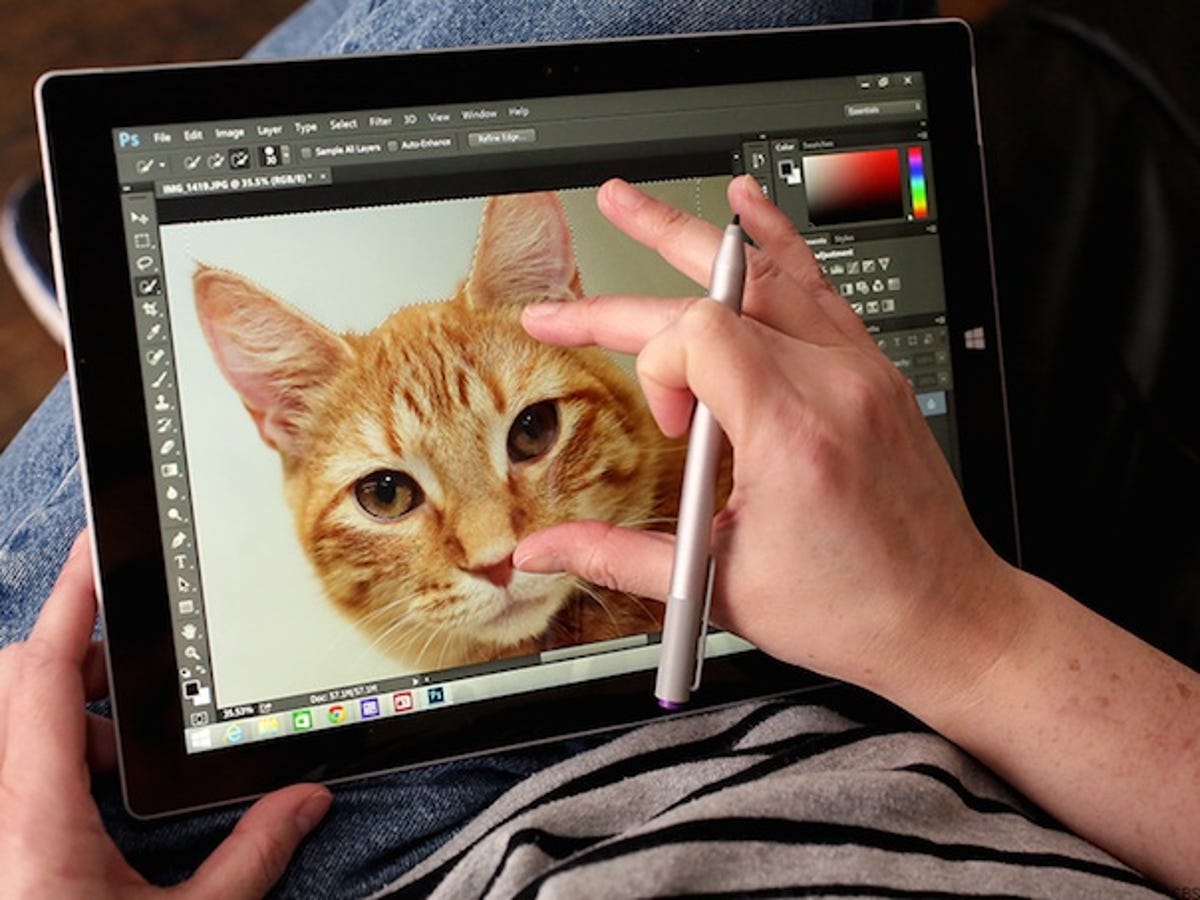
Display -- bigger is (much) better: A12-inch display combined with a 3:2 aspect ratio makes -- at the risk of sounding redundant -- a big difference. The previous 10.6-inch Pros with their 16:9 aspect ratio made it hard to be productive. And I've come to believe that bigger tablets -- with roomier displays -- are definitely better than smaller ones. Need a small tablet? Then get a large phone or a phablet.
To wit, I prefer the larger iPad Air to the iPad Mini Retina, the larger Nexus 10 to the Nexus 7, and I would take Samsung's 12.2-inch Galaxy Tab Pro over the smaller Galaxy tablets. (And I now favor 14- and 13-inch laptops over the 11.6-inch MacBook Air, which I used for a long time.)
Bye-bye, brick analogies: Weight distribution is really important but rarely covered in reviews. The old Pro compressed 2 pounds into a chassis built around a 10.6-inch display. The Pro 3 spreads less weight (1.76 pounds) over a wider/longer but thinner 12-inch-class chassis. Gone are the brick analogies.
Bigger, better keyboard and touchpad: I'm typing now on the Pro 3's Type Cover keyboard and it comes a lot closer to the 13-inch MacBook Pro Retina's keyboard (which I also use) than the Pro 2's. This also fits into the bigger-is-better theme: with a larger chassis, you get a more spacious keyboard.
Ditto on the touchpad. It's not only larger but has mechanical feedback (it clicks). Let me be blunt, the Pro 2's seemed like a conspiracy to combine the worst aspects of a touchpad. Not only was it too small, but because Microsoft matched it perfectly with the surrounding fabric, it also vanished into the keyboard. I spent way too much time just trying to find the damn thing.
Prettier too: I've had Surface 2 envy for a while. In other words, I liked the design of the Windows RT-based Surface 2 with its metallic-looking silver backside and slimmer profile but was reluctant to buy a device that ran the unpopular RT operating system. The Pro 3 matches the Surface 2's aesthetics -- and is just as thin, runs Windows 8.1, and uses a speedy Intel Haswell processor, to boot.
MacBook Air as a yardstick: I think Microsoft should probably tone down the ad campaign that compares the Pro 3 to the MacBook Air. Too many people are wedded to their Airs for reasons that the Pro 3 cannot improve on.
I think, rather, it could be a better iPad Air (as a starting point, at least). For instance, I've decided, as an experiment, to sideline the Air then see where that takes me. I use the Air a lot for work when I'm on the road but there are certain mission-critical tasks that the Air just can't handle (and, believe me, I've tried). And this could ultimately play into the laptop replacement scenario: more time on the Pro 3 would mean less time using a MacBook.
And in this respect, Microsoft is ahead of Apple. Rumor has it that Apple is working on a 12- or 13-inch class " iPad Pro" and/or possibly a new 12-inch version of the MacBook Air. Unless Apple comes up with some mind-blowing hybrid design, Redmond is the trendsetter, not Cupertino.
In closing, let me say that though first impressions count, they're not definitive. I will do a long-term review after I've gotten to know the Pro 3's strengths and weaknesses better.
Updated at 4:10 p.m. PDT on June 22. Expands iPad Air discussion at bottom.