 Why You Can Trust CNET
 Meta M1 smartwatch review: A sexier-looking smartwatch? Well, sort of
In a world of ever-multiplying smartwatches, can the stylish but simple Meta M1 stand out based on looks alone? We wore one for a week to find out.


- Nearly 20 years writing about tech, and over a decade reviewing wearable tech, VR, and AR products and apps
Smartwatches of the future will either fall into two camps: those that pack tons of features and are part of mobile ecosystems, like Android Wear, and those that just try to be everyday, slightly-smarter watches.

The Good
The Bad
The Bottom Line
Count the Meta M1 in the latter camp. Curved steel. Funky lines. A leather band. On my wrist, it could be mistaken for some new Diesel or Fossil design.
That's no accident: Meta is a company founded by people who came from Fossil. The Meta M1 is an attempt to make smartwatches sexy, cool, or just an everyday item.
I've been wearing a pre-release Meta M1 for a week, using it on my wrist constantly. Like a watch.
So here's the question: does it work? Yes, and better than I expected. But it's far from perfect yet.
Design: Sexy, or overdone?
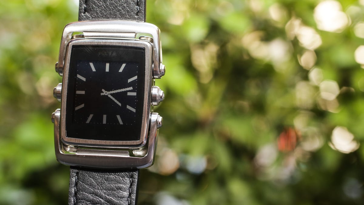
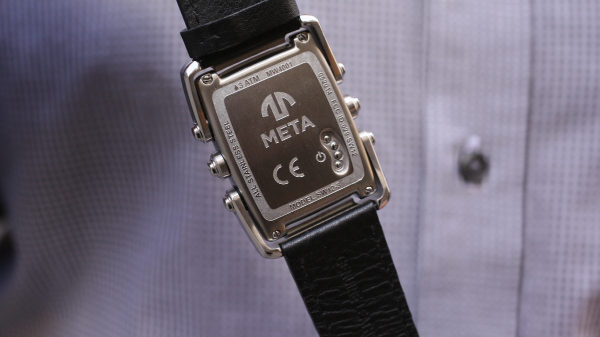
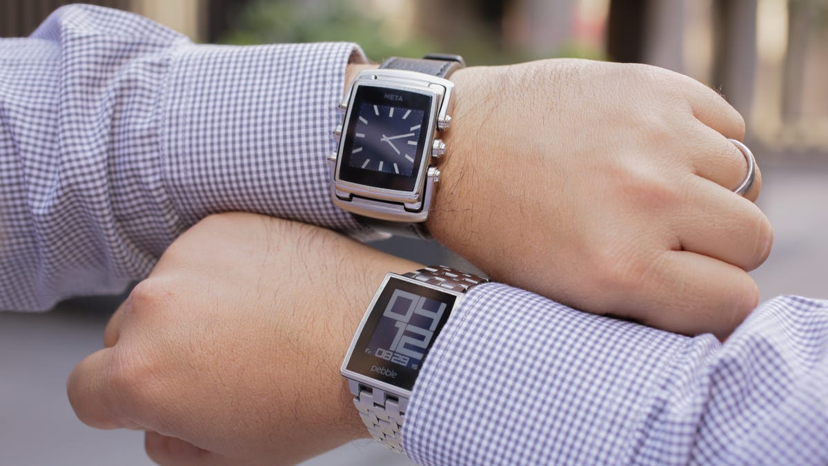
The Meta M1 has a look that might seem familiar: in many ways, physically and spiritually, it's like a brother to the Pebble Steel . Meta's $250-and-up watch (in the UK, it costs £250 and up; Australian availability has not been announced) has an all-steel body, super-crisp always-on black-and-white non-touch LCD display, has swappable wristbands, works with Android or iOS, and is water resistant to 5ATM.
The Meta M1 has an all-steel body, super-crisp always-on black-and-white non-touch LCD display, has swappable wristbands, works with Android or iOS, and is water resistant to 3ATM, as long as you don't wear a leather band.

The funky metal body comes with bendable arms that give it an industrial semi-steampunk look. Designed by Frank Nuovo, who also designed Vertu phones back in the day, it's a look that's gotten me a fair amount of compliments. It's distinctive, and no one finds in unattractive. Is it good enough to attract someone at a crowded bar? It could. It's the most club-friendly smartwatch I've seen. It sort of looks like a Pebble Steel with a midlife crisis.
The design has a purpose: the bendable metal armatures connect to the leather strap instead of the body itself, making the watch hug the wrist more. It felt snug and very comfortable. And each side of the Meta M1 has three buttons to press: six in all. These take the place of a touchscreen. The Pebble Steel only has four buttons, but they're larger.
The Meta M1 comes in a variety of colors and wristband pairings, with prices ranging from $250 all the way up to a way-too-high $450. Some are chromed steel, some have a more gunmetal look, and bands range from natural rubber (it's vanilla-scented, by the way) to leather, to steel. If you buy one watch, you can replace the band later with one of Meta's, or any 26-mm band you can find.
The small LCD display looks exactly like the Pebble Steel's, and even feels a bit more vibrant in direct sunlight. But the backlighting on my pre-release unit wasn't so hot: a top-firing light barely lit the screen, while the Pebble Steel's night glow in comparison is crisp and bright. I was told the backlighting would be fixed in the final version -- I hope so, since backlighting is important.
The Meta M1's buttons, and the Meta's UI and software, are also work in progress. I found the buttons harder to press than on the Pebble.

No apps...just built-in features
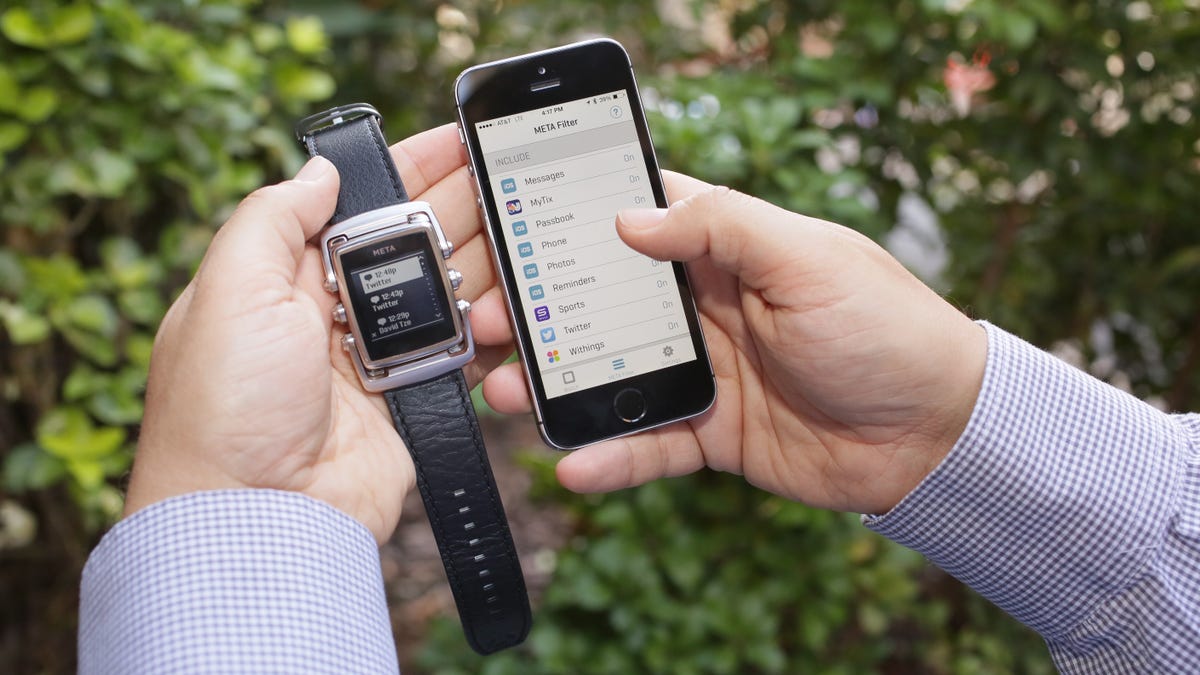
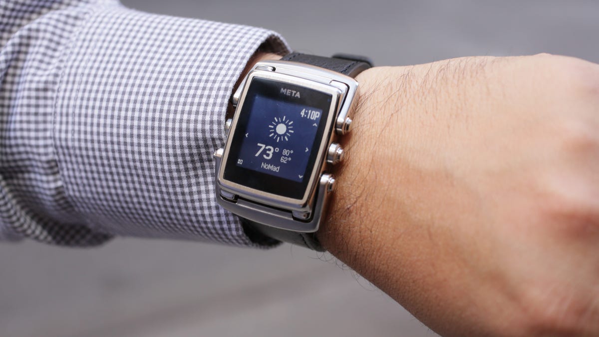
While the Pebble has its own app store for watch faces and many sometimes-useful, sometimes-random other functions, each of which has to be downloaded and installed, the Meta M1 keeps things simple. Any features are baked right into the watch itself: calendar, weather, phone music remote control, notifications, and a countdown timer can all be cycled through by pressing the left and right-side middlemost buttons on the watch.
Meta will introduce more features in the future when they're ready: a sports-score app has been promised, giving quick score updates for major pro and college sports, as well as a functioning pedometer that will work with a major fitness app's ecosystem. The rest of the M1's features work via the Meta app itself, and data gets pushed from Meta's own cloud services, instead of from individual apps.
What does that mean? I actually found the M1's connection to be more stable for things like weather and calendar appointments, with everything showing up instantly and easily. On the Pebble, depending on when I last checked my phone, I've seen weather updates disconnect.
The M1 didn't always hold its Bluetooth connection: once in an odd while I had odd time-outs in the iOS app that required turning Bluetooth off and on, but I was also using a pre-release Meta app build on an early-production Meta M1.
Notifications filter: Genius
The Meta M1 can get any notifications I get on my phone, and they pop up like text messages: someone liked what I said on Twitter, someone replied on Facebook, my wife said she's running late, or I just activated my NJ Transit e-ticket. Whatever shows up on my phone showed up on the M1's screen.
Sometimes, however, messages would get cut off: tweets were sometimes incomplete, as were text messages. It's a shame, because it means I had to go get my phone to read the rest, defeating the point of a wrist-worn device somewhat. But the Meta M1 is the best heads-up notification watch I've seen next to the Pebble itself.
But the real killer app of the M1 is its notification filter, called Meta Filter. The Pebble watch doesn't allow sub-filtering of notifications: you either turn the hose on or off, and then manage notifications app per app from within those app's settings.
The Meta M1 can filter notifications beyond how your phone does: the clever Meta app collects all notification types into its filter, and then lets you turn any one on or off. That Withings "remember to eat calcium-rich foods" ping I have on phone? Eliminated off my watch. I don't feel like random sports news either? Just tap to remove. Any notification can be tapped back into service easily.
A sometimes-complicated interface
The one downside to the Meta M1, for me, was the at times weirdly hard-to-navigate watch interface. Some of the sub-menus require pressing the leftmost lower button; others require pressing the middle left and right buttons and cycling up and down with the right-side upper and lower ones. Figuring out which of the six buttons controls which menu function is sometimes helped by tiny icon indicators near each button's wrist position, but the button layout isn't always consistent. After a week of use, I found myself fiddling and button-pressing more than I preferred.
This could be fixed in a firmware update, but I wish the Meta M1 was even simpler. A few too many buttons and few too many sub-menus made this not as casual a smartwatch experience as you'd think.
Battery life: Really good
The Meta M1 lasted well over four days on a single charge, and then some, while staying continuously connected. That's much like the Pebble, and trounces other fancier color-screened Android Wear and Samsung Gear watches. A snap-on magnetic charge dongle connects to a regular micro USB cable, and glows when connected. The M1 doesn't have a clear battery-life indicator yet, oddly, but you can check your M1's battery level on the phone app.
Conclusion: Built like a watch, but a lot like a Pebble
The Meta M1 is the most watch-like smartwatch I've seen: it feels like something I'd buy in a regular store, and it's fashionable enough to wear outside of a tech conference. But the physical design only goes so far: internally, the Meta M1 has a throwback screen and simplified interface that could appeal to LCD digital watch fans like the Pebble, but the crude design of many of the M1's watch faces make the M1 uglier than it should be.
With new watch faces, the Meta M1 might eventually get software as nice-looking as the watch itself. But by the time that happens, will another smartwatch come along?
The Meta M1 proves that design matters, and that regular watch makers will be entering the smartwatch game soon enough. It also has a very clever notifications filter. But at this point in the wearables game, the Meta M1 feels a little too late and too quirky for its own good...unless it can improve and get more affordable fast. Then again, I really liked wearing it. But I wanted to like it more.