 Why You Can Trust CNET
 Adobe Slate review: Adobe Slate for iPad makes telling stories with photos much easier
Adobe's free iPad app brings whizzy Web-page creation to anyone who's got words, pictures and information they want to share.


Adobe's consumer iPad apps got off to a rough start with Adobe Voice , the company's software for assembling photo/graphic slideshows with voiceovers that get saved as movies. It received a lot of complaints from users initially because of limited output options, which Adobe subsequently rectified. It's now joined by a sibling app, Adobe Slate, which serves a similar purpose -- quickly generating a narrative for anyone with nice photos to share. It's fun, fast and easy to use for creating whizzy, scalable Web pages that can be viewed in any browser.

Adobe Slate
The Good
The Bad
The Bottom Line
Like Voice, Slate is completely free -- it's not a Creative Cloud app. You do need to register an Adobe ID, though, and put up with the "Made with Slate," "Get Slate" and Adobe hosting. This is in keeping with Adobe's desire to attract users in education, nonprofits, small businesses and other demographics that can't afford or don't want the complexity of the company's Creative Cloud ecosystem.
How it works
"Show" works better than "tell." Here's a version of my review, built using Slate.
You start by tapping the big "Create a New Story" text, and you're presented with a cover page. You're prompted to add a title, a subtitle and a photo, and the icons at the top of the screen can take you back to your project list (as well as the ability to browser public projects), show theme choices, or preview.
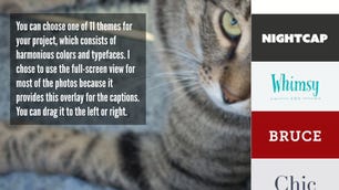
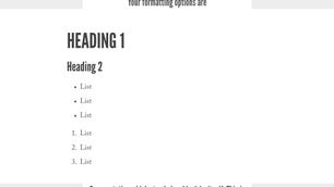
At any time you can select from among 11 theme choices, which control fonts, colors and layout. Projects are designed to be scalable across devices, from phone to desktop display. Each theme includes six text-styling options to choose from. Each toggles between the style and the body text with a tap.
(Geek aside: Slate generates standard CSS in linked stylesheets that reside on Adobe's servers. The styles are a basic set of CSS styles linked to HTML tags: default paragraph, H1, H2, lists and blockquote.)
For now, they're locked: you can't change anything within a theme. On one hand, changing things could result in a domino effect of ugly badness. But I don't think being able to make the caption font a little bigger would end the world.
Photos can come from a variety of sources: your
, the camera, Creative Cloud, Lightroom, Dropbox or via a search through Creative Commons-licensed images from across the Web. If you do the latter, the app pulls in the attribution info, which appears as an "i" icon atop the photo. Other cloud-storage options, such as Google, are on the roadmap, but Adobe is really waiting to see what people ask for.Slate offers a few choices for photo display. They include full screen, full width, windowed and inline. Windowed covers and reveals the image as you scroll; you can indicate the most important area of the image and Slate will try to center around that. Inline will fit the image to the width of the implicit center column of the page.

You move from viewport to viewport by scrolling vertically; they're not really pages, just another asset. You can insert a photo, a group of photos automatically laid out in a grid, a text block, or a button link. The app supports Apple's voice dictation for text entry. The supported types of assets is kind of limited at the moment; notably absent are video and vector graphics.
When you're ready, you can share your story in a variety of ways. If you want it to be public, and therefore visible when people browse, you can categorize it and choose if and how your authorial information should appear. There's also a dedicated photo-credit section, although Adobe pulls in any credits that are carried with the photos.
There are direct share widgets for Facebook, Twitter; email or message with an image and link; or copying a link or embed code to the clipboard. Emailing can only use the native
Mail, so if you're on Gmail you can't do it.When you upload a project it retains a unique URL, so if you need to go back and edit it, it doesn't break the link when you re-upload. That's a very nice feature.
Conclusion
There's plenty here give you a new, more-elegant-than-usual and easily updateable way to communicate with text and images.
Is there stuff missing? Sure. Most importantly, undo and redo are notably absent. Are there annoyances? Yes. Because it's a what-you-see-is-what-you-get interface, the page occasionally scrolls while you're trying to edit text. And rearranging elements means hitting an up or down arrow, but you only see what you're moving while the other elements fly by, which is insanely frustrating. Creating is quick, but editing less so.
While the limited set of themes might get old fast, and while I wish they had at least a few corresponding themes in Voice for consistency, I think Adobe will update the app fast enough based on feedback to keep things interesting.