Screens test: Galaxy Note 2 vs. Apple iPhone 5 (charts)
Here are the charts from the CalMan 4 software comparing the measurements of the iPhone 5's screen to those of the Samsung Galaxy Note 2.


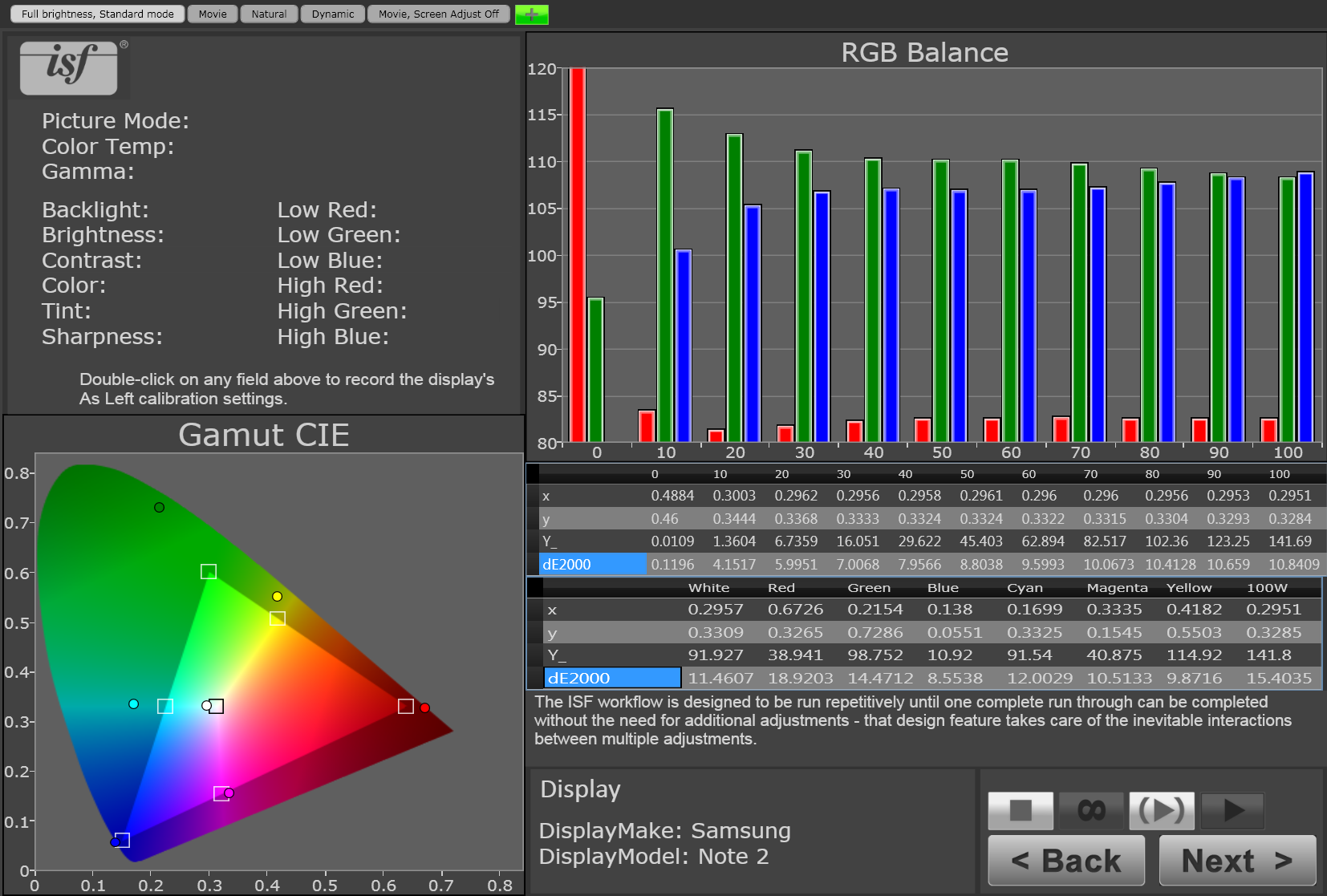
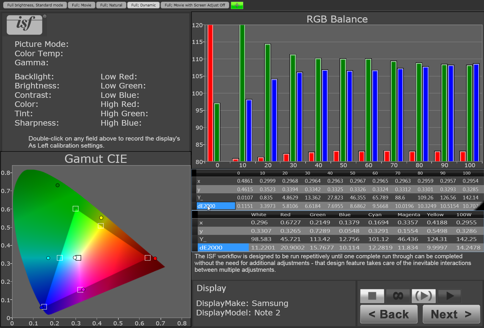
Note 2 (default: full brightness, standard mode)
Here's a brief key, clockwise from the upper left.
-- Above the gray "ISF" logo is the indication of which Screen mode is being measured -- Immediately below it is an area for filling in picture setting details; it goes unused for these charts since phones lack those settings.
-- The large RGB balance bar graph and the "x, y, Y_" table immediately below shows how black ("0") through gray and finally full white ("100") test patterns measured. Ideally all three of the red, green, and blue bars should be close to "100" on the graph's vertical axis. "Y_" is light output in nits, and "dE2000" is the color error.
-- The second table below the bar graph, with the first row listing "white, red, green...100W" shows how the color test patterns measured.
-- The "Gamut CIE" diagram is a visual representation of those color numbers, showing how close the measured display came to the target color. Ideally the colored circles should be as close as possible to the squares of the triangle, which represent the sRGB/Rec 709 standard gamut. The same goes for the central white circle, whose target square is the D65 standard white point. Again, "dE2000" is the color error.
This caption repeats on every slide.

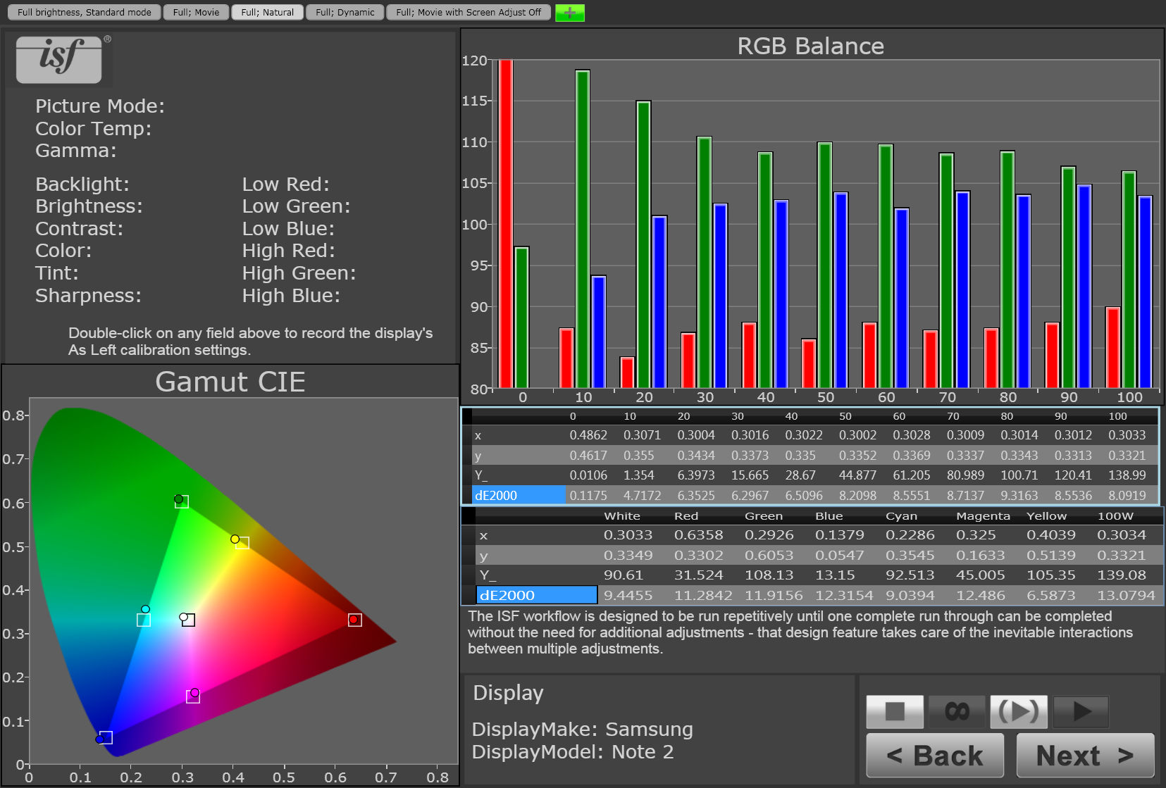
Note 2 (adjusted: AAST off, Movie mode)
Here's a brief key, clockwise from the upper left.
-- Above the gray "ISF" logo is the indication of which Screen mode is being measured -- Immediately below it is an area for filling in picture setting details; it goes unused for these charts since phones lack those settings.
-- The large RGB balance bar graph and the "x, y, Y_" table immediately below shows how black ("0") through gray and finally full white ("100") test patterns measured. Ideally all three of the red, green, and blue bars should be close to "100" on the graph's vertical axis. "Y_" is light output in nits, and "dE2000" is the color error.
-- The second table below the bar graph, with the first row listing "white, red, green...100W" shows how the color test patterns measured.
-- The "Gamut CIE" diagram is a visual representation of those color numbers, showing how close the measured display came to the target color. Ideally the colored circles should be as close as possible to the squares of the triangle, which represent the sRGB/Rec 709 standard gamut. The same goes for the central white circle, whose target square is the D65 standard white point. Again, "dE2000" is the color error.
This caption repeats on every slide.
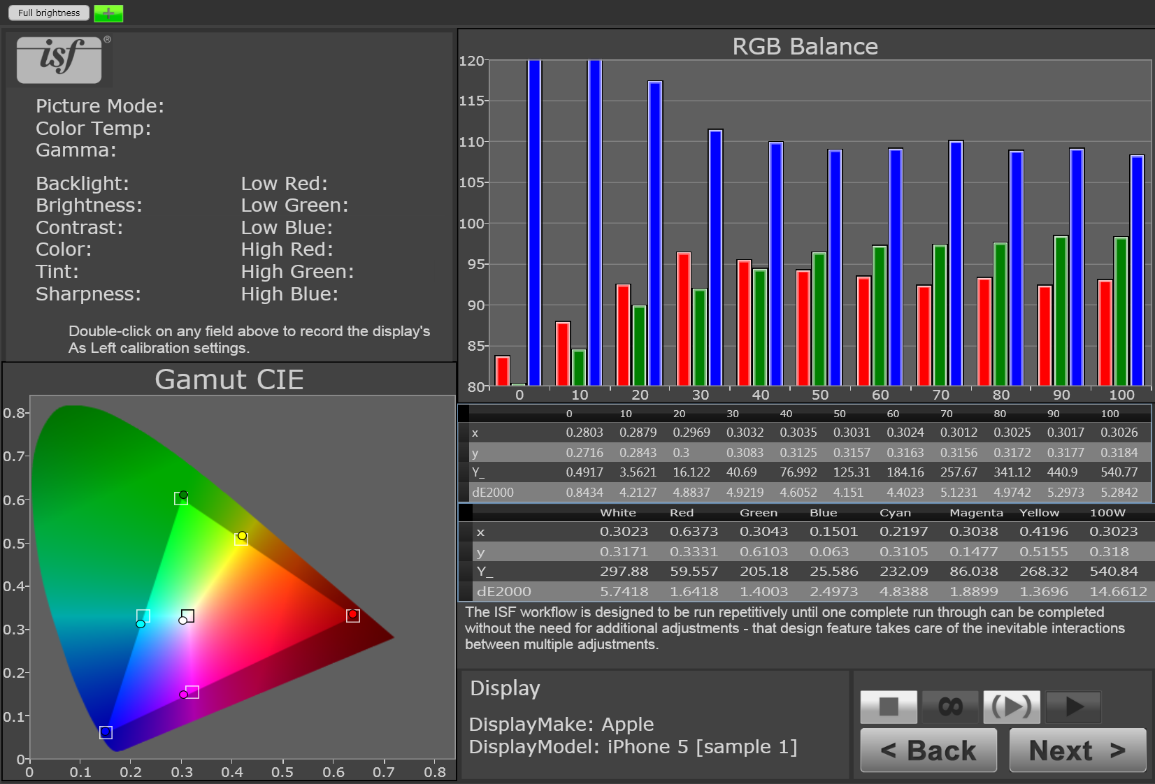
iPhone (default, full brightness)
Here's a brief key, clockwise from the upper left.
-- Above the gray "ISF" logo is the indication of which Screen mode is being measured -- Immediately below it is an area for filling in picture setting details; it goes unused for these charts since phones lack those settings.
-- The large RGB balance bar graph and the "x, y, Y_" table immediately below shows how black ("0") through gray and finally full white ("100") test patterns measured. Ideally all three of the red, green, and blue bars should be close to "100" on the graph's vertical axis. "Y_" is light output in nits, and "dE2000" is the color error.
-- The second table below the bar graph, with the first row listing "white, red, green...100W" shows how the color test patterns measured.
-- The "Gamut CIE" diagram is a visual representation of those color numbers, showing how close the measured display came to the target color. Ideally the colored circles should be as close as possible to the squares of the triangle, which represent the sRGB/Rec 709 standard gamut. The same goes for the central white circle, whose target square is the D65 standard white point. Again, "dE2000" is the color error.
This caption repeats on every slide.
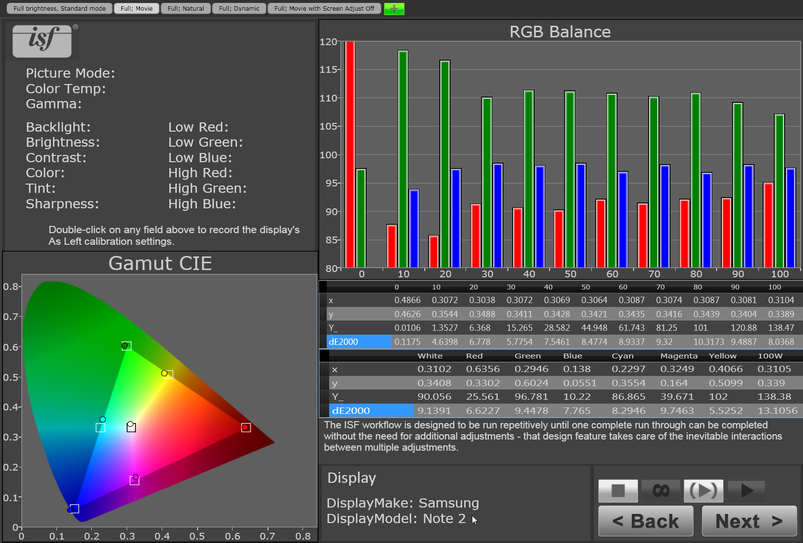
Note 2 (full brightness, natural mode)
Here's a brief key, clockwise from the upper left.
-- Above the gray "ISF" logo is the indication of which Screen mode is being measured -- Immediately below it is an area for filling in picture setting details; it goes unused for these charts since phones lack those settings.
-- The large RGB balance bar graph and the "x, y, Y_" table immediately below shows how black ("0") through gray and finally full white ("100") test patterns measured. Ideally all three of the red, green, and blue bars should be close to "100" on the graph's vertical axis. "Y_" is light output in nits, and "dE2000" is the color error.
-- The second table below the bar graph, with the first row listing "white, red, green...100W" shows how the color test patterns measured.
-- The "Gamut CIE" diagram is a visual representation of those color numbers, showing how close the measured display came to the target color. Ideally the colored circles should be as close as possible to the squares of the triangle, which represent the sRGB/Rec 709 standard gamut. The same goes for the central white circle, whose target square is the D65 standard white point. Again, "dE2000" is the color error.
This caption repeats on every slide.
Note 2 (full brightness, movie mode)
Here's a brief key, clockwise from the upper left.
-- Above the gray "ISF" logo is the indication of which Screen mode is being measured -- Immediately below it is an area for filling in picture setting details; it goes unused for these charts since phones lack those settings.
-- The large RGB balance bar graph and the "x, y, Y_" table immediately below shows how black ("0") through gray and finally full white ("100") test patterns measured. Ideally all three of the red, green, and blue bars should be close to "100" on the graph's vertical axis. "Y_" is light output in nits, and "dE2000" is the color error.
-- The second table below the bar graph, with the first row listing "white, red, green...100W" shows how the color test patterns measured.
-- The "Gamut CIE" diagram is a visual representation of those color numbers, showing how close the measured display came to the target color. Ideally the colored circles should be as close as possible to the squares of the triangle, which represent the sRGB/Rec 709 standard gamut. The same goes for the central white circle, whose target square is the D65 standard white point. Again, "dE2000" is the color error.
This caption repeats on every slide.
Note 2 (full brightness, dynamic mode)
Here's a brief key, clockwise from the upper left.
-- Above the gray "ISF" logo is the indication of which Screen mode is being measured -- Immediately below it is an area for filling in picture setting details; it goes unused for these charts since phones lack those settings.
-- The large RGB balance bar graph and the "x, y, Y_" table immediately below shows how black ("0") through gray and finally full white ("100") test patterns measured. Ideally all three of the red, green, and blue bars should be close to "100" on the graph's vertical axis. "Y_" is light output in nits, and "dE2000" is the color error.
-- The second table below the bar graph, with the first row listing "white, red, green...100W" shows how the color test patterns measured.
-- The "Gamut CIE" diagram is a visual representation of those color numbers, showing how close the measured display came to the target color. Ideally the colored circles should be as close as possible to the squares of the triangle, which represent the sRGB/Rec 709 standard gamut. The same goes for the central white circle, whose target square is the D65 standard white point. Again, "dE2000" is the color error.
This caption repeats on every slide.
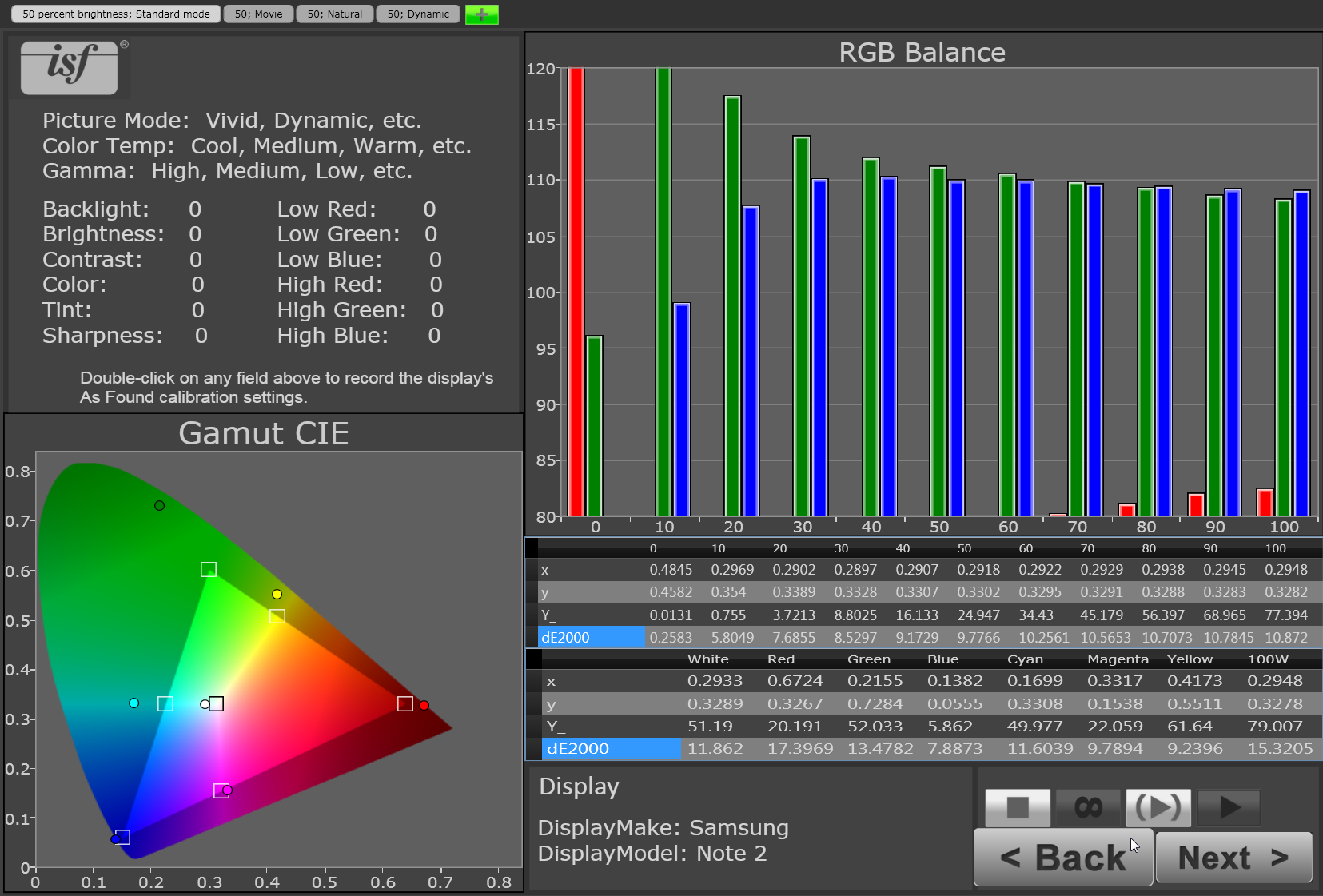
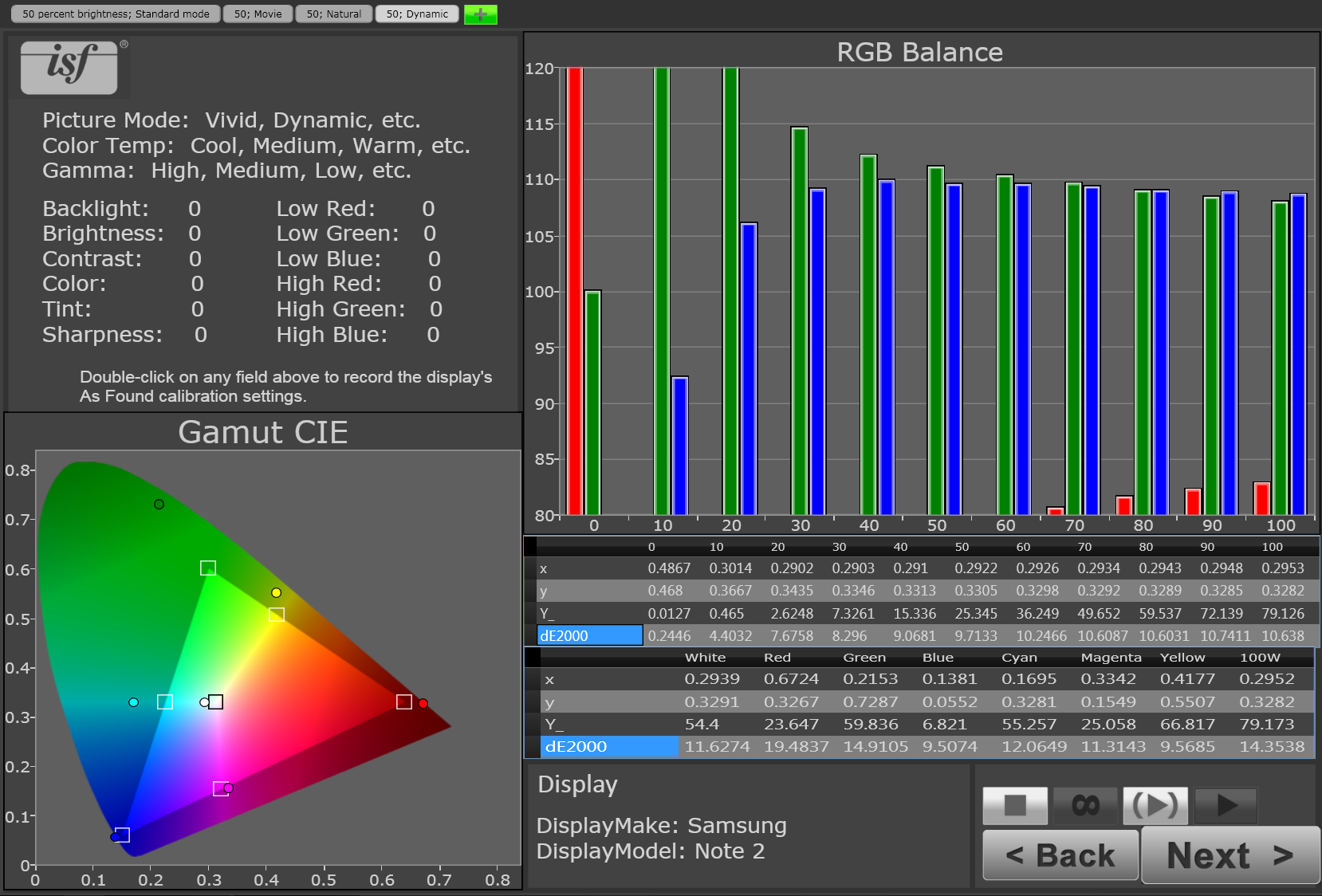
Note 2 (half brightness, standard mode)
Here's a brief key, clockwise from the upper left.
-- Above the gray "ISF" logo is the indication of which Screen mode is being measured -- Immediately below it is an area for filling in picture setting details; it goes unused for these charts since phones lack those settings.
-- The large RGB balance bar graph and the "x, y, Y_" table immediately below shows how black ("0") through gray and finally full white ("100") test patterns measured. Ideally all three of the red, green, and blue bars should be close to "100" on the graph's vertical axis. "Y_" is light output in nits, and "dE2000" is the color error.
-- The second table below the bar graph, with the first row listing "white, red, green...100W" shows how the color test patterns measured.
-- The "Gamut CIE" diagram is a visual representation of those color numbers, showing how close the measured display came to the target color. Ideally the colored circles should be as close as possible to the squares of the triangle, which represent the sRGB/Rec 709 standard gamut. The same goes for the central white circle, whose target square is the D65 standard white point. Again, "dE2000" is the color error.
This caption repeats on every slide.
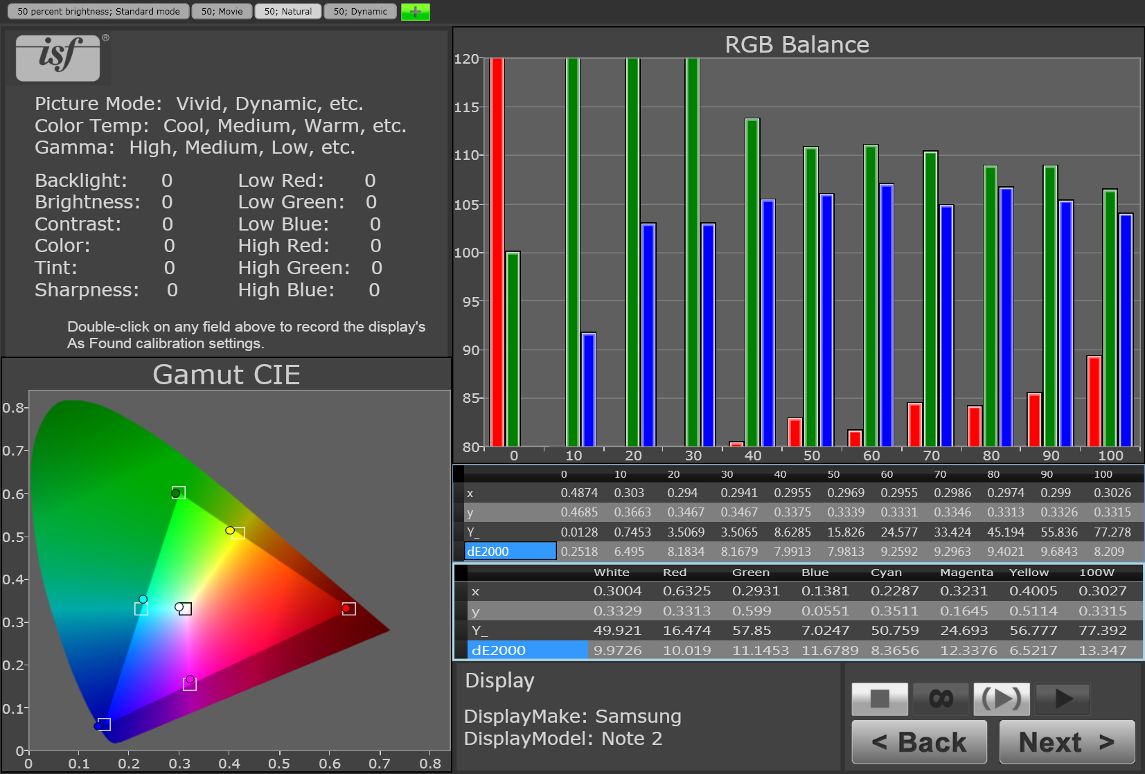
Note 2 (half brightness, natural mode)
Here's a brief key, clockwise from the upper left.
-- Above the gray "ISF" logo is the indication of which Screen mode is being measured -- Immediately below it is an area for filling in picture setting details; it goes unused for these charts since phones lack those settings.
-- The large RGB balance bar graph and the "x, y, Y_" table immediately below shows how black ("0") through gray and finally full white ("100") test patterns measured. Ideally all three of the red, green, and blue bars should be close to "100" on the graph's vertical axis. "Y_" is light output in nits, and "dE2000" is the color error.
-- The second table below the bar graph, with the first row listing "white, red, green...100W" shows how the color test patterns measured.
-- The "Gamut CIE" diagram is a visual representation of those color numbers, showing how close the measured display came to the target color. Ideally the colored circles should be as close as possible to the squares of the triangle, which represent the sRGB/Rec 709 standard gamut. The same goes for the central white circle, whose target square is the D65 standard white point. Again, "dE2000" is the color error.
This caption repeats on every slide.
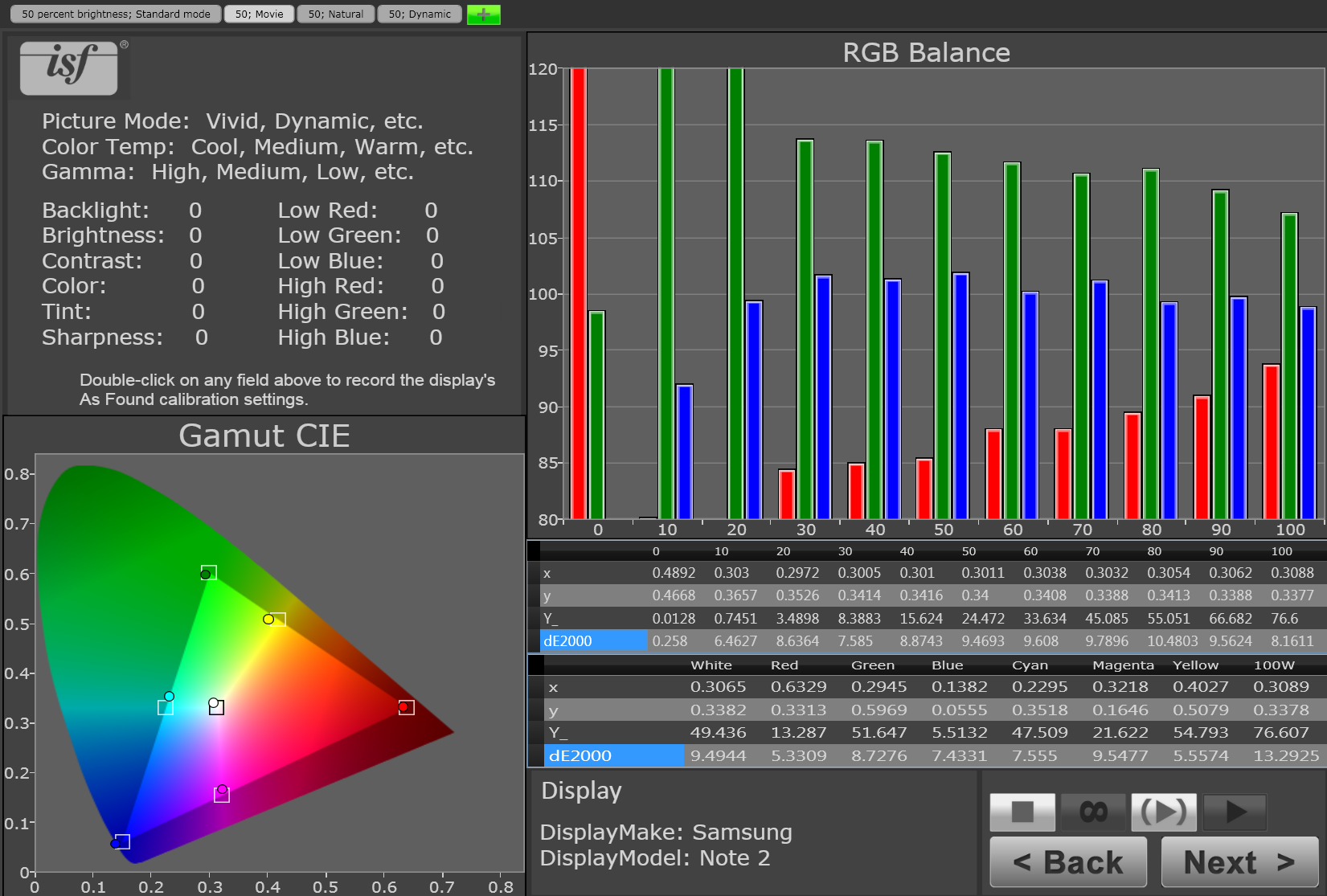
Note 2 (half brightness, movie mode)
Here's a brief key, clockwise from the upper left.
-- Above the gray "ISF" logo is the indication of which Screen mode is being measured -- Immediately below it is an area for filling in picture setting details; it goes unused for these charts since phones lack those settings.
-- The large RGB balance bar graph and the "x, y, Y_" table immediately below shows how black ("0") through gray and finally full white ("100") test patterns measured. Ideally all three of the red, green, and blue bars should be close to "100" on the graph's vertical axis. "Y_" is light output in nits, and "dE2000" is the color error.
-- The second table below the bar graph, with the first row listing "white, red, green...100W" shows how the color test patterns measured.
-- The "Gamut CIE" diagram is a visual representation of those color numbers, showing how close the measured display came to the target color. Ideally the colored circles should be as close as possible to the squares of the triangle, which represent the sRGB/Rec 709 standard gamut. The same goes for the central white circle, whose target square is the D65 standard white point. Again, "dE2000" is the color error.
This caption repeats on every slide.
Note 2 (half brightness, dynamic mode)
Here's a brief key, clockwise from the upper left.
-- Above the gray "ISF" logo is the indication of which Screen mode is being measured -- Immediately below it is an area for filling in picture setting details; it goes unused for these charts since phones lack those settings.
-- The large RGB balance bar graph and the "x, y, Y_" table immediately below shows how black ("0") through gray and finally full white ("100") test patterns measured. Ideally all three of the red, green, and blue bars should be close to "100" on the graph's vertical axis. "Y_" is light output in nits, and "dE2000" is the color error.
-- The second table below the bar graph, with the first row listing "white, red, green...100W" shows how the color test patterns measured.
-- The "Gamut CIE" diagram is a visual representation of those color numbers, showing how close the measured display came to the target color. Ideally the colored circles should be as close as possible to the squares of the triangle, which represent the sRGB/Rec 709 standard gamut. The same goes for the central white circle, whose target square is the D65 standard white point. Again, "dE2000" is the color error.
This caption repeats on every slide.
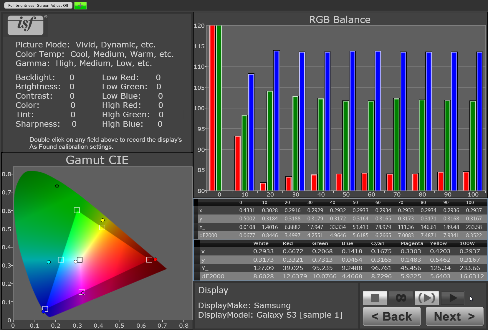
Galaxy S3 (full brightness, AAST off)
Here's a brief key, clockwise from the upper left.
-- Above the gray "ISF" logo is the indication of which Screen mode is being measured -- Immediately below it is an area for filling in picture setting details; it goes unused for these charts since phones lack those settings.
-- The large RGB balance bar graph and the "x, y, Y_" table immediately below shows how black ("0") through gray and finally full white ("100") test patterns measured. Ideally all three of the red, green, and blue bars should be close to "100" on the graph's vertical axis. "Y_" is light output in nits, and "dE2000" is the color error.
-- The second table below the bar graph, with the first row listing "white, red, green...100W" shows how the color test patterns measured.
-- The "Gamut CIE" diagram is a visual representation of those color numbers, showing how close the measured display came to the target color. Ideally the colored circles should be as close as possible to the squares of the triangle, which represent the sRGB/Rec 709 standard gamut. The same goes for the central white circle, whose target square is the D65 standard white point. Again, "dE2000" is the color error.
This caption repeats on every slide.
More Galleries

My Favorite Shots From the Galaxy S24 Ultra's Camera
20 Photos
Honor's Magic V2 Foldable Is Lighter Than Samsung's Galaxy S24 Ultra
10 Photos
The Samsung Galaxy S24 and S24 Plus Looks Sweet in Aluminum
23 Photos
Samsung's Galaxy S24 Ultra Now Has a Titanium Design
23 Photos
I Took 600+ Photos With the iPhone 15 Pro and Pro Max. Look at My Favorites
34 Photos
