After a fear-soaked weekend worrying that Motorola would mess up its gorgeous new Xoom tablet with Motoblur -- don't worry, it promised not to -- we're back to daydreaming about the flagship slab of Android 3.0 Honeycomb goodness.
Although we love the Samsung Galaxy Tab, the best Android tablet so far, we can't wait to wrap our mitts around one with a user interface that was specifically designed for the big screen.
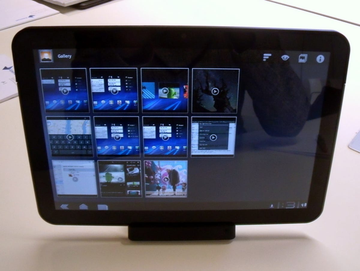
We took the Xoom for a test drive recently and spent even more time with Honeycomb. Although it was still a prototype, and far from stable, we're happy to report that the user interface is fresh and fun to use.
The 3D-style carousel of home screens packs in plenty of space for widgets, and the widgets themselves can now support more graphical whizz-bang-osity. For example, a widget for Google's ebook reader app shows a stack of book covers, which you can scroll through right in the widget.
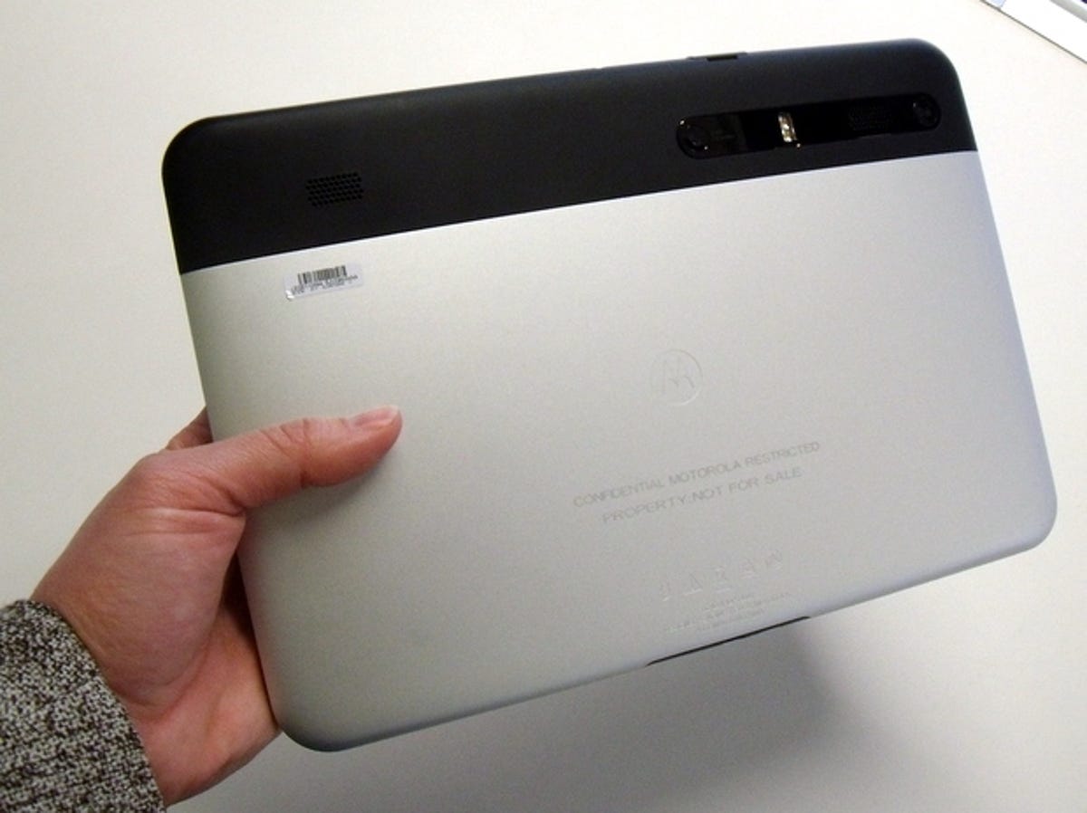
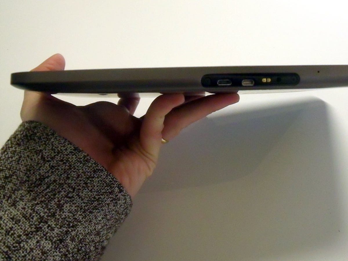
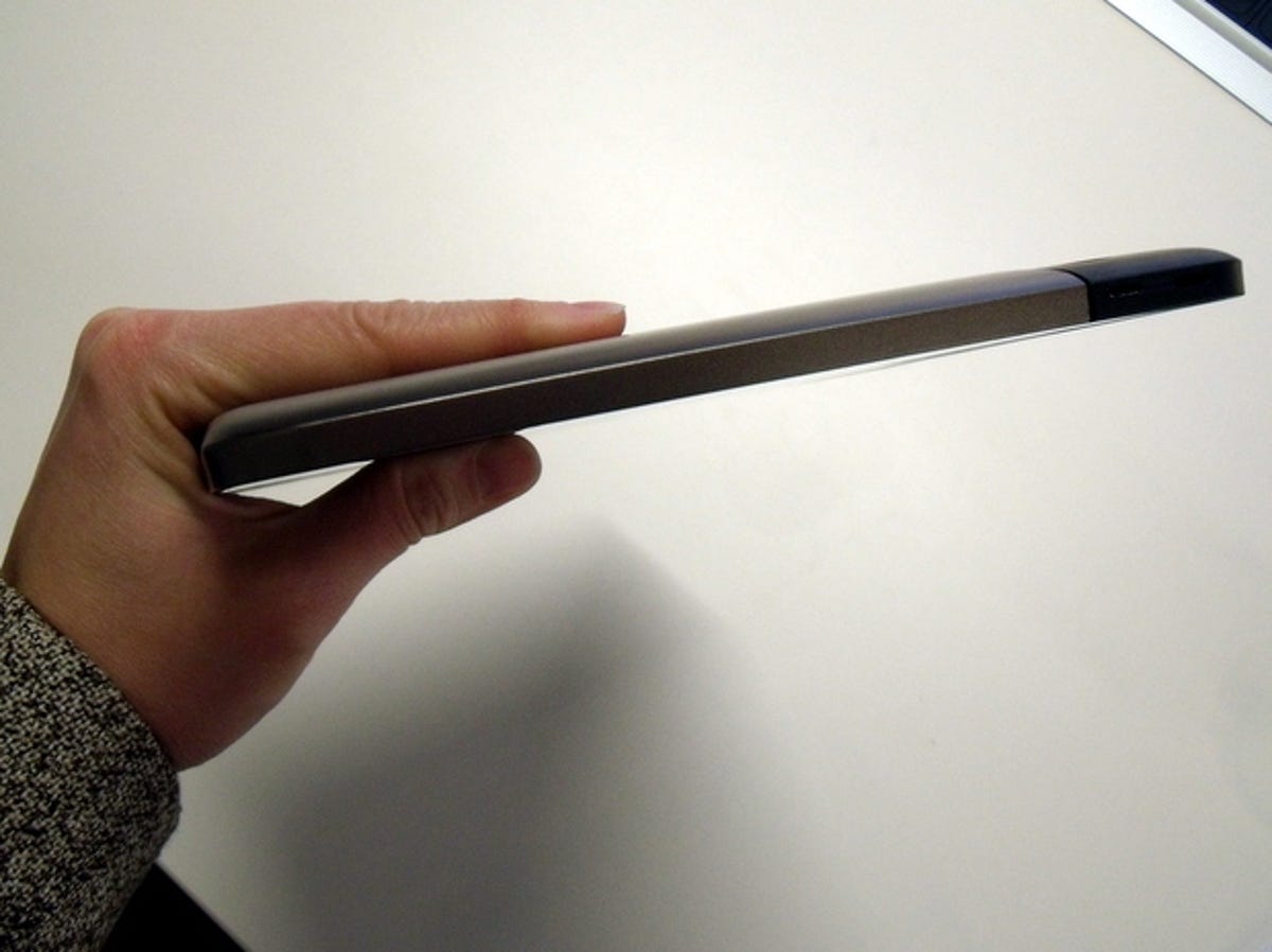
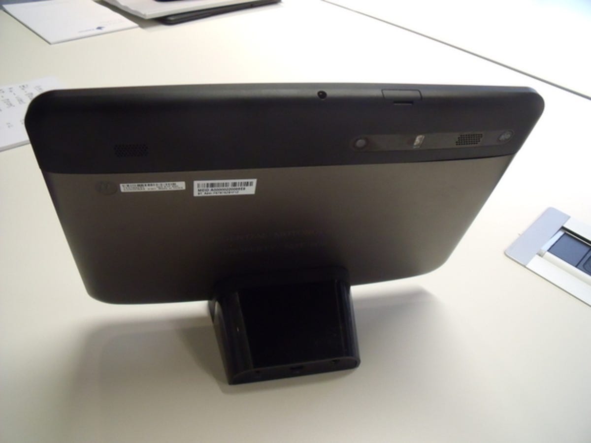
The Xoom itself still has some tweaking to do, including deciding once and for all what colour it's going to be. We've seen it in black and silver -- and so can you if you click the gallery above.
But there's no doubt that at 10.1 inches, the Xoom will be a hefty beast. Like the iPad, you're likely to need two hands, a lap, or the wrists of a milkmaid to hold the Xoom up for a long reading session. The iPad is around 5g lighter than the 730g weight we expect for the Xoom.
Hit the gallery above to measure up the Xoom for a spot in your valuable hand land, then check out our full in-depth preview here.


More Galleries

My Favorite Shots From the Galaxy S24 Ultra's Camera
20 Photos
Honor's Magic V2 Foldable Is Lighter Than Samsung's Galaxy S24 Ultra
10 Photos
The Samsung Galaxy S24 and S24 Plus Looks Sweet in Aluminum
23 Photos
Samsung's Galaxy S24 Ultra Now Has a Titanium Design
23 Photos
I Took 600+ Photos With the iPhone 15 Pro and Pro Max. Look at My Favorites
34 Photos
