Loving paper maps in the age of GPS
In an amazing exhibit, the British Library celebrates the glory of maps by showing how they've shaped our history, our culture, and how we understand each other.


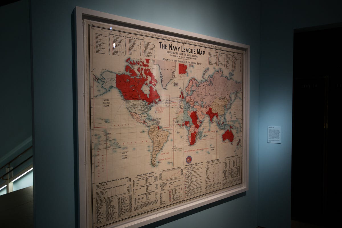
A very British map
Through Match 1, 2017, the British Library in London is showing a fascinating exhibition called "Maps and the 20th Century: Drawing the Line."
Assembled by curator Tom Harper, it shows how paper maps still pervade our daily lives, even as we slowly ditch them for apps on our phones. Maps do more than just help us find our way, they reflect how we see ourselves and the world around us. If you're in London over the next two months, check out this incredible collection. It's well worth your time.
Made in 1901, this first map greets you at the exhibit's entrance. It depicts the history and strength of the British Navy and the British Empire at its peak.
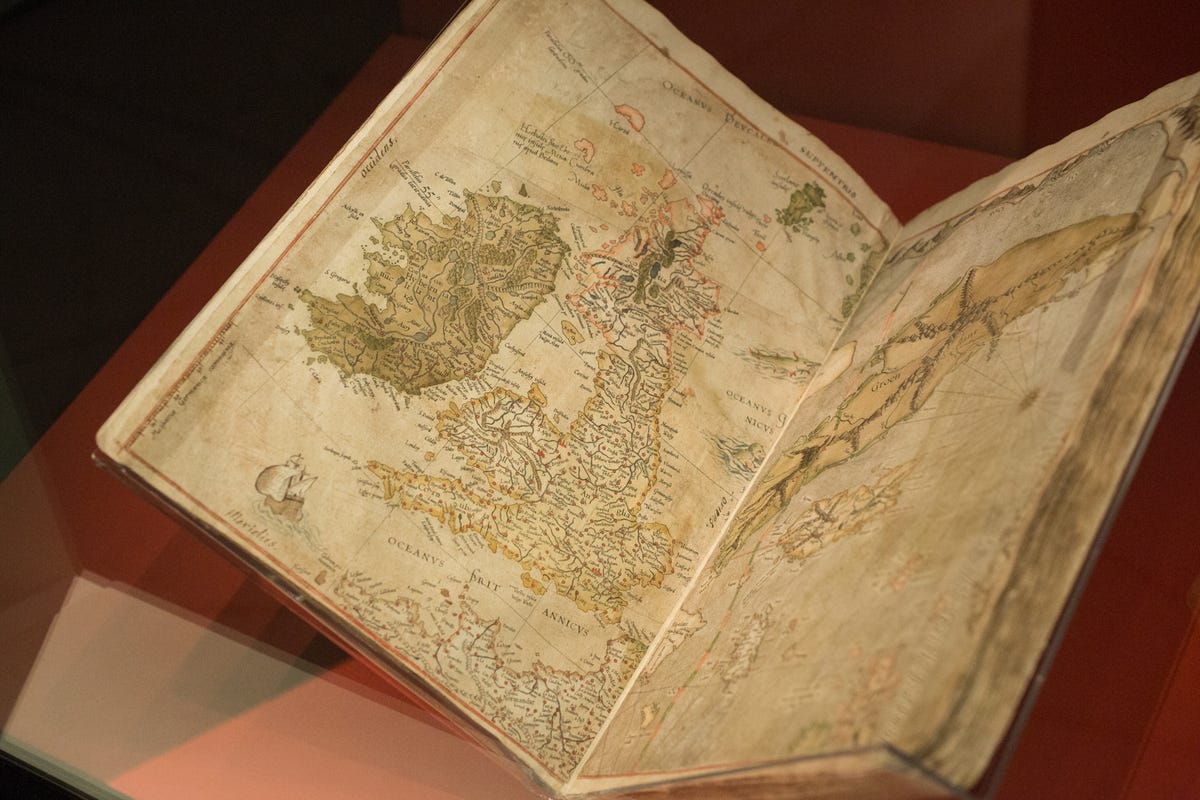
The man who made maps
One of the oldest and most important items in the collection is The Mercator Atlas of Europe. Compiled in the 1570s, it's the work of Flemish cartographer Gerardus Mercator.
Mercator's legacy lives on to this day with the Mercator projection, or the common wall map that exaggerates the size of regions near the poles. I mean, you know that Greenland isn't nearly as large as Africa. Right?
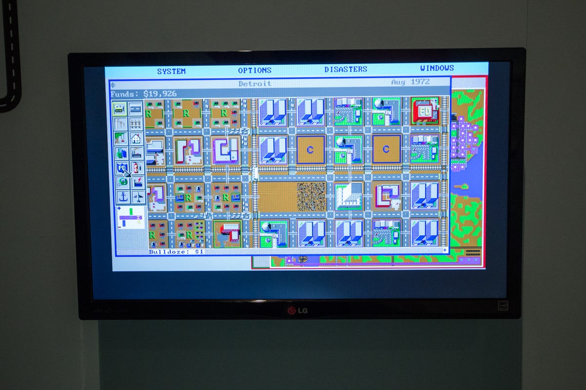
Maps as a game
Oh, original Sim City. Oh, grand and courageous time waster of my high school years. I salute you.
Released in 1989, the original game appealed to a non-gamer like me for two reasons: Gameplay revolved around a map, and it indulged my inner geography/urban planning nerd. Many subsequent Sim City versions followed.
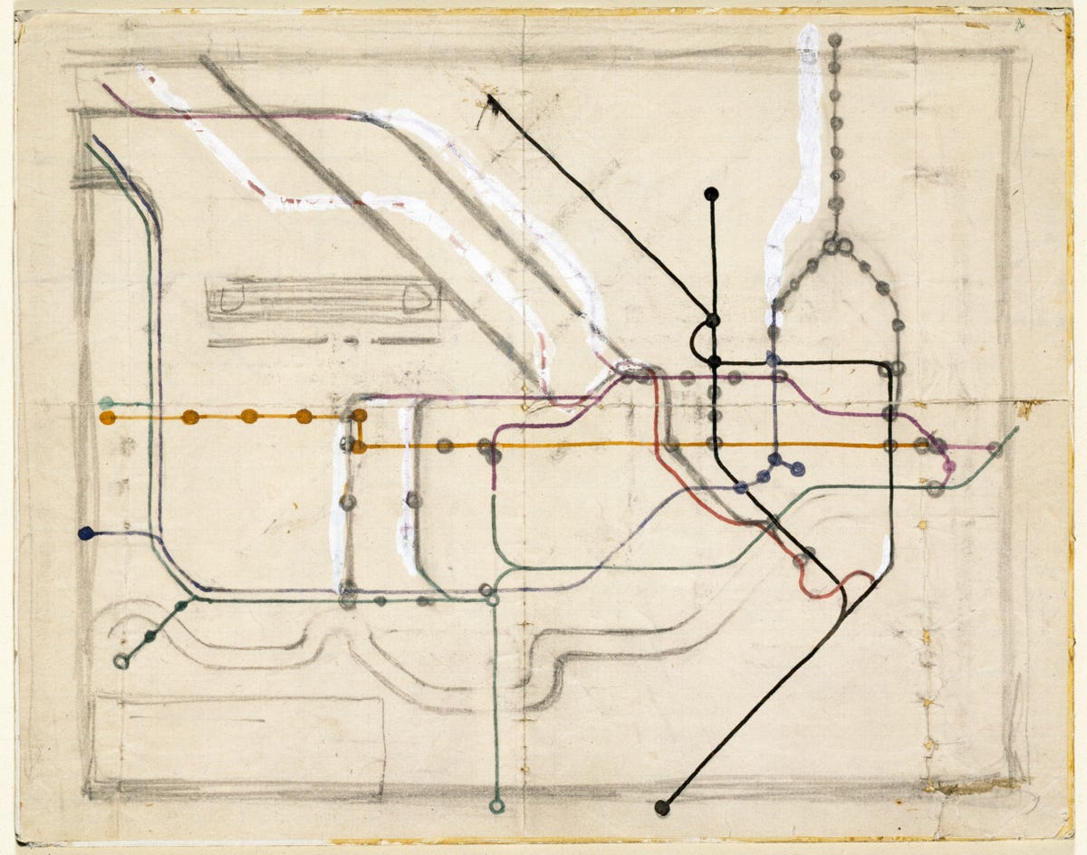
Mind the gap
A London icon if there ever was one, this is the first incarnation of the current London Underground map. Drawn in 1931 by draftsman Harry Beck, it dispensed with geographical accuracy -- Paddington isn't really directly north of Notting Hill Gate, for example -- in favor of showing how to get from one station to another. Beck leaned on his experience drawing electrical circuit diagrams to create the concept. The first official version for passengers was published two years later.
Though it has been somwhat altered in the decades since, the map's basic design is what we use today. It's arguably the most influential and recognizable transit map ever.

A hated subway map
As celebrated transit maps go, the New York City subway map is second only to Beck's creation. But unlike London's map, its history has been far more turbulent.
In 1972, designer Massimo Vignelli shocked New Yorkers with a highly-stylized subway map based on Beck's design that simplified the tangled subway diagram with straight lines bent at 45- and 90-degrees angles. It was quickly unpopular for its distorted geography, lack of detail and muddy color scheme (water was beige instead of blue). In 1979, transit officials replaced Vignelli's map with an early version of the existing map.
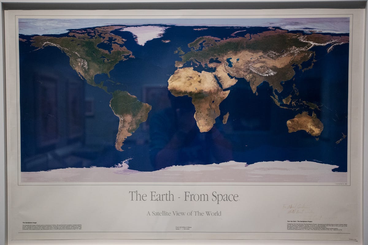
Earth from space
One of the earliest satellite maps, the 1990 design compiled multiple shots from space to depict an entirely cloudless day across the entire planet. In the mid-1990s it also was a common decoration in university dorm rooms.
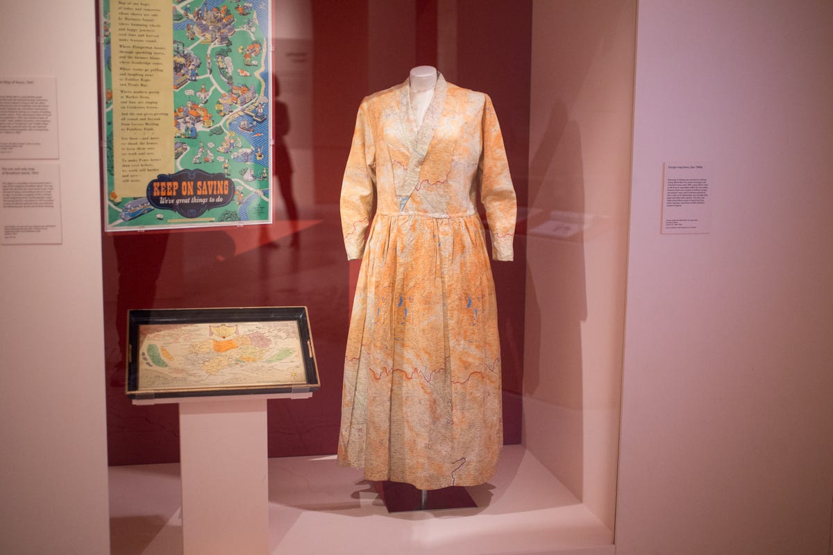
Maps reused
This isn't just a couture dress with a map print. Rather, it's a dress made of small fabric maps showing evacuation routes away from the southern British coast during World War II. The fabric swatches were supplied to the local population for use during a German invasion.
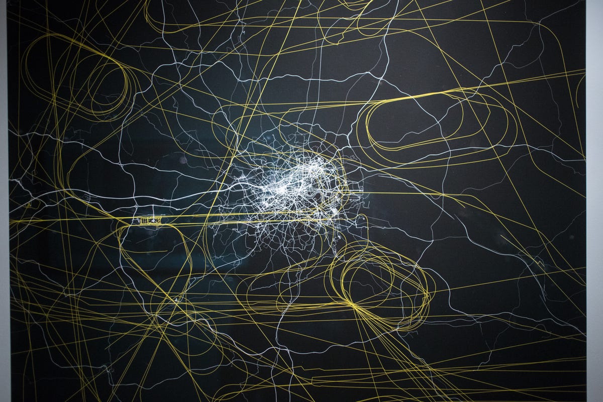
Maps of movement
In "My Ghost", artist Jeremy Wood wore a GPS device to track his movements around Greater London for 16 years.
The concentrated white lines show his movement around the city center by foot, bicycle, car and bus. Yellow lines show when he was in an airplane. Why the loops in the corners? Those are from when Wood was in a holding pattern while on approach to Heathrow Airport.

Money as money
Before the introduction of the euro in 2002, Italians used the lira, Greeks the drachma, France the franc and Portugal the escudo. Here you can see those former currencies superimposed on their countries. Of course, other currencies on the map, like the British pound and the Swedish krona, are still in use.

All cables lead to London
Using the UK as the center of world, this map shows the undersea cables connecting the British Empire (the red bits) to the rest of the world.
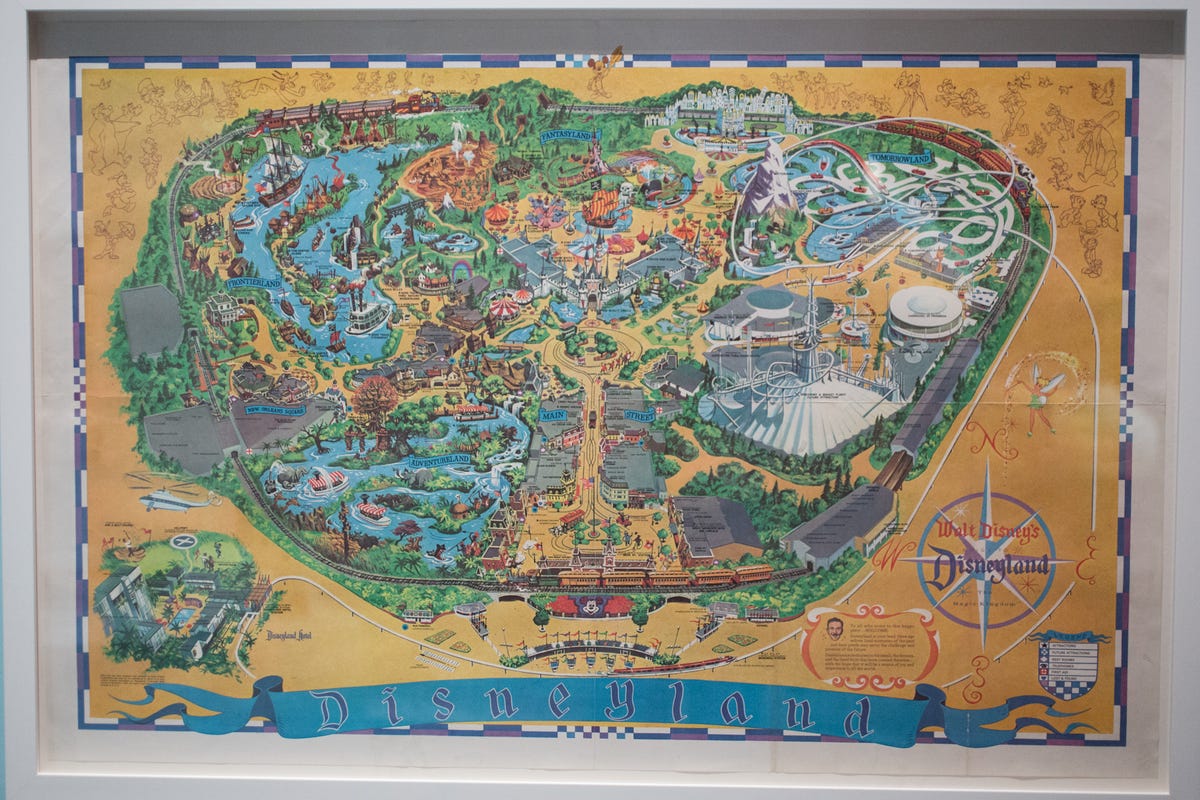
'The Happiest Place on Earth'
Printed in 1968, 11 years after Disneyland opened, you could buy this map as a souvenir in the park's shops (I still have a circa-1985 version). Many of the attractions depicted on the map still exist, while others, like The Mine Train Through Nature's Wonderland and Carousel of Progress, have long since closed.
The basic shape of Disneyland has remained the same, though the world beyond the park's borders has changed dramatically.
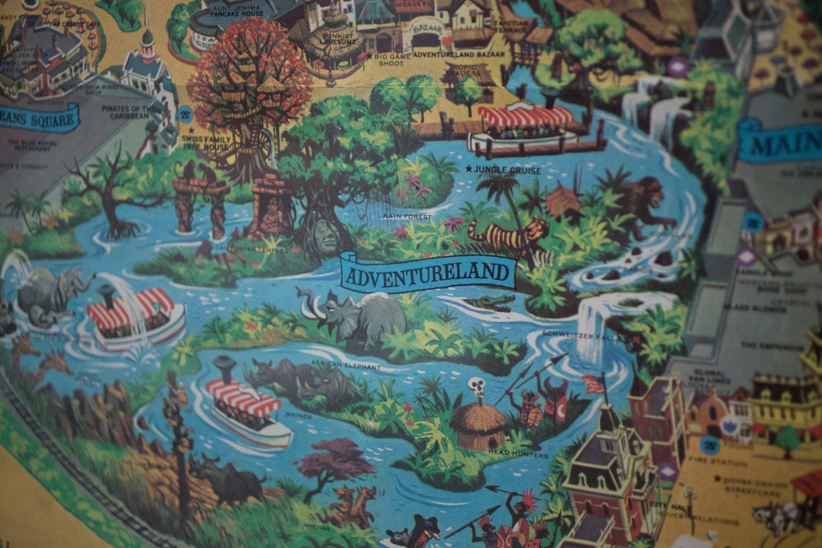
I've had a special affinity with the Adventureland section of the park since I worked as a Jungle Cruise skipper during the mid-1990s. You see that? We call that the backside of water!
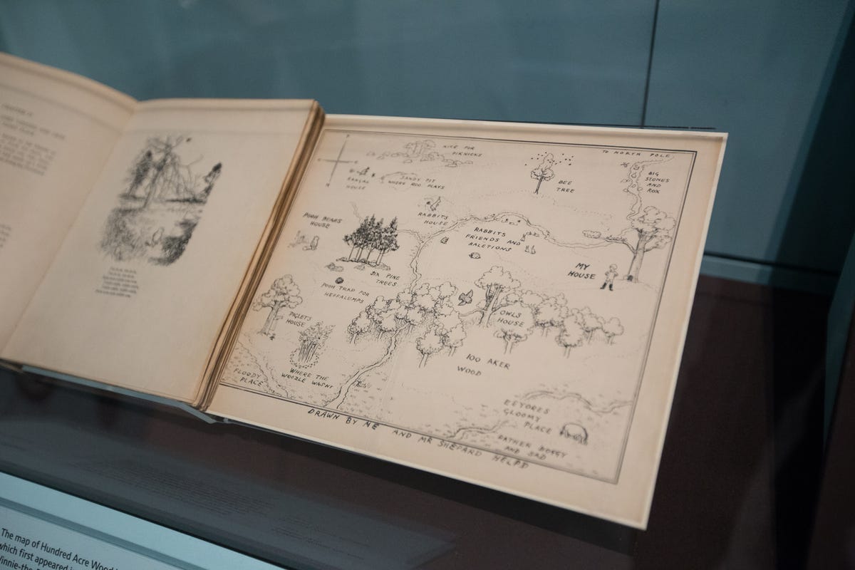
Hundred Acre Wood
Drawn by EH Shepard, this hand-drawn map of Winnie-the-Pooh's forest home first appeared in AA Milne's stories in 1926. The setting for the Wood was inspired by Ashdown Forest in Sussex, England.
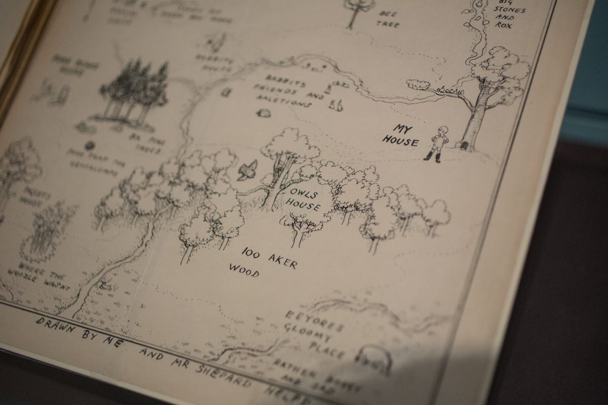
Apparently, the 100 Acre Wood map was really drawn by Christopher Robin.
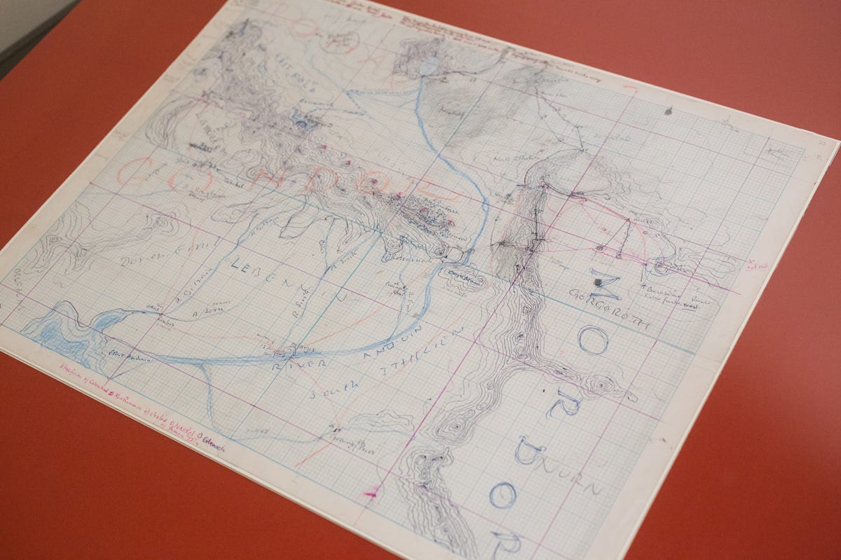
Maps of fantasy
If "Lord of the Rings" is more your thing, here's a depiction of J.R.R. Tolkien's Middle Earth. Mordor is on the right and Gondor is on the left.

Europe on the brink
A Portugese "Mappa Humoristico da Europa" from 1914 depicts the countries of Europe as animals just before the outbreak of World War I.
The war's later belligerents like France, Germany and the UK are clawing and biting each other while smaller (and later neutral) nations like Spain and Norway watch the unfolding drama.

Maps as humor
A similar map from 1953 depicts European country as, well, different personalities. Spain is a bull relaxing in a chair, the UK is a sailor and Sweden is some sort of weird elephant. Behind the Iron Curtain a Russian (cat, I guess?) cracks a whip over the Eastern Bloc nations. Meanwhile, the countries of North and South America watch from a balcony across the Atlantic Ocean.

Earlier in the East
Back to animals, this 1904 Japanese map shows a bloated Russian octopus encroaching on Korea and Manchuria during the Russo-Japanese War (1905-1905). It was a war that Russia would lose.

Maps as propaganda
Maps as propaganda were a major theme of the exhibit. In this 1915 German map, an invasive British spider is spinning a web all over Europe while devouring its French ally. Up in the top corner, Uncle Sam watches from afar (the US wouldn't join WWI until 1917).
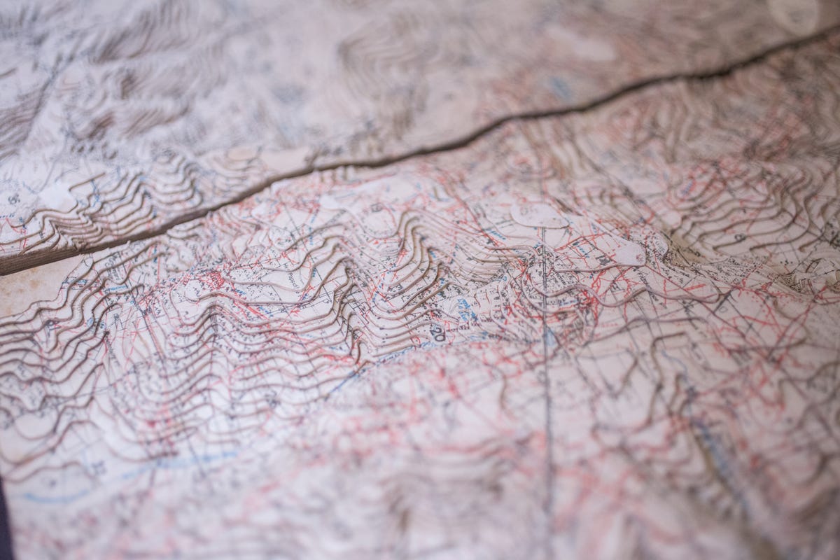
Maps as war
Two years later was the Third Battle of Ypres. Here's a relief map of the Western Front in Belgium from just before the battle began. The red lines show the German trenches.
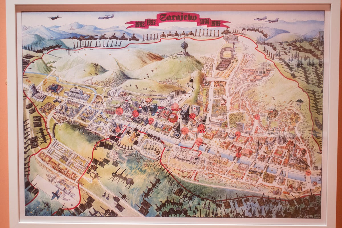
Maps of emergency
Though at first glance it may look like the map of a theme park, this map shows something much deadlier: Sarajevo during the siege by Bosnian Serb troops from 1992 to 1996. Clearly visible is the ring of armaments around the city, while closer in are secret tunnels and places to hide from sniper fire.
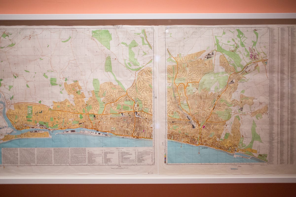
Mysterious maps
Found in 1992 after the collapse of the Soviet Union, this map shows the English city of Brighton, but all in Russian. Made for a possible invasion, perhaps?

From Pearl Harbor to Hiroshima
Called "Utopia," this map takes the Hawaiian island of Oahu and uses it to show the beginning and end of WWII between the United States and Japan.
Though much of the island like Pearl Harbor (the war's start) and Honolulu look as they actually do, other places have been altered. Look closely in the top left corner, for example, and you can see a map of the Japanese city of Hiroshima (the war's end).
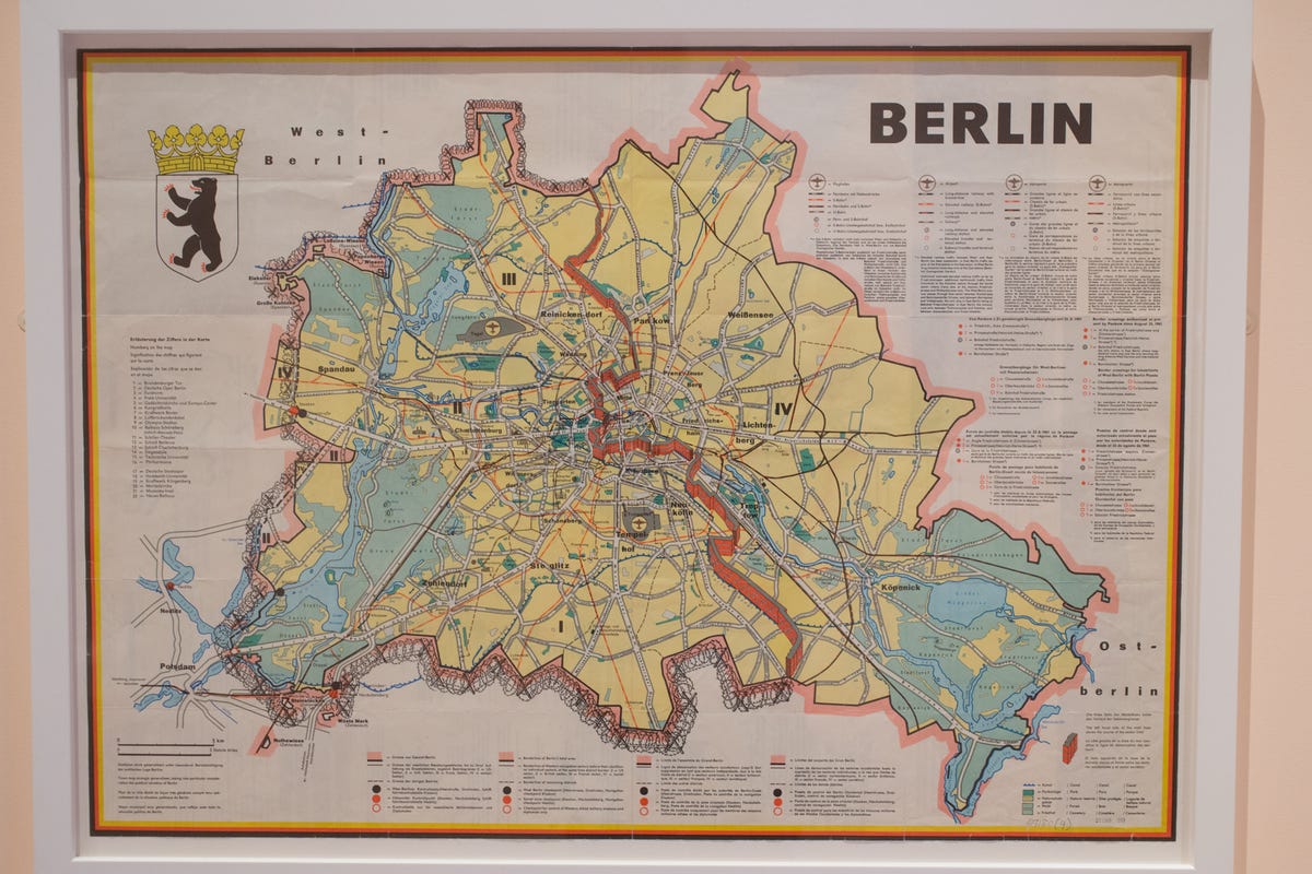
Maps that are no more
Berlin as divided by the wall now only lives in maps like this.
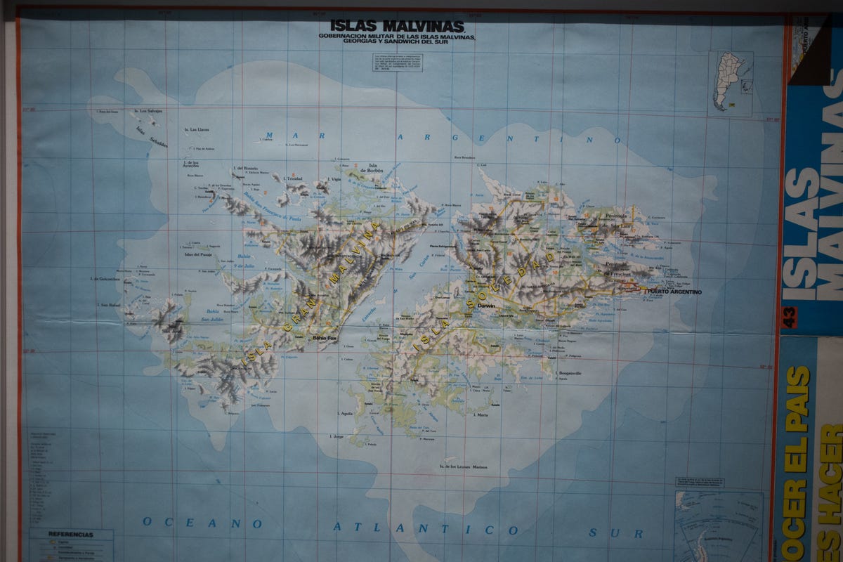
An Argentine view
Most of us probably call them the Falkland Islands, but to Argentina these sheepish specks in the South Atlantic are known as the Islas Malvinas.
By replacing the English place names with Argentine names, this 1986 map shows that geography often is in the eye of the beholder.

Maps for breakfast
If you like maps as much as I do, why not have your breakfast on a tray showing a map of your breakfast?
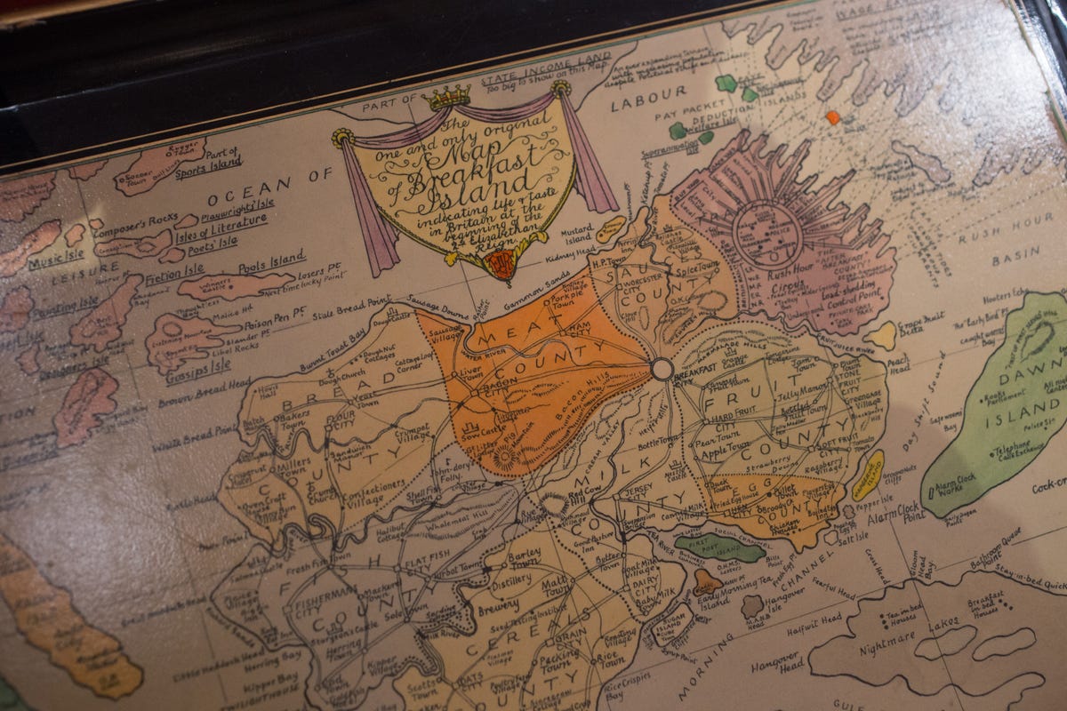
Choose your meal from the Milk, Cereal, Milk, Bread and Fruit Counties.
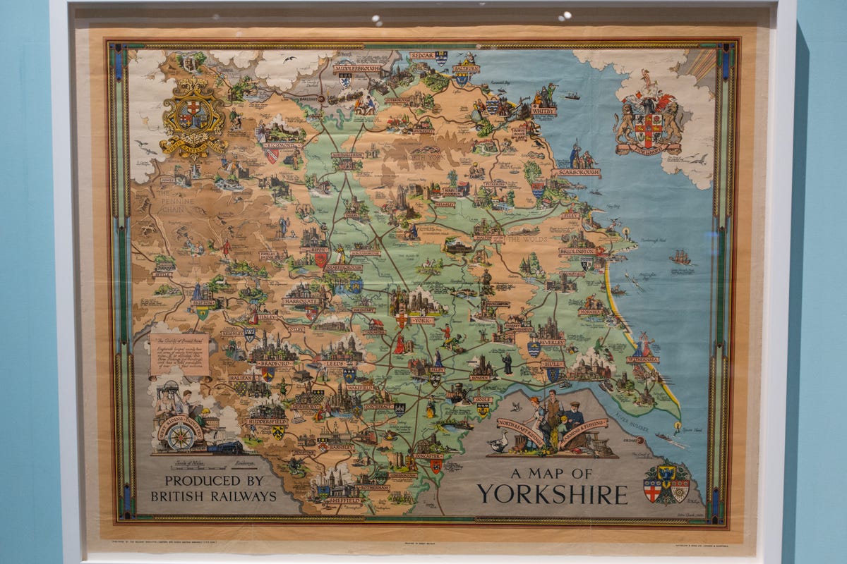
Maps for travel
Produced by British Railways in 1949, this travel map shows England's Yorkshire with drawings representing the region's cities and attractions.
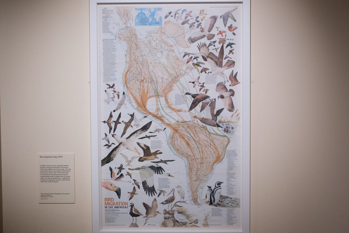
A map for the birds
This map shows the exhaustingly long flyways for migratory birds between North and South America.

And lastly, GPS
The exhibition doesn't ignore GPS. Here's one of the earliest GPS devices for consumers, a handheld unit that was produced in 1993.
More Galleries

My Favorite Shots From the Galaxy S24 Ultra's Camera
20 Photos
Honor's Magic V2 Foldable Is Lighter Than Samsung's Galaxy S24 Ultra
10 Photos
The Samsung Galaxy S24 and S24 Plus Looks Sweet in Aluminum
23 Photos
Samsung's Galaxy S24 Ultra Now Has a Titanium Design
23 Photos
I Took 600+ Photos With the iPhone 15 Pro and Pro Max. Look at My Favorites
34 Photos
