X

Imagining a Jony Ive-inspired world (pictures)

Imagineers from around the world submit funny images of how they think Jony Ive's new design ethos -- seen in iOS 7 -- would affect the world.
headshots_Christopher_MacManus_140x100.jpg
Christopher MacManus
ios_hero_short_2x.png
1 of 9 Apple

A ripple effect

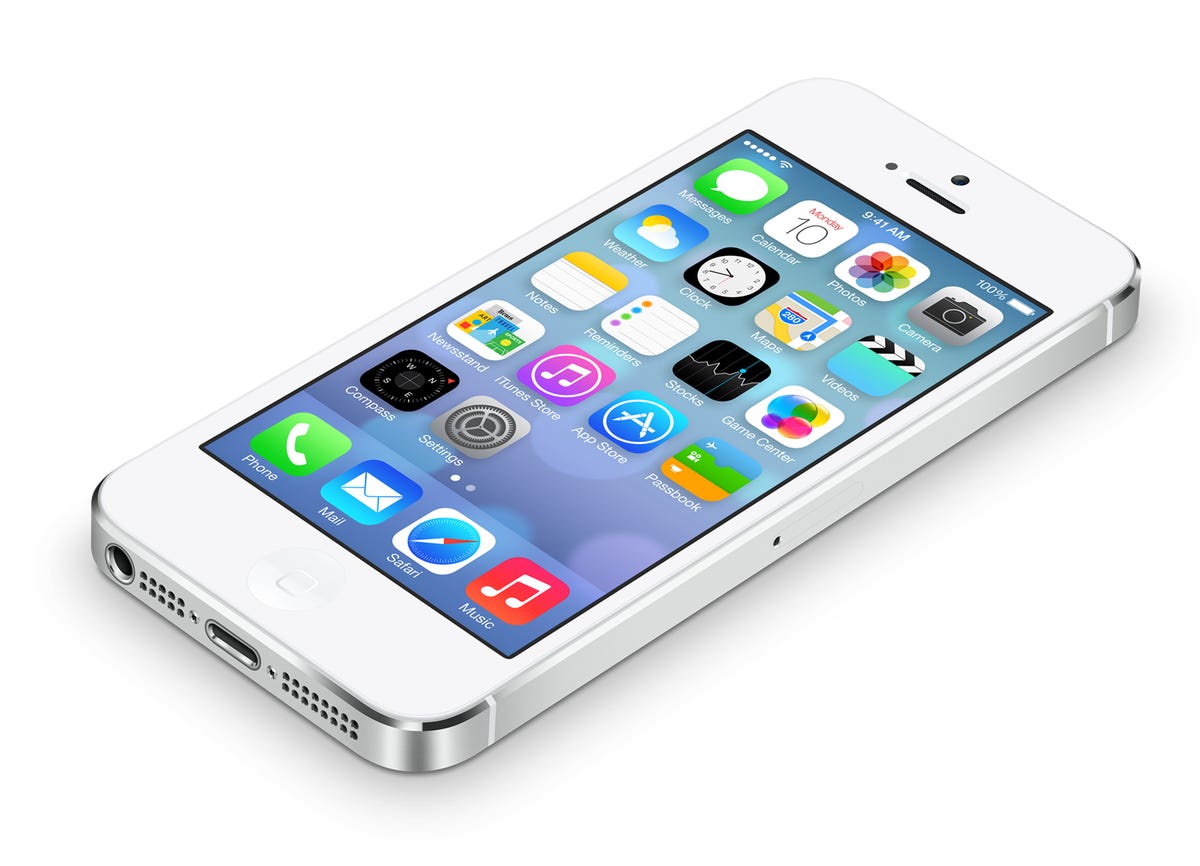
Apple design chief Jony Ive's complete visual overhaul of iOS certainly got the tech industry talking -- and a few imaginative artists also had their say about the matter.

The impromptu Tumblr Jony Ive Redesigns Things shows us a world inspired by Ive's new design direction as seen in iOS 7. Designer Sasha Agapov runs the eclectic image blog, which hosts funny Ive-inspired submissions from jokesters around the world.

To get you in the mood, first look at this teaser image showing iOS 7 on an iPhone 5. Among many changes, take notice of the gradients in the icons, the skinny font, and the simple flair. Artistic comedians have taken these themes and integrated them into the following images.

tumblr_mo7kmgzPOY1svn1xeo1_r1_1280.png
2 of 9 Sasha Agapov

iOS America

Jony Ive Redesigns Things Tumblr owner Sasha Agapov modified the American flag with a not-so-subtle gradient that adds dramatic color to the elder icon. What would Betsy Ross say about this?
cacho.png
3 of 9 Christopher Cacho

Apple 2.0

Graphic designer Christopher Cacho thought the old Apple logo could use some sprucing up. The new-age color scheme sure feels different from the rainbow colors of yesteryear.
waxy.png
4 of 9 Andy Baio

Bare bone

Jack of all trades (and Wired columnist) Andy Baio took Ive's minimalism to heart with this simple redesign of the U.S. dollar bill. We have a feeling the counterfeiters would have a field day with this one.
camille.jpg
5 of 9 Camille Marlow

iMac flair

In this image, developer Camille Marlow amusingly suggests that the gradients seen in the iOS 7 software could transcend to Apple's hardware color scheme. Thankfully, this eyesore will likely never see the light of day, but I must admit the gradient accent on the side of the Magic Mouse is growing on me.
forgrasy.jpg
6 of 9 Thomas Fogarasy

Mystical Evernote

The trademark Evernote elephant icon gets a refresh from user interface designer Thomas Fogarasy. Does anyone else think this design actually looks better than the real Evernote logo?
mikeott.png
7 of 9 Mike Ott

Breaking Bad

Android Analyse Senior Editor Mike Ott whipped up this colorful Ive interpretation of the logo used for the television show "Breaking Bad."
tumblr_mo799im31x1svn1xeo1_1280.jpg
8 of 9 Sasha Agapov

Jony Ive's new passport photo

Sasha Agapov, owner of the "Jony Ive Redesigns Things" Tumblr, amusingly suggests that if Ive could redesign his passport photo, it might look like this.
tumblr_mo79abCAWr1svn1xeo1_1280.jpg
9 of 9 Sasha Agapov

If Ive ran Google

Another brilliant eyesore, created by Sasha Agapov, reminds us why it's a good thing Google keeps the front page of the search engine plain.

More Galleries

Yamaha motorcycle and instrument designers trade jobs (pictures)
yamaha01.jpg

Yamaha motorcycle and instrument designers trade jobs (pictures)

16 Photos
CNET's 'Day of the Dead Devices' altar (pictures)
dia-de-los-muertos-3318-001.jpg

CNET's 'Day of the Dead Devices' altar (pictures)

9 Photos
2007 Los Angeles Auto Show: concept cars
conceptss01_440.jpg

2007 Los Angeles Auto Show: concept cars

14 Photos
Best sound bars under $300
polk-magnifi-mini-15.jpg

Best sound bars under $300

18 Photos
2018 Ford F-150 Power Stroke reports for diesel duty
2018 Ford F-150 diesel

2018 Ford F-150 Power Stroke reports for diesel duty

22 Photos
Music-friendly cell phone accessories

Music-friendly cell phone accessories

11 Photos
Cosplay at Comic-Con 2016: From Stormtroopers to Sansa Stark
dsc0515.jpg

Cosplay at Comic-Con 2016: From Stormtroopers to Sansa Stark

34 Photos