First look: Microsoft Office 2013
Microsoft today revealed the next important brick in its Windows 8 castle, the latest version of its Office suite of productivity tools.


Templates, templates
Microsoft today revealed the next important brick in its Windows 8 castle, the latest version of its Office suite of productivity tools.
Technically the 15th version of the software, collectively, the new tools will be known as Office 2013 and will deliver most of what users have come to rely on, with a smattering of the new Windows 8 flavour. In fact, Microsoft has doubled the size of the design team working on the Office product, up to 170 designers, to give this latest version an experience that users can become emotionally involved with.
Beyond just looking good, Office is now designed with touchscreen interfaces in mind, and the way the users interacts with this new software, strongly reflects this. The taskbar across the top of the screen now has a flatter appearance and is more touch-friendly in sizing. The Ribbon menu below this remains much the same, but there is now an option to collapse the Ribbon and give back screen real estate to the document you are working on.
As we've seen with Windows 8 previously, user settings are saved to the cloud in Office 2013, so that when you log in from a different device, a phone or a tablet perhaps, your favourites, recent documents, settings and formatting travel with you.
If you want to try out the new Office for yourself, Microsoft has released a consumer preview that you can download now.
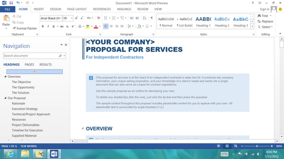
This screenshot shows the new start page for Word, launching with recent documents on the left and a large view of available template thumbnails on the right. The software intelligently shows your favourite templates first, and the list will amend the more you use Office.
Ribbon
The Ribbon is still a major part of controlling tools like Word, but its visibility is optional. You can click on the small arrow above the elevator bar on the right to collapse it upwards and give yourself more screen to work in. It will reappear every time you select one of the toolbar options along the top. Alternatively, you can lock the Ribbon in place if you find you use it a lot.

Excel-lent
Here you can see how Excel looks in Office 2013. This is one of the tools that received the most attention in creating a touch-friendly version. Microsoft has worked to make certain actions require as little input as possible — down to a single click where possible.

Easy graphs
This graph is an example of one of the many templates included in Excel. You select the appearance, input the data — and Excel does the rest.

Presentations
PowerPoint also opens with a set of templates, ready to be filled in with your data.

Laid out
The new touch interface doesn't take away any of the control that you might expect from PowerPoint. In fact, you will probably find that it makes it easy to manipulate your elements when creating a new presentation.

The cockpit
Micorosoft has overhauled the presenter mode in PowerPoint. In the cockpit, the presenter has easy to access controls for slides, and a preview view of the next slide, place above notes. There is also a new "laser pointer" feature. When you touch the screen where the current slide is displayed, a red dot appears under your finger, making it easier to highlight parts you wish to emphasis.
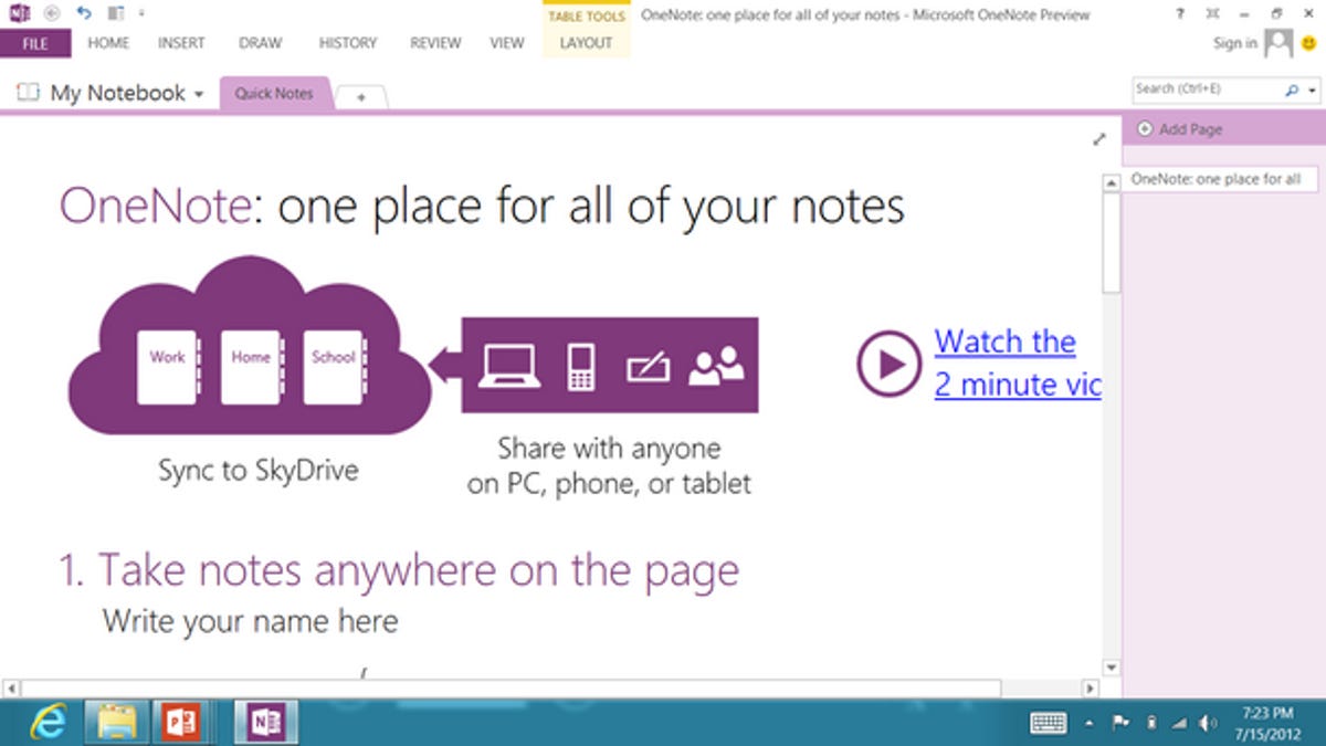
Meet OneNote
While most of the tools in Office need no introduction, Microsoft has included a tutorial in OneNote to show off some of its lesser known and lesser used features.
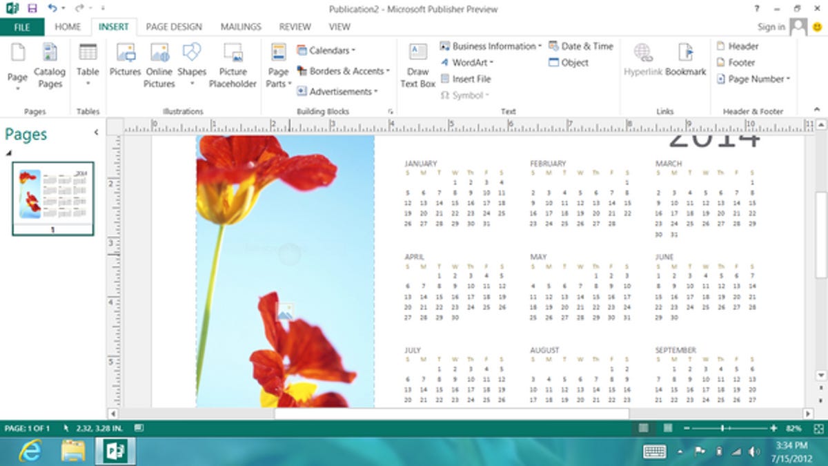
Charity fundraising, now easier
Planning a nude photo calendar of the school's tuckshop ladies to raise funds for a new library? The calendar tool in Publisher makes it easier than ever to give Mildred and Harriett their 15-minutes of fame.
Pattern forming
As you might have guessed, Publisher also opens with a page of easy-to-use templates.
More Galleries

My Favorite Shots From the Galaxy S24 Ultra's Camera
20 Photos
Honor's Magic V2 Foldable Is Lighter Than Samsung's Galaxy S24 Ultra
10 Photos
The Samsung Galaxy S24 and S24 Plus Looks Sweet in Aluminum
23 Photos
Samsung's Galaxy S24 Ultra Now Has a Titanium Design
23 Photos
I Took 600+ Photos With the iPhone 15 Pro and Pro Max. Look at My Favorites
34 Photos
