10 big redesigns of 2010 (images)
We take a look at some of the face-lifts, paint jobs, and general rejiggering that happened to some of the biggest sites during the year.


10 big redesigns of 2010
Visual change is a necessity on the Web, and each year we see sites--big and small--change their stripes. Many times this is just to give the site an updated or fresher look and feel, but it can also be an important part in building room for new features.
As we've done in the past, CNET has rounded up 10 big redesigns that happened this year.
For a look back, be sure to check out our lists from
Flickr
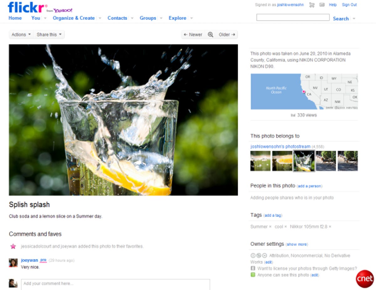
Flickr's visual overhaul was more than just a change of clothes, it was a complete rewrite of the site that made pages load faster and require less bandwidth.
Yahoo launched the new look as an opt-in beta, before later rolling it out to all users. One of the major features meant that photos appeared larger, and could be viewed almost instantly in full screen using a new Lightbox tool that borrowed some of the user interface from Flickr's slideshow tool.
Google News
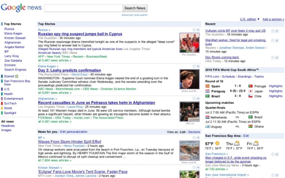
Google News got its big makeover in June, promising users more choice and personalization options for how they wanted to consume headlines alongside things like sports scores, stock tickers, and weather reports.
As part of the change, the company introduced a "News for You" section. This was a list of topics and news sources that could be tweaked based on whatever users were interested in.
Users did not take kindly to the redesign though. As part of the change, Google had quietly ditched the two-column layout, as well as the option to remove "News for You" topics that users weren't interested in. Google quickly relented.
Mapquest
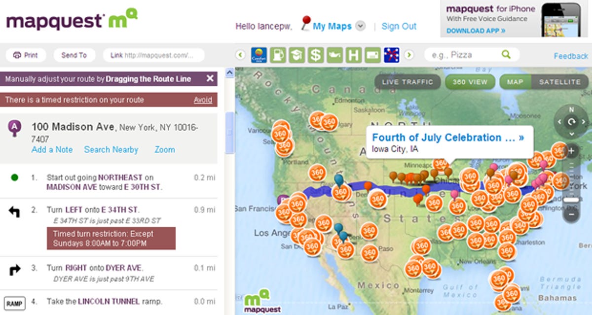
Maybe it was all the jokes about the aging logo, or the interface that hadn't quite kept up with rivals. Whatever it was, MapQuest set out to fix it, and in June unveiled a completely overhauled version of its mapping site.
Besides the new look (and logo), MapQuest added options to: make customized map lists to share with friends, grab driving directions from the address search box, sort through businesses by type, drag direction routes around the maps to change them, get 360-degree views from streets, as well as see reviews from map pins.
MapQuest is currently offering users a way to use the "classic" version of the site, something that may not stick around for long.
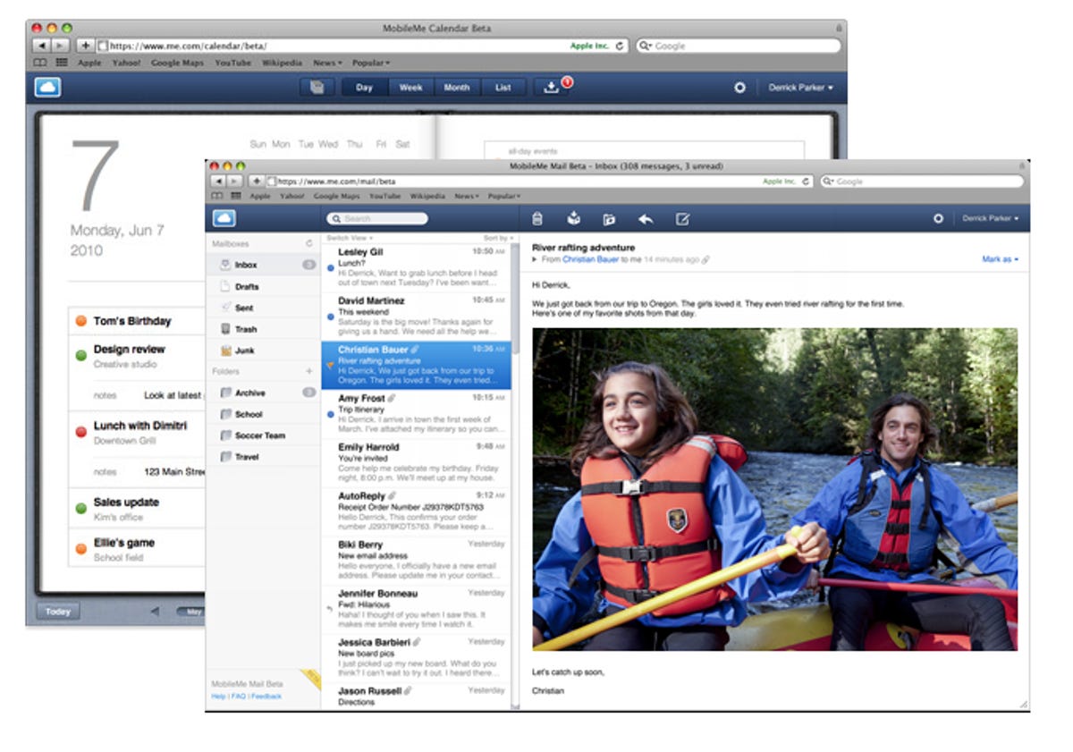
Apple's MobileMe
Apple's MobileMe site continues to be a work in progress after its very big shift from .Mac in 2008. MobileMe comprises a handful of Web apps, bundled together in one cohesive package. That includes e-mail, an address book, calendar, photo gallery, and a iOS device tracker that works with "find my iPhone/iPod/iPad" feature.
In 2010, Apple did a complete overhaul of both the e-mail service and the calendaring service to better match it up with the user interface found on iOS devices. Apple also tweaked MobileMe's navigation menu to match the alt+tab behavior found in Mac OS, giving users a heads-up display of tools they can access at any given time.
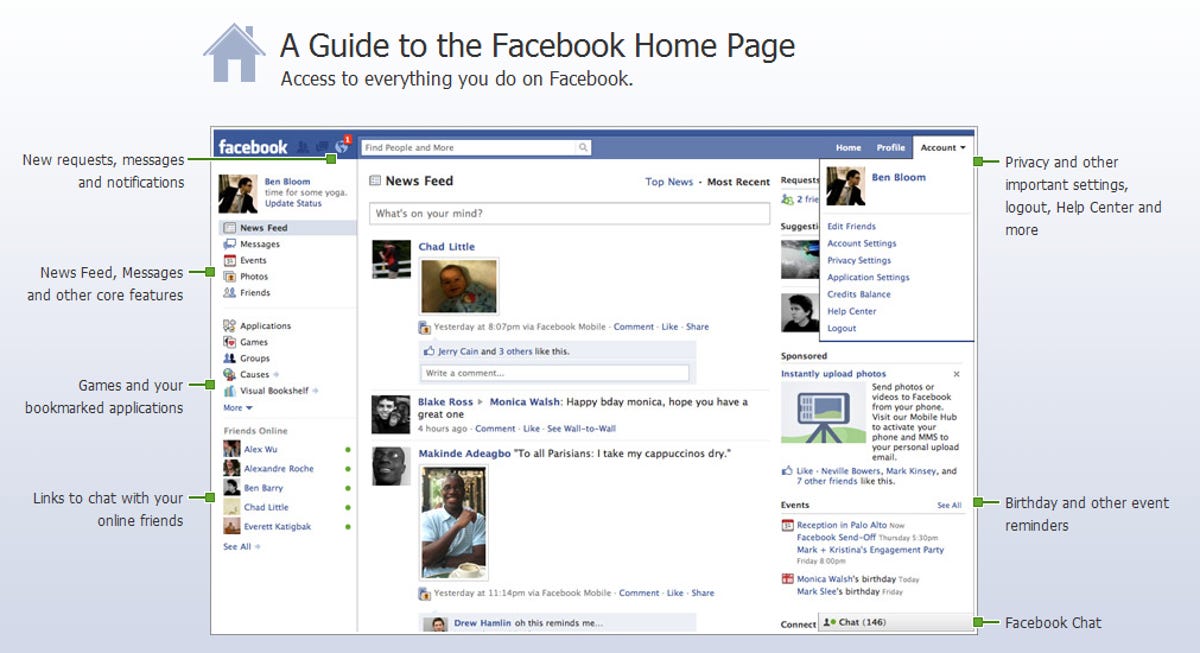
Facebook's big redesign moves in 2010 did not quite draw the ire that some of the site's visual tweaks did in 2009. That's because they weren't nearly as dramatic. The big change, pushed out to users in February, rejiggered the site's home page, grouping things like new requests, messages, and notifications up into the top left of the screen, with things like basic site navigation, bookmarked applications, and online chats taking up the entire left-hand side.
Later in the year the company rolled out a complete refresh of its profile pages, in part to give photos--one of the most popular parts of the service--more presence. Other changes made as part of the refresh included a quick breakdown of people's information at the very top of every profile page, as well as a more visual representation of who their friends were.
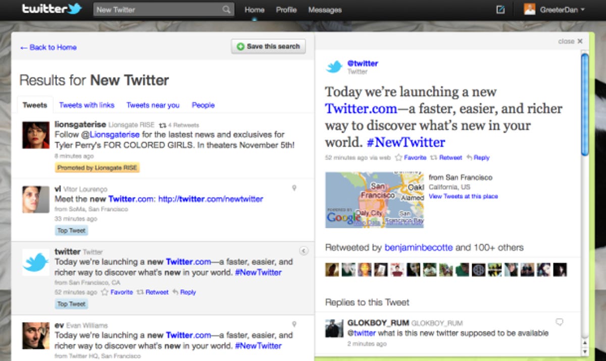
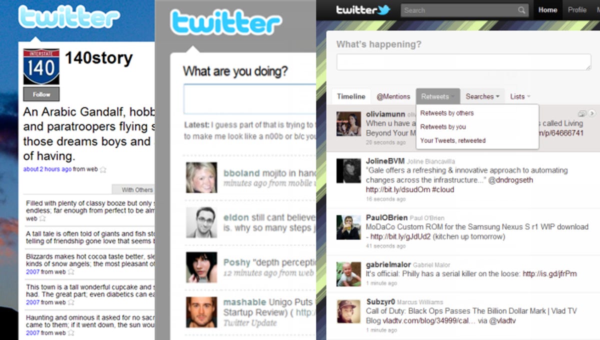
Of those on this list, Twitter's redesign is one of the most drastic, with a complete rebuilding of its back end, as well as the basic user interface.
Twitter extended what users could do on the entire right-hand side of the site, making it so that things like conversations between two users, tweets that went over the 140-character limit, as well as photos, could all be opened without leaving the page. To make that work, Twitter partnered with 16 different media companies to get specialty content links to open up from within the extended right side.
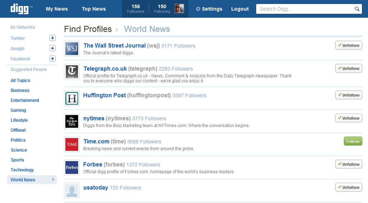
Digg
Easily one of the most controversial on this list, Digg's version 4 redesign began as an opt-in preview for Digg users midyear, before going to everyone in late August.
Digg's redesign was more than a face-lift, it was a dramatic shift in the way users both submitted and discovered stories. During that process a handful of classic Digg features were cut, and a vocal majority of users voiced their concerns that too much power had been given to publishers, who were now able to automatically submit their content to the site instead of the Digg community picking out items that could be voted on.
To some degree Digg relented, bringing some features back and acknowledging that things did not go as planned. But that did not change some of what was going on behind the scenes, including Digg CEO Jay Adelson stepping down and company layoffs.
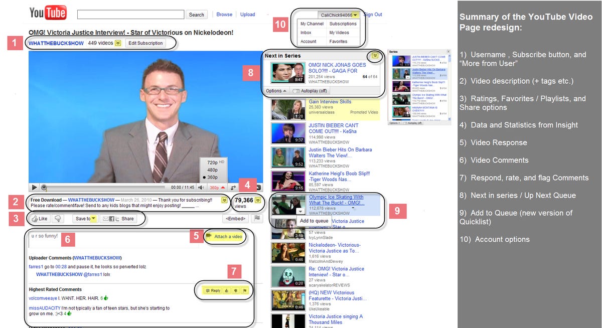
YouTube
YouTube's redesign efforts in 2010 were twofold: one being the YouTube site itself, and later the YouTube video player.
On the site side, Google simply cleaned house to better fit in and integrate the service's feature creep over the years. The many additions had slowed down page load and begun confusing users, so Google tucked features away, and reorganized menus. The change also introduced a complete overhaul in YouTube's ratings system, which did away with the stars in favor of a thumbs up and thumbs down.
As for the video player itself, Google did some of the same things, including slimming down the progress bar to hide away when not in use, and changing how some of the control toggles were overlayed on the video itself.
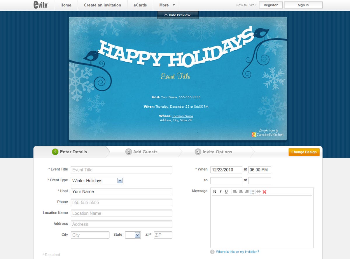
Evite
Evite continues to be a dominant force in the events space, but one thing that hadn't changed much over the years was the way the site had been designed. In September Evite changed that with a new version of the site that overhauled the look and feel, as well as tacking on additional social elements to combat growing rival Facebook.
This social bit consisted of something Evite called "event conversation," which was basically a comment forum attached to every event. This was separate from the RSVP tool, where users often changed their responses to talk to other users instead of using the feature as planned.
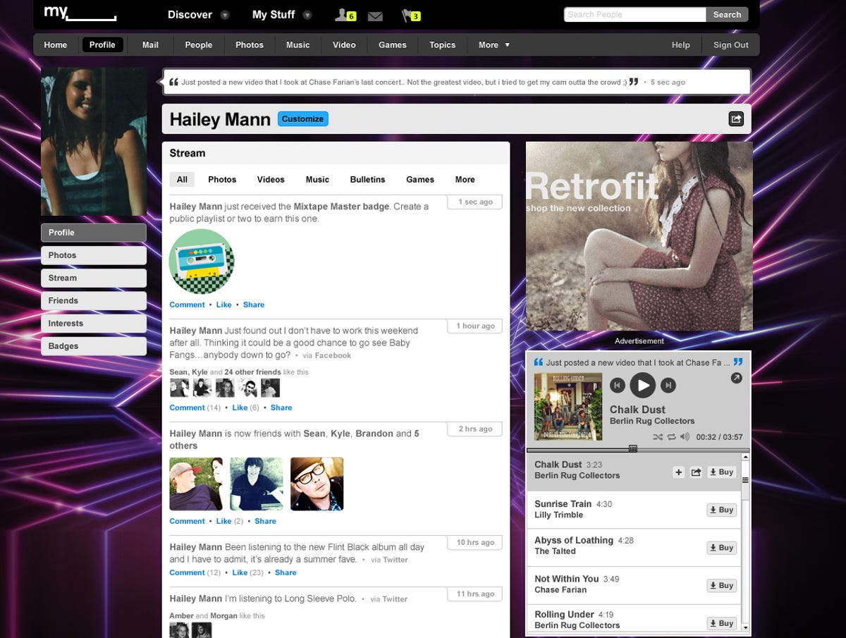
MySpace
MySpace and bleeding eyeballs went together like peanut butter and jelly--at least up until late October, when MySpace began rolling out an updated version of its site that was cleaned up, simplified, and actually kind of sexy. There was also a complete tweak of MySpace's logo, which did away with the lineup of people icons, and replaced it with "My" followed by a blank line.
Along with the new look, MySpace introduced an overhauled designer tool for people who wanted to pursue the endless (and time-honored) tradition of tweaking every single square inch of their profile, as well as a game of sorts--offering up badges for interacting with friends, or using parts of the social network.
Attempting to better bring together some of MySpace's parent company's media efforts, MySpace also added topic pages that feature movies, music, TV shows, and celebrity news.
More Galleries

My Favorite Shots From the Galaxy S24 Ultra's Camera
20 Photos
Honor's Magic V2 Foldable Is Lighter Than Samsung's Galaxy S24 Ultra
10 Photos
The Samsung Galaxy S24 and S24 Plus Looks Sweet in Aluminum
23 Photos
Samsung's Galaxy S24 Ultra Now Has a Titanium Design
23 Photos
I Took 600+ Photos With the iPhone 15 Pro and Pro Max. Look at My Favorites
34 Photos
