Why smartphone design matters (Smartphones Unlocked)
Even if you slap a case on your brand-new smartphone, the handset's aesthetics mean more than you might think.


Here's a question: Does cell phone design matter at all once you buy a phone?
A CNET reader recently asked this, and he got me thinking about whether design is essential to the success of a product or just window dressing. "Curb-appeal is important before buying," he claimed, "However, everyone I know almost immediately puts a case on their new cell phone for protection."
He has a point. A recent NPD study found that three out of four Americans cover up their significantly pricey investments with a protective case. And ultimately, performance makes or breaks the usefulness of a product. If the battery won't last, after all, that gleaming unibody aluminum housing won't do you any good.
Still, skin-deep aesthetics do matter, both on and off the shelf. They matter quite a bit.
I give every phone that crosses my desk a thorough eyeball treatment. I analyze in great detail the way a smartphone looks and feels in the hand -- how slippery or grippable the backing is, how rich or luminous the color, how plasticky or premium the materials. Handset-makers gain points for seamless joints and eye-catching accents, and lose them for dull, cookie-cutter design.
There's no doubt that a phone's physical allure draws customers in, and that your phone might just be as important to your personal style as the clothes on your back. According to Ethan Imboden, Frog Design's Head of Venture Design, aesthetics are the "outer manifestations of our inner aspirations. These are statements on what we are and who we want to be."
If cell phone design didn't matter, or mattered only to make the sale, the phone-makers wouldn't spend hours on ethnographic research in people's homes, and piles of money delving into exact manufacturing processes and materials chemistry to get the color, build, and coatings just right. Even more than simple tricks to flag your interest, the decisions that go into making a phone are often part of a bigger-picture project to build a lasting brand, and maybe even a product icon.
Color
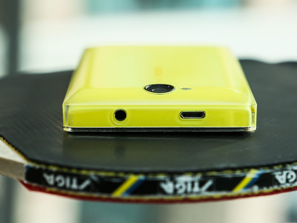
Of all the handset manufacturers I work with, none has embraced color as consistently or commandingly as Nokia, which, now owned by Microsoft, will cease to be a label. But before that, the Finnish phone-maker's Lumia line was practically defined by the riotous rainbow of polycarbonate shades designed to both appeal to and reflect youthful individualism. In addition to black and white, Lumia (and Asha) phones often emerged in yellow, cyan, red, and orange or green.


"Nokia has always recognized that color allows us to stand out," Nokia's Joeske Schellen, Head of Color and Material Technology Design, told CNET before the acquisition became final. "[It] evokes emotions and delivers choice to our consumers, and that is why color has always had such a strong presence on our products."
Nokia hasn't been alone in the pursuit, and other phone-makers, like HTC and Samsung, have also announced variations on phone shades -- though often we see these specialized colors emerge later down the line as exclusives for certain carriers, or only in certain markets. The black-and-gold HTC One M8 , and red and blue HTC Ones are vivid examples; so are the copper and aqua versions of the Samsung Galaxy S5 , and the red LG Nexus 5.
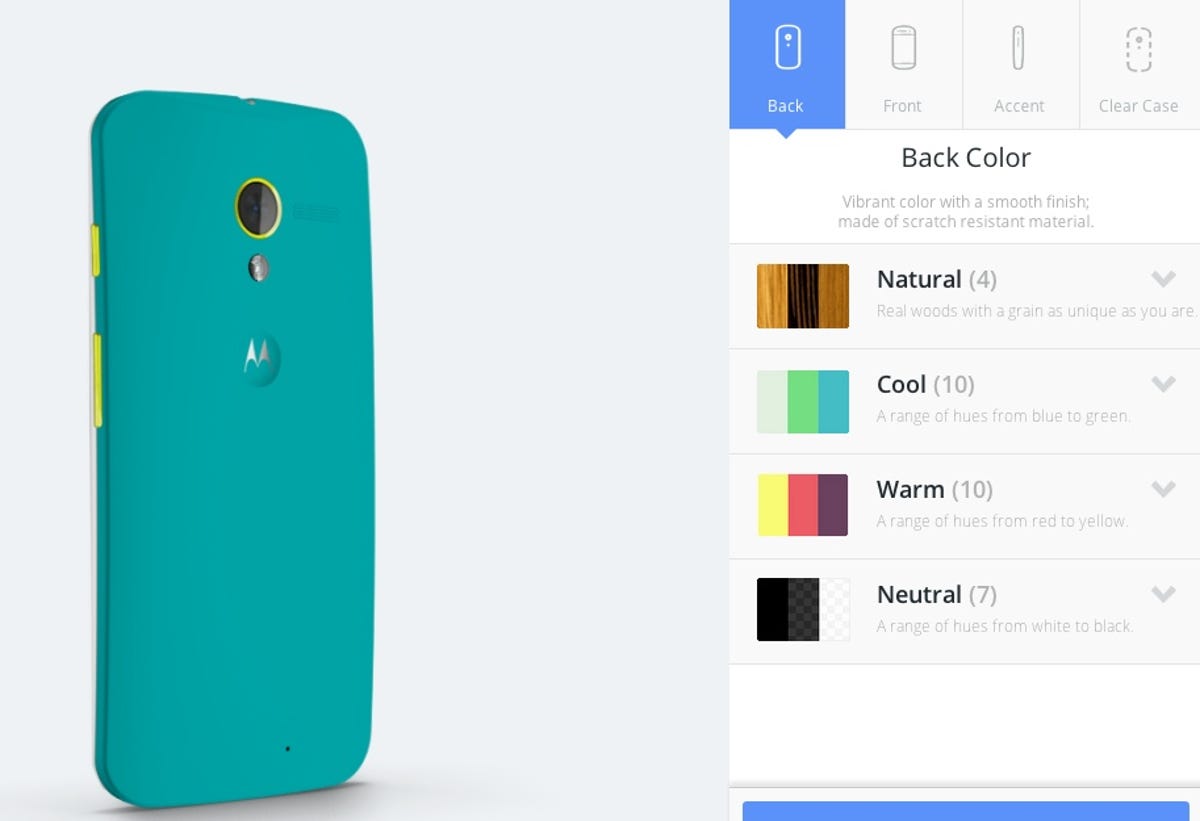
Before being bought by Lenovo, Motorola also lassoed the spirit of personal expression and individualism with the Moto X Moto Maker, a website that lets owners pick backplate materials from a color palette (including wood grain) and aluminum accent colors for both phone buttons and the ring around the camera lens. The ultimate in individual smartphone design, Motorola's gambit may not have been the runaway success story that the company, then owned by Google, was hoping for (for a number of reasons). Still, Motorola's effort to create and staff an entire website and perfect the manufacturing process for a wide range of colors speaks volumes about the need to do something different.
It may not be because of fiery shades, but color also plays a huge role in the iPhone story. Even before Apple unleashed its own green, blue, yellow, and red varieties of its less expensive iPhone 5C, the Cupertino, Calif., company deserves credit for both the white-phone craze and for current excitement over the light gold-colored finish of its iPhone 5S, a shade emulated by competitors.
In all cases, the manufacturer's choice of colors is a conscious one. Lighter tones often suggest refinement while louder hues speak to the young or young-at-heart. Nokia knew that the screaming yellows and reds of the Asha 503 and other Asha phones for example, were important to the division's sales strategy, targeting 16- to 25-year-olds in emerging markets, a demographic that tends to embrace lively hues.
In those closed-door conversations about which phones are painted blue, black, grey, silver, or even chartreuse, designers must think about about a whole range of factors, like the ages, socio-economic status, and perhaps even cultural attitudes toward color for the people they're trying to reach.
Finishes
Color has a powerful draw that can be seen from across the room, but the phone's more subtle finishes -- which protect the materials from wear -- have their own, albeit smaller, place in the universe of cell phone design. It's these finishes that make a phone feel smooth or sticky, rough or slippery, and they often contribute to how you perceive the value of the phone in your hand.
Here's an example: remember the glossy coating on the brushed-looking Samsung Galaxy S3 ? It added lustre and gleam, but on the flipside, that goopy finish also collected fingerprints and reflected glare. Done right, glossy can add an extra dimension to what might be an otherwise flat, dull finish. The Nokia Asha 503 is one example of this (and one of which Nokia was especially proud); a clear, resinous top coating soars above a layer of bright color that seems to hug the phone's internals, giving the handset its trapped-in-ice look.
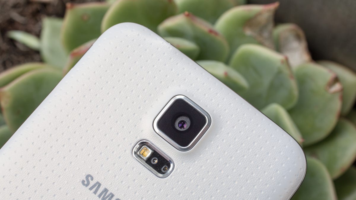
On the other hand you have matte finishes, like the Galaxy S5 (dimpled to add dimension) and all-metal, hairline-finished HTC One M8. Both of these phone finishes deter the buildup of fingerprint goo without getting flat and dull, a problem that matte coatings can have when done wrong.
The world of finishes is also where some of the phone's accents live, like a metallic-looking racing stripe around the sides, or a contrasting button shade that makes a phone look edgy, or at least designed with purpose. That brushed metallic button array on the matte back of the LG G2 Pro is a great recent example. Here's another: HTC's gold Harmon Kardon edition of the HTC One M8 throws in an accent around the camera lens, but could have taken the gold theme further by also making the side buttons pop.
You'd better believe that "the fit and finishes guys" as they're sometimes called, pour a lot of time and effort into the final feel of notable phones, all as part of a design philosophy that balances attributes like grippiness and gleam -- with the product's ultimate perception.
Build materials
You've got color, you've got finish -- but where do the phone's build materials fit into all this? Everywhere. I'd say it's pretty easy to argue that the phone's construction is the most important place that a phone-maker sends a message about the handset's personality and values.
Apple's first iPhone is the quintessential example of this, and one that's so significant because of its beginnings, breaking new ground with a sleek metal unibody dominated by an all-touch display that was large for its size back then. Compare the original iPhone to plastic phones of 2007, with small, often unresponsive screens and user interfaces like mini computers, and you see a huge difference. Apple had made a designer product whose simple, modern, elegant aesthetic and single home button quickly came to represent all that it could do.
Apple isn't alone. Nokia, for one, also saw design as an ethos. As Nokia's Schellen said in an interview with CNET before the Microsoft acquisition, "Simplicity and purity are really important for Nokia. It's important that a Nokia device strongly feels like a Nokia device."
Feeling "like a Nokia device" took work behind the scenes. Like other handset-makers, Nokia had spent time and money sending its employees into people's homes to conduct ethnographic research on how potential customers use products, also noting the markers of lifestyle that they value.
While its glossy or matte polycarbonate phone finishings aren't usually considered as premium as handsets made with metal and multiple panes of glass, Nokia has stood by its material's strengths, like its plastic's compatibility with radio frequencies, and its ability to hold bold, saturated color.
Although the use of plastic can sometimes look and feel chintzy, Nokia's Schellen says that the company has pumped a lot of money into detailed manufacturing processes to achieve color saturation, strength, and regularity -- and the process isn't cheap. When you add together the R&D, chemistry, and trial-and-error into manufacturing, "our plastic is as premium at a cost perspective as metals are," she said.
Interesting design is also one area that has set Nokia's lower-end phones apart from other phone-makers operating in a more price-sensitive space. Instead of opting for a simple one-dimensional slab look, Nokia chose its ice-cool Asha 503 phone for a more complicated process that coats the colored phone internals with a thick, hard top coating. In addition to looking really unique, according to Nokia's Schellen, the layered manufacturing process helps make the phone durable enough to skip a case, an important consideration for the phone's price-conscious target market.
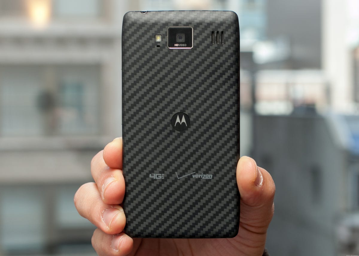
Another favorite poster child for materials is Motorola's distinctive Kevlar-backed Droid Razr line , whose industrial-strength backing not only gives the phone a tough-guy aura, but also serves a practical purpose of protecting the phone from splashes and scrapes.
It's all about the brand
Even if phone owners do buy a case, the handset's on-the-shelf looks make a big impact on the company's message about its identity -- is it hip and experimental, or safe and traditional? Does the company treat its products with care, or throw together junk for a quick, cheap sale?
These core values about what the brand is and what the company wants to be echo in the flagship phones especially. As Apple knows with its original iPhone, hitting a home run in the design department has been a mother lode of long-term payoffs for the value of the brand.
That first iPhone wasn't just a phone that people merely liked -- it became something they craved. Its design captured users' imagination, and elevated the iPhone from the fate of being just another shelf-liner to the realm of zeitgeist.
Apple's designers, along with phone designers for other brands, use every tool in their arsenal -- including carefully-selected color, finishes, and materials -- to strive for the same dream: turning just-another-phone into an icon that people care about and remember for long after the phone's lifespan.

Smartphones Unlocked is a monthly column that dives deep into the inner workings of your trusty smartphone.