What Google should learn from Bing's images
Google's takedown of background images on its homepage reveals that the company doesn't quite realize why Microsoft's backgrounds work so well on Bing.


I was focusing my attentions on deep World Cup meditation when I heard my phone ring and a scream. Yes, it was a friend of mine appalled at the sight of images beneath the type on Google home page.
"How could they do this?" she screamed. "Do they have no idea? "
Might I point out that my friend has some taste? She dresses like Audrey Hepburn. A kind of Audrey Hipburn, to be precise. And you should see her floral designs. Even if she does steal most of the flowers from roadsides and other people's gardens. Oh, and she's one of the best art directors in America.
You see, she wasn't objecting to the fact that Google had suddenly inserted imagery on its home page. She was objecting to just how badly the whole thing was designed.
What Bing understood when it created its own home page with imagery was that the whole page had to be balanced. Google seems not to quite have a grasp of what visual balance looks like. You don't put white type over a busy background. No one can see it. And it's ugly.
Please look at these screenshots and compare. I have tried three of Google suggested backgrounds from the options it still offers. Not one could honestly be called attractive. When visual elements fight, it's like trying to decipher why your lover has suddenly decided that you are seeing your ex. You know, the ex who lives in Sydney, Australia. The one you haven't seen for 15 years.

My friend's opinion: "Here, for example, look how the white type disappears to the right of the search box. White type on a light background. Equals ugly. Big ugly. Big stinking ugly."

My friend again: "Look at how the type simply disappears over the busyness of the cherry image. This isn't pretty. This isn't Armani. This is Armessi. Ugh. If one of my art directors came in with this, I would stifle a snort. And take the rest of the day off."
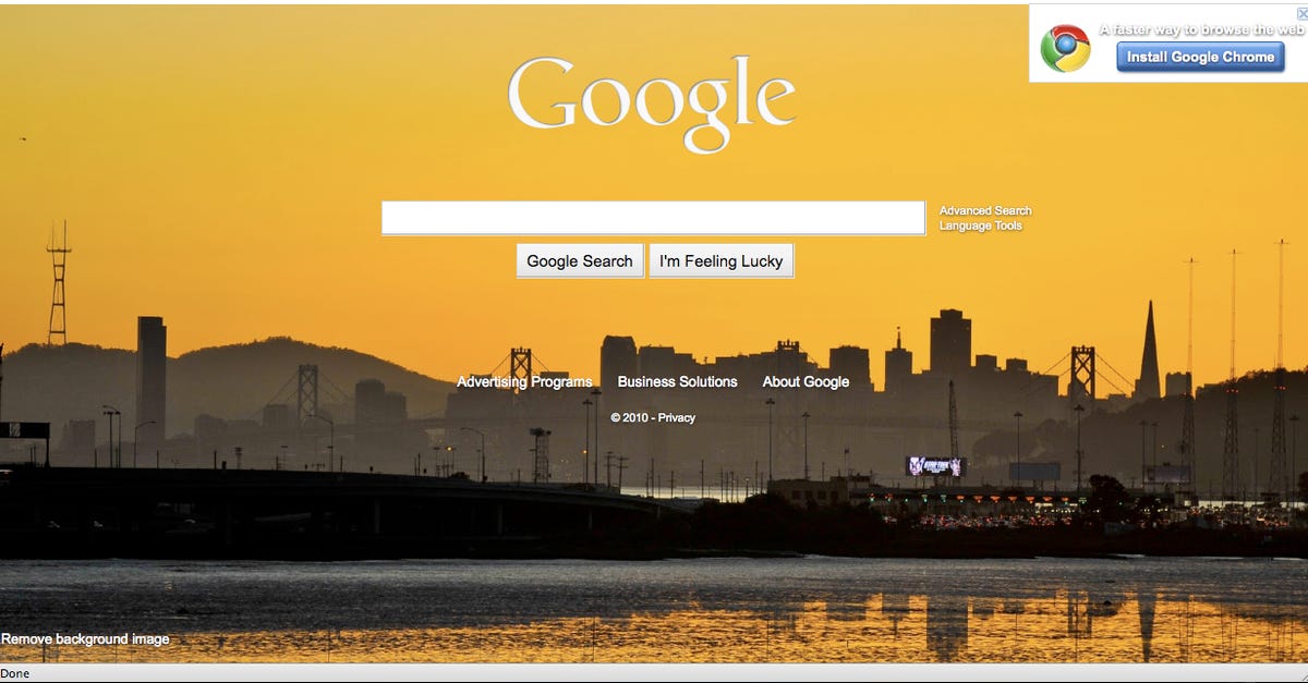
My friend, who by now, I suspect, has reached for a large cocktail glass. With a cocktail in it: "What do these people not get? You don't let the white type fight with the Bay Bridge. What's the point? Who wants ugly on their desktop? If I wanted ugly on my desktop, I'd put a picture of Oakland up there. Or Warsaw. Or Chace Crawford." I think she was joking. About Oakland, anyway.
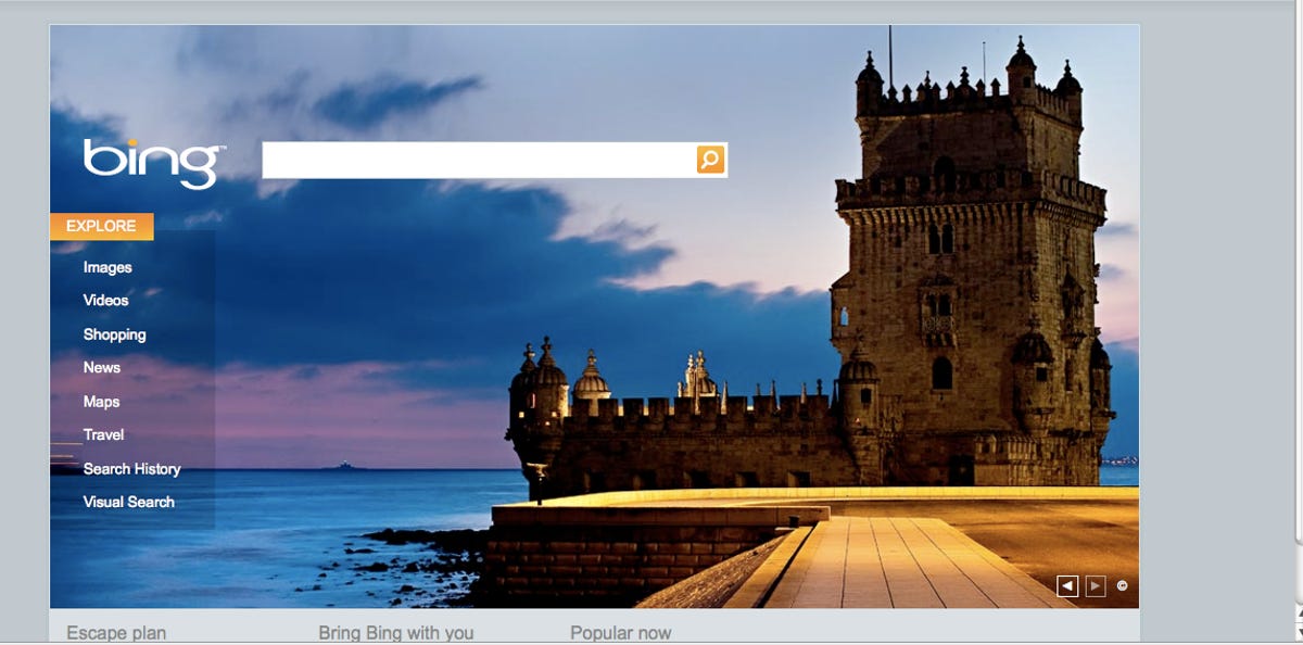
Please contrast this with the Bing homepage. My friend said: "Balance. Thought. Taste. Someone really sat down and thought about what this page would look like. Someone chose images that would give the type space to be itself. Someone actually wondered that search shouldn't be a cold, hard quest for facts."
Personally, I thought it was remarkably daring and progressive for Google to try imagery. Remarkably daring and progressive for the company that likes to test 41 different shades of blue. Google is slowly thinking about how to make itself more attractive to real human beings. It's even tried ads.
But it's truly strange to see something so touchingly amateurish emerge from the Googleplex. I am sure that some people truly objected to the new images just because they missed the existentialist void of the white Google home page.
Yet I cannot help thinking that my highly talented friend was not the only one who offered a swift "yeuch" because the whole thing so closely resembled a pie you've kept in your glove box for a couple of very hot days.