The rise of the accidental sensor
Insight from pervasive data isn't just about information that's deliberately collected for a specific purpose.
When IBM speaks of Smarter Planet or the U.S. Department of Energy talks of smart grids, a big part of the vision is pervasive sensors that measure and meter the physical world in real time.
Implicit is the assumption that much of this instrumentation will be deliberate and purposeful, put in place for a specific function such as measuring traffic flows or electricity consumption.
This is all fascinating stuff. But what I find even more intriguing is how data that's created by individuals--perhaps even as an accidental byproduct of some activity--can be aggregated and mined to deliver insights.
For example, Fast Company reported last fall that Google was adding 16 more countries to its flu trends program for a total of 20. According to Fast Company:
Google first released the program last November after noticing a geographical correlation between online flu searches and disease hotspots. The program was said to be especially helpful in Mexico following the emergence of the new H1N1 swine flu there last spring.
No one was searching using the term "H1N1" in order to help generate a global flu map. They were presumably just seeking information for their own purposes. But these points springing from individual self-interest provide useful data in the aggregate.
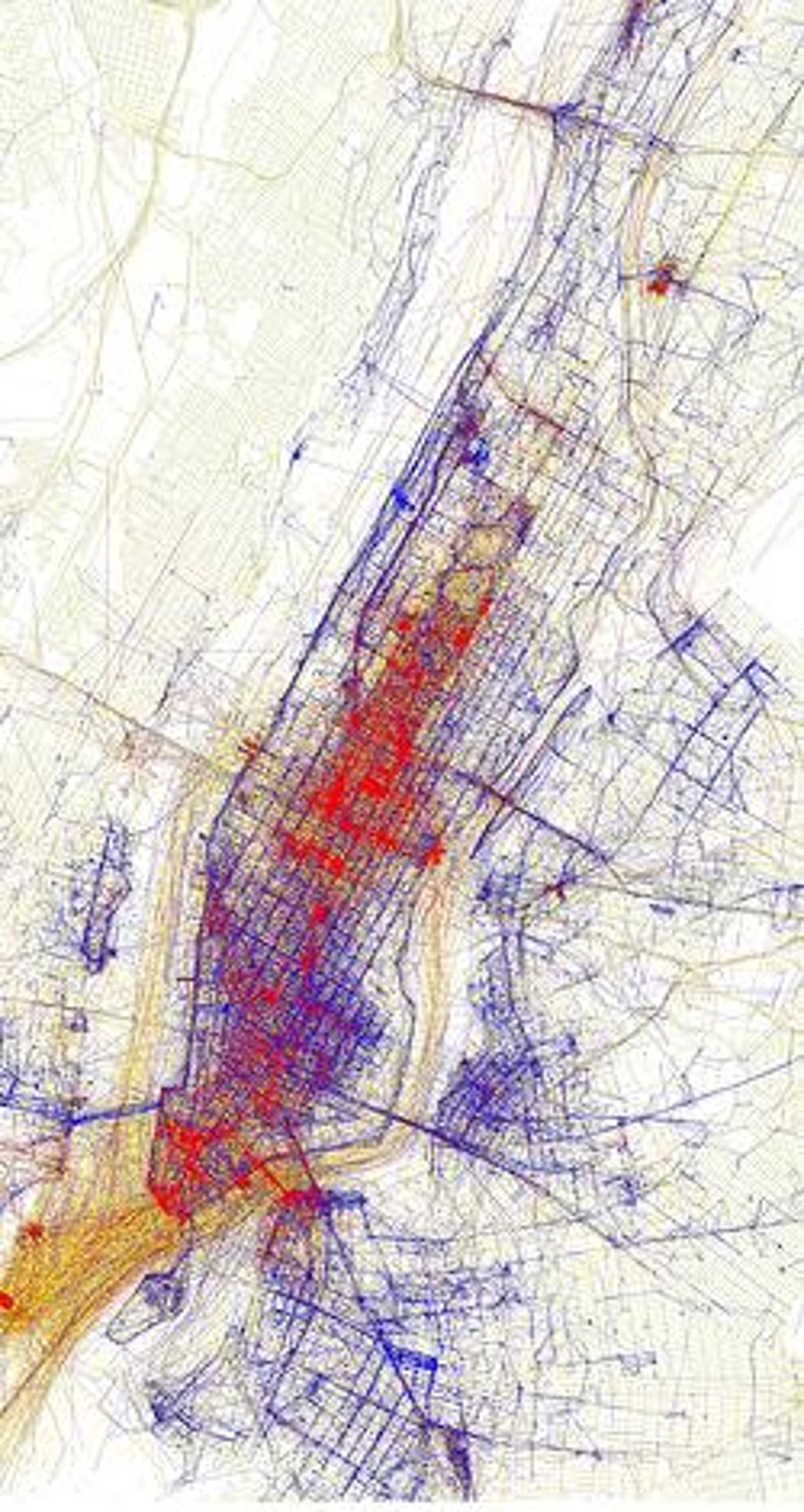
A neat set of maps on Flickr created by Eric Fischer likewise offers a great visualization of data aggregation. According to Fischer:
Blue points on the map are pictures taken by locals (people who have taken pictures in this city dated over a range of a month or more).
Red points are pictures taken by tourists (people who seem to be a local of a different city and who took pictures in this city for less than a month).
Yellow points are pictures where it can't be determined whether or not the photographer was a tourist (because they haven't taken pictures anywhere for over a month). They are probably tourists but might just not post many pictures at all.
Based on my knowledge of some of these cities, the results seem quite accurate. For example, San Francisco's Fisherman's Wharf and the surrounding waterfront is bright tourist red--as you'd expect. New York City also looks about right to me. (Midtown Manhattan looked to have fewer locals than I would have anticipated until I realized that this is more of a business than a residential area and people take relatively few photos of their day-to-day work life.)
What was perhaps most striking for me about these visualizations is how rich the data set is given that adding location to photographs is, relatively speaking, in its infancy; few cameras today have GPS receivers built in to geotag photos automatically. For the most part, you have to add location information by some sort of a manual process such as placing a photo on a map when uploading it to Flickr.
One reason people go to this trouble is that it makes it easier to identify and locate pictures in the future. They may also do so because it's another way to share and lets others find a photo through by place. But it's fair to say that few if any geotagged their photos with a thought to creating data.
Yet that's what they did. And, as we collectively create more and more information as a byproduct of our everyday actions, the aggregations will only get more interesting.