The curse of the two-faced interface
Sometimes, user interfaces come together at the last minute. And not very well.


When I got my Panasonic cordless home phone system about two years ago, I was amused to discover that its voice-announce features used two different voices. The voice that reads the caller ID is female. The one that talks me through the voice-mail options is male. It's pretty clear that this is not the result of an intentional design decision, nor an homage to "Airplane," but rather, because these two systems were built separately and grafted together at the last minute. Look close enough at this phone and you can almost see the duct tape.
I thought the Panasonic was an anomaly, a rare device with dual-personality psychotic disorder in a population of mostly benign, only neurotically bad user interfaces. But the more I looked, the more this disorder began to pop up in my own arsenal of technology. I think it's contagious. And it's dangerous.
In my own living room there are two infected devices. My Denon receiver has one onscreen interface (ugly typefaces, no graphics, but a consistent onscreen menu scheme) for options and settings, but another (nicer fonts, a little graphical love, but relies on buttons on the remote for navigation) for the Internet radio and network streaming functions. There's an iPad remote app, too. It's from another planet.
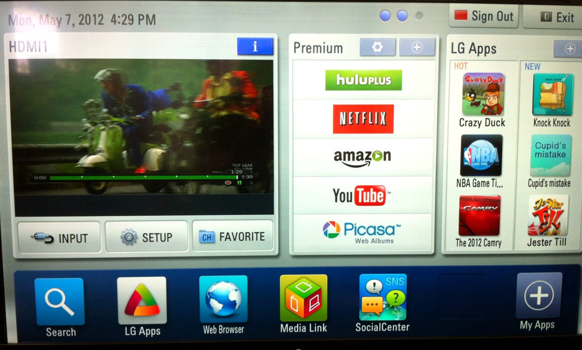
An LG TV I got a few months ago is a Sybil of interfaces for control and setup, with overlapping but different menus to access various apps and streaming services. There's an additional motion-control interface available for this TV. I didn't buy it. The last thing this set needs is yet another interface.
Even in devices that should be up to date in the interface department you see multiple personalities fighting. It's like being a fly on the wall of the meeting where the designers and engineers all just said, when they had to finalize the design of a product, "Oh, screw it. Let's go get lunch."
For example, the first time I tried to make an app purchase on my Galaxy Nexus Android phone from a link a vendor had e-mailed me, it asked me if I wanted to do so in the browser or in the marketplace (now called Play). How should that be a decision a new user has to make? I do get that Android is flexible, and the geek in me loves this, but forcing a user to make a decision they don't understand is UI negligence. Remember "Abort, Retry, Fail?"
Now, there is a lot to be said for flexibility. In an operating system or app, if you don't want to use a mouse, you should be able to use the keyboard. If neither are what you want, then voice control is pretty cool. But in a good interface, you'll be able to slide between interaction methods without having to think about it. I mouse around on my computer when I'm surfing the Web, for example, but keep my hands on the keyboard and rely on shortcuts when I go into writing mode. I don't have to think about it.
This rant is not a paean to Apple. I find Windows and Windows apps mostly better for multimodal users than the Mac. But I do want to point out that when it comes to designing systems as coherent units, Apple has a lot to teach. There are mercifully few rabbit holes you can go down in OS X where you find yourself using what feels like a different system buried in a product you thought you knew. Fewer still in iOS. In consumer electronics these issues pop up everywhere.
Apple has been trying hard to build unified products for years. That fact that it hasn't succeeded in every aspect of every one of its products after all this time indicates how incredibly hard it is to build beautiful systems that are coherent and consistent.
Has the rest of the electronics industry learned nothing at all from the payback Apple's gotten from its efforts? Yes, it's hard to build interfaces that approach the levels of Apple's greatest hits. Yes, it's expensive and can slow down development. But there is a value to coordinating product interaction designs, if only to keep users from going insane themselves.