T-Mobile Shadow: Hands-on impressions and photo gallery
CNET offers some first impressions as well as a hands-on photo gallery of the new T-Mobile Shadow smartphone.


In addition to the
I have the T-Mobile Shadow in hand, but I only received it a few hours ago, so I'm still checking out the smartphone and putting through its paces. I'll have a full review for you tomorrow morning, but for now, I wanted to share some initial thoughts and some hands-on photos of the smartphone with you.
Design
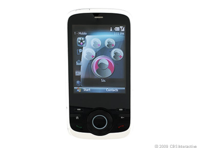
From afar, the T-Mobile Shadow looks like a more modern, hipper version of the original Shadow. By the numbers, it's the same size as its predecessor at 4 inches tall by 2 inches wide by 0.6 inch deep and weighs 5.3 ounces, but the smartphone now sports curved edges, a shinier face, and a new paint job that gives it a fresh look. I received the white/mint version (it's also available in black/burgundy) and found it quite attractive, especially the back where it slowly transforms from white to mint.
However, that's about where the attraction ends. Up close and in the hand, I couldn't help but think that the T-Mobile Shadow looked like a toy and didn't really see any vast improvements or benefits over its predecessor. In fact, I actually favor the original model's design. The new Shadow has a smaller 1.6-inch QVGA display that doesn't look all that sharp or bright, showing just 64,000 colors at a 320x240-pixel resolution. The navigation toggle/wheel below the screen also feels loose and cheap. I did like the user interface for its cool animated effect and how it organizes the phone's applications into eight main categories, all of which are accessible right from the Today screen.
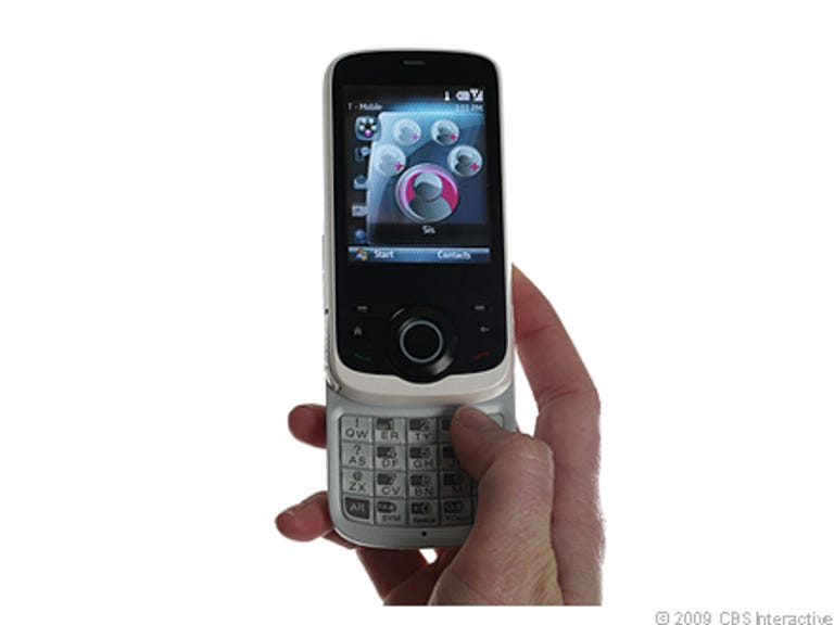
The Shadow offers the same slider design as the first Shadow. To access the SureType 20-button keypad, just slide the screen up. It requires a good push but the sliding mechanism feels strong and the screen securely locks into place. What greets you when you finally open the phone, however, is a bit disappointing. Allow me to illustrate.
Two co-workers happened to be around my desk when I received the phone (one who was actually considering purchasing the T-Mobile Shadow for herself) and as soon as I pushed up the screen, they both immediately went off about how the worn down and ugly the keypad looked--that's never a good sign. But they're right. While the buttons are large and easy to press, the backlighting is really uneven and dim and only illuminates about five buttons. It just looks bad. I'm even more disappointed considering that HTC made the Shadow, and the company has quite a reputation for making high-quality devices.
Features and performance
The new features didn't particularly wow me either. The main difference is that the Shadow now ships with Windows Mobile 6.1 Standard and includes a faster processor (260MHz versus 200MHz) and UMA support so you can now make calls over Wi-Fi using T-Mobile's Unlimited HotSpot Calling service. Everything else is pretty much status quo. I think I would have at least liked to seen an upgraded camera, 3G support, or integrated GPS.
Call quality was decent with good volume and fairly clear audio. There was some slight background hissing, but nothing incredibly distracting. We did run into a bit of that notorious Windows Mobile sluggishness in the way of a pause or few-second delay when launching applications or performing some tasks. I'll obviously give you a more in-depth look at some of these issues in my full review on Wednesday.
Outlook
As I mentioned earlier, I've only had a few hours with T-Mobile Shadow so I won't deliver my final verdict yet. However, if I had to describe my experience thus far, I guess I would say I feel underwhelmed. It feels like HTC and T-Mobile simply tweaked the design slightly, threw in a couple new tricks, and put it out for sale without bringing any real innovation or benefit over its predecessor. I just don't see anything compelling for current Shadow owners to make the upgrade.
That said, I feel like the T-Mobile Shadow has a place and purpose. I think it's a good device for people crossing over from a regular cell phone to their first smartphone, since it introduces the extra functionality in consumer-friendly package. Perfect for T-Mobile's younger demographic.
I'll have more tomorrow but in the meantime, feel free to post any of your thoughts and be sure to check out our T-Mobile Shadow photo gallery.